Habitat use visualizations
Resource Selection Functions, Part II
Elie Gurarie
2019-11-29
The Goal: To perform some preliminary visualizations and summary statistics of the habitat use compared to availability for the Hay River population.
Background
Data exploration and visualization is always important before “blindly” fitting models. It’s taken a lot of effort to organize the data in a way which is suitable for analysis. But some exploration of those variables with respect to our two main subsets (“Used” and “Available”) as well as some potential seasonal subsets of data might shed light on the patterns to expect and test for.
Data and packages
Load some packages (note: no need for all the heavy duty spatial stuff! Just data manipulation and visualization for now)
pcks <- c("ggplot2", "plyr", "lubridate", "magrittr", "sf")
a <- sapply(pcks, require, character = TRUE)
Everything here is based off the hayriver.RSF data frame generated in Part I. For simplicity / laziness, let’s rename it to hr, but also add a few columns that might be interesting to look at, such as “month”, “year” and "day of year:
load("_data/hayriver_RSF.rda")
hr <- hayriver.RSF %>% mutate(month = month(timestamp),
                              year = year(timestamp),
                              doy = yday(timestamp))
str(hr)
## 'data.frame': 9691 obs. of 14 variables:
## $ EOSD : num 211 82 81 212 211 81 82 83 212 83 ...
## $ nick_name : Factor w/ 13 levels "HR108","HR109",..: 1 1 1 1 1 1 1 1 1 1 ...
## $ timestamp : POSIXct, format: "2007-02-22 22:30:00" "2007-02-25 22:13:00" ...
## $ X : num -258895 -255315 -253800 -257247 -252508 ...
## $ Y : num 2255298 2265024 2267979 2264706 2262221 ...
## $ Road.Density: num 0 0.2148 0.0475 0.1892 0 ...
## $ DEM : num 301 302 308 304 296 ...
## $ Used : logi TRUE TRUE TRUE TRUE TRUE TRUE ...
## $ longitude : num -117 -117 -117 -117 -117 ...
## $ latitude : num 60.2 60.3 60.4 60.3 60.3 ...
## $ EOSD.class : Factor w/ 20 levels "Broadleaf-dense",..: 4 19 20 5 4 20 19 18 5 18 ...
## $ month : num 2 2 2 3 3 3 3 3 3 3 ...
## $ year : num 2007 2007 2007 2007 2007 ...
## $ doy : num 53 56 59 62 65 68 71 72 74 77 ...Visualizations and Summary Stats
Land-cover use
Used vs. Available
The variable that is - in some ways - most relevant and interesting to us is the landcover variable. Getting a table of counts is fast and easy in R:
table(hr$EOSD.class, hr$Used)##
## FALSE TRUE
## Broadleaf-dense 10 3
## Broadleaf-open 5 6
## Bryoids 2 3
## Coniferous-dense 142 1373
## Coniferous-open 235 3174
## Coniferous-sparse 58 460
## Developed 2 0
## Exposed/Barren Land 1 0
## Herbs 0 0
## Mixedwood-dense 48 164
## Mixedwood-open 12 72
## Recent Burn 64 650
## Rock/Rubble 0 0
## Shadow 0 0
## Shrub Low 8 32
## Shrub Tall 5 0
## Water 91 91
## Wetland-herb 33 682
## Wetland-shrub 76 1404
## Wetland-treed 53 724As is converting that to a reasonably legible barplot:
par(mar = c(3,10,2,2), cex.axis = 0.8)
barplot(t(table(hr$EOSD.class, hr$Used)),
        beside = TRUE, horiz = TRUE, las = 1)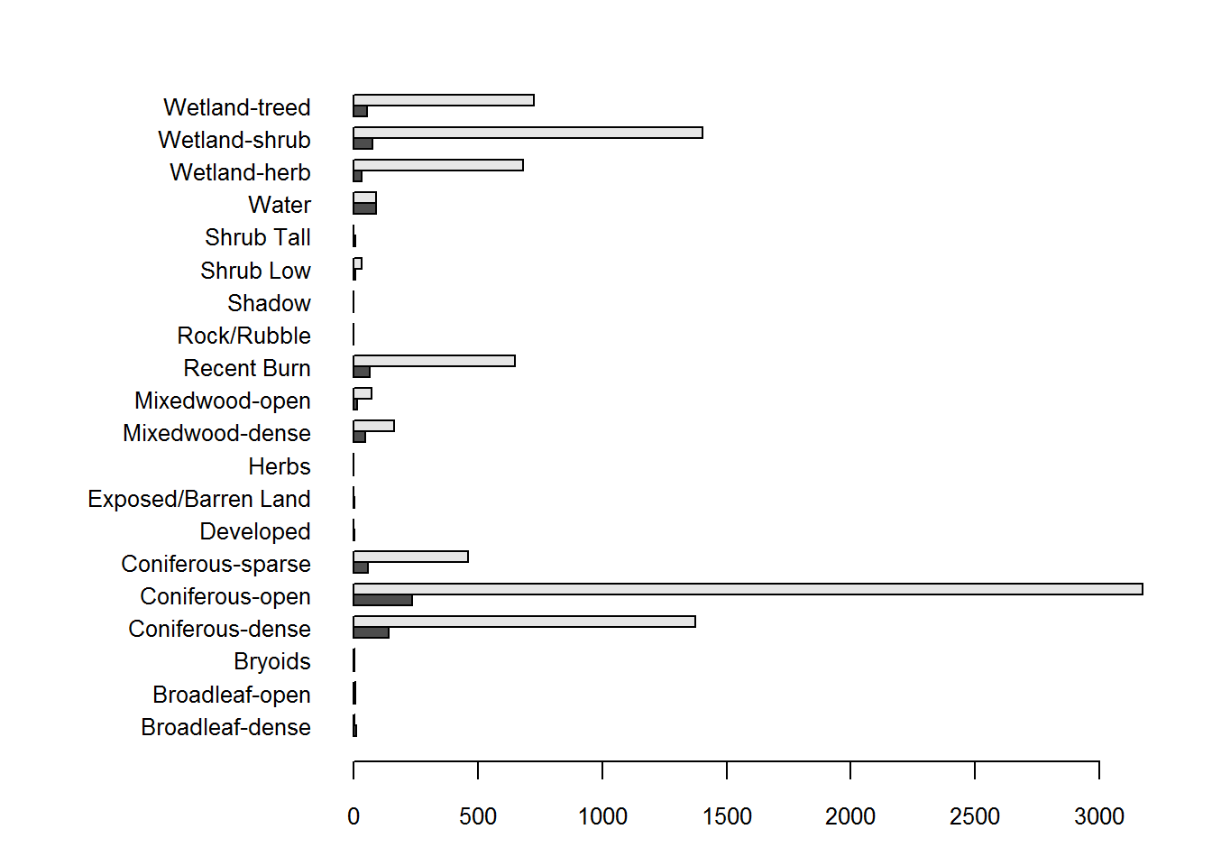
But this is not a terrific figure, since there are a lot more Used than Available locations, so it is hard to compare. The following code is a bit fussy, but it reorganizes the data into a data frame with proportional counts and plots it nicely:
counts.table <- table(hr$EOSD.class, hr$Used)
counts.df <- as.data.frame.matrix(counts.table,
                                  row.names = row.names(counts.table))
names(counts.df) <- c("Available", "Used")
counts.df$Total <- rowSums(counts.df)
counts.df$EOSD <- row.names(counts.df)

counts.df <- mutate(counts.df,
                    Used = Used/sum(Used),
                                        Available = Available/sum(Available))   %>%
                                        plyr::arrange(Available)

par(mar = c(4,15,2,2), cex = 0.8)
cols <- c("grey", "darkgreen")
barplot(t(counts.df[,c("Available", "Used")]),
                    beside = TRUE, col = cols,
          horiz = TRUE, las = 1, bor = NA,
                    names.arg = counts.df$EOSD)
legend("bottomright", fill = cols, legend = c("available", "used"))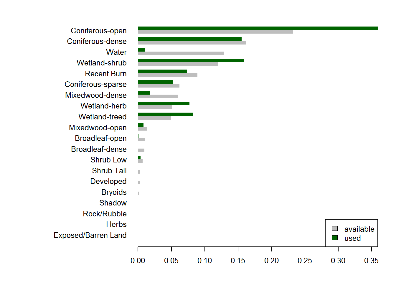
These are arranged by proportion of availability, and there are clear patterns to pick out, e.g. much higher than expected use of wetland herbs and wetland shrubs and, even, coniferous open habitat, avoidance of dense mixed woods and, most strongly but also obviously, of water.
Relative use plots
Ratios of use versus available counts can also be useful, e.g.:
counts.df <- mutate(counts.df, rel.preference = Used / Available) %>% subset(!is.na(rel.preference) & Used > 0) %>% arrange(rel.preference)
par(mar = c(4,10,2,2), cex = 0.8, las = 1)
with(counts.df, barplot(rel.preference, width = Available, horiz = TRUE, names.arg = EOSD))
abline(v = 1, col = 2, lwd = 2, lty = 3)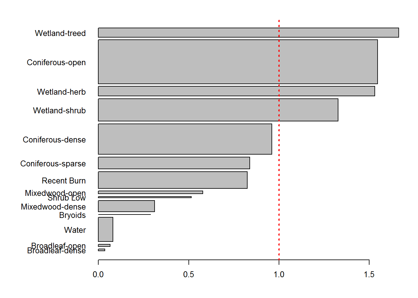
The widths of the bars are proportional to the availability in the landscape, those that are greater than 1 indicate greater use than expected (i.e. possible preference), those that are less than one indicate - possible - avoidance. The RSF will help us quantify these results.
Note, with a little but of fussing, we can actually match these bars to the colors of the original EOSD map:
require(raster); eosd <- raster("_data/rasters/EOSD_withfire")
counts.df <- merge(counts.df, levels(eosd)[[1]][,c("Description","Color")], by.x = "EOSD", by.y = "Description")
par(mar = c(4,10,2,2), cex = 0.8, las = 1)
with(counts.df,
     barplot(rel.preference, width = Available,
             horiz = TRUE, names.arg = EOSD,
             col = Color))
abline(v = 1, col = 2, lwd = 2, lty = 3)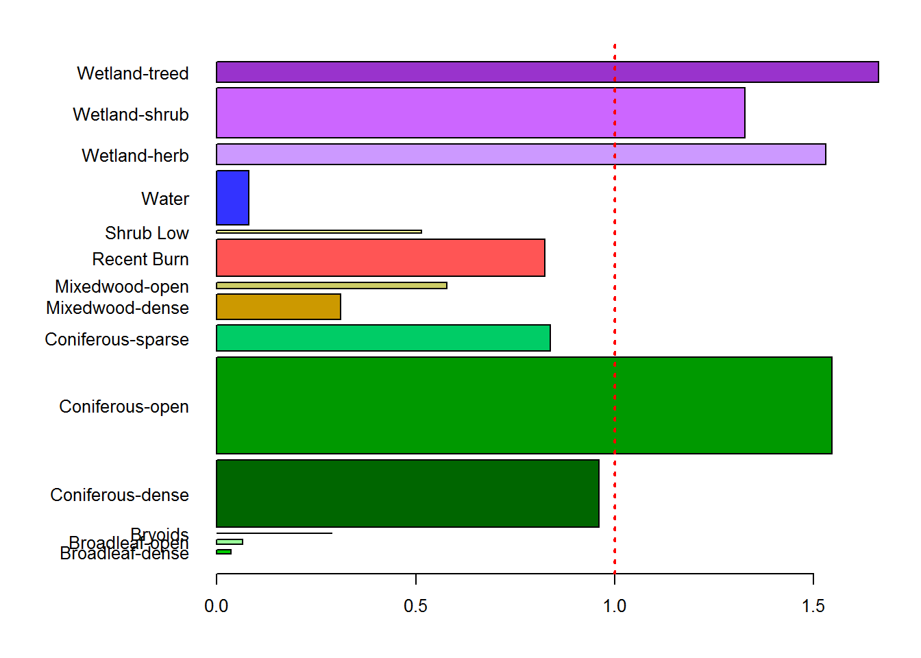
Continuous covariates
Boxplot are the most obvious way to look for differences:
boxplot(DEM ~ Used, data = hr, main = "Elevation (m)")
boxplot(Road.Density ~ Used, data = hr, "Road Density (m/m^2)")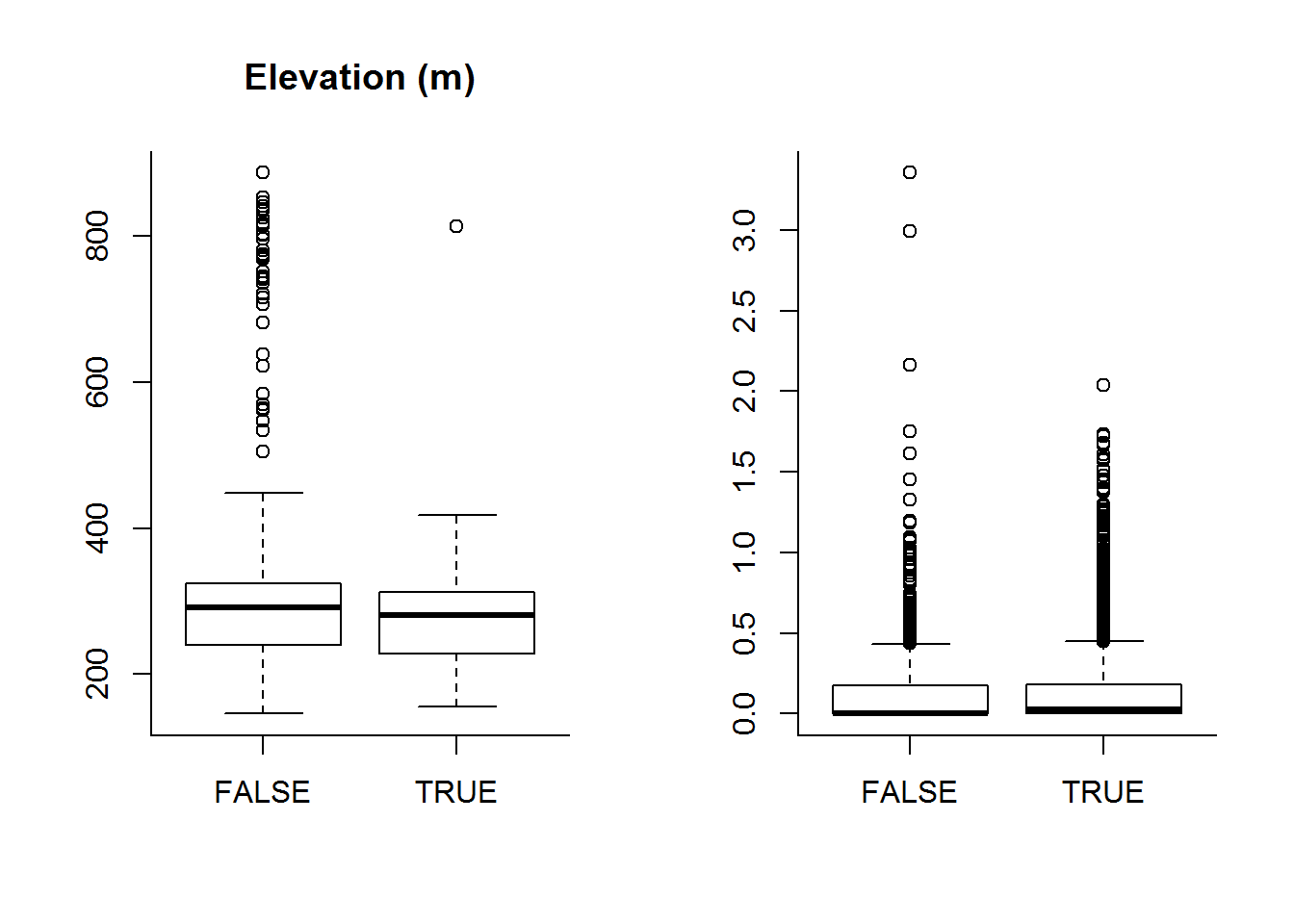
But it’s hard to see any really compelling differences.
Interesting - always - to look at differences against individuals:
boxplot(DEM ~ nick_name, data = subset(hr, Used))
boxplot(Road.Density ~ nick_name, data = subset(hr, Used))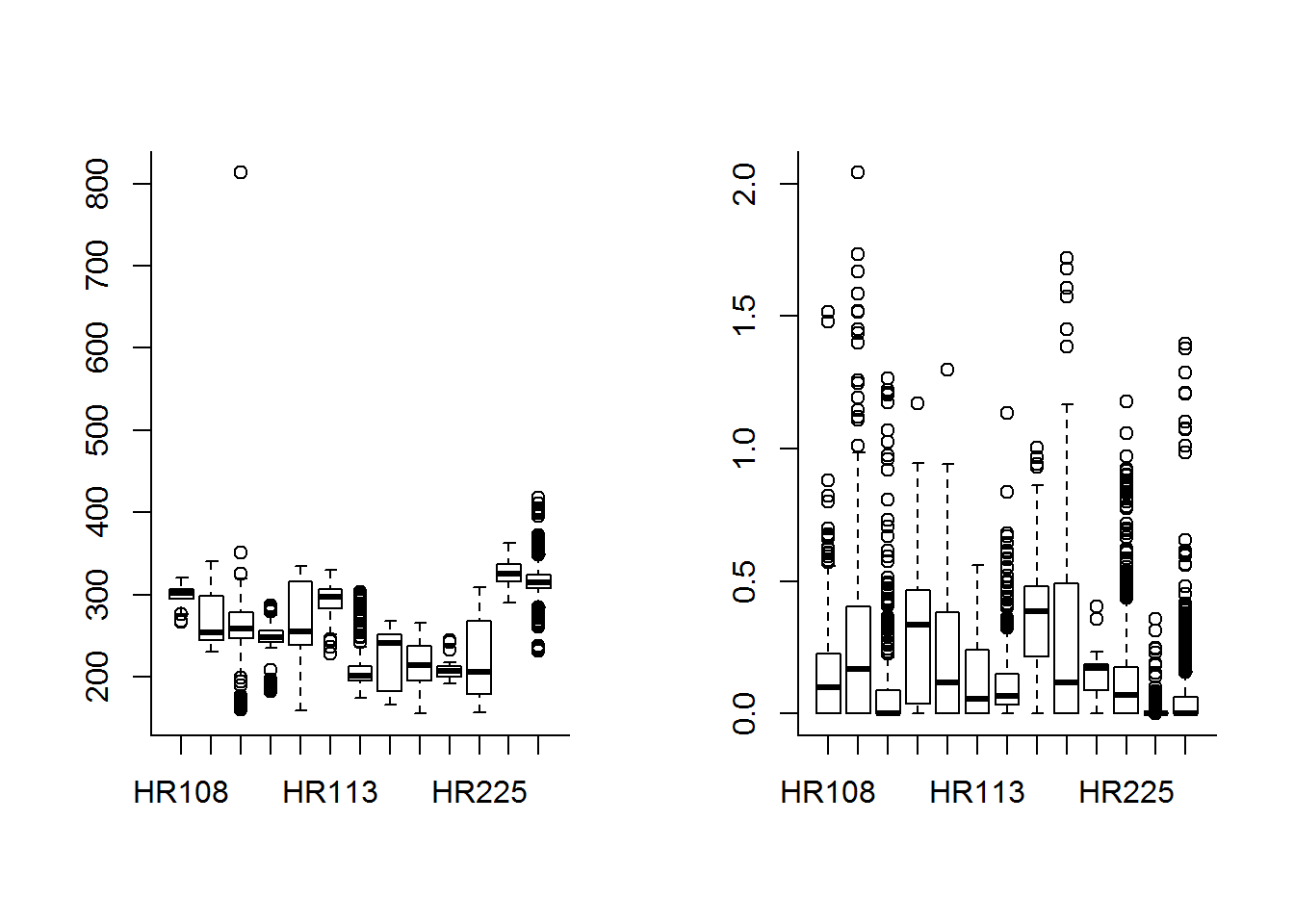
I often like looking at density plots or violinplots to compare continuous covariates across use.
par(mfrow = c(1,2), bty = "l")
with(hr, {
    plot(density(DEM[!Used]), xlim = c(0,800), main = "elevation distrubution",
         xlab = "DEM", col = "grey", lwd = 2, ylim = c(0,0.012))
    lines(density(DEM[Used], na.rm = TRUE), col = 2, lwd = 2)
    abline(v = tapply(DEM, Used, median), col = c("grey", "red"), lty = 3)

    plot(density(sqrt(Road.Density[Used]), na.rm = TRUE), main = "road densities",
         xlab = "sqrt(Road density)", col = "grey", lwd = 2)
    lines(density(sqrt(Road.Density[!Used]), na.rm = TRUE), col = 2, lwd = 2)
    abline(v = tapply(Road.Density, Used, median), col = c("grey", "red"), lty = 3)


    legend("topright", col = c("red", "grey"), legend = c("used", "available"), lty = 1, lwd = 2)
    })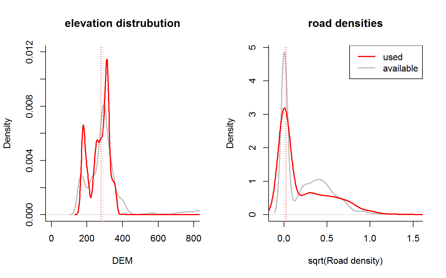
Note, road densities are extremely skewed, but also contain a lot of zeros, so we take the square root (rather than log) just to fit them on the figure.
There are few very obvious difference (e.g. in medians - the dashed lines above) between the two distributions. Here are some quick summary statistics:
ddply(hr, "Used", summarize, DEM = t(quantile(DEM))) ## Used DEM.0% DEM.25% DEM.50% DEM.75% DEM.100%
## 1 FALSE 146.0664 239.6714 291.6505 323.6667 886.6441
## 2 TRUE 155.2552 228.1318 280.1572 313.0000 813.1412ddply(hr, "Used", summarize, DRoad = t(quantile(Road.Density)))## Used DRoad.0% DRoad.25% DRoad.50% DRoad.75% DRoad.100%
## 1 FALSE 0.00000000 0.00000000 0.00000000 0.17517307 3.35663557
## 2 TRUE 0.00000000 0.00000000 0.02342629 0.17865342 2.04081440It is important also to make sure that our covariates aren’t too correlated:
plot(hr$DEM, jitter(sqrt(hr$Road.Density), 200),
     col = rgb(hr$Used,0,0,.2), pch = 19, cex = 0.5)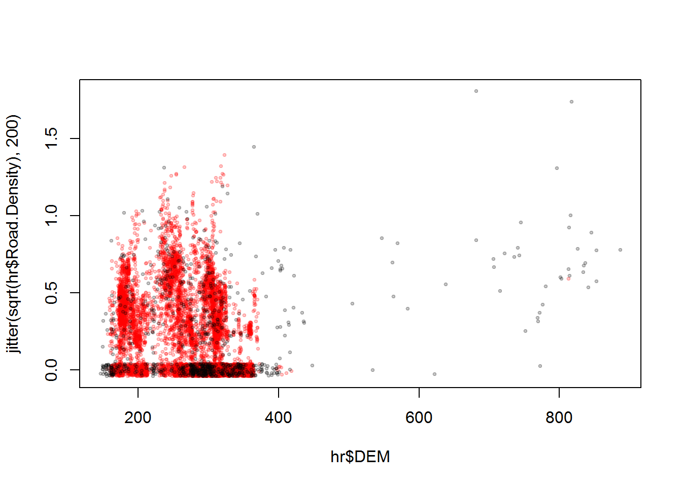
Red points, in the above, are “used” locations. I added the jitter to see all the 0 density points. But in any case, correlation shouldn’t be too much of a problem
Seasonal / individual breakdowns
Here are some fun, quick visualizations of the distribution of caribou use vs. availability across seasons for our two continuous covariates.
Elevation:
ggplot(hr, aes(Used, DEM, fill = factor(month))) + geom_violin(draw_quantiles = c(.25,.5,.75)) 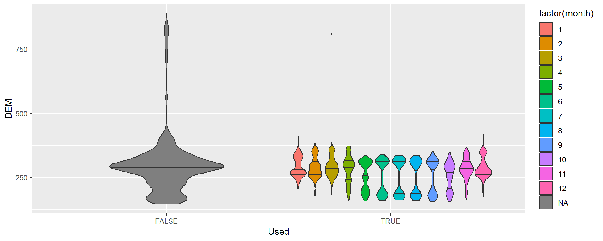
There appear to be some seasonal differences, but also a sharp split in the summer months between high and low elevations. This almost certainly reflects individual differences, which we can quickly see here:
require(ggthemes)
ggplot(hr,
  aes(timestamp, DEM, factor = nick_name, color = nick_name)) + geom_path() + theme_few()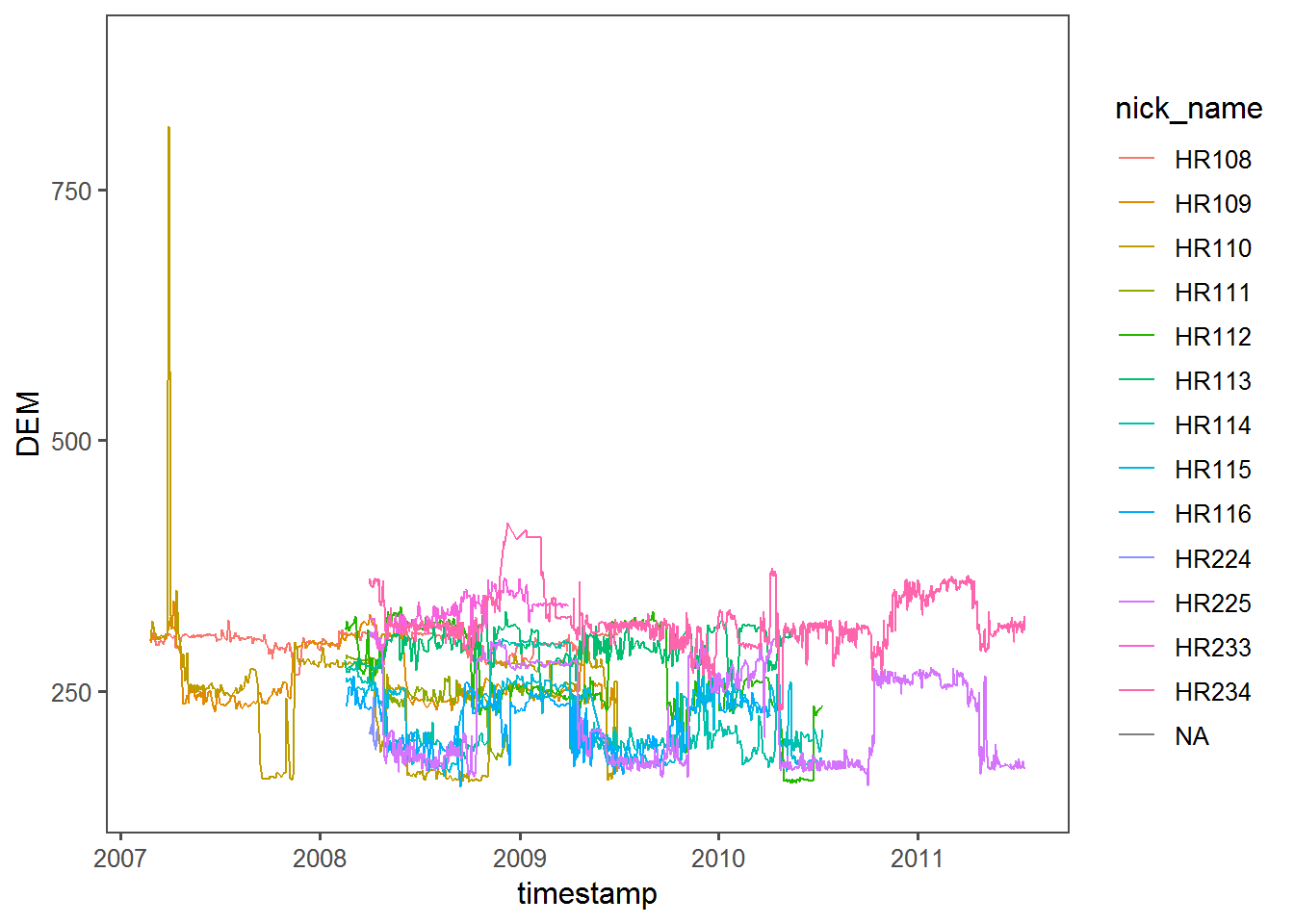
This is actually a super-interesting plot, since it indicates that quite a few animals have a strong seasonal range shift with some altitudinal site fidelity in the winter, but less so in the summer. It also shows exactly where one rather extreme altitudinal movement occurs near the beginning for HR110.
Here’s an example of an (arguably - extreme) piped workflow that (a) subsets the portion of data that we’re interested in, (b) extracts the columns we’re interested in, (c) “melts” the data frame, i.e. repeats it three times, once each for longitude, latitude and elevation, and finally (d) plots it along the three “facets” of interest:
require(reshape2)
hr %>% subset(Used & DEM < 800) %>%
  magrittr::extract(,c("longitude","latitude","DEM","nick_name","timestamp", "Used")) %>%
  melt(c("nick_name","timestamp","Used")) %>%
  ggplot(aes(timestamp, value, color = nick_name)) +
    facet_wrap(.~variable, scales = "free_y", nrow = 3) +
    geom_path() + theme_few()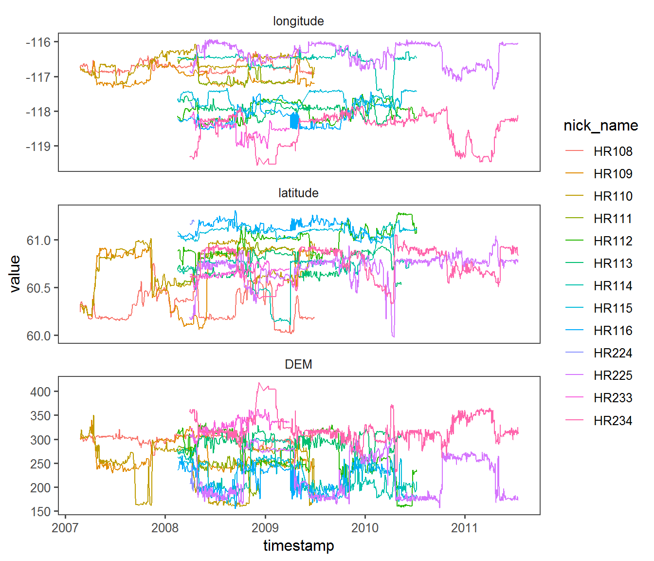
The altitudinal migration really is clearest here - and something eventually to think about when modeling elevation.
Here’s are some equivalent road density violinplots against season:
ggplot(hr %>% mutate(Road.Density = Road.Density + 1e-6),
aes(Used, Road.Density, fill = factor(month))) + geom_violin(draw_quantiles = c(.25,.5,.75)) + scale_y_log10() 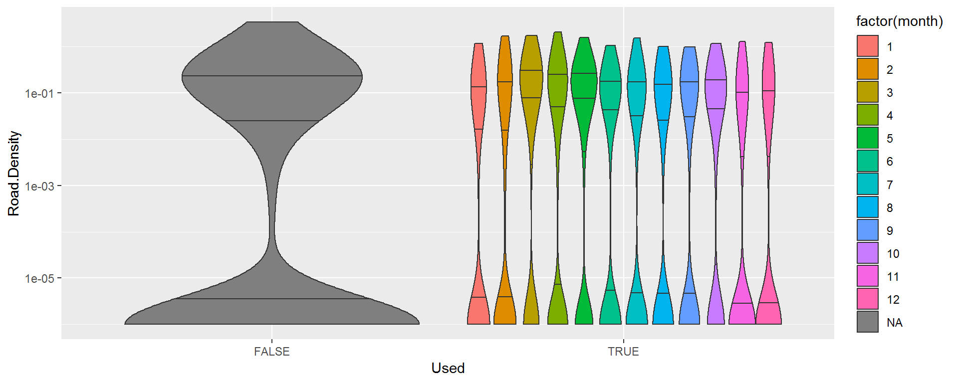
It is harder to pick out any strong patterns here, though there might be greater avoidance of roads in the summer than in the late winter. Note, the bottom of the barbells are artificially set to 1e-6.
Preliminary conclusions
Visual exploration of the data help to get some idea of the structure of the data and help formulate hypotheses before embarking on rigorous modeling.
Here are a few take-aways from these explorations:
The differences between Used and Available locations are especially striking for the land cover use, with certain clear preferences and avoidances which we will need to test statistically.
Hay river caribou do not, generally, spend time in the highest elevations: 95% of their locations are between 171 and 360 m above sea level. There is a difference in means. There are only a few very high elevation portion of one track for one animal.
There does, however, seem to be a bit of a seasonal migration in elevation, which is distinct and obvious but not consistent among individuals. If we’re interested in this migration, we should model it. But also, we should keep in mind that it’s there and take it into account for other models.
Individual variation - in general - is likely to be somewhat high, not just in elevation. This is an early warning that we will want to use mixed models!
Road densities are going to be tricky because they are so skewed and contain so many 0’s. This is probably, in part, a function of the distance at which we computed the threshold, but it is in any case unclear whether it is likely to be a significant covariate.
Complete code
Click below to show complete code from this document.
knitr::opts_chunk$set(echo = TRUE, cache=TRUE, message = FALSE, warning = FALSE)
load("_data/hayriver_RSF.rda")
hr <- hayriver.RSF %>% mutate(month = month(timestamp),
                              year = year(timestamp),
                              doy = yday(timestamp))
str(hr)
pcks <- c("ggplot2", "plyr", "lubridate", "magrittr", "sf")
a <- sapply(pcks, require, character = TRUE)
table(hr$EOSD.class, hr$Used)
par(mar = c(3,10,2,2), cex.axis = 0.8)
barplot(t(table(hr$EOSD.class, hr$Used)),
        beside = TRUE, horiz = TRUE, las = 1)
counts.table <- table(hr$EOSD.class, hr$Used)
counts.df <- as.data.frame.matrix(counts.table,
                                  row.names = row.names(counts.table))
names(counts.df) <- c("Available", "Used")
counts.df$Total <- rowSums(counts.df)
counts.df$EOSD <- row.names(counts.df)

counts.df <- mutate(counts.df,
                    Used = Used/sum(Used),
                                        Available = Available/sum(Available))   %>%
                                        plyr::arrange(Available)

par(mar = c(4,15,2,2), cex = 0.8)
cols <- c("grey", "darkgreen")
barplot(t(counts.df[,c("Available", "Used")]),
                    beside = TRUE, col = cols,
          horiz = TRUE, las = 1, bor = NA,
                    names.arg = counts.df$EOSD)
legend("bottomright", fill = cols, legend = c("available", "used"))
counts.df <- mutate(counts.df, rel.preference = Used / Available) %>% subset(!is.na(rel.preference) & Used > 0) %>% arrange(rel.preference)
par(mar = c(4,10,2,2), cex = 0.8, las = 1)
with(counts.df, barplot(rel.preference, width = Available, horiz = TRUE, names.arg = EOSD))
abline(v = 1, col = 2, lwd = 2, lty = 3)
require(raster); eosd <- raster("_data/rasters/EOSD_withfire")
counts.df <- merge(counts.df, levels(eosd)[[1]][,c("Description","Color")], by.x = "EOSD", by.y = "Description")
par(mar = c(4,10,2,2), cex = 0.8, las = 1)
with(counts.df,
     barplot(rel.preference, width = Available,
             horiz = TRUE, names.arg = EOSD,
             col = Color))
abline(v = 1, col = 2, lwd = 2, lty = 3)
par(mfrow = c(1,2), bty = "l")
boxplot(DEM ~ Used, data = hr, main = "Elevation (m)")
boxplot(Road.Density ~ Used, data = hr, "Road Density (m/m^2)")
par(mfrow = c(1,2), bty = "l")
boxplot(DEM ~ nick_name, data = subset(hr, Used))
boxplot(Road.Density ~ nick_name, data = subset(hr, Used))
par(mfrow = c(1,2), bty = "l")
with(hr, {
    plot(density(DEM[!Used]), xlim = c(0,800), main = "elevation distrubution",
         xlab = "DEM", col = "grey", lwd = 2, ylim = c(0,0.012))
    lines(density(DEM[Used], na.rm = TRUE), col = 2, lwd = 2)
    abline(v = tapply(DEM, Used, median), col = c("grey", "red"), lty = 3)

    plot(density(sqrt(Road.Density[Used]), na.rm = TRUE), main = "road densities",
         xlab = "sqrt(Road density)", col = "grey", lwd = 2)
    lines(density(sqrt(Road.Density[!Used]), na.rm = TRUE), col = 2, lwd = 2)
    abline(v = tapply(Road.Density, Used, median), col = c("grey", "red"), lty = 3)


    legend("topright", col = c("red", "grey"), legend = c("used", "available"), lty = 1, lwd = 2)
    })
ddply(hr, "Used", summarize, DEM = t(quantile(DEM)))
ddply(hr, "Used", summarize, DRoad = t(quantile(Road.Density)))
plot(hr$DEM, jitter(sqrt(hr$Road.Density), 200),
     col = rgb(hr$Used,0,0,.2), pch = 19, cex = 0.5)
ggplot(hr, aes(Used, DEM, fill = factor(month))) + geom_violin(draw_quantiles = c(.25,.5,.75))
require(ggthemes)
ggplot(hr,
  aes(timestamp, DEM, factor = nick_name, color = nick_name)) + geom_path() + theme_few()
require(reshape2)

hr %>% subset(Used & DEM < 800) %>%
  extract(,c("longitude","latitude","DEM","nick_name","timestamp", "Used")) %>%
  melt(c("nick_name","timestamp","Used")) %>%
  ggplot(aes(timestamp, value, color = nick_name)) +
    facet_wrap(.~variable, scales = "free_y", nrow = 3) +
    geom_path() + theme_few()
ggplot(hr %>% mutate(Road.Density = Road.Density + 1e-6),
       aes(Used, Road.Density, fill = factor(month))) + geom_violin(draw_quantiles = c(.25,.5,.75)) + scale_y_log10()
## require(nlme)
## dem.gls <- gls(DEM ~ nick_name + s(doy) - 1, correlation = corAR1(form = ~1|timestamp),
##                data = subset(hr, !is.na(DEM) & !is.na(nick_name)))
## gls.coefs <- summary(dem.gls)$tTable %>% as.data.frame
##
## require(mgcv)
##
## h.used <- subset(hr, !is.na(DEM) & !is.na(nick_name))
## x11()
## par(mar = c(2,2,2,2), mfrow = c(2,7))
##
## gams <- dlply(h.used, "nick_name", function(df){
##   dem.gam <- gam(DEM ~ s(doy), data = df)
##   plot(dem.gam, main = df$nick_name[1], ylim = c(-60,60))
##   dem.gam
## })
##
## gam.coefs <- summary(dem.gam)$tTable %>% as.data.frame