Visualizing Movement Data
Elie Gurarie and Eric Palm
1 Introduction
Visualizing tracks is a first step in identifying possible patterns or errors, as well as potential explanations for them. You should try different kinds of plots depending on your data. The kinds of figures you make should also be tuned to your goals. For your own exploratory purposes, there’s no need to get too picky about formatting and esthetics and there’s a higher premium on simplicity of code. For presentation and publication purposes, it might be worth getting more fussy.
In this lesson we provide are some examples you can later modify and improve to better serve your research question or interests.
1.1 Useful packages
ggplot2- flexible package for for plotting from data framesggmap- good for plotting data over Google basemapsmapview- interactive viewing of spatial datamaptools- plotting of spatial datagplots- various data plotting tools
1.2 Objectives
In this lesson we will:
- Vizualize movements by creating a custom function called “scan.track”
- Do basic mapping of locations using
ggplot2andggmap - Create interactive maps unsing
mapview - Produce .pdf plots and .kml files that can easily shared
2 Load the processed caribou data
We’ll work (mainly) with caribou data that has already been processed in the ways described in Processing Data. If you remember, this processed dataset only contained one location per day. The raw data of the actual study is on MoveBank, and could be loaded as follows:
login <- movebankLogin(username="XXXX", password="XXXX")
caribou <- getMovebankData(study="ABoVE: ADFG Fortymile Caribou (for TWS workshop)", login=login)
Here are (some of) the processed data:
load("./_data/caribou.daily.df.rda")
head(caribou.daily.df)
## id day.date time lon lat x
## 1 FA17.09 2017-08-10 2017-08-10 10:43:25 -144.4443 64.56422 622.4520
## 2 FA17.09 2017-08-11 2017-08-11 11:38:00 -144.5056 64.61959 619.2791
## 3 FA17.09 2017-08-12 2017-08-12 14:31:00 -144.6126 64.82508 613.2968
## 4 FA17.09 2017-08-13 2017-08-13 12:44:00 -144.6422 64.91234 611.5279
## 5 FA17.09 2017-08-14 2017-08-14 10:53:15 -144.6342 64.94925 611.7512
## 6 FA17.09 2017-08-15 2017-08-15 13:45:22 -144.5486 65.04582 615.3788
## y
## 1 7162.356
## 2 7168.407
## 3 7191.098
## 4 7200.764
## 5 7204.889
## 6 7215.799Note, the number of locations per caribou:
table(caribou.daily.df$id)##
## FA17.09 FA1523 FA1403 FY1607
## 32 32 32 323 Scanning track
We will start by exploring one individual.
A basic XY-plot of one caribou:
FY1607 <- subset(caribou.daily.df, id == "FY1607")
with(FY1607, plot(x,y,asp=1, type="o"))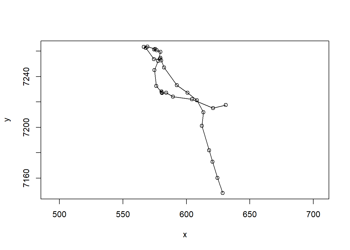
Note the very important asp=1 argument, that makes the aspect ratio between the x and y-axis equal to 1.
What about time dimension? Here’s a way you can plot x and y coordinates as a function of time.
par(mar = c(0,4,0,0), oma = c(4,0,5,0), xpd=NA)
layout(rbind(c(1,2), c(1,3)))
with(FY1607, {
     plot(x, y, asp = 1, type="o")
     plot(time, x, type="o", xaxt="n", xlab="")
     plot(time, y, type="o")
     title(FY1607$id[1], outer=TRUE)
})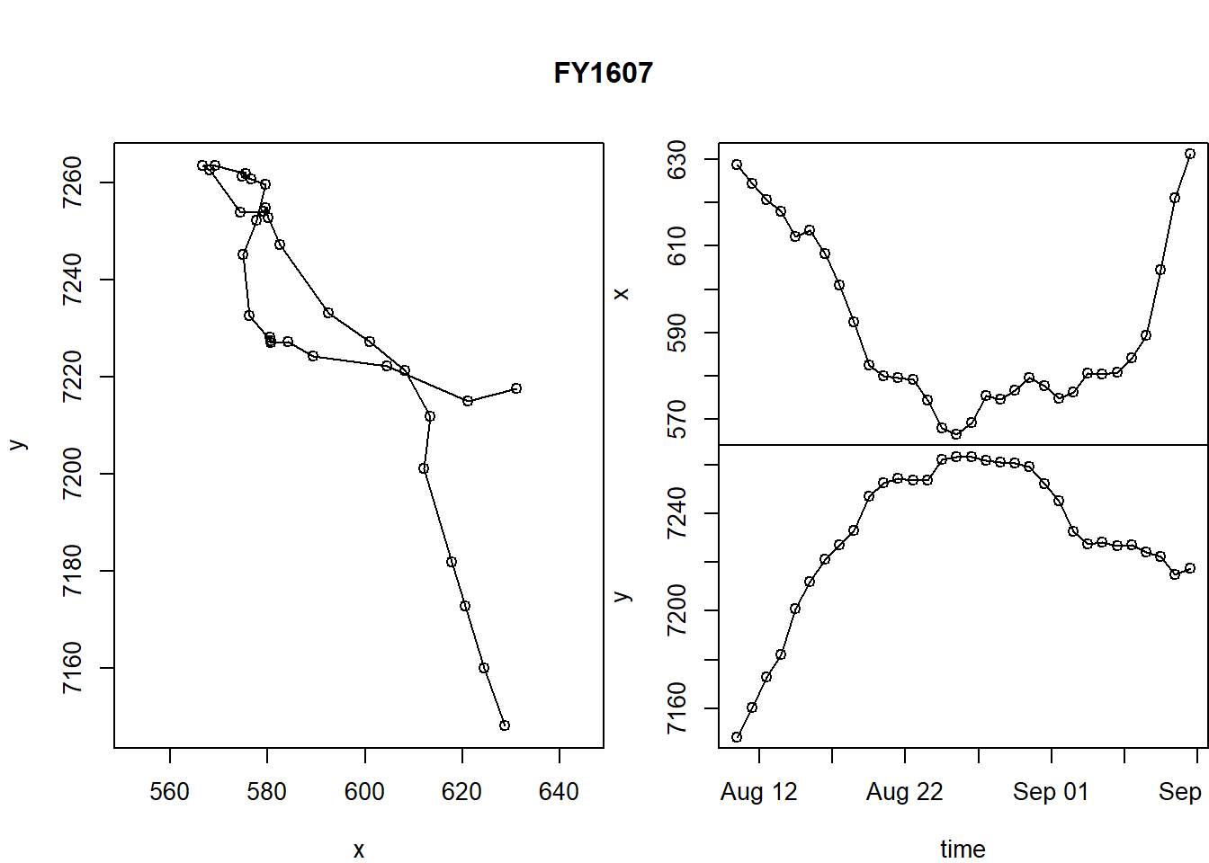
A few tricks here:
- the
layout()command helps “lay out” our three figures in an arrangement that echoes the matrix shape: 1 | 2 1 | 3 - The
par()commands control all graphical parameters, but here, in particular, the margins (mar) and the outer margins (oma). See?parfor more guidance.
This is a useful function, so let’s keep it around.
scan.track <- function(x,y,time, ...){
  par(mar = c(0,4,0,0), oma = c(4,0,5,4), xpd=NA)
  layout(rbind(c(1,2), c(1,3)))
     plot(x, y, asp = 1, type="o", ...)
     plot(time, x, type="o", xaxt="n", xlab="", ...)
     plot(time, y, type="o", ...)
}
R trick: the ... in the function definition allows us to pass any arguments we want to the functions inside the scan.track function. We’re drawing curves - this way we can add colors, control width, etc., all from the “outside”.
Let’s test it:
with(subset(caribou.daily.df, id == "FA1403"),
  scan.track(x,y,time,pch=19, col=rgb(1,0,0,.5), cex=0.5))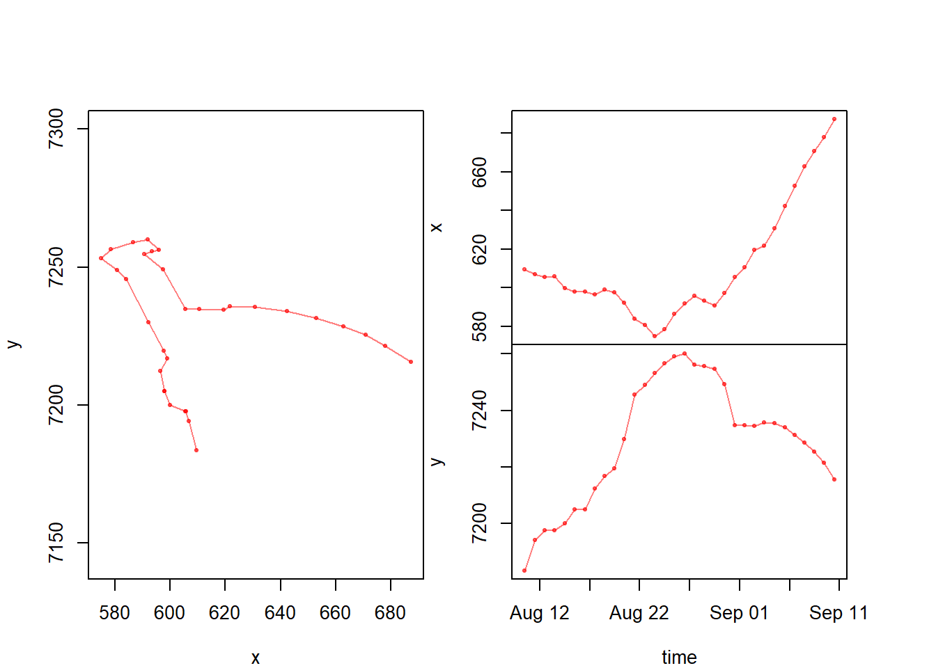
Now that we have a function, we might want to generate this plot for all individuals and save the output as a multi-page pdf. The following loop should do just that:
pdf("caribouscans.pdf", width = 6, height = 3)
for(myname in levels(caribou.daily.df$id)){
    me <- subset(caribou.daily.df, id == myname)
  scan.track(me$x, me$y, me$time, pch=19, col=rgb(0,0,0,.5), cex=0.5)
  title(myname, outer=TRUE)
}
dev.off()
This will generate a pdf with all the caribou (labeled).
4 Pseudo-animating a track
This is, in my opinion, the best way to animate a track, essentially by flipping through a multi-page pdf.
pdf("myanimation.pdf")
for(i in 1:nrow(FY1607)){
  with(FY1607, {
         plot(x,y, asp=1, type="l", col="grey")
       lines(x[1:i], y[1:i], col="blue", cex=0.5, lwd=2)
       points(x[i], y[i], pch=21, cex=2, col="lightblue")
       title(paste(id[1], day.date[i]))

  })
  box()
}
dev.off()
Basically, you loop through the data and plot only up to the ith point.
5 Mapping
5.1 ggplot2 and ggmap
ggplot2, which is a different way to think about graphics than plotting in base r. For some things, it can be very efficient.
Here’s a ggplot (of the caribou) with no maps:
require(ggplot2)
ggplot(caribou.daily.df, aes(x=x, y=y, col=id)) + geom_path(alpha = 0.5) + geom_point(alpha = 0.5) + coord_fixed()
See how the alpha command is buried inside of the point and path geometries. The coord_fixed is equivalent to asp = 1 in base plot. The best feature of ggplot is the automatic labeling.
There is a great package called ggmap with allows us to use google and other map sources to improve our plots. We will use google maps, available through the package ‘ggmap’. There are several steps here:
- Obtain a “basemap” - which is downloaded from Google, and requires a range
require(ggmap)
latrange <- range(caribou.daily.df$lat) + c(-.5,.5)
longrange <- range(caribou.daily.df$lon) + c(-.5,.5)
caribou.map <- get_map(location = c(longrange[1], latrange[1], longrange[2], latrange[2]), maptype = "terrain", source="google")
There are lots of options for the maptype, e.g. terrain, satellite, roadmap, hybrid. The choice depends on the information you want to communicate (and how much you want to foreground your tracks).
Note: if you are using the ‘move’ package (data is a Move object), you can use the
bbox()command to automatically obtain the bounding box of the data range code as follows:
caribou.map <- get_map(bbox(caribou.move), source="google", zoom=8, maptype="terrain")- Now that we’ve downloaded the basemap, we can draw it with:
ggmap(caribou.map)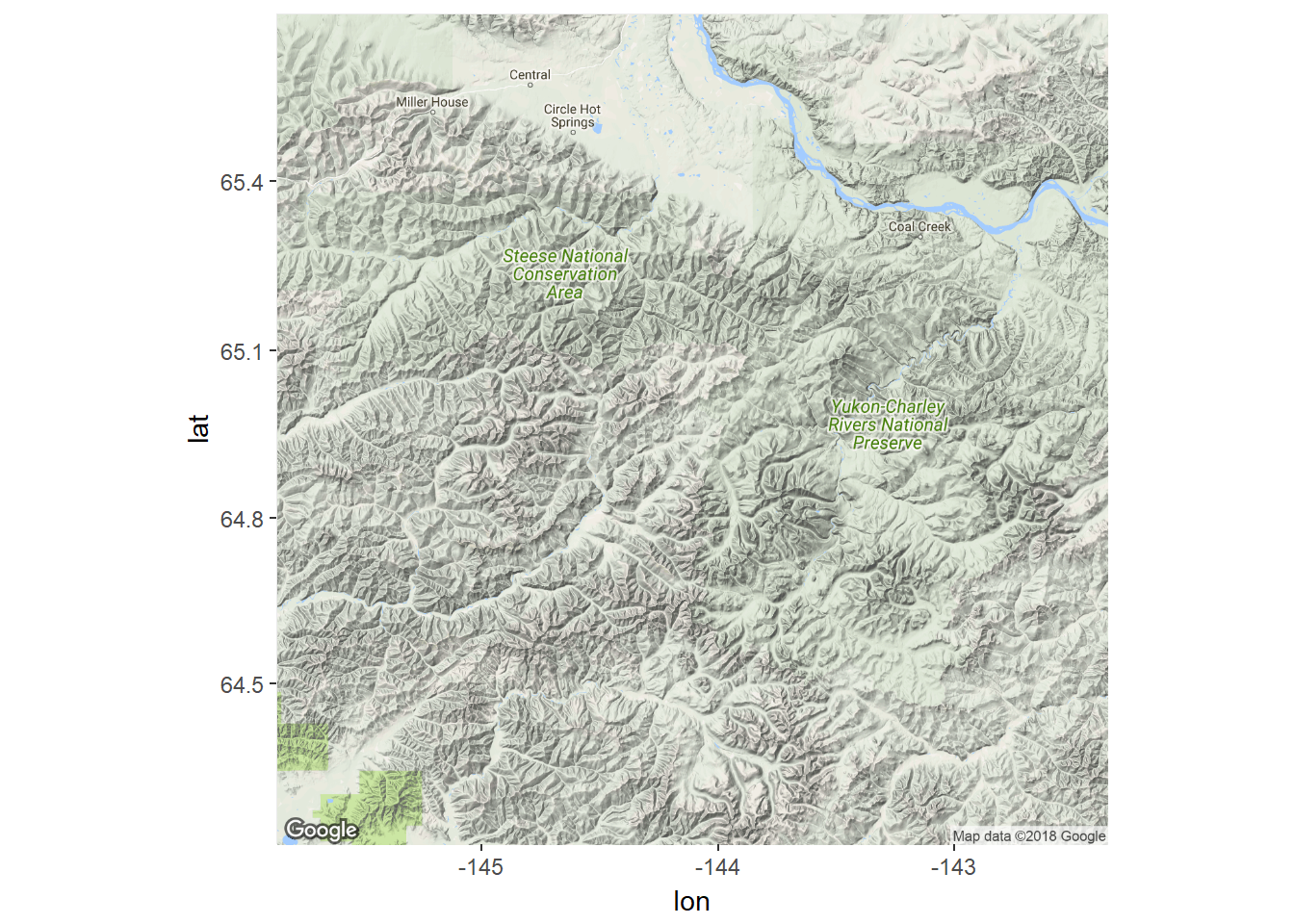
… and add ggplot syntax to add the tracks of the caribou.
ggmap(caribou.map) +
    geom_point(data = caribou.daily.df, mapping = aes(x = lon, y = lat, col=id), alpha = 0.6, size=1) +
    geom_path(data = caribou.daily.df, mapping = aes(x = lon, y = lat, col=id), alpha = 0.6, size=1) +
    coord_map() + labs(x = "Longitude", y = "Latitude") +
    scale_color_discrete(l = 65) +
    guides(color=guide_legend(ncol=2))
5.2 Leaflet and mapview
Mapview is a package which allows you to create interactive, web-friendly “leaflet” maps, which relies on accessing openly availably mapping data.
Even ESRI provides some high-quality world imagery maps. The following code is will open a new, interactive visualization device using ESRI imagery. The window allows zooming and scrolling within the R environemnt. Note, that for this to work we need to convert the caribou.daily.df to a SpatialPoints object (caribou.sp) with the coordinates function:
require(mapview)
require(sp)
caribou.sp <- caribou.daily.df
coordinates(caribou.sp)<- ~lon + lat
proj4string(caribou.sp)<-CRS("+proj=longlat +ellps=WGS84 +datum=WGS84 +no_defs")
mapview(caribou.sp, zcol="id", legend = TRUE, cex=5, lwd=2, map.type = "Esri.DeLorme")
5.3 Google Earth kml files
The kml file syntax is a native syntax for adding locations (points, paths, etc.) to the Google Earth program, which is a wonderful way to visualize what is happening. Three is a function in maptools which allows you to output your movement data as a kml. The steps below are a bit complicated, but essentially:
require(maptools)
require(gplots)
palette(rich.colors(4))
for(myid in unique(caribou.daily.df$id)){
  m <- subset(caribou.daily.df, id == myid)[c("lon", "lat")]
  m.lines <- Lines(Line(m), ID = myid)
  kmlLine(m.lines, kmlfile = paste0(myid,".kml"),
          kmlname = myid, description = myid,
          lwd=4,
          col=match(myid, unique(caribou.daily.df$id)))
}
Here’s a screen grab: 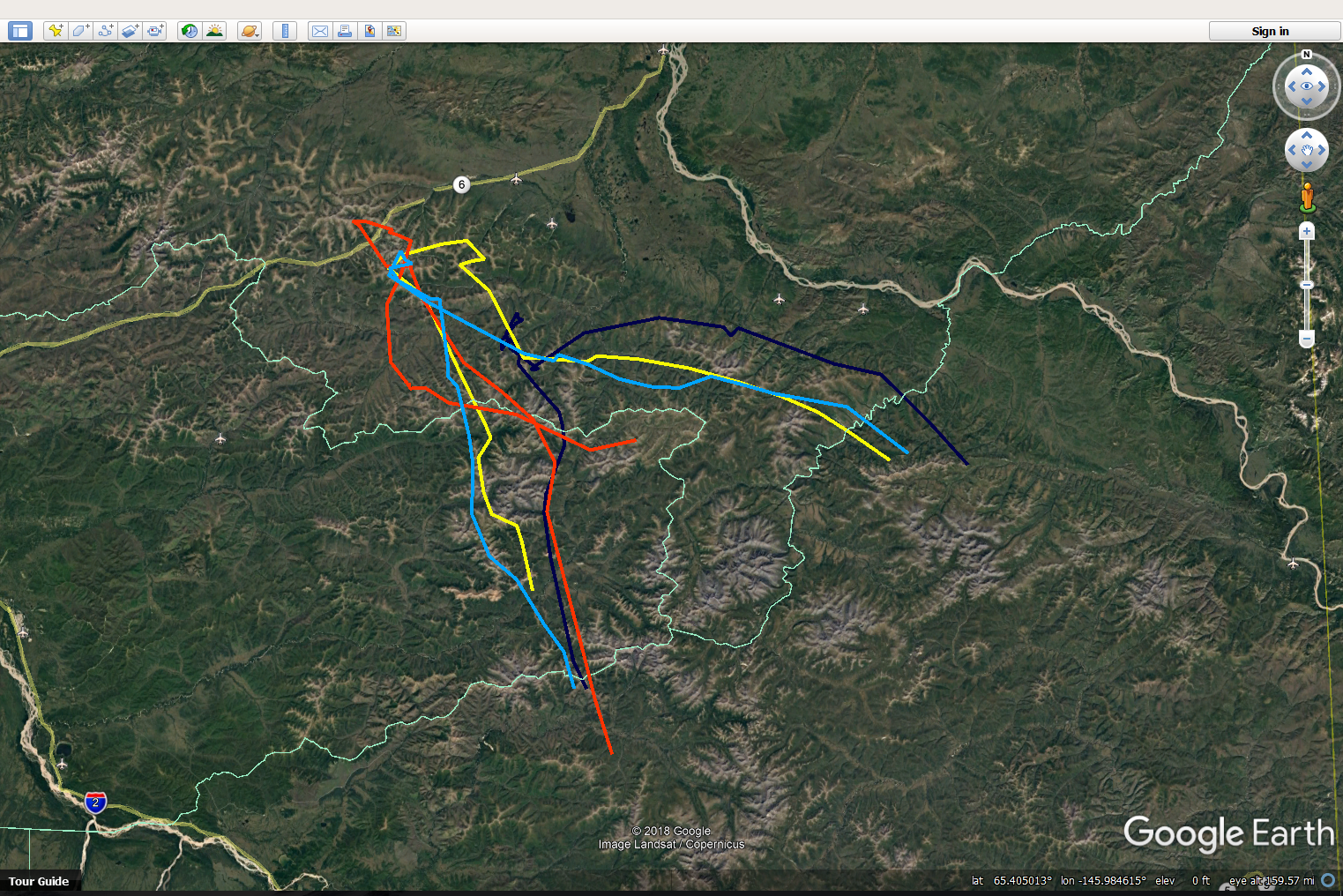
This will generate 4 files, one for each caribou, that can be opened in Google Earth. The biggest trick here is the awkward command for matching the colors col=match(myid, unique(caribou.daily.df$id))), which is saying: match the ID of each individual caribou to same ID in the list of IDs. This uses a favorite palette called rich.colors from gtools).
6 Annotated data
Often there are additional covariates (sometimes referred to as “annotations”) that can be added to a visualization. These caribou collars collect elevation data. ggplots are good at layering information. For these plots, we’ll load the caribou data with all locations, not just the daily mean locations. Below is a ggplot of one caribou with color reflecting elevation:
load("./_data/caribou.df.rda")ggplot(subset(caribou.df, id == "FY1607"), aes(x = lon, y = lat, color=elevation)) +
geom_path() +
geom_point() +
scale_color_continuous(na.value="transparent")#, limits = c(1400, 2500))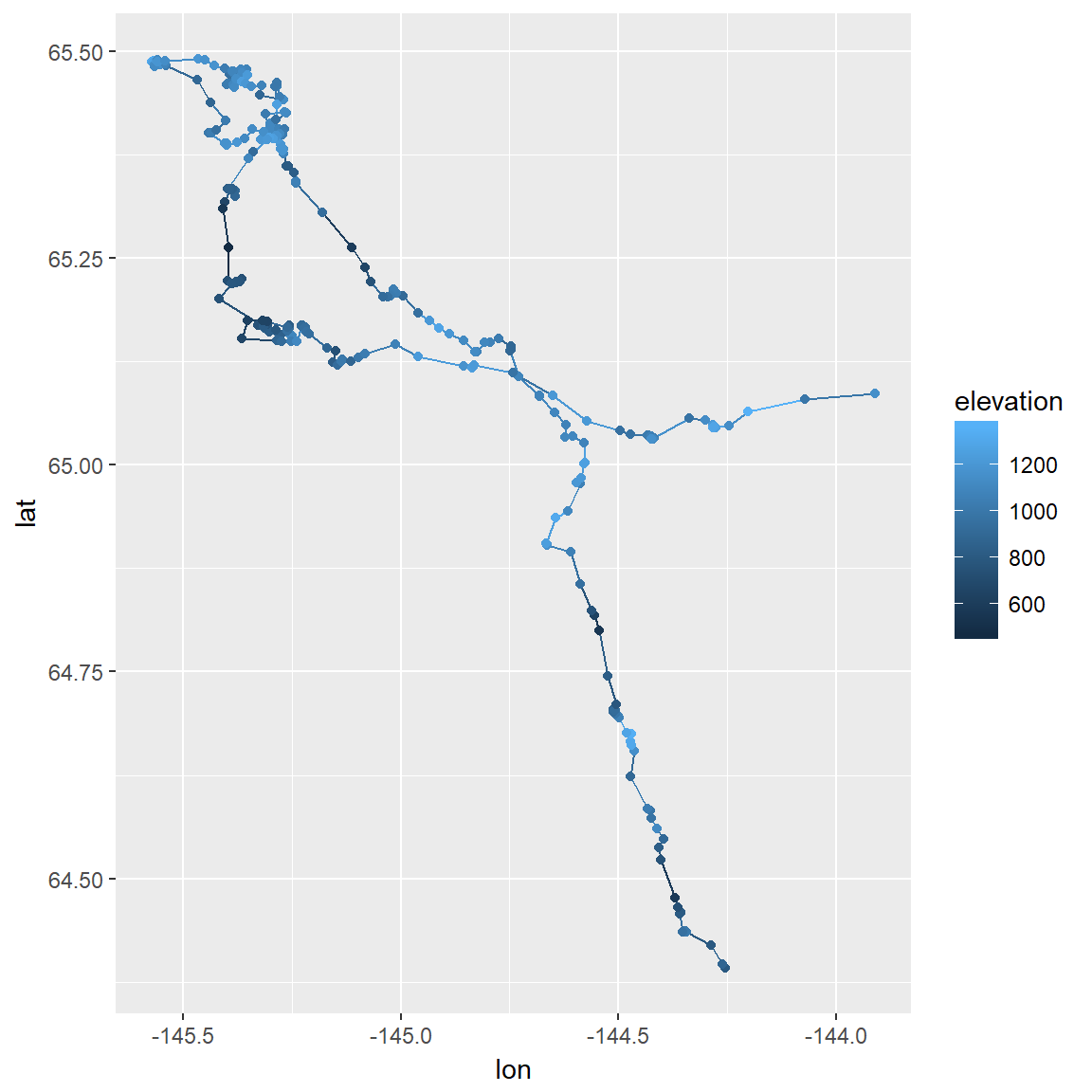
To make a ggmap version, we’ll use the caribou.map object we created earlier and plot all caribou at once, using a more exciting color scheme this time and using a bit of code to lighten the background map so the points stand out more:
ggmap(caribou.map, darken = c(0.5, "white")) +
  geom_point(data = caribou.df, aes(x = lon, y = lat, color = elevation), size =2) +
  scale_color_gradientn(colors=terrain.colors(10), na.value="transparent") +
  geom_point(shape=1, size = 2, color = "black") +
  coord_map() +
  labs(x = "Longitude", y = "Latitude")