GLM: Logistic Regression and Model Selection
BIOL709/BSCI339
Logistic Regression Inference
Sole data
Back to the Sole data from the previous lab:
Solea <- read.csv("https://terpconnect.umd.edu/~egurarie/teaching/Biol709/data/Solea.csv")
head(Solea)
## Sample season month Area depth temperature salinity transparency gravel
## 1 1 1 5 2 3.0 20 30 15 3.74
## 2 2 1 5 2 2.6 18 29 15 1.94
## 3 3 1 5 2 2.6 19 30 15 2.88
## 4 4 1 5 4 2.1 20 29 15 11.06
## 5 5 1 5 4 3.2 20 30 15 9.87
## 6 6 1 5 4 3.5 20 32 7 32.45
## large_sand med_fine_sand mud Solea_solea
## 1 13.15 11.93 71.18 0
## 2 4.99 5.43 87.63 0
## 3 8.98 16.85 71.29 1
## 4 11.96 21.95 55.03 0
## 5 28.60 19.49 42.04 0
## 6 7.39 9.43 50.72 0And, using our handy plotting function:
plotBinary <- function (X, Y, ...) {
     plot(X, jitter(Y, factor = 0.1), col = rgb(0, 0, 0, 0.5),
         pch = 19, ylim = c(-0.2, 1.2), ...)
     boxplot(X ~ Y, horizontal = TRUE, notch = TRUE, add = TRUE,
         at = c(-0.1, 1.1), width = c(0.1, 0.1), col = "grey",
         boxwex = 0.1, yaxt = "n")
}
… visually explore several covariates that might be interesting.
par(mfrow=c(3,1), bty="l", mar=c(4,4,1,1), cex.lab=1.5)
with(Solea, plotBinary(salinity, Solea_solea, xlab="salinity", ylab = "Presence", yaxt = "n"))
with(Solea, plotBinary(temperature, Solea_solea, xlab="temperature",   ylab = "Presence", yaxt = "n"))
with(Solea, plotBinary(depth, Solea_solea, xlab="depth", ylab = "Presence", yaxt = "n"))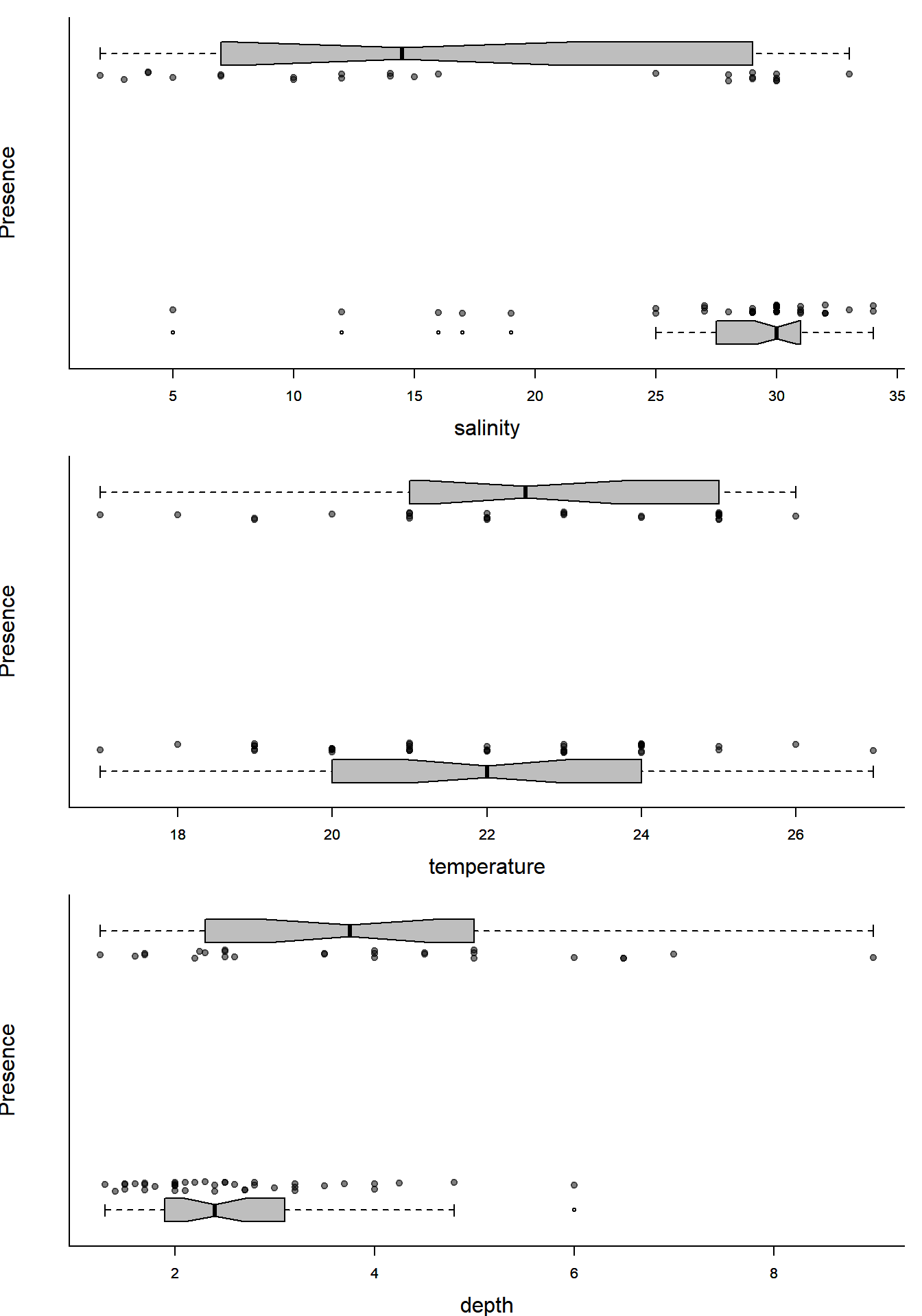
You can kind of tell that places with more salinity are less likely to have Sole present, or that temperature does not seem very significant, but can we quantify and test these hypothesized relationship?
Fitting the model
The logistic model with one covariate can be written: \[ Y_i = Bernoulli(p)\] \[ p = {\exp(\beta_0 + \beta_1 X) \over 1 + \exp(\beta_0 + \beta_1 X)}\]
Now we just need to fit the model with the glm() function - very similar to the lm() function:
(Sole.glm <- glm(Solea_solea ~ salinity, family=binomial(link="logit"), data=Solea))##
## Call: glm(formula = Solea_solea ~ salinity, family = binomial(link = "logit"),
## data = Solea)
##
## Coefficients:
## (Intercept) salinity
## 2.6607 -0.1299
##
## Degrees of Freedom: 64 Total (i.e. Null); 63 Residual
## Null Deviance: 87.49
## Residual Deviance: 68.56 AIC: 72.56The link bit is uneccessary as logit is the default link function for this family.
There you have it. Esimates are \(\beta_0 = 2.66\) and \(\beta_1 = -0.1299\), i.e. there is a negative effect of salinity on presence of sole.
Prediction intervals
Directly from the glm results
We can illustate this model over our first figure using the predict function, which provides predictions for “new data” (which must be a data frame with the same names as the old predictor names)
expit <- function(x) exp(x)/(1 + exp(x))
Sole.predict <- predict(Sole.glm, newdata = data.frame(salinity = 0:40), se.fit = TRUE)
Note that by default it returns the raw prediction, which is not the probability but logit(p). To see it in terms of the original probabilities, we need to back-transform it with expit.
There is a bit of a nuance here: predict does have a type = "response" option to get it automatically in the right units, but that transformation doesn’t work correctly on the standard errors.
Here’s the plot, with prediction intervals:
plotBinary(Solea$salinity, Solea$Solea, xlab = "Salinity", ylab = "Presence", yaxt = "n")
lines(0:40, expit(Sole.predict$fit))
### plot the prediction intervals
lines(0:40, with(Sole.predict, expit(fit+1.96*se.fit)), col=2)
lines(0:40, with(Sole.predict, expit(fit-1.96*se.fit)), col=2)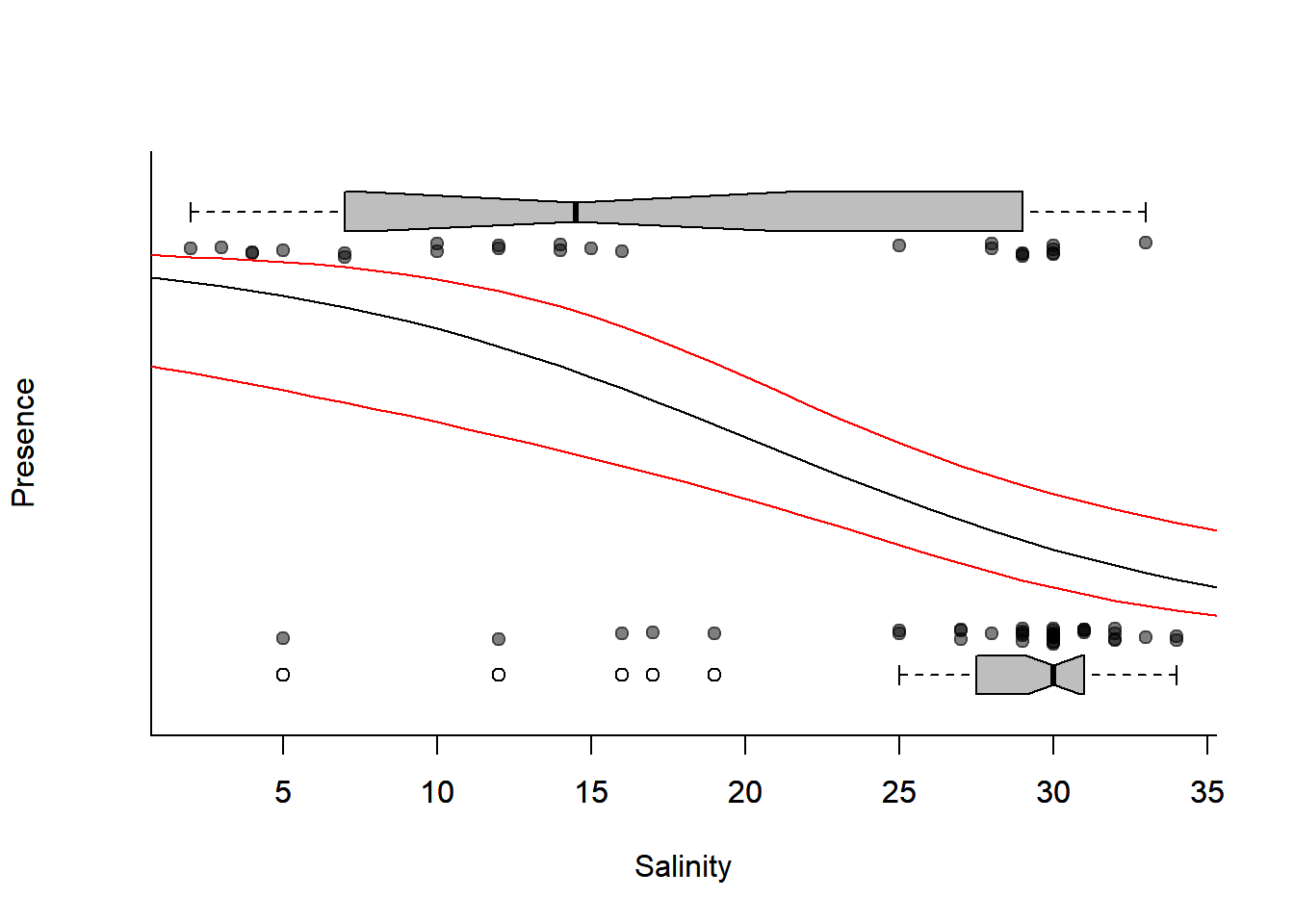
Quick Exercise:
Using these prediction intervals, how would you report the probability of finding sole in salinity of 5, 20, and 35 ppm respectively?
Bootstrapping
You can always bootstap prediction intervals as well! They are, after all, just another statistic:
require(mosaic)
X <- Solea$salinity
Y <- Solea$Solea_solea

Solea.bs <- with(Solea, data.frame(X,Y))
newdata <- data.frame(X = 0:40)
Solea.prediction.bs <- matrix(NA, ncol=1000, nrow = nrow(newdata))

for(i in 1:1000)
Solea.prediction.bs[,i] <- predict(glm(Y ~ X, data = Solea.bs[sample(1:nrow(Solea.bs), replace=TRUE),], family = "binomial"), newdata = newdata, type = "response")
Below, I plot all of the bootstrapped fits, with the bootstrap prediction interval, compared to the inferred prediction interval:
plotBinary(X,Y)

# bootstraps
apply(Solea.prediction.bs, 2, function(x) lines(0:40, x, col=rgb(0,1,0,.3)))
## NULLlines(0:40, apply(Solea.prediction.bs, 1, quantile, p = 0.025), col = "darkgreen", lwd=2)
lines(0:40, apply(Solea.prediction.bs, 1, quantile, p = 0.975), col = "darkgreen",lwd=2)
# point prediction
lines(0:40, expit(Sole.predict$fit), col="darkblue", lwd=3, lty = 3)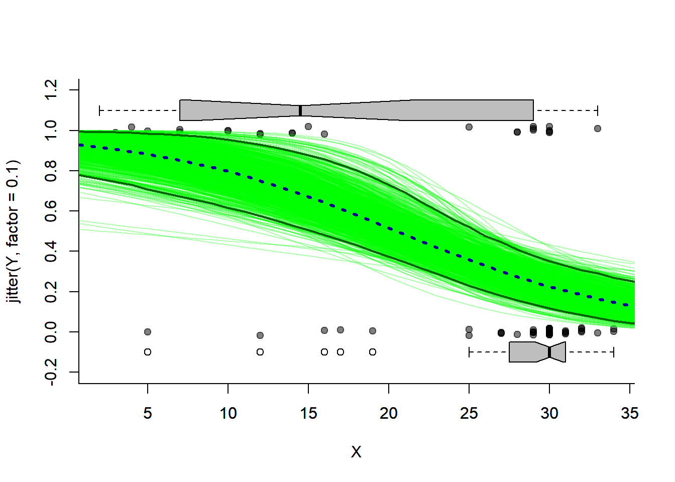
Model Selection
Analysis of Deviance
Lets define some formulas so we can easily play with the additional covariate of temperature:
f1 <- formula(Solea_solea~1)
f2 <- formula(Solea_solea~temperature)
f3 <- formula(Solea_solea~salinity)
f4 <- formula(Solea_solea~salinity+temperature)
f5 <- formula(Solea_solea~temperature*salinity)
In a glm, the analogy to ANOVA is called “Analysis of Deviance”, where the “deviance” is given by: \[D = 2(l_{model1} - l_{model0})\] and \(l\) is the log-likelihood of the model. The deviance is somewhat analogous to the variance analyzed in an ANOVA, at least to the extent that the goal of modeling is to explain as much as possible of deviance. In cases where the models are nested, you can test the significance of a term with a Chi squared test - note that the deviance is defined exactly like a likelihood ratio test statistic, and that this test is just the Likelihood Ratio Test.
The function to obtain an Analasis of Deviance (ANODEV) table is also anova:
anova(glm(f5, family=binomial, data=Solea))## Analysis of Deviance Table
##
## Model: binomial, link: logit
##
## Response: Solea_solea
##
## Terms added sequentially (first to last)
##
##
## Df Deviance Resid. Df Resid. Dev
## NULL 64 87.492
## temperature 1 0.8593 63 86.632
## salinity 1 18.6567 62 67.976
## temperature:salinity 1 3.2866 61 64.689anova(glm(f5, family=binomial, data=Solea), test = "Chi")## Analysis of Deviance Table
##
## Model: binomial, link: logit
##
## Response: Solea_solea
##
## Terms added sequentially (first to last)
##
##
## Df Deviance Resid. Df Resid. Dev Pr(>Chi)
## NULL 64 87.492
## temperature 1 0.8593 63 86.632 0.35394
## salinity 1 18.6567 62 67.976 1.565e-05 ***
## temperature:salinity 1 3.2866 61 64.689 0.06985 .
## ---
## Signif. codes: 0 '***' 0.001 '**' 0.01 '*' 0.05 '.' 0.1 ' ' 1When applied to a single model, the anova.glm command gives the reduction in the residual deviance as each term of the formula is added sequentially. For this reason, it usually best to enter the variables in the sequence of decreasing significance. In our case, that suggests:
anova(glm(Solea_solea ~ salinity * temperature, family=binomial, data=Solea),
test = "Chi")
## Analysis of Deviance Table
##
## Model: binomial, link: logit
##
## Response: Solea_solea
##
## Terms added sequentially (first to last)
##
##
## Df Deviance Resid. Df Resid. Dev Pr(>Chi)
## NULL 64 87.492
## salinity 1 18.9315 63 68.560 1.355e-05 ***
## temperature 1 0.5845 62 67.976 0.44456
## salinity:temperature 1 3.2866 61 64.689 0.06985 .
## ---
## Signif. codes: 0 '***' 0.001 '**' 0.01 '*' 0.05 '.' 0.1 ' ' 1Or to compare models:
anova(glm(f3, family=binomial, data=Solea),
      glm(f5, family=binomial, data=Solea), test = "Chi")
## Analysis of Deviance Table
##
## Model 1: Solea_solea ~ salinity
## Model 2: Solea_solea ~ temperature * salinity
## Resid. Df Resid. Dev Df Deviance Pr(>Chi)
## 1 63 68.560
## 2 61 64.689 2 3.871 0.1443AIC
The AIC (Akaike information criterion) is a measure of fit that penalizes for the number of parameters \(p\): \[ AIC = -2l_{mod} + 2p\] Because a HIGH likelihood means a better fit, the LOW AIC is the best model. The nice thing about AIC is that we can compare models that are not nested:
AIC(glm(f3, family=binomial, data=Solea),
    glm(f2, family=binomial, data=Solea))
## df AIC
## glm(f3, family = binomial, data = Solea) 2 72.55999
## glm(f2, family = binomial, data = Solea) 2 90.63224You can see how much better the salinity model is than the temperature model.
In R, it is often much smarter to work with lists. Note how we can use lists and the ldply function from the (handy) plyr pacakge to build an AIC table:
require(plyr)
formulae <- list(f1, f2, f3, f4, f5)
solea.glms <- llply(formulae, function(f) glm(f, family=binomial, data=Solea))
names(solea.glms) <- formulae
ldply(solea.glms, AIC)
## .id V1
## 1 Solea_solea ~ 1 89.49152
## 2 Solea_solea ~ temperature 90.63224
## 3 Solea_solea ~ salinity 72.55999
## 4 Solea_solea ~ salinity + temperature 73.97552
## 5 Solea_solea ~ temperature * salinity 72.68895Visualization
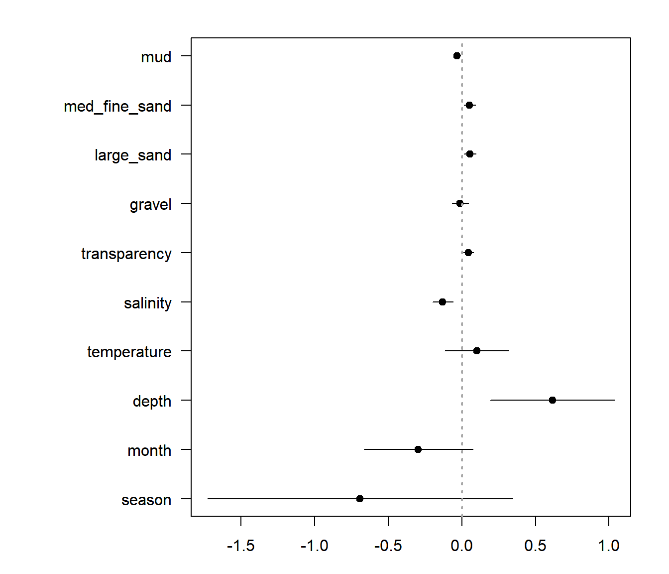
A nice thing to do - as an initial exploratory step - is to fit all the single main effect models and visualize the effect sizes and significant. The naive way to do that would be something like this:
covariates <- names(Solea)[!( names(Solea) %in% c("Sample", "Area", "Solea_solea"))]

getBetaAndSe <- function(covar)
    coef(summary(glm(Solea_solea ~ Solea[[covar]], data = Solea, family = "binomial")))[2,1:2]

# a Loop:
beta.table <- data.frame(variable = covariates, estimate = NA, se = NA)
for(i in 1:length(covariates))
    beta.table[i,2:3] <- getBetaAndSe(covariates[i])

# plyr and magrittr piping one-liner
## (Less code, but also less tansparent)
  require(magrittr)
    beta.table2 <- adply(t(covariates), 2, getBetaAndSe) %>% mutate(X1 = covariates)
Base plot:
par(mar = c(3,10,2,2))
beta.table <- mutate(beta.table, low = estimate - 2 * se, high = estimate + 2*se)
n <- nrow(beta.table)
with(beta.table, {
    plot(estimate, 1:n, pch = 19, xlim = c(min(low), max(high)),
         yaxt = "n", ylab="")
    segments(low, 1:n, high, 1:length(high))
    axis(2, at = 1:n, label = variable, las = 2, cex =0.8)
    abline(v = 0, lwd = 2, lty = 3, col="darkgrey")
})
A ggplot approach:
ggplot(beta.table, aes(y=estimate, x=variable, ymin=low, ymax=high)) + geom_pointrange() + coord_flip()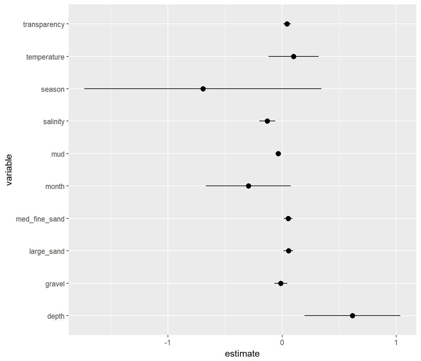
This is a useful figure, in general. But a problem is that the variables are all in different units so effect sizes are hard to compare.
This is one of the main reasons that people often scale covariates, which means simply that they transform via: \[X^{T} = {X - \overline{X} \over s_x}\] This way, all the effects are comparable. This is useful enough that there is a function scale just for that.
I recreate the plot above with rescaled variables (and heavy piping)
covariates <- names(Solea)[!( names(Solea) %in% c("Sample", "Area", "Solea_solea"))]
getBetaAndSe <- function(covar){
    coefs <- glm(Solea_solea ~ scale(Solea[[covar]]), data = Solea, family = "binomial") %>%
        summary %>% coef
    data.frame(variable = covar,
               estimate = coefs[2,1],
               se = coefs[2,2],
               p = coefs[2,4])
}

require(ggthemes)
beta.table <- adply(t(covariates), 2, getBetaAndSe) %>%
            arrange(estimate) %>%
            mutate(low = estimate - 2*se,
                         high = estimate + 2*se,
                         variable = reorder(variable, order(estimate)))

# note - the "reorder" was necessary to make the variables plot
# in the right order in ggplot ... but it took TOO LONG to figure out!

ggplot(beta.table, aes(y=estimate, x=variable, ymin=low, ymax=high, color = (p < 0.05))) +
            geom_pointrange() +
            geom_hline(yintercept = 0, col="darkgrey", lty = 3, lwd=2) +
            coord_flip() + theme_few() + ggtitle("Single main effect plot")
Including EVERYTHING
You can create a model that includes all main effects, using (in R’s formula notation) just ~.:
maineffects.glm <- glm(Solea_solea ~ ., family="binomial", data=Solea.redux)We can take a look at an effects plot here too:
Solea.redux.scaled <- data.frame(scale(Solea.redux[,1:6]),
                                 Solea_solea = Solea.redux$Solea_solea)
me.glm.scaled <- glm(Solea_solea ~ ., family="binomial", data=Solea.redux.scaled)

beta.table <- data.frame(summary(me.glm.scaled)$coef)
beta.table$variable <- row.names(beta.table)
beta.table <- mutate(beta.table, estimate = Estimate,
                 se = Std..Error,
           low = Estimate - 2*se,
                 high = Estimate + 2*se,
                 p = Pr...z..)

ggplot(beta.table, aes(y=estimate, x=variable, ymin=low, ymax=high, color = (p < 0.05))) +
            geom_pointrange() +
            geom_hline(yintercept = 0, col="darkgrey", lty = 3, lwd=2) +
            coord_flip() + theme_few() + ggtitle("Multiple main effect plot")
The analysis of deviance of the main effects model:
anova(maineffects.glm, test="Chi")## Analysis of Deviance Table
##
## Model: binomial, link: logit
##
## Response: Solea_solea
##
## Terms added sequentially (first to last)
##
##
## Df Deviance Resid. Df Resid. Dev Pr(>Chi)
## NULL 64 87.492
## depth 1 11.3487 63 76.143 0.000755 ***
## temperature 1 0.2190 62 75.924 0.639765
## salinity 1 8.1295 61 67.794 0.004355 **
## transparency 1 0.0365 60 67.758 0.848523
## gravel 1 2.0728 59 65.685 0.149951
## mud 1 0.3753 58 65.310 0.540107
## ---
## Signif. codes: 0 '***' 0.001 '**' 0.01 '*' 0.05 '.' 0.1 ' ' 1It looks like only depth and salinity are really significant players here. The stepAIC function (in MASS) uses AIC as a criterion to march through the inclusion and removal of different covariates to find the one with lowest AIC.
require(MASS)
best.main.glm <- stepAIC(maineffects.glm)
## Start: AIC=79.31
## Solea_solea ~ depth + temperature + salinity + transparency +
## gravel + mud
##
## Df Deviance AIC
## - transparency 1 65.310 77.310
## - depth 1 65.477 77.477
## - mud 1 65.685 77.685
## - temperature 1 65.722 77.722
## <none> 65.310 79.310
## - gravel 1 67.603 79.603
## - salinity 1 72.965 84.965
##
## Step: AIC=77.31
## Solea_solea ~ depth + temperature + salinity + gravel + mud
##
## Df Deviance AIC
## - depth 1 65.489 75.489
## - mud 1 65.730 75.730
## - temperature 1 65.883 75.883
## <none> 65.310 77.310
## - gravel 1 67.683 77.683
## - salinity 1 73.011 83.011
##
## Step: AIC=75.49
## Solea_solea ~ temperature + salinity + gravel + mud
##
## Df Deviance AIC
## - mud 1 65.884 73.884
## - temperature 1 66.229 74.229
## <none> 65.489 75.489
## - gravel 1 67.846 75.846
## - salinity 1 76.752 84.752
##
## Step: AIC=73.88
## Solea_solea ~ temperature + salinity + gravel
##
## Df Deviance AIC
## - temperature 1 66.484 72.484
## <none> 65.884 73.884
## - gravel 1 67.976 73.976
## - salinity 1 86.553 92.553
##
## Step: AIC=72.48
## Solea_solea ~ salinity + gravel
##
## Df Deviance AIC
## <none> 66.484 72.484
## - gravel 1 68.560 72.560
## - salinity 1 87.317 91.317It seems to like the salinity and gravel main effects model.
What about with interactions? To add interactions: ~ (.)^2.
interactions.glm <- glm(Solea_solea ~ (.)^2, family="binomial", data=Solea.redux)
best.interaction.glm <- stepAIC(interactions.glm, trace = 0)
anova(best.interaction.glm, test = "Chi")
## Analysis of Deviance Table
##
## Model: binomial, link: logit
##
## Response: Solea_solea
##
## Terms added sequentially (first to last)
##
##
## Df Deviance Resid. Df Resid. Dev Pr(>Chi)
## NULL 64 87.492
## depth 1 11.3487 63 76.143 0.000755 ***
## temperature 1 0.2190 62 75.924 0.639765
## salinity 1 8.1295 61 67.794 0.004355 **
## transparency 1 0.0365 60 67.758 0.848523
## gravel 1 2.0728 59 65.685 0.149951
## mud 1 0.3753 58 65.310 0.540107
## depth:salinity 1 3.9958 57 61.314 0.045612 *
## depth:gravel 1 0.0336 56 61.280 0.854576
## depth:mud 1 2.5044 55 58.776 0.113527
## temperature:salinity 1 3.9134 54 54.862 0.047902 *
## temperature:transparency 1 0.0965 53 54.766 0.756011
## salinity:transparency 1 2.7607 52 52.005 0.096609 .
## gravel:mud 1 5.3620 51 46.643 0.020581 *
## ---
## Signif. codes: 0 '***' 0.001 '**' 0.01 '*' 0.05 '.' 0.1 ' ' 1There are multiple interactions that appear significant, and the residual deviance of 46.6 really does seem low. HOWEVER, we only have 65 rows of data! And six possible covariates … leading to 1 + 6 + 6*6 = 43 parameters to fit! This is almost certainly a case of serious overfitting, and a somewhat spurious result.
In fact, when sample sizes are relatively small (e.g. when n / K < 40 … so we’re way off!) the recommendation is to use the “AICc” - or small-size corrected AIC - which provides extra penalities for more parameters. Its formula is: \[\mathrm{AICc} = \mathrm{AIC} + \frac{2(k +1)(k + 2)}{n - k - 2}\].
There is an extremely powerful function called dredge in package MuMIn, which will fit EVERY possible combination of ALL variables and assess the “best” model. It will automatically select the “best” criterion.
require(MuMIn)
maineffects.glm <- glm(Solea_solea ~ ., family="binomial", data=Solea.redux, na.action = na.pass)
mega.model.comparison <- dredge(maineffects.glm)
head(mega.model.comparison)
## Global model call: glm(formula = Solea_solea ~ ., family = "binomial", data = Solea.redux,
## na.action = na.pass)
## ---
## Model selection table
## (Intrc) depth gravl mud slnty tmprt df logLik AICc delta
## 9 2.661 -0.1299 2 -34.280 72.8 0.00
## 11 2.746 0.04743 -0.1509 3 -33.242 72.9 0.12
## 25 5.218 -0.1412 -0.1033 3 -33.988 74.4 1.62
## 27 5.371 0.04786 -0.1633 -0.1055 4 -32.942 74.6 1.80
## 10 1.837 0.1416 -0.1136 3 -34.127 74.6 1.89
## 13 2.717 -0.006696 -0.1178 3 -34.185 74.8 2.01
## weight
## 9 0.282
## 11 0.265
## 25 0.126
## 27 0.115
## 10 0.109
## 13 0.103
## Models ranked by AICc(x)Ultimately, it also agrees that the best model only includes salinity, with gravel a close second. There’s a wacky visualization that comes with this model comparison:
plot(mega.model.comparison)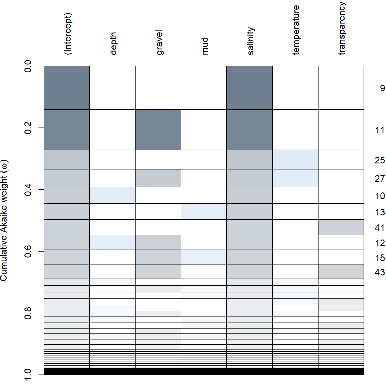
Note … a well-worded warning from the creators of
dredge:Users should keep in mind the hazards that a “thoughtless approach” of evaluating all possible models poses. Although this procedure is in certain cases useful and justified, it may result in selecting a spurious “best” model, due to the model selection bias.
“Let the computer find out” is a poor strategy and usually reflects the fact that the researcher did not bother to think clearly about the problem of interest and its scientific setting (Burnham and Anderson, 2002).
