Lab 8: Analysis of Variance and Linear Regression
BIOL709/BSCI339
1. One-way Analysis of Variance: the Pie Example
a) First, by hand
We refer first to the Zone-Out Duration experiment in the lecture.
ZOD <- c(0,0.5,1.5,2,1,2,2,3,5,5.5,6.5,7)
Pie <- c(rep("A",4),rep("B",4),rep("C",4))
Let’s make Pie a factor:
Pie <- factor(Pie)
levels(Pie)
## [1] "A" "B" "C"And - as always in factorial-type data, draw a boxplot
boxplot(ZOD~Pie, col=c("green", "blue", "red"), ylab="ZOD (minutes)", xlab="Pie type") 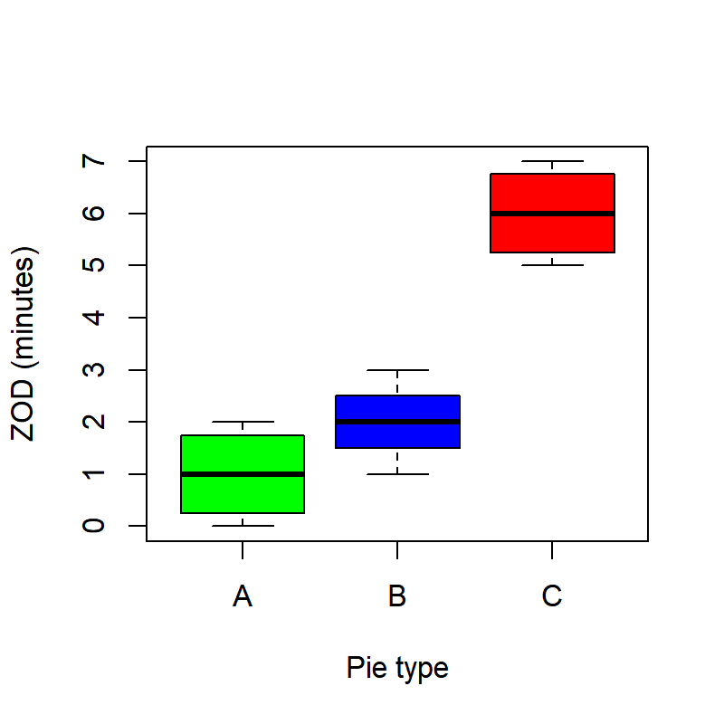
Also, as with all analyses, it is helpful to generate a table of summary statistics:
SummaryTable <- data.frame(
n = tapply(ZOD, Pie, length),
mean=tapply(ZOD,Pie,mean),
sd = tapply(ZOD,Pie,sd))
SummaryTable
## n mean sd
## A 4 1 0.9128709
## B 4 2 0.8164966
## C 4 6 0.9128709As a general rule, it is a good idea to record summary tables like these in separate files. For example:
write.csv(SummaryTable, file="SummaryTable.csv")Ok, let’s start collecting all the little pieces of ANOVA:
X <- Pie
Y <- ZOD
a <- length(levels(X))
N <- length(Y)
n <- N/a
Recall the definition of the total sums of squares and the treatment (or group [or model]) sum of squares: \[SS_{total} = \sum_{j=1}^a \sum_{i=1}^n (Y_{ij} - \overline{Y_{\cdot\cdot}})^2\] \[SS_{treatment} = \sum_{j=1}^a \sum_{i=1}^n (Y_{j\cdot} - \overline{Y_{\cdot\cdot}})^2 = n \sum_{j=1}^a (Y_{j\cdot} - \overline{Y_{\cdot\cdot}})^2\]
Y.means <- tapply(Y,X,mean)
SS.total <- sum((Y-mean(Y))^2)
SS.treatment <- n*sum((Y.means-mean(Y))^2)
The SS.error can be obtained in one of two ways. Either by the definition, which is \[SS_{error} = \sum_{j=1}^a \sum_{i=1}^n (Y_{ij} - \overline{Y}_{i\cdot})^2,\] or simply as the difference of the SS.total and the `SS.treatment``.
SS.error <- SS.total - SS.treatmentEXERCISE: Calculate the error sum of squares in R using the mathematical definition above and confirm that if gives the same result.
Next, we compute the mean square of the errors and the mean square of the treatment (or group).
MS.error <- SS.error/(N-a)
MS.treatment <- SS.treatment/(a-1)
And obtain the F-statistic:
F0 <- MS.treatment/MS.errorAnd compute the p-value:
1-pf(F0,a-1,N-a)## [1] 5.080526e-05Clearly, we can reject the null hypothesis that there is no relationship between Pie type and Zone-Out Duration.
b) Using R
Of course, all of this could be performed in R. But it takes two steps. The first (and this should be somewhat familiar looking) is to specify the linear model
Pie.lm <- lm(ZOD~Pie)Recall that the notation Y ~ X means that we are modeling Y as a response to explanatory factor X, i.e. \(Y_{ij} = \mu_i + \epsilon_{ij}\). The lm part tells us that the \(\epsilon\)’s are indpendent and identically distributed (iid) and normal, i.e. \(\epsilon_{ij} \sim {\cal N}(0,\sigma^2)\).
Look at the output of summary(Pie.lm)
summary(Pie.lm)##
## Call:
## lm(formula = ZOD ~ Pie)
##
## Residuals:
## Min 1Q Median 3Q Max
## -1.000 -0.625 0.000 0.625 1.000
##
## Coefficients:
## Estimate Std. Error t value Pr(>|t|)
## (Intercept) 1.0000 0.4410 2.268 0.0495 *
## PieB 1.0000 0.6236 1.604 0.1433
## PieC 5.0000 0.6236 8.018 2.17e-05 ***
## ---
## Signif. codes: 0 '***' 0.001 '**' 0.01 '*' 0.05 '.' 0.1 ' ' 1
##
## Residual standard error: 0.8819 on 9 degrees of freedom
## Multiple R-squared: 0.8889, Adjusted R-squared: 0.8642
## F-statistic: 36 on 2 and 9 DF, p-value: 5.081e-05Note that this gives somewhat confusing output (what is Intercept? Why is PieB “1”, when its mean is 2.0? What are the t-tests it is performing?). The short interpretation of this output is that it is not very useful.
However, the Pie.lm is a “fitted model object”“, which contains a lot of useful information. Note all the named components of this object:
names(Pie.lm)## [1] "coefficients" "residuals" "effects" "rank"
## [5] "fitted.values" "assign" "qr" "df.residual"
## [9] "contrasts" "xlevels" "call" "terms"
## [13] "model"Important features of the model are the model predictions:
Pie.lm$fit## 1 2 3 4 5 6 7 8 9 10 11 12
## 1 1 1 1 2 2 2 2 6 6 6 6and the model residuals:
Pie.lm$res## 1 2 3 4 5
## -1.000000e+00 -5.000000e-01 5.000000e-01 1.000000e+00 -1.000000e+00
## 6 7 8 9 10
## -8.326673e-17 -8.326673e-17 1.000000e+00 -1.000000e+00 -5.000000e-01
## 11 12
## 5.000000e-01 1.000000e+00Note, immediately, that this object make finding the residual sum of squares instant:
sum(Pie.lm$res^2)## [1] 7Before we perform the analysis of variance, it is import to verify the assumptions of ANOVA, which are related to the residuals. The simplest, most efficient, and often sufficient way to verify these is by plotting the linear model directly:
par(mfrow=c(2,2), bty="l")
plot(Pie.lm)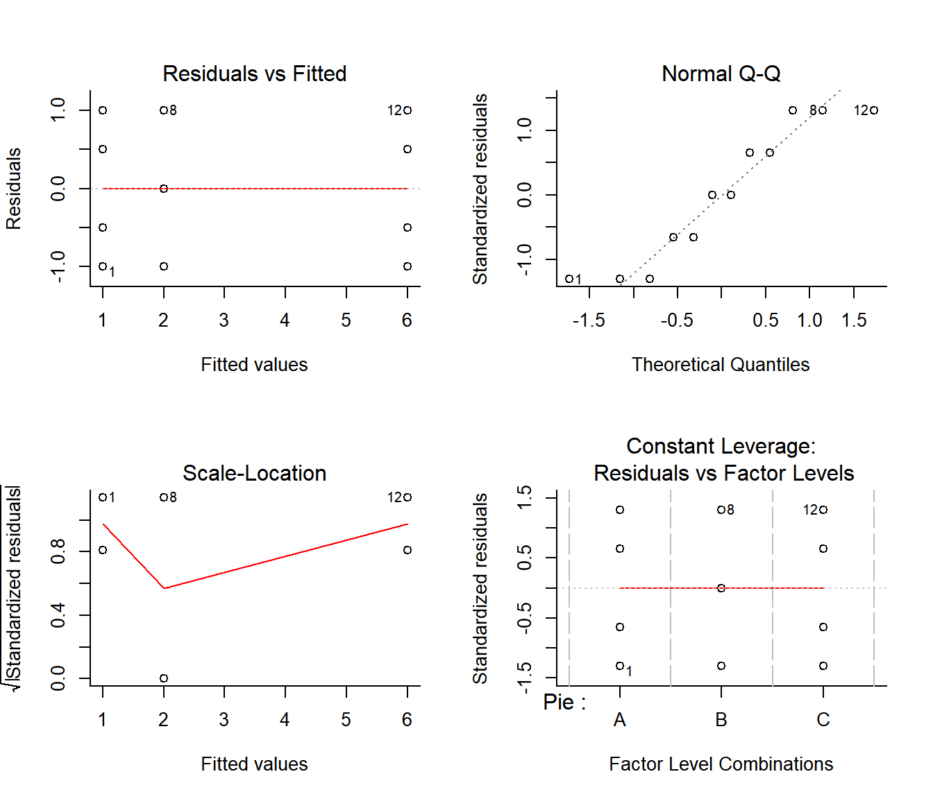
The imporant plots here are the first two. They indicate that the residuals have consistent variances and are roughly normal, suggesting that the assumptions are valid.
EXERCISE: Use the
Pie.lmobject to create the first plots by hand.
Ok, now that we have confirmed that the assumptions of ANOVA are supported, we can shoot the magic bullet:
anova(Pie.lm)## Analysis of Variance Table
##
## Response: ZOD
## Df Sum Sq Mean Sq F value Pr(>F)
## Pie 2 56 28.0000 36 5.081e-05 ***
## Residuals 9 7 0.7778
## ---
## Signif. codes: 0 '***' 0.001 '**' 0.01 '*' 0.05 '.' 0.1 ' ' 1There it is: instant ANOVA. Double check that the results of the ANOVA conforms with our results. Note, as always, that the output of anova is a named list:
names(anova(Pie.lm))## [1] "Df" "Sum Sq" "Mean Sq" "F value" "Pr(>F)"out of which any component can be easily extracted, for example:
anova(Pie.lm)$Sum## [1] 56 7Exercise: perform an analysis of variance on a random resampling of the ZOD (or Pie) data. Do you expect there to be a significant effect of Pie?
2. Two-Way ANOVA: Analysis of Cow Growth
A 2-way ANOVA is essentially similar to a 1-way ANOVA, but explores 2 main effects AND a potential interaction effect.
We will look at some data on growth of a cow under three different diets (barley, oats and wheat) and three diet supplements, plus a control group with no supplements1. The response variable is weekly weight gain on individual cows. The data are posted here:
## Growth <- read.csv("http://terpconnect/egurarie/teaching/Biol709/data/Growth.csv")There’s a fun package called googleVis, which allows you to generate a Google style html table (as well as lots of other Google style visualizations with R/Markdown/knitr, see examples here: http://www.r-bloggers.com/googlevis-0-3-2-is-released-better-integration-with-knitr/).
require(googleVis)
print(gvisTable(Growth, options=list('height'=300, 'width' = 200)), 'chart')
Note that the supplement factor levels are ordered alphabetically
levels(Growth$supplement)## [1] "agrimore" "control" "supergain" "supersupp"Which awkwardly places “control” second. A reordering of factors might be in order (so to speak). There is a convenient function called relevel which does exactly that:
Growth$supplement <- relevel(Growth$supplement, ref="control")par(cex.lab=1.25, cex.axis=1.1, mar=c(4,4,2,2), bty="l")
cols <- c("orange", "yellow", "red")
layout(rbind(c(1,2),c(3,3)))
boxplot(gain~diet, data=Growth, col=cols, ylab="Weight gain (kg)", main="Diet", srt=45)
boxplot(gain~supplement, data=Growth, col="orange", ylab="Weight gain (kg)", main="Supplement")
boxplot(gain~diet*supplement, data=Growth, at = c(-.5,0,.5) + rep(1:4*3,each=3),
col=cols, xaxt="n", ylab="Weight gain (kg)", main="Diet x Supplement")
axis(1,at=1:4*3, labels=levels(Growth$supplement))
legend("topleft", legend=levels(Growth$diet), fill=cols, bty="n")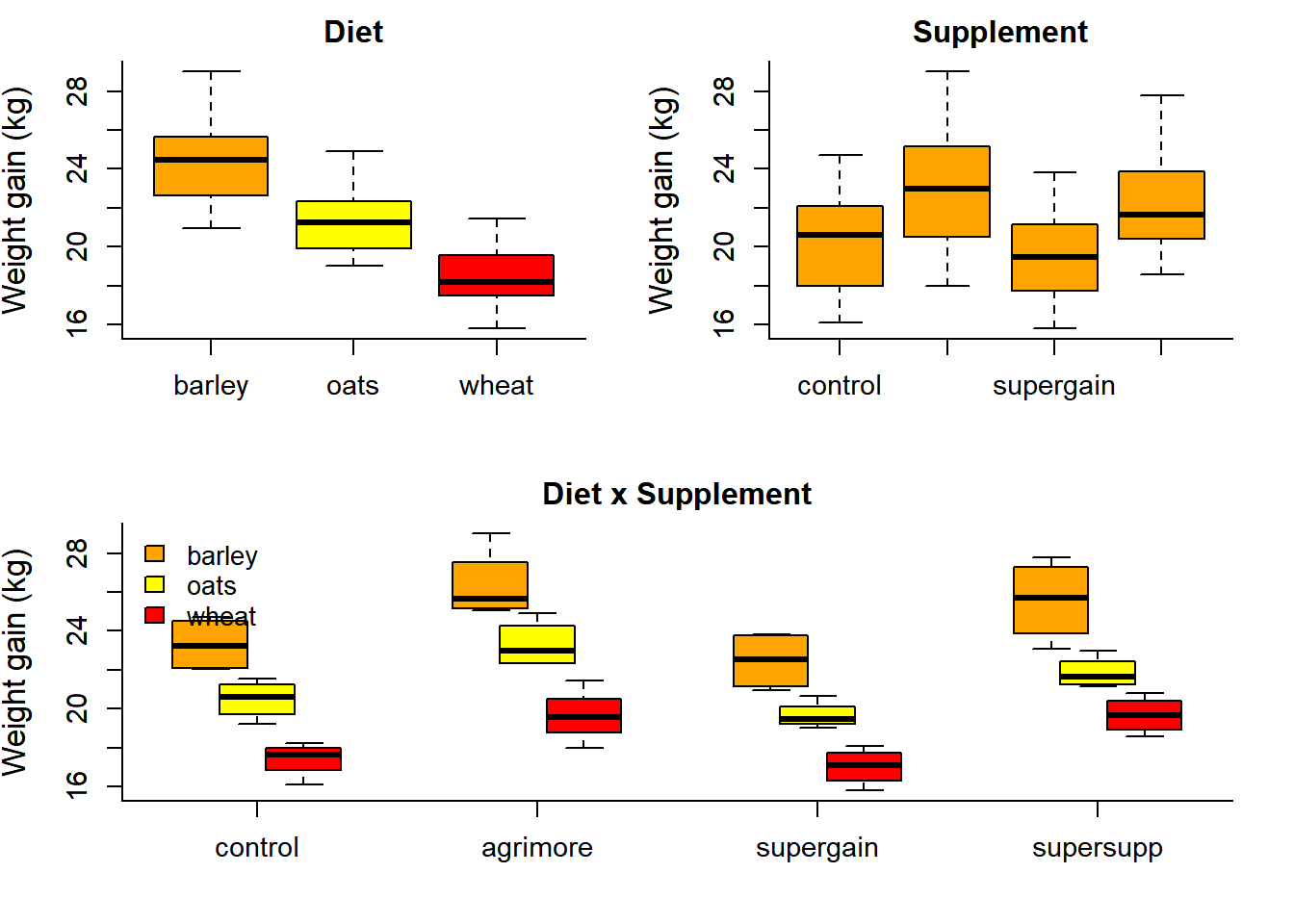 These boxplots are quite illuminating, showing likely significant main effects. The open question is: are there significant “interaction effects”? I.e., do different supplements in combination with different grains act in different ways on weight growth?
One quick way to visualize this question is to look at “interaction plots”:
par(mfrow=c(2,1), bty="l", mar = c(4,4,2,2))
with(Growth, interaction.plot(diet, supplement, gain))
with(Growth, interaction.plot(supplement, diet, gain))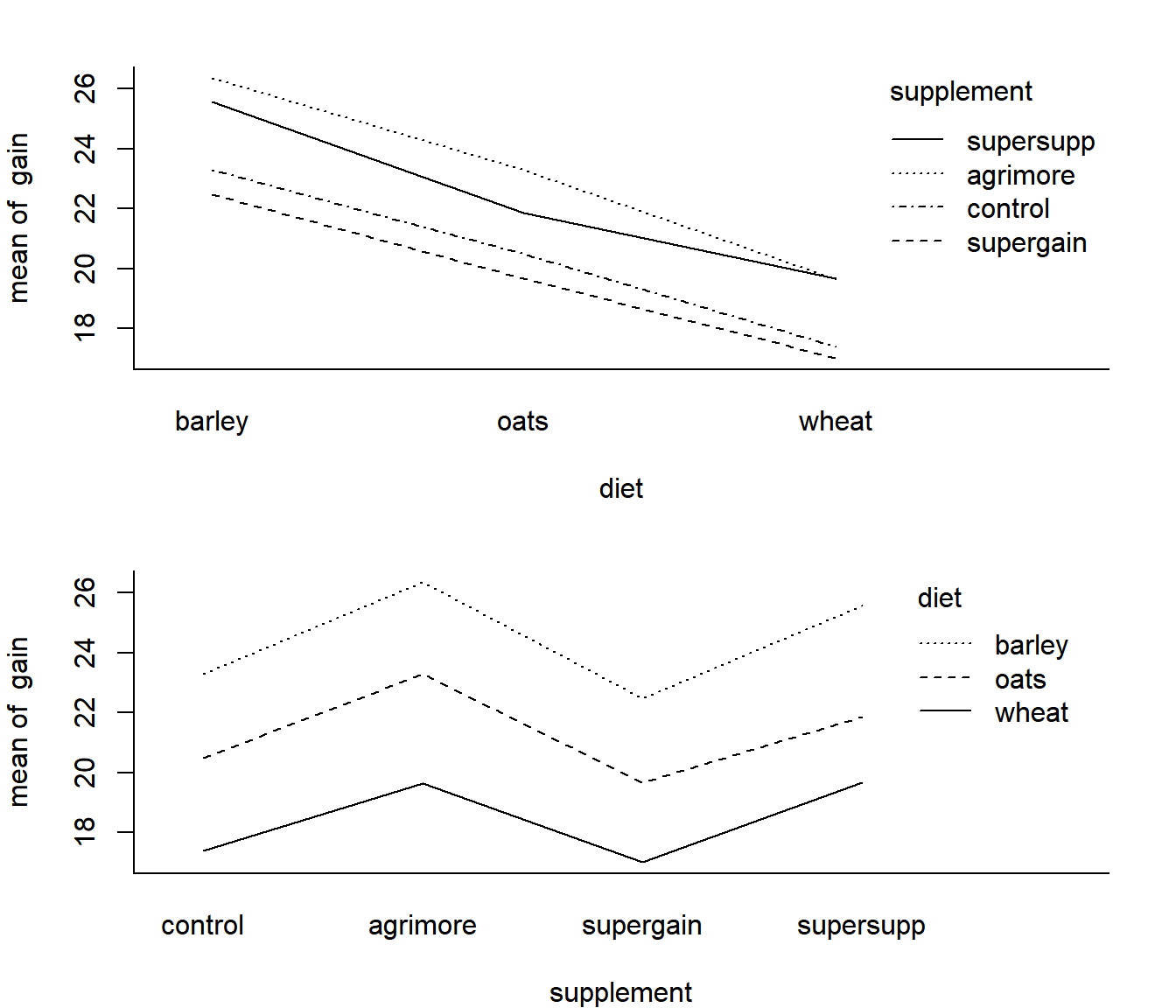
The fact that these lines are fairly parallel, suggests that the effects of the supplements are similar across all diets.
As usual, it is often very useful to generate a summary table of the data. We’ll use tapply, but in a somewhat different way this time, structuring the application with a list.
with(Growth, tapply(gain, list(diet, supplement), mean))## control agrimore supergain supersupp
## barley 23.29665 26.34848 22.46612 25.57530
## oats 20.49366 23.29838 19.66300 21.86023
## wheat 17.40552 19.63907 17.01243 19.66834With some manipulation, we can make a decent looking table of means and standard deviations:
M <- with(Growth, tapply(gain, list(supplement, diet), mean))
S <- with(Growth, tapply(gain, list(supplement, diet), sd))
Summary <- M
Summary[1:length(Summary)] <- paste(round(M,1), " (", round(S,2), ")", sep="")
Summary <- data.frame(Supplement = levels(Growth$supplement), Summary)
print(gvisTable(Summary, options=list('height'=150)), 'chart')
Ok, with little further ado, let’s perform an analysis of variance in three short steps. First, fit the linear model:
Growth.lm <- lm(gain~diet*supplement, data=Growth)Second, look at the diagnostic plots:
par(mfrow=c(2,2)); plot(Growth.lm)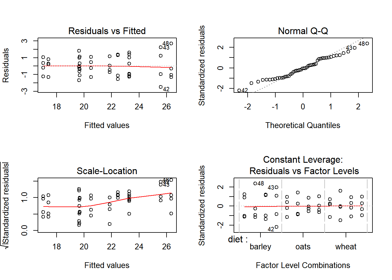
The diagnostic plots look fine. Finally, compute the anova table:
anova(Growth.lm)## Analysis of Variance Table
##
## Response: gain
## Df Sum Sq Mean Sq F value Pr(>F)
## diet 2 287.171 143.586 83.5201 2.999e-14 ***
## supplement 3 91.881 30.627 17.8150 2.952e-07 ***
## diet:supplement 6 3.406 0.568 0.3302 0.9166
## Residuals 36 61.890 1.719
## ---
## Signif. codes: 0 '***' 0.001 '**' 0.01 '*' 0.05 '.' 0.1 ' ' 1The p-values here suggest strongly that there are highly significant main effects, but no significant interaction effects. The supplements act in similar ways across all basic feed types, and there is strong evidence that Argimore and Supersupp are the superior supplement, whereas supergain might be made out of sawdust.
Topic for discussion: Each p-value represents a hypothesis test. What exactly are the hypotheses being tested?
3. Inference on Linear Regression
Load the sleep data:
Sleep.df <- read.csv("http://faculty.washington.edu/eliezg/data/Sleep.csv")
Sleep <- Sleep.df$Sleep
ZOD <- Sleep.df$ZOD
Or, by hand:
Sleep <- c(2.6, 4.2, 4.3, 4.8, 4.9, 5.3, 5.5, 5.6, 5.6, 6.5, 6.8, 7.8, 7.8, 8, 8.4)
ZOD <- c(13, 8, 13, 10, 10, 9, 8, 10, 9, 1, 4, 3, 2, 0, 6)
Plot the data:
        plot(Sleep, ZOD,
                xlab="Sleep (hrs)",
                ylab="Zone-out duration (min)",
        pch=19, col=rgb(0,0,0,.3), cex=2)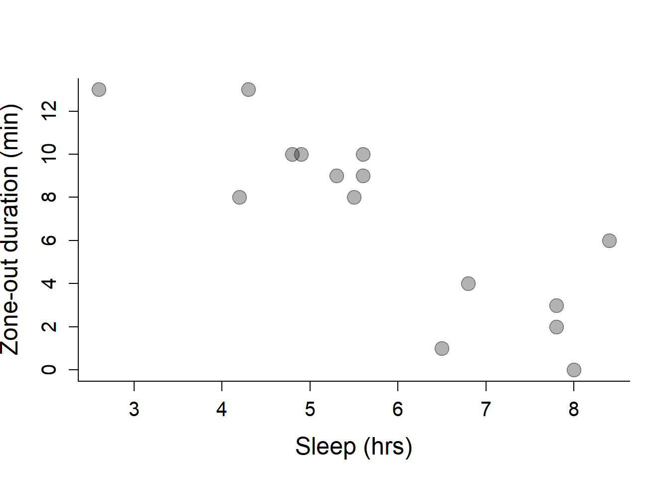
We’ve already estimated regression parameters in this class, but as a brief review, here is how you obtain \(\widehat\alpha\) and \(\widehat\beta\):
    Sleep.mean <- mean(Sleep)
    ZOD.mean <- mean(ZOD)
    (beta.hat <- sum( (Sleep - Sleep.mean) * (ZOD - ZOD.mean) )/ sum( (Sleep - Sleep.mean)^2 ))
## [1] -2.117387 (alpha.hat <- ZOD.mean - beta.hat*Sleep.mean)## [1] 19.50279Which we can add to out plot with the abline() function:
  plot(Sleep, ZOD,
                xlab="Sleep (hrs)",
                ylab="Zone-out duration (min)",
        pch=19, col=rgb(0,0,0,.3), cex=2)
  abline(beta.hat, alpha.hat, col=2, lwd=2)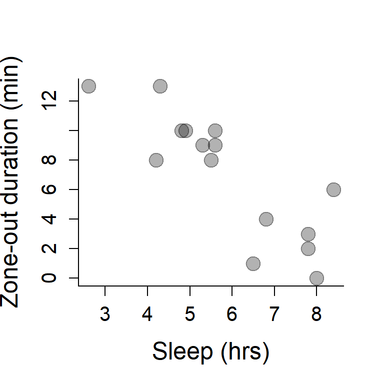
Now, lets let R fit the linear model
    Sleep.lm <- lm(ZOD ~ Sleep)
    summary(Sleep.lm)
##
## Call:
## lm(formula = ZOD ~ Sleep)
##
## Residuals:
## Min 1Q Median 3Q Max
## -4.7398 -1.0511 0.1428 1.1135 4.2833
##
## Coefficients:
## Estimate Std. Error t value Pr(>|t|)
## (Intercept) 19.5028 2.3353 8.351 1.39e-06 ***
## Sleep -2.1174 0.3837 -5.519 9.89e-05 ***
## ---
## Signif. codes: 0 '***' 0.001 '**' 0.01 '*' 0.05 '.' 0.1 ' ' 1
##
## Residual standard error: 2.374 on 13 degrees of freedom
## Multiple R-squared: 0.7009, Adjusted R-squared: 0.6778
## F-statistic: 30.46 on 1 and 13 DF, p-value: 9.893e-05Note that the output of the linear model summary has some t-values attached to the two coeffients. In contrast to the fitted factor model above, these t-values correspond to useful tests. Specifically, they test: \(H_0: \alpha = 0\) and \(H_0: \beta = 0\). It turns out that the statistic: \[t_\beta = \frac{\widehat{\beta}}{MSE}\sum_{i=1}^n ({X_i - \overline{X})^2}\] happens to have a \({\cal T(\nu = n-2)}\) distribution under the null-hypothesis. And a similar statistic can be constructed for the intercept \(\widehat{\alpha}\).
Of course, it is somewhat more straightforward to compute the ANOVA table:
anova(Sleep.lm)## Analysis of Variance Table
##
## Response: ZOD
## Df Sum Sq Mean Sq F value Pr(>F)
## Sleep 1 171.66 171.664 30.458 9.893e-05 ***
## Residuals 13 73.27 5.636
## ---
## Signif. codes: 0 '***' 0.001 '**' 0.01 '*' 0.05 '.' 0.1 ' ' 1Note that the p-value is very small (highly significant), and exactly equal to the \(p\)-value on the slope in the summary() command. This is not a coincidence, the F-statistic used in the ANOVA is exactly the square of the \(t\)-statistic above.
Quick exercise: Confirm this fact by extracting the t-statistic from the summary output. (Hint: it is hidden under the
$coefportion of the summary object).
We know that the T distribution models the ratio between a \({\cal N}(0,1)\) and the square root of a \(\chi^2\) random variable, so it is perhaps unsurprising that the square of that statistic has the appropriate F null-distribution. Before we forget, we should always plot the diagnostic plots.
plot(Sleep.lm)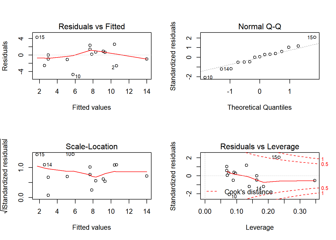
Exercise: Randomize either Sleep or ZOD and perform this regression (i.e. plot the relatinship, fit the linear model, draw the regression line, and perform an ANOVA). Do this a bunch of times. Do you ever geta significant result at the 5% significance level?
4. ANCOVA: Continuous and Discrete covariates
PieSleep <- read.csv("https://terpconnect.umd.edu/~egurarie/teaching/Biol709/data/PieSleep.csv")
print(gvisTable(PieSleep, options = list(height = 200, width=200)), "chart")
Note that a quick one-way ANOVA against the Pie effect=is not significant:
boxplot(ZOD~Pie, col=c(3,4,2), data = PieSleep)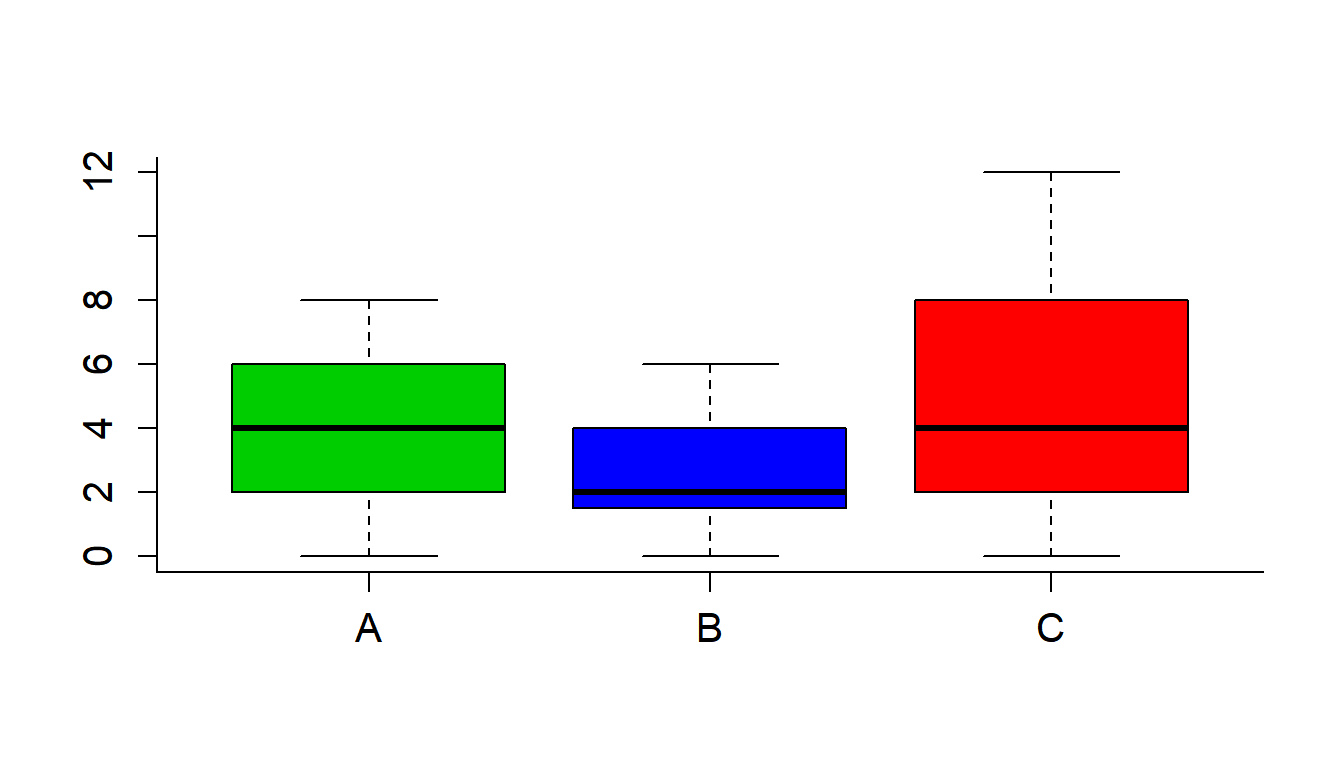
with(PieSleep, tapply(ZOD,Pie,mean))## A B C
## 3.800000 2.733333 4.866667anova(lm(ZOD~Pie, data = PieSleep))## Analysis of Variance Table
##
## Response: ZOD
## Df Sum Sq Mean Sq F value Pr(>F)
## Pie 2 34.13 17.0667 2.0653 0.1395
## Residuals 42 347.07 8.2635Plot all the data:
    cols <- c("green", "blue", "red")
    plot(ZOD~Sleep, col=cols[Pie], pch=19, data = PieSleep)
        legend("topright",
                legend=c("Apple","Blueberry","Cherry"),
                col=1:3,
                pch=19)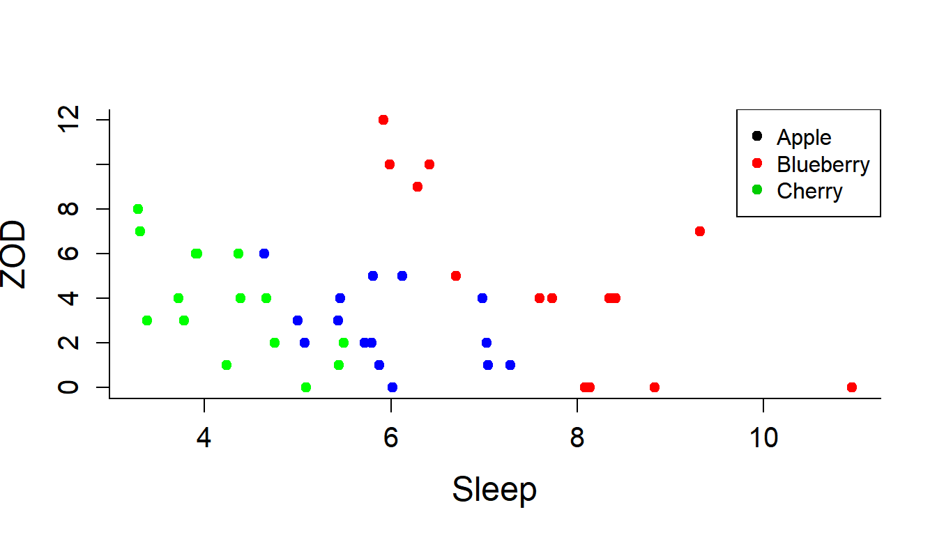
A similar plot using ggplot:
require(ggplot2)
ggplot(PieSleep, aes(x = Sleep, y = ZOD, color = Pie)) + geom_point()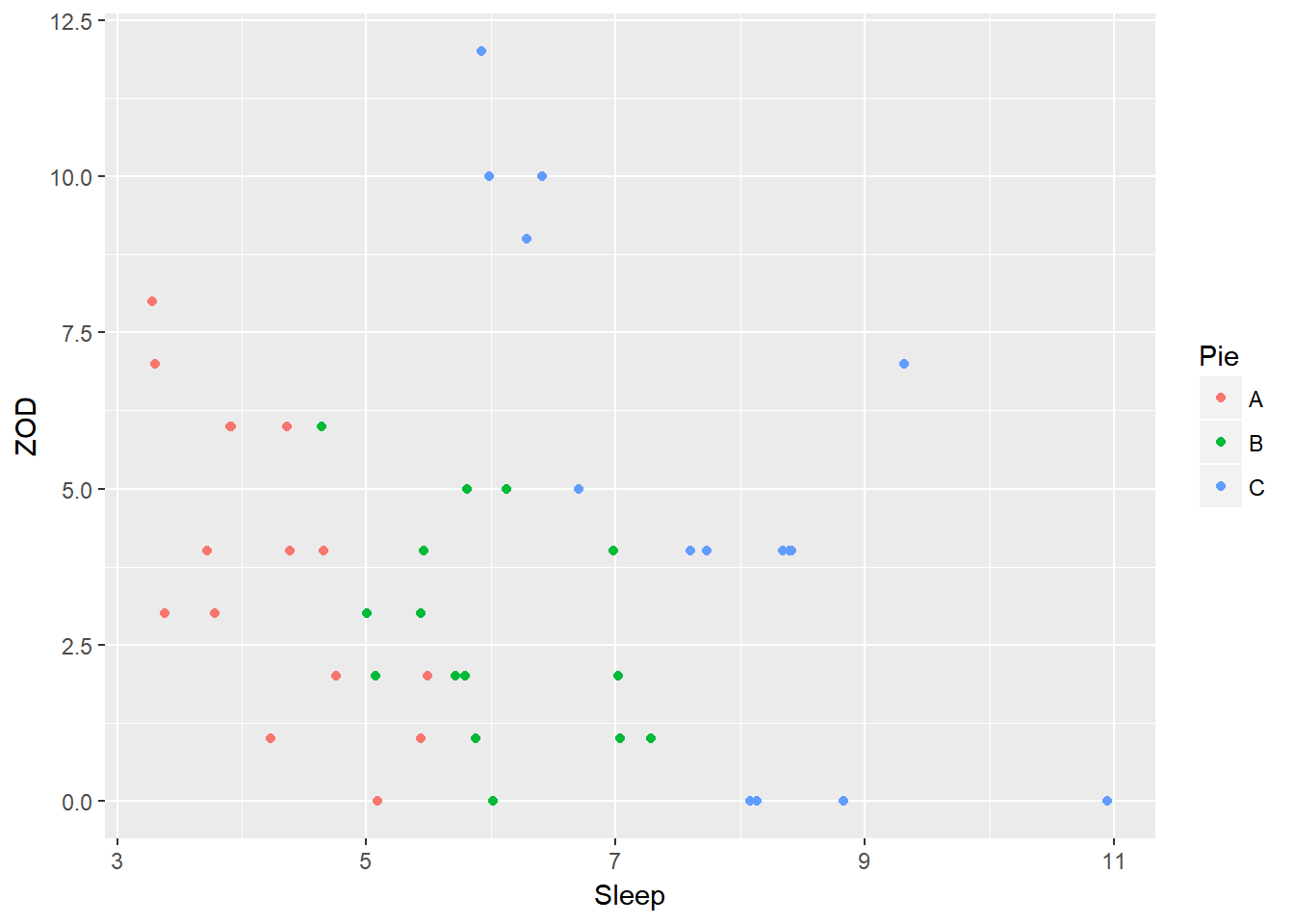
Add some regression lines:
    abline(lm(ZOD[Pie=="A"]~Sleep[Pie=="A"], data = PieSleep), col="green")
        abline(lm(ZOD[Pie=="B"]~Sleep[Pie=="B"], data = PieSleep), col="blue")
        abline(lm(ZOD[Pie=="C"]~Sleep[Pie=="C"], data = PieSleep), col="red")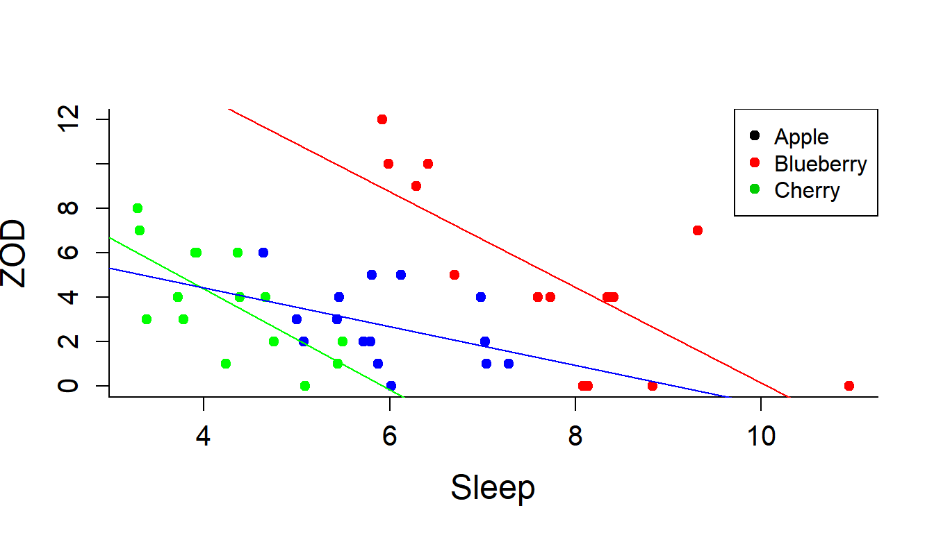
Or, with ggplot (adds a little extra information):
ggplot(PieSleep, aes(x = Sleep, y = ZOD, color = Pie)) + geom_point() + stat_smooth(method = "lm")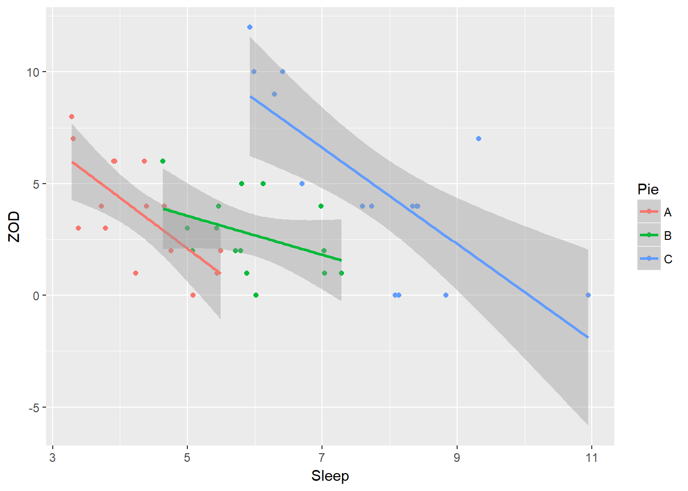
Here is an example of a ggplot with more bells and whistles - or, at least, where the colors match the pies:
require(ggthemes)
ggplot(PieSleep, aes(x = Sleep, y = ZOD, colour = Pie))+ geom_point() + scale_color_manual(values = c("green","blue","red")) + theme_classic() + stat_smooth(method = "lm") 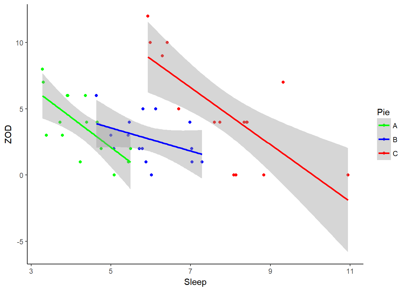
Ok, lets fit a model that includes the Pie effect, the Sleep effect and their interaction:
PieSleep.lm <- lm(ZOD ~ Pie * Sleep, data = PieSleep)
anova(PieSleep.lm)
## Analysis of Variance Table
##
## Response: ZOD
## Df Sum Sq Mean Sq F value Pr(>F)
## Pie 2 34.133 17.067 3.7437 0.03256 *
## Sleep 1 156.831 156.831 34.4023 7.967e-07 ***
## Pie:Sleep 2 12.445 6.223 1.3650 0.26731
## Residuals 39 177.790 4.559
## ---
## Signif. codes: 0 '***' 0.001 '**' 0.01 '*' 0.05 '.' 0.1 ' ' 1The interaction is clearly not significant. So we fit a main-effect only model:
PieSleep.lm <- lm(ZOD ~ Pie + Sleep, data = PieSleep)
anova(PieSleep.lm)
## Analysis of Variance Table
##
## Response: ZOD
## Df Sum Sq Mean Sq F value Pr(>F)
## Pie 2 34.133 17.067 3.6782 0.03394 *
## Sleep 1 156.831 156.831 33.8005 7.96e-07 ***
## Residuals 41 190.236 4.640
## ---
## Signif. codes: 0 '***' 0.001 '**' 0.01 '*' 0.05 '.' 0.1 ' ' 1This is the most “parsimonious” model. Note that to specify it, we need to obtain all the relevant parameters. We can obtain those directly from the output of:
PieSleep.lm##
## Call:
## lm(formula = ZOD ~ Pie + Sleep, data = PieSleep)
##
## Coefficients:
## (Intercept) PieB PieC Sleep
## 11.876 2.170 7.832 -1.901The intercept corresponds to the intercept for the Apple group, the PieB and PieC effects are additive on the intercept, the slope is common to all of them. Thus:
alpha.A <- PieSleep.lm$coef[1]
alpha.B <- alpha.A + PieSleep.lm$coef[2]
alpha.C <- alpha.A + PieSleep.lm$coef[3]
beta <- PieSleep.lm$coef[4]
Finally, the variance coefficient is the mean square residual:
names(anova(PieSleep.lm))## [1] "Df" "Sum Sq" "Mean Sq" "F value" "Pr(>F)"sigma2 <- anova(PieSleep.lm)$Mean[3]Let’s write out the results:
t(data.frame(alpha.A, alpha.B, alpha.C, beta, sigma2))## (Intercept)
## alpha.A 11.876168
## alpha.B 14.046201
## alpha.C 19.708178
## beta -1.901100
## sigma2 4.639895A very nice model. Cherry pie is still the pie least conducive to concentration in class - the apparent lack of a significant result is due to the fact that the study was - in fact - poorly designed and the apple pie eating subjects were disadvantaged by having the least sleep.
Note that these data were simulated, and when I simulated them I made the intercepts 10, 15 and 20 minutes respectively, with a slope of -2 and a variance of 4. So the model managed to identify these values fairly closely.
I took these data from The R Book by Michael Crawley, Wiley 2007: http://www.bio.ic.ac.uk/research/mjcraw/therbook/.↩