A Likelihood Approach to GLM’s
BIOL709/BSCI339
The Data
First, to motivate this, here is a data-set of presence and absence of common sole (a kind of flat-fish, Solea solea) in the estuary of the Tejo river in Portugal. The response variable is binary (absence = 0, presence = 1), and there are various potential explanatory covariates, in this case continuous ones like salinity, temperature, depth, relative percentages of gravel/sand/mud.1 The data can be found here: https://terpconnect.umd.edu/~egurarie/teaching/Biol709/data/
Solea <- read.csv("https://terpconnect.umd.edu/~egurarie/teaching/Biol709/data/Solea.csv")Let’s just look for now at the presence of sole with respect to salinity. Note that the explanatory variable is continuous, and the response variable is discrete, i.e. we are flipping a one-way ANOVA on its side.
Plotting a binary response is not that as easy as scatterplotting continuous covariates. Below is a slightly elaborate option:
Y <- Solea$Solea_solea
X <- Solea$salinity
plot(X, jitter(Y, factor=0.1), col=rgb(0,0,0,.5), pch=19, ylim=c(-.2,1.2), xlab="Salinity", ylab="Presence", yaxt="n")
boxplot(X~Y, horizontal=TRUE, notch=TRUE, add=TRUE, at=c(-.1,1.1), width=c(.1,.1), col="grey", boxwex = 0.1, las=1)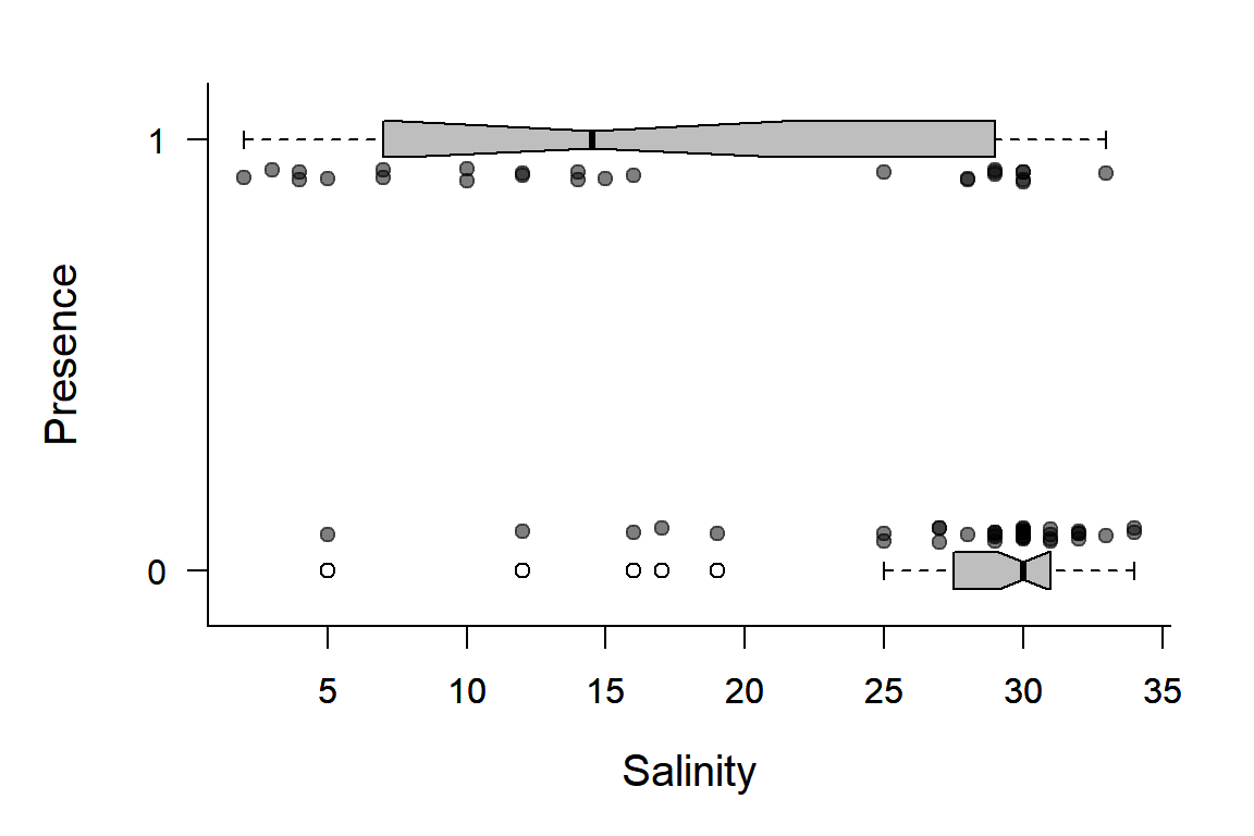
There are many things going on here. Note, we can generalize this code to make a handy function that plots these kinds of data:
plotBinary <- function (X, Y, ...)
 {
     plot(X, jitter(Y, factor = 0.1), col = rgb(0, 0, 0, 0.5),
         pch = 19, ylim = c(-0.2, 1.2), ...)
     boxplot(X ~ Y, horizontal = TRUE, notch = TRUE, add = TRUE,
         at = c(-0.1, 1.1), width = c(0.1, 0.1), col = "grey",
         boxwex = 0.1, yaxt = "n")
 }
Note, the all-important super-useful “…”
So, for example:
par(mfrow=c(3,1), bty="l", mar=c(4,4,1,1), cex.lab=1.5)
with(Solea, plotBinary(salinity, Solea_solea, xlab="salinity", ylab = "Presence", yaxt = "n"))
with(Solea, plotBinary(temperature, Solea_solea, xlab="temperature",   ylab = "Presence", yaxt = "n"))
with(Solea, plotBinary(depth, Solea_solea, xlab="depth", ylab = "Presence", yaxt = "n"))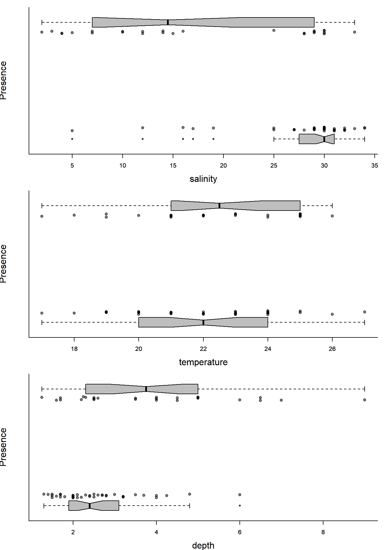
Lots of ecologically relevant relationships.
GLM background
We build by analogy to the standard linear models we’ve fitted so far: \[ Y_i = \beta_0 + \beta_1 X_1 + \beta_2 X_2 + ... + \epsilon_i \] where the \(X\)’s are covariates, the \(\beta\)’s are regression coefficients, and \(\epsilon\) is a \({\cal N}(0,\sigma^2)\) random variable.
We can rewrite this equation, equivalently, as: \[ Y_i = {\cal N}(\mu, \sigma^2) \] \[ E(Y_i) = \mu = {\bf X}\beta \]
Where \({\bf X}\beta\) is a way of expressing the fact that the expected value of the response is a product of a matrix of covariates \(\bf X\) and a vector of coefficients \(\beta\) - (the matrix notation is just an efficient bookkeeping scheme - trust me). Together, \({\bf X}\beta\) are called the linear predictor.
In a GENERALIZED linear model, we recast that equation as something that looks like: \[Y_i \sim \text{Distribution}[\mu]\] and \[g(E(Y)) = g(\mu) = {\bf X} \beta\]
Two important pieces here:
\(\text{Distribution}\) usually comes from something called the “exponential family” of distributions. This includes: Normal, Gamma, Exponential, Poisson, Bernoulli, Binomial, Beta, and many others (but NOT, for example, the Uniform). This is quite a good set, as it means we can model an observation that is, for example, count data (Poisson), or binary (Bernoulli) or constrained to 0 and 1 (Beta) or skewed (Gamma), and so on.
That said … the exponential family constraint is only important because it allows for an iteratively least squares method of fitting the model. With maximum likelihood estimation (as below), there are no real constraints on the distribution shape!
\(g^{-1}\) is the inverse of the link function, a function which transforms the predictor into a “usable” parameter for the distribution of the response.
Some examples of families and canonical links:
In the normal model above, the distribution is \({\cal N}(\mu, \sigma^2)\) and the link function is the identity function.
For the Solea data, the distribution will be \(\text{Bernoulli}(p)\). But what should the function be? It has to be something that transforms quantities over the real line (the predictors) to a number between 0 and 1 (the modeled probability). This works: \[g^{-1}(x) = {\exp(x) \over 1 + \exp(x)}\] This thing, sometimes called the expit, is the inverse of the logit() function: \[g(p) = \log{p \over 1 - p}\] also known as the “log-odds” function.
Note, how good the expit is at converting normally distributed data, for example, to nice, well-constrained numbers between 0 and 1. See how this function behaves for several linear functions of \(x\).
curve(exp(x)/(1+exp(x)), xlim=c(-6,6), lwd=2)
curve(exp(1 - x/2)/(1+exp(1-x/2)), add=TRUE, col=2, lwd=2)
curve(exp(-5 + 2*x)/(1+exp(-5+2*x)), add=TRUE, col=3, lwd=2)
legend("left", col=1:3, legend=c("y=x", "y=1-x/2", "y=-5+2x"), title="Predictor", lty=1)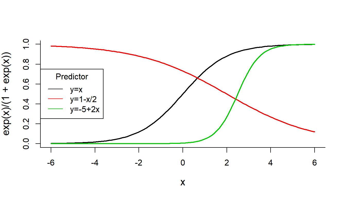
GLM likelihood function
Our data:
X <- Solea$salinity
Y <- Solea$Solea_solea
The model for \(\widehat{p}\) has two coefficients:
getP.hat <- function(beta0, beta1, X){
    lP <- (beta0 + beta1 * X)
    exp(lP)/(1 + exp(lP))
}
See how this function looks for different values of \(\beta_0\) and \(\beta_1\):
plotBinary(X,Y)
lines(1:40, getP.hat(beta0 = 20, beta1 = -1, 1:40))
lines(1:40, getP.hat(beta0 = 10, beta1 = -1/2, 1:40), col=2)
lines(1:40, getP.hat(beta0 = 5, beta1 = -1/4, 1:40), col=3)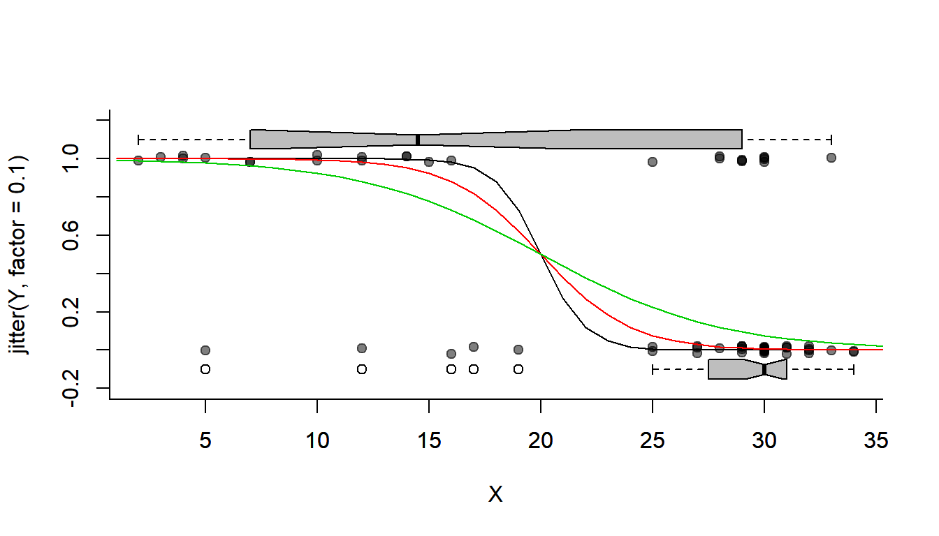
The following function returns the (negative2) log-likelihood for data set X and Y. Note the key function: sum(dbinom(RESPONSE, log = TRUE)). Also, this likelihood function (to pass into optim) MUST have the parameters to estimate (the GLM coefficients) as the single first argument:
logLike.Binomial <- function(coefs, X, Y){
    beta0 <- coefs['beta0']
    beta1 <- coefs['beta1']
    p.hat <- getP.hat(beta0, beta1, X)
    -sum(dbinom(Y, size = 1, prob = p.hat, log = TRUE))
}
Now, we need to start with some random guess for those parameters. In this case, it is not that important that they be good guesses (because it is an “easy” likelihood to maximize). But sometimes, it is really important that they be roughly close to the right numbers.
coef0 <- c(beta0 = 0, beta1 = -1)Finally … OPTIMIZE!
(glm.fit <- optim(coef0, fn = logLike.Binomial, X = X, Y = Y, hessian= TRUE))## $par
##      beta0      beta1
##  2.6601654 -0.1298135
##
## $value
## [1] 34.28
##
## $counts
## function gradient
## 85 NA
##
## $convergence
## [1] 0
##
## $message
## NULL
##
## $hessian
## beta0 beta1
## beta0 11.26252 274.3119
## beta1 274.31190 7500.4898The parameter estimates are:
(coef.hat <- glm.fit$par)## beta0 beta1
## 2.6601654 -0.1298135Plot the optimized fit:
plotBinary(X,Y)
lines(1:40, getP.hat(beta0 = glm.fit$par['beta0'], beta1 = glm.fit$par['beta1'], 1:40))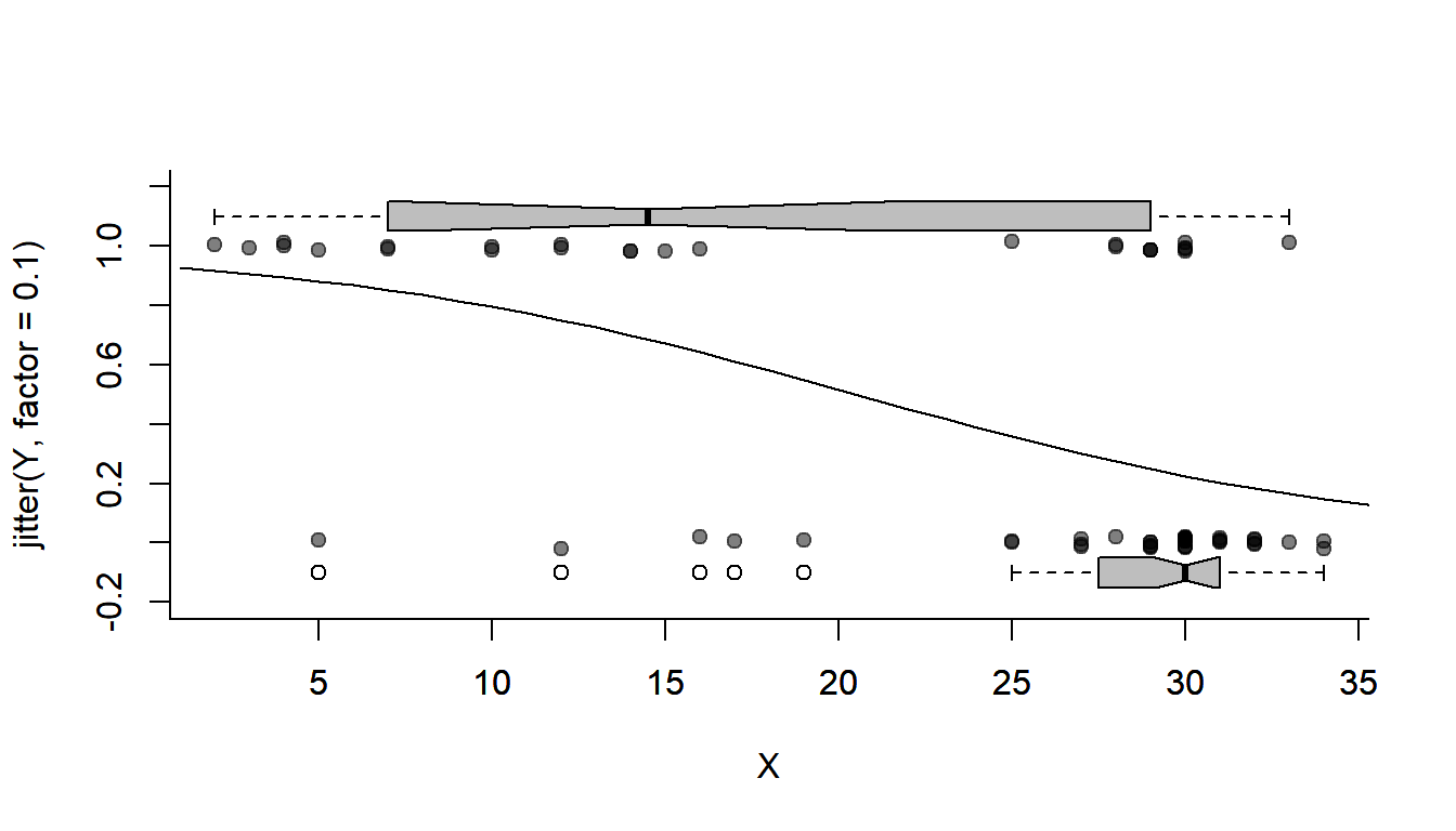
Confidence Intervals
From the Hessian
Obtain confidence intervals:
sqrt(diag(solve(glm.fit$hessian)))## beta0 beta1
## 0.90158337 0.03493645Bootstrapping!
Say you don’t believe the magic of the Hessian but would like confidence intervals. No worries, we can (almost) ALWAYS bootstrap!
First, get a function that gives you the parameters you’re interested in:
getCoefs <- function(X,Y){
    optim(coef.hat, fn = logLike.Binomial, X = X, Y = Y, hessian= FALSE)$par
}
Note that I put in the estimated coefficients - since those are bound to be pretty darned good.
Next, repeat this process a bunch of times over a random sample (remember: with replacement)!
nreps <- 1000
Coefs.bs <- matrix(nrow = nreps, ncol = 2)
for(i in 1:nreps){
    sample <- sample(1:length(X), replace = TRUE)
    Coefs.bs[i,] <- getCoefs(X[sample], Y[sample])
}
colnames(Coefs.bs) <- c("beta0", "beta1")
This might take a noticeable moment on your computer.
You can visualize the bootstrap distribution:
hist(Coefs.bs[,'beta0'], col="grey", bor = "darkgrey", breaks = 50,
    main = expression("Bootstrap of "~beta[0]))
abline(v = quantile(Coefs.bs[,1], c(0.025, 0.5, 0.975)), col = 2, lwd = 2, lty = c(3,1,3))

hist(Coefs.bs[,'beta1'], col="grey", bor = "darkgrey", breaks = 50,
    main = expression("Bootstrap of "~beta[1]))
abline(v = quantile(Coefs.bs[,2], c(0.025, 0.5, 0.975)), col = 2, lwd = 2, lty = c(3,1,3))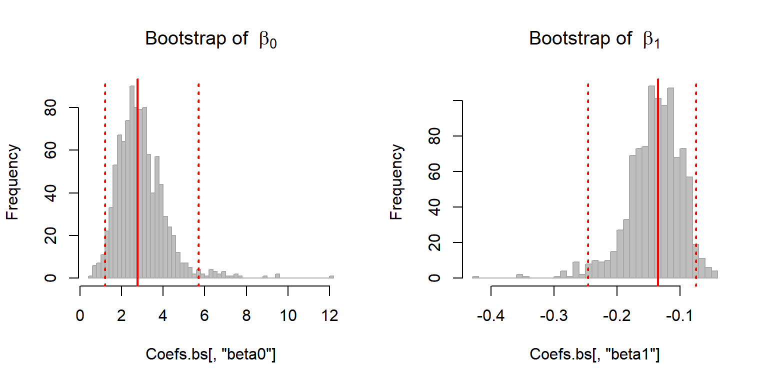
And obtain 95% bootstrap confidence intervals:
apply(Coefs.bs, 2, quantile, p = c(0.025, 0.975))## beta0 beta1
## 2.5% 1.207931 -0.24596854
## 97.5% 5.703337 -0.07433606Quick Exercise:
Compare these confidence intervals to those obtained from the Hessian.
Plot these estimates against each other. What do you observe? How do you interpret this?
Comparison with glm
summary(glm(Y~X, family = "binomial"))##
## Call:
## glm(formula = Y ~ X, family = "binomial")
##
## Deviance Residuals:
## Min 1Q Median 3Q Max
## -2.0674 -0.7146 -0.6362 0.7573 1.8997
##
## Coefficients:
## Estimate Std. Error z value Pr(>|z|)
## (Intercept) 2.66071 0.90167 2.951 0.003169 **
## X -0.12985 0.03494 -3.716 0.000202 ***
## ---
## Signif. codes: 0 '***' 0.001 '**' 0.01 '*' 0.05 '.' 0.1 ' ' 1
##
## (Dispersion parameter for binomial family taken to be 1)
##
## Null deviance: 87.492 on 64 degrees of freedom
## Residual deviance: 68.560 on 63 degrees of freedom
## AIC: 72.56
##
## Number of Fisher Scoring iterations: 4Pretty similar results!
Note that the glm function also records a “log-Likelihood”:
logLik(glm(Y~X, family = "binomial"))## 'log Lik.' -34.28 (df=2)And that it is equal to (the negative) of the maximized value of the optim output:
glm.fit$value## [1] 34.28Exercise: Likelihood Ratio Test
A. Estimate a null-model for the probability of Solea occurence (\(p\)), i.e. the model \(M_0: Y \sim \text{Bernoulli}(p)\), in two ways:
Using a “method of moments” estimator … (i.e. the intuitive one)
Using a “maximum likelihood” estimator … (i.e. modify the code above to maximize the likelihood of an intercept-only model)
Are these estimates equal?
B. Model selection
Compute (and report) the log-likelihood, the number of parameters, AIC and BIC of the null model and of AIC, and BIC of the salinity logistic regression in the lab.
Perform the likelihood ratio test of the Solea salinity model against the null model. Report the likelihood ratio statistic, the null distribution, and the resuling p-value. Compare, also, the AIC and BIC values. Are the results consistent?
6. Other covariates
Fit the logistic model for temperature and depth and generalize the code above to perform the likelihood ratio test and the AIC/BIC comparison against any of the covariates in the Solea data. Fit the logistic model for temperature and depth. Compare the results of the three tests to the p-value outputted by summary(glm()), and by anova(glm()).
I got this example from a quite excellent ecological statistics book: Mixed Effects Models and Extensions in Ecology with R (2009). Zuur, Ieno, Walker, Saveliev and Smith. Springer↩
Confusing, but important↩