The concept of the Fourier transform is involved in two very important instrumental methods in chemistry. In Fourier transform infrared spectroscopy (FTIR), the Fourier transform of the spectrum is measured directly by the instrument, as the interferogram formed by plotting the detector signal vs mirror displacement in a scanning Michaelson interferometer. In Fourier Transform Nuclear Magnetic Resonance spectroscopy (FTNMR), excitation of the sample by an intense, short pulse of radio frequency energy produces a free induction decay signal that is the Fourier transform of the resonance spectrum. In both cases the instrument recovers the spectrum by inverse Fourier transformation of the measured (interferogram or free induction decay) signal.
The power
spectrum or frequency
spectrum is a simple way of showing the total amplitude
at each of these frequencies; it is calculated as the square root
of the sum of the squares of the coefficients of the sine and
cosine components. The power spectrum retains the frequency information
but discards the phase information, so that the power
spectrum of a sine wave would be the same as that of a cosine wave
of the same frequency, even though the complete Fourier transforms
of sine and cosine waves are different in phase. In situations
where the phase components of a signal are the major
source of noise (e.g. random shifts in the horizontal x-axis
position of the signal), it can be advantageous to base
measurement on the power spectrum, which discards the phase
information, by ensemble
averaging the power spectra of repeated signals: this is
demonstrated by the Matlab/Octave scripts EnsembleAverageFFT.m and EnsembleAverageFFTGaussian.m.

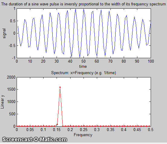
 A
time-series signal with n points gives a power spectrum
with only (n/2)+1 points. The first point is the zero-frequency
(constant) component, corresponding to the DC (direct current)
component of the signal. The second point corresponds to a
frequency of 1/nΔx (whose period is exactly equal to the time
duration of the data), the next point to 2/nΔx, the next point to
3/nΔx, etc., where Δx is the interval between adjacent x-axis
values and n is the total number of points. The last (highest
frequency) point in the power spectrum (n/2)/nΔx=1/2Δx, which is
one-half the sampling rate. This is illustrated in the figure on
the right, which shows a one-second, 1000-point signal that has
only three non-zero Fourier components (top panel), all of which
are clearly distinguishable in the signal itself (middle panel).
The frequencies are labeled and they all show up at the expected
places, and with the expected amplitudes in the Fourier spectrum,
which I have drawn here as a bar graph (botom panel). You can
even count the cycles of the sine components to confirm their
frequencies.
A
time-series signal with n points gives a power spectrum
with only (n/2)+1 points. The first point is the zero-frequency
(constant) component, corresponding to the DC (direct current)
component of the signal. The second point corresponds to a
frequency of 1/nΔx (whose period is exactly equal to the time
duration of the data), the next point to 2/nΔx, the next point to
3/nΔx, etc., where Δx is the interval between adjacent x-axis
values and n is the total number of points. The last (highest
frequency) point in the power spectrum (n/2)/nΔx=1/2Δx, which is
one-half the sampling rate. This is illustrated in the figure on
the right, which shows a one-second, 1000-point signal that has
only three non-zero Fourier components (top panel), all of which
are clearly distinguishable in the signal itself (middle panel).
The frequencies are labeled and they all show up at the expected
places, and with the expected amplitudes in the Fourier spectrum,
which I have drawn here as a bar graph (botom panel). You can
even count the cycles of the sine components to confirm their
frequencies.
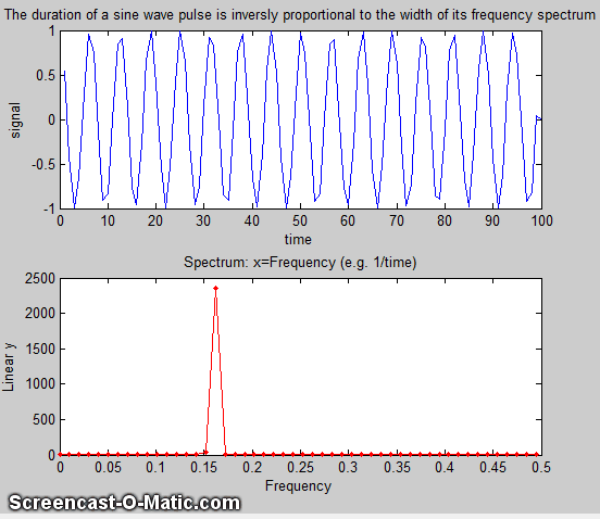
The limits of sampling. The highest frequency that can be represented in a discretely-sampled waveform is one-half the sampling frequency, which is called the Nyquist frequency; frequencies above the Nyquist frequency are "folded back" to lower frequencies, severely distorting the signal. The frequency resolution, that is, the difference between the frequencies of adjacent points in the calculated frequency spectrum, is simply the reciprocal of the time duration of the signal.
 The
self-contained Matlab script AliasingDemo.m demonstrates the
phenomenon of aliasing (graphic on the left). It creates a sine
wave of a fixed frequency (100 Hz), then samples it repeatedly at
gradually decreasing sampling rates, starting at 600 Hz, well above
the Nyquist frequency (200 Hz) and ending at 130 Hz, well below
the Nyquist frequency. The animated graphic shows that the
distortion caused by sampling starts out modest but increases
drastically as the sampling rate approaches 200 Hz, below which
the apparent frequency (indicated by the number of peaks counted,
which starts at 20) decreases. The reduction in the
apparent frequency, which is called frequency folding, is
the result of the fact that the sampling begins to miss more and
more peaks as the sampling rate decreases below twice the
frequency of the signal.
The
self-contained Matlab script AliasingDemo.m demonstrates the
phenomenon of aliasing (graphic on the left). It creates a sine
wave of a fixed frequency (100 Hz), then samples it repeatedly at
gradually decreasing sampling rates, starting at 600 Hz, well above
the Nyquist frequency (200 Hz) and ending at 130 Hz, well below
the Nyquist frequency. The animated graphic shows that the
distortion caused by sampling starts out modest but increases
drastically as the sampling rate approaches 200 Hz, below which
the apparent frequency (indicated by the number of peaks counted,
which starts at 20) decreases. The reduction in the
apparent frequency, which is called frequency folding, is
the result of the fact that the sampling begins to miss more and
more peaks as the sampling rate decreases below twice the
frequency of the signal.
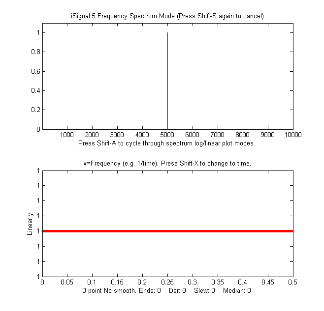
A pure sine or cosine wave that has an exactly integral number of
cycles within the recorded signal will have a single non-zero Fourier component corresponding
to its frequency. Conversely, a signal consisting of zeros
everywhere except at a single point, called a delta function,
has equal Fourier components
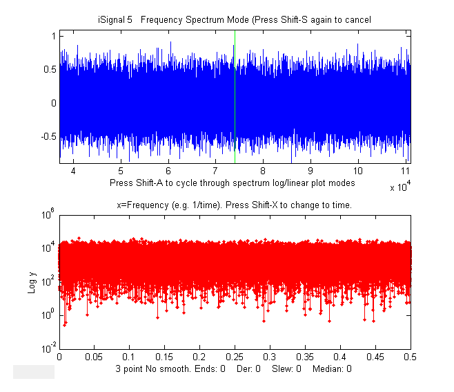
at all frequencies. Random noise also has a power
spectrum that is spread out over a wide frequency range, but
shaped according to its noise
color, with pink noise having more power at low frequencies,
blue noise having more power at high frequencies, and white noise
having roughly the same power at
all frequencies. For periodic waveforms that repeat over
time, a single period is the smallest repeating unit of the
signal, and the reciprocal of that period is called the fundamental
frequency. Non-sinusoidal periodic waveforms exhibit a
series of frequency components that are multiples of the
fundamental frequency; these are called "harmonics".
 A familiar example of a periodic signal is
the electrical recording of a heartbeat, call an electrocardiograph
(ECG), which consists of a highly repeatable series of
waveforms, as in the real data example on the left, which shows a
fundamental frequency of 0.6685 Hz with multiple harmonics
at frequencies that are x2,
x3, x4..., etc, times the
fundamental frequency. The waveform is shown in blue in the top
panel and its frequency spectrum is shown in red in the bottom
panel. The fundamental and the harmonics are sharp peaks, labeled
with their frequencies. The spectrum is qualitatively similar to
what is obtained for perfectly
regular identical peaks.
A familiar example of a periodic signal is
the electrical recording of a heartbeat, call an electrocardiograph
(ECG), which consists of a highly repeatable series of
waveforms, as in the real data example on the left, which shows a
fundamental frequency of 0.6685 Hz with multiple harmonics
at frequencies that are x2,
x3, x4..., etc, times the
fundamental frequency. The waveform is shown in blue in the top
panel and its frequency spectrum is shown in red in the bottom
panel. The fundamental and the harmonics are sharp peaks, labeled
with their frequencies. The spectrum is qualitatively similar to
what is obtained for perfectly
regular identical peaks.
Recorded vocal sounds, especially vowels, also have a periodic waveform with harmonics.
(The
sharpness of the peaks in these spectra shows that the
amplitude and the frequency are very constant over the
recording interval in this example. Changes
in amplitude or frequency over the recording interval will
produce clusters or bands of
Fourier
components rather than sharp peaks,
as in this example).
Another familiar example of periodic change is the seasonal
variation in temperature, for example the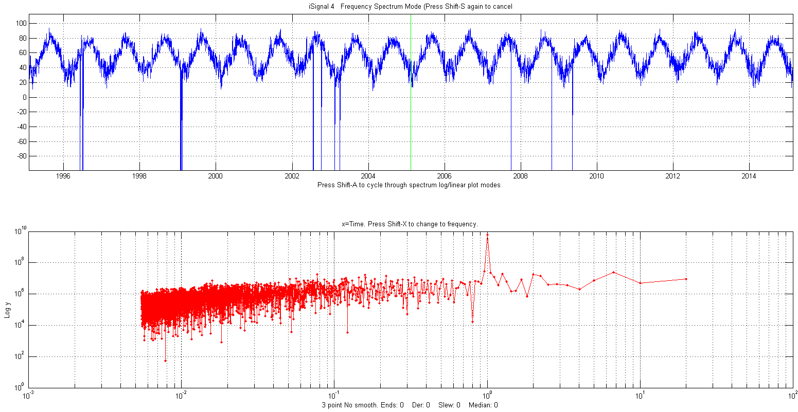 average daily
temperature measured in New York City between 1995 and 2015,
shown in the figure on the right. (The negative spikes are missing
data points - power outages?) In this example the spectrum in the
lower panel is plotted with time (the reciprocal of
frequency) on the x-axis (called a periodogram)
which, despite the considerable random noise due to local
weather variations and missing data, shows the expected peak at
exactly 1 year; that peak is sharp because the
periodicity is extremely (in fact, astronomically) precise. In
contrast, the random noise is not periodic and is spread
out roughly equally over the entire periodogram.
average daily
temperature measured in New York City between 1995 and 2015,
shown in the figure on the right. (The negative spikes are missing
data points - power outages?) In this example the spectrum in the
lower panel is plotted with time (the reciprocal of
frequency) on the x-axis (called a periodogram)
which, despite the considerable random noise due to local
weather variations and missing data, shows the expected peak at
exactly 1 year; that peak is sharp because the
periodicity is extremely (in fact, astronomically) precise. In
contrast, the random noise is not periodic and is spread
out roughly equally over the entire periodogram.
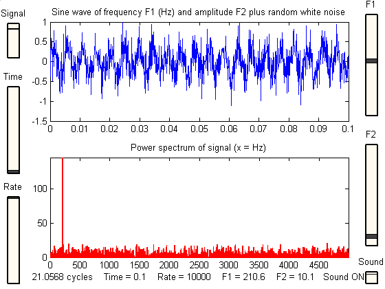
The figure on the right is a
simulation that shows how hard it is to see a periodic component
in the presence of random noise, and yet how easy it is to pick it
out in the frequency spectrum. In this example, the signal (top
panel) contains an equal mixture of random white noise and
a single sine wave; the sine wave is almost completely obscured by
the random noise. The frequen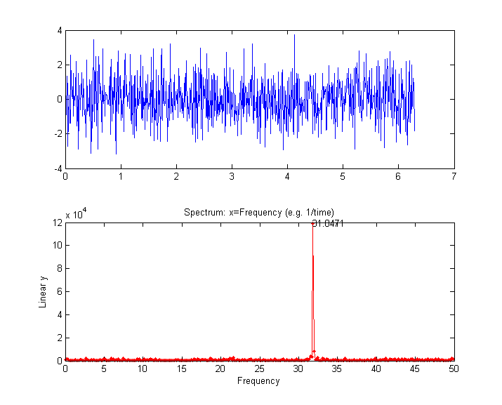 cy spectrum (created
using the downloadable Matlab/Octave function "PlotFrequencySpectrum") is
shown in the bottom panel. The frequency spectrum of the white
noise is spread out evenly over the entire spectrum, whereas the
sine wave is concentrated into a single spectral element,
where it stands out clearly. Here is the Matlab/Octave code that
generated that figure; you can Copy and Paste it into
Matlab/Octave:
cy spectrum (created
using the downloadable Matlab/Octave function "PlotFrequencySpectrum") is
shown in the bottom panel. The frequency spectrum of the white
noise is spread out evenly over the entire spectrum, whereas the
sine wave is concentrated into a single spectral element,
where it stands out clearly. Here is the Matlab/Octave code that
generated that figure; you can Copy and Paste it into
Matlab/Octave:
x=[0:.01:2*pi]';
y=sin(200*x)+randn(size(x));
subplot(2,1,1);
plot(x,y);
subplot(2,1,2);
PowerSpectrum=PlotFrequencySpectrum(x,y,1,0,1);
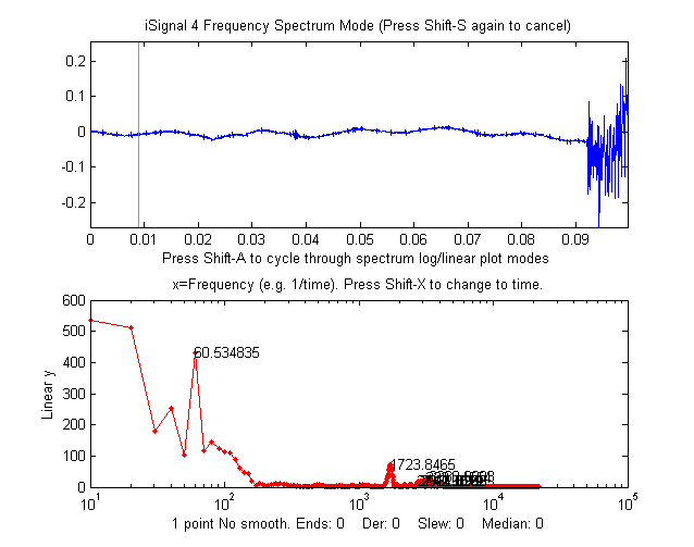
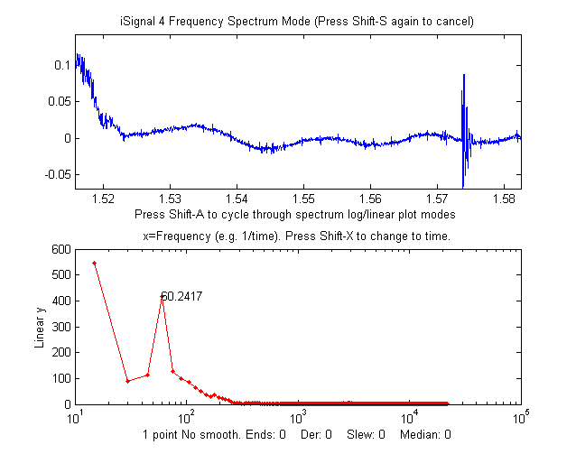
Data from an
audio recording, zoomed in to the period immediately before
(left) and after (right) the actual sound, shows a regular
sinusoidal oscillation
(x = time in seconds). In the lower panel,
the power spectrum of each signal (x =
frequency in Hz) shows a strong sharp peak very near 60 Hz,
suggesting that the oscillation is caused by stray pick-up
from the 60
Hz power line in the USA (it would be 50 Hz had the
recording been made in Europe). Improved shielding and
grounding of the equipment might reduce this interference.
The "before" spectrum,
on the left, has a frequency resolution of only 10 Hz (the
reciprocal of the recording time of about 0.1 seconds) and
it includes only about 6 cycles of the 60 Hz frequency
(which is why that peak in the spectrum is the 6th point);
to achieve a better resolution you would have had to have
begun the recording earlier, to achieve a longer recording.
The "after" spectrum, on the right, has an even shorter
recording time and thus a poorer frequency resolution.
 |
 |
 An
example of a time series with complex multiple periodicity is the
world-wide daily page views (x=days,
y=page views) for this web site
over a 2070-day period (about 5.5 years). In
the periodogram plot (shown on the left) you can clearly see
at sharp peaks at 7 and 3.5 days, corresponding to the first and
second harmonics of the expected workday/weekend cycle, and
smaller peaks at 365 days (corresponding to a sharp dip each year
during the winter holidays) and at 182 days (roughly a half-year),
probably caused by increased use in the two-per-year semester
cycle at universities. (The large values at the longest times are
caused by the gradual increase in use over the entire data record,
which can be thought of as a very low-frequency component whose
period is much longer that the entire data record).
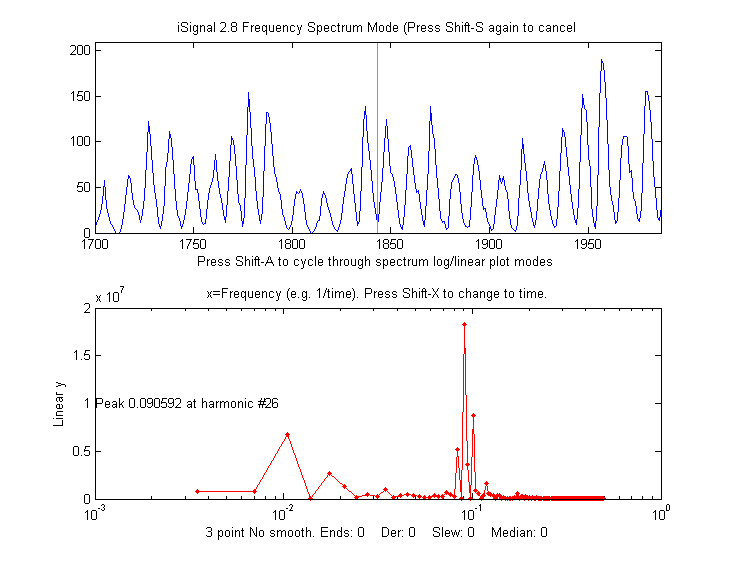
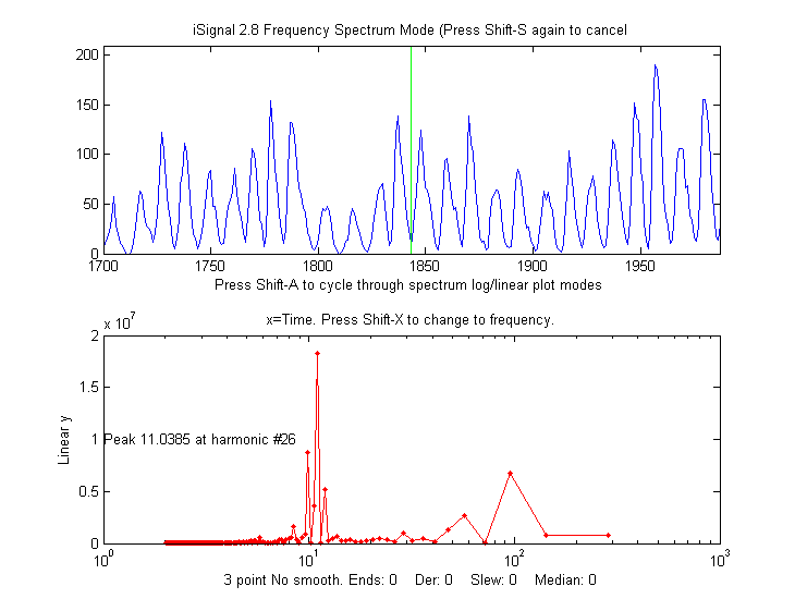
An
example of a time series with complex multiple periodicity is the
world-wide daily page views (x=days,
y=page views) for this web site
over a 2070-day period (about 5.5 years). In
the periodogram plot (shown on the left) you can clearly see
at sharp peaks at 7 and 3.5 days, corresponding to the first and
second harmonics of the expected workday/weekend cycle, and
smaller peaks at 365 days (corresponding to a sharp dip each year
during the winter holidays) and at 182 days (roughly a half-year),
probably caused by increased use in the two-per-year semester
cycle at universities. (The large values at the longest times are
caused by the gradual increase in use over the entire data record,
which can be thought of as a very low-frequency component whose
period is much longer that the entire data record).
 Analysis of
the frequency spectra of signals provides another way to
understand signal-to-noise ratio, filtering, smoothing, and differentiation. Smoothing is a
form of low-pass filtering, reducing the high-frequency
components of a signal. If a signal consists of smooth features,
such as Gaussian peaks, then its spectrum will be concentrated
mainly at low frequencies. The wider the width of the
peak, the more concentrated the frequency spectrum will be at low
frequencies (see animated picture on the right). If that signal is
contaminated with white noise (spread out evenly over all
frequencies), then smoothing will make the signal look better,
because it reduces the high-frequency components of the noise.
However, the low-frequency noise will remain in the signal after
smoothing, where it will continue to interfere with the
measurement of signal parameters such as peak heights, positions,
widths, and areas. This can be demonstrated by
least-squares measurement.
Analysis of
the frequency spectra of signals provides another way to
understand signal-to-noise ratio, filtering, smoothing, and differentiation. Smoothing is a
form of low-pass filtering, reducing the high-frequency
components of a signal. If a signal consists of smooth features,
such as Gaussian peaks, then its spectrum will be concentrated
mainly at low frequencies. The wider the width of the
peak, the more concentrated the frequency spectrum will be at low
frequencies (see animated picture on the right). If that signal is
contaminated with white noise (spread out evenly over all
frequencies), then smoothing will make the signal look better,
because it reduces the high-frequency components of the noise.
However, the low-frequency noise will remain in the signal after
smoothing, where it will continue to interfere with the
measurement of signal parameters such as peak heights, positions,
widths, and areas. This can be demonstrated by
least-squares measurement.  Conversely,
differentiation is a form of high-pass filtering, reducing
the low frequency components of a signal and emphasizing
any high-frequency components present in the signal. A
simple computer-generated Gaussian peak (shown by the animation on
the left) has most of its power concentrated in just a few low
frequencies, but as successive orders of differentiation are
applied, the waveform of the derivative swings from positive to
negative like a sine wave, and its frequency spectrum shifts
progressively to higher frequencies, as shown in the animation on
the left. This behavior is typical of any signal with smooth peaks.
So the optimum range for signal information of a differentiated
signal is restricted to a relatively narrow range, with
little useful information above and below that range.
Conversely,
differentiation is a form of high-pass filtering, reducing
the low frequency components of a signal and emphasizing
any high-frequency components present in the signal. A
simple computer-generated Gaussian peak (shown by the animation on
the left) has most of its power concentrated in just a few low
frequencies, but as successive orders of differentiation are
applied, the waveform of the derivative swings from positive to
negative like a sine wave, and its frequency spectrum shifts
progressively to higher frequencies, as shown in the animation on
the left. This behavior is typical of any signal with smooth peaks.
So the optimum range for signal information of a differentiated
signal is restricted to a relatively narrow range, with
little useful information above and below that range. 
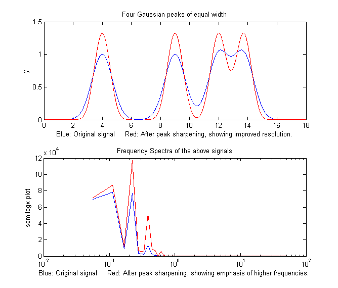
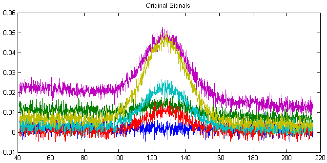 Working together, smoothing and
differentiation act as a kind of frequency-selective bandpass
filter that optimally passes the band of frequencies
containing the differentiated signal information but reduces both
the lower-frequency effects, such as slowly-changing drift
and background, as well as the high-frequency noise. An
example of this can be seen in the DerivativeDemo.m
described in a previous
section. In the set of six original signals, shown on the
right, the random noise occurs mostly in a high frequency range,
with many cycles over the x-axis range, and the baseline
shift occurs mostly in a much lower-frequency phenomenon, with
only a small fraction of one cycle occurring over that
range. In contrast, the peak of interest, in the center of the
x-range, occupies an intermediate frequency range, with a few
cycles over that range. Therefore we could predict that a
quantitative measure based on differentiation and smoothing might
work well, as was shown previously.
Working together, smoothing and
differentiation act as a kind of frequency-selective bandpass
filter that optimally passes the band of frequencies
containing the differentiated signal information but reduces both
the lower-frequency effects, such as slowly-changing drift
and background, as well as the high-frequency noise. An
example of this can be seen in the DerivativeDemo.m
described in a previous
section. In the set of six original signals, shown on the
right, the random noise occurs mostly in a high frequency range,
with many cycles over the x-axis range, and the baseline
shift occurs mostly in a much lower-frequency phenomenon, with
only a small fraction of one cycle occurring over that
range. In contrast, the peak of interest, in the center of the
x-range, occupies an intermediate frequency range, with a few
cycles over that range. Therefore we could predict that a
quantitative measure based on differentiation and smoothing might
work well, as was shown previously. There are several
Web sites that can compute Fourier transforms interactively
(e.g. WolframAlpha).
Matlab and Octave have
built-in functions for computing the Fourier transform (fft and ifft). These
function express their results as complex numbers. For example, if
we compute the Fourier transform of a simple 3-element vector, we
get 3-element result of complex numbers: time-segmented
Fourier power spectrum, also known as a "Short-Time Fourier
transform (STFT)". It breaks y into 'NumSegments' equal-length
segments, computes the power spectrum of each segment, and plots the
result of the first 'MaxHarmonic' Fourier components as a contour
plot. If the number of segments and of data points is such that the
last segment is incomplete, it is discarded. The function returns
the power spectrum matrix (time-frequency-amplitude) as a matrix of
size (NumSegments x
MaxHarmonic). If logmode=1, it computes and plots the base10
logarithm of the amplitudes, and displays the matrix as a contour
plot, with yellow representing higher amplitudes and green and blue
lower amplitudes. Typing "mesh(PSM)" shows the 3-D mesh plot
of the power spectrum matrix, which can be rotated by dragging the
pointer.
Examples in
the help file include the spectrum of a passing
automobile
horn and of a brief
sample
of human speech shown on the left.
time-segmented
Fourier power spectrum, also known as a "Short-Time Fourier
transform (STFT)". It breaks y into 'NumSegments' equal-length
segments, computes the power spectrum of each segment, and plots the
result of the first 'MaxHarmonic' Fourier components as a contour
plot. If the number of segments and of data points is such that the
last segment is incomplete, it is discarded. The function returns
the power spectrum matrix (time-frequency-amplitude) as a matrix of
size (NumSegments x
MaxHarmonic). If logmode=1, it computes and plots the base10
logarithm of the amplitudes, and displays the matrix as a contour
plot, with yellow representing higher amplitudes and green and blue
lower amplitudes. Typing "mesh(PSM)" shows the 3-D mesh plot
of the power spectrum matrix, which can be rotated by dragging the
pointer.
Examples in
the help file include the spectrum of a passing
automobile
horn and of a brief
sample
of human speech shown on the left.


In the next example below, the signal is a pair of Lorentzian
peaks which are initially completely obscured by a strongly
periodic noise source that causes a rough peak in the frequency
spectrum (bottom panel). As the smooth width increases, the actual
signal gradually emerges from the noise, but if the smooth width
is too great, the peaks are broadened and shortened.

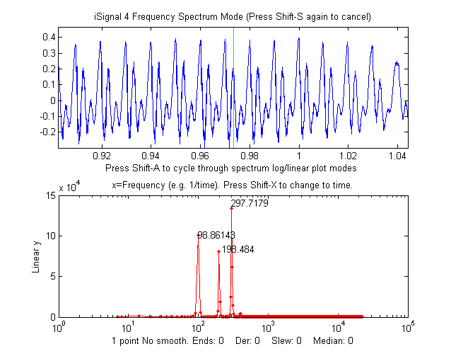
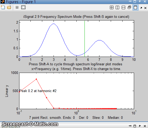
 |
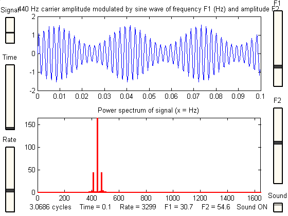
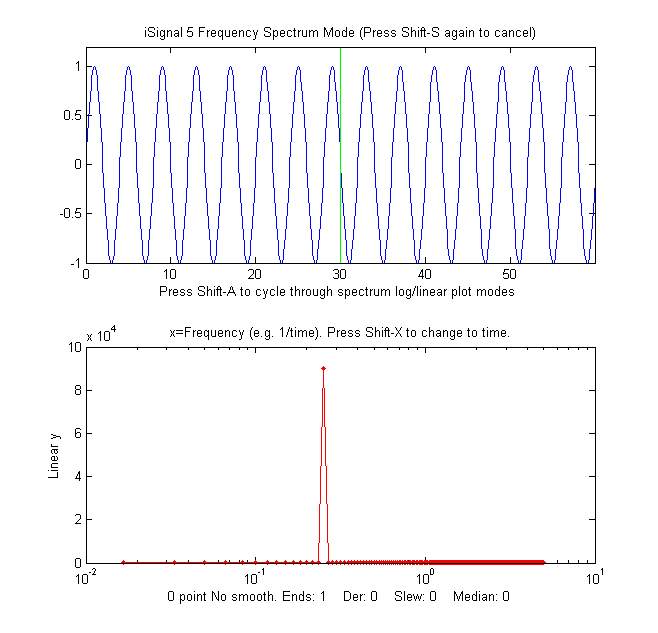
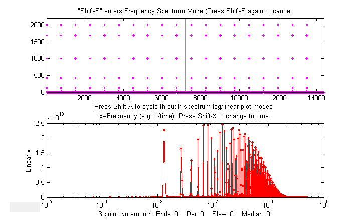
iPower: Keyboard-controlled
interactive
power spectrum demonstrator,
useful for teaching and learning about the
power spectra of different types of signals
and the effect of signal duration and sampling
rate. Single keystrokes allow you to select
the type of signal (12 different signals
included), the total duration of the signal,
the sampling rate, and the global variables f1
and f2 which are used in different ways in the
different signals. When the Enter key is
pressed, the signal (y) is sent to the Windows
WAVE audio device. Press K to see a
list of all the keyboard commands. Tested in
Matlab version 7.8 (R2009a). Click here to view or download. You can also download it from the Matlab File Exchange. KEYBOARD CONTROLS: Adjust
signal duration 10% up/down.........A,Z
Adjust sampling rate 10% up/down...........S,X Adjust first variable 10% up/down......... D,C Adjust second variable 10% up/down........ F,V Cycle through Linear/Log plot modes..........L Switch X-axis scale of power spectrum........H Print keyboard commands......................K Play signal as sound................Enter or P PRE-PROGRAMMED SIGNAL TYPES *Sine
wave, frequency f1 (Hz), phase f2
*Square wave, frequency f1 (Hz), phase f2 *Sawtooth wave, frequency Ff1(Hz) *Triangle wave, frequency f1 (Hz), phase f2 *Sine wave burst of frequency f1 (Hz) and length f2 sec *440 Hz carrier amplitude modulated by sine wave, frequency f1 (Hz) and amplitude f2 *440 Hz carrier frequency modulated by sine wave of frequency f1 (Hz) and amplitude f2 *Sine wave, frequency f1 (Hz), modulated with Gaussian of width f2 sec *Sine wave, frequency f1 (Hz) with non-linear transfer function f2 *Sine wave sweep from 0 to f1 (Hz) *Sine wave of frequency f1 (Hz) and amplitude f2 plus random white noise *Pink (1/f) noise *Sine wave, frequency f1 (Hz), amplitude f2 plus pink noise There is also an older slider-operated version (see left) for Matlab version 6.5. Click here to view or download. |

