Species richness
Goals
The design and structure of these data require a hierarchy of analyses with respect to the level of analysis, the response variable of choice, and the covariates of choice, and to the model structure.
The level of analysis means:
- across individuals:
- across transects (nested within individuals - but important to compare across)
- across locations (nested within transects - but possibly important to compare across individuals).
Response variables include:
- Species Richness (number of unique taxa present)
- Species Richness above some threshold of abundance
- A diversity index which combines number of taxa with relative abundances (e.g. Simpson’s index)
- Measures of similarity across sites (e.g. Bray-Curtis)
Relevant covariates include:
- transect (Arm X, Arm Y or Face)
- environmental covariates: Sebum, Temperature, Moisture, pH
- spatial structure (i.e. across locations and with spatial correlation)
There is a lot of similarity across the different kinds of analysis. In this document, we will focus on Number of Unique Taxa, and the distribution of Environmental Covariates at the Individual Level, with a focus on comparing Across Transects.
Preliminaries
Load the following three packages
require(magrittr)
require(plyr)
require(reshape2)
And load the data compiled at the end of Step1_Data.html.
load("../data/SMBT.rda")Unique Taxa
Counting function
The following function counts Taxa above a given abundance threshold:
countTaxa <- function(df, threshold = 0)
  with(df, c(n.UniqueTaxa = length(unique(Taxon[Relative_Abundance > threshold]))))
As an example, the total number of unique taxa is:
countTaxa(SMBT)## n.UniqueTaxa
## 491The total number across transects is:
ddply(SMBT, "Transect", countTaxa)And the figure below illustrates the number of unique taxa by transect as a function of the abundance threshold (log-log plot):
thresholds <- 10^(seq(-5,0,.1))
N.unique <- ddply(SMBT, "Transect", Vectorize(countTaxa, "threshold"), threshold = thresholds)[,-1]
matplot(x = thresholds, y = t(N.unique), type = "l", log = "x", lty = 1, lwd = 2,
        ylab = "Number of unique taxa", xlab = "minumum abundance")
legend("topright", col = 1:3, legend = unique(SMBT$Transect), lty = 1, lwd = 2, title = "Transect", bty = "n")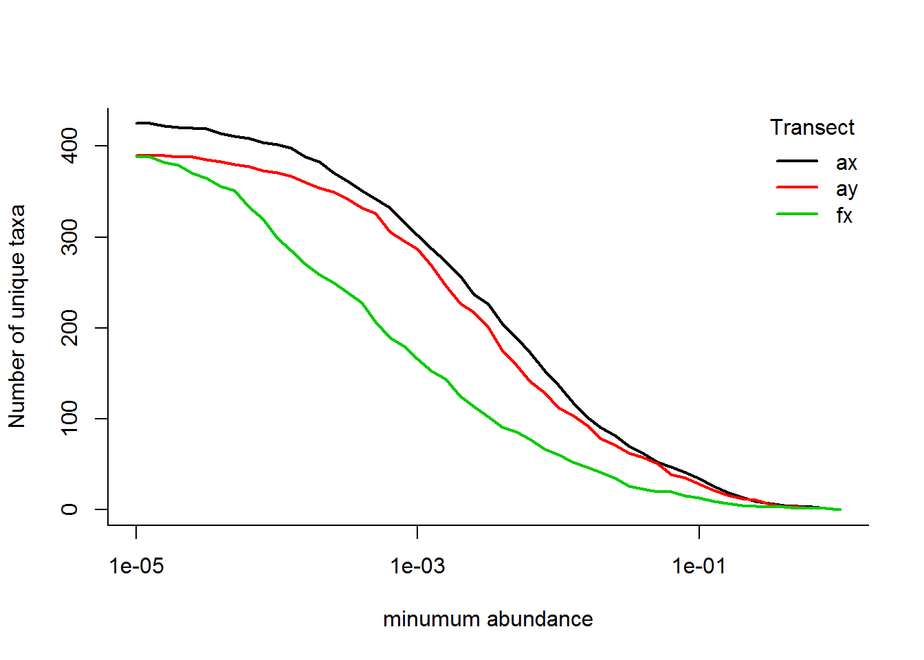
Or, in a variation, plotting the total species richnesss curve against the proportional number of species:
N.unique.rel <- N.unique/N.unique[,1]
matplot(x = thresholds, y = t(N.unique.rel), type = "l", log = "x", lty = 1, lwd = 2,
        ylab = "Proportion of unique taxa", xlab = "minumum abundance")
legend("topright", col = 1:3, legend = unique(SMBT$Transect), lty = 1, lwd = 2, title = "Transect", bty = "n")
abline(h = 0.5, lwd = 3, col = "grey", lty = 3)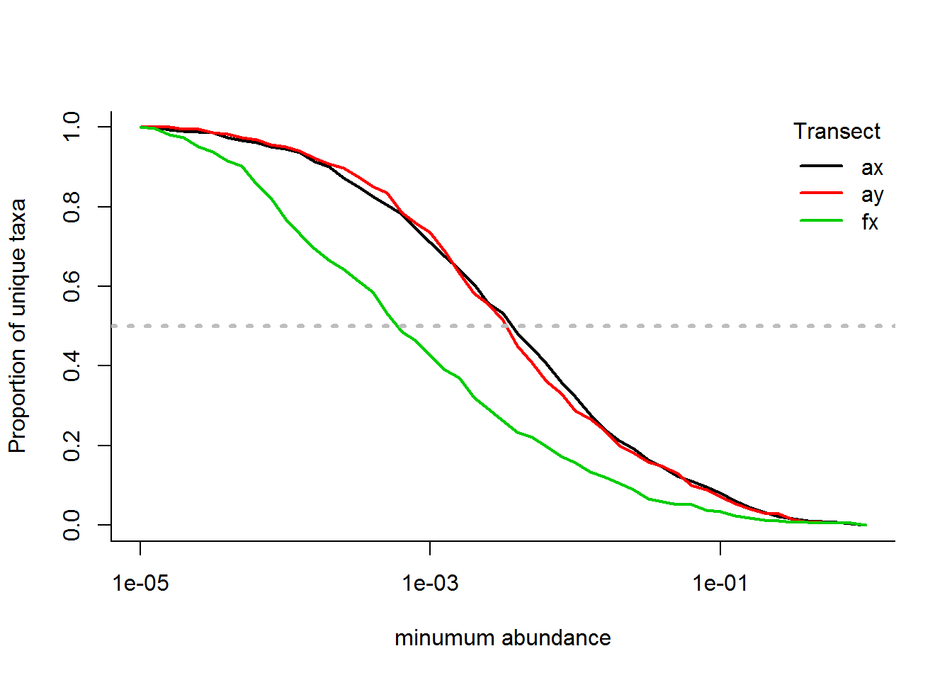
An interesting statistic is the abundance threshold which eliminates 50% of the taxa:
apply(N.unique.rel, 1, function(x) thresholds[which.min(abs(x - .5))])## [1] 0.0039810717 0.0031622777 0.0006309573i.e., 50% of the taxa occur at abundances less than 0.40%, 0.32% and 0.063%, respectively, for Arm-X, Arm-Y and Face-X. These might be useful empirical thresholds for cutting off “rare” species.
Richness across individuals
To ask the question How variable are people with respect to species richness of Skin Biomes?
Below, code to compute the individual-specific number of taxa.
d <- ddply(SMBT, c("Transect", "Person"), countTaxa) %>%
  mutate(Person = factor(Person))

d2 <- dcast(d, Transect  ~ Person) %>% mutate(Transect = as.character(Transect))
TotalUnique.ByPerson <- daply(SMBT, "Person", countTaxa)
TotalUnique.ByTransect <- daply(SMBT, "Transect", countTaxa)
TotalUnique <- countTaxa(SMBT)

d3 <- rbind(d2, c("Total",  TotalUnique.ByPerson)) %>%
  cbind(Total = c(TotalUnique.ByTransect, TotalUnique))

d3[is.na(d3)] <- '-'
d3
The following plot shows that (a) there is considerable variability among individuals in the number of taxa, and (b) that the number of taxa generally decreases from Arm X, Arm Y to Face X,
require(ggplot2)
ggplot(d, aes(Transect, n.UniqueTaxa)) + geom_boxplot(fill = "lightgrey", col = "darkgrey") +
  geom_point(aes(as.integer(Transect), n.UniqueTaxa, col = Person)) +
geom_path(aes(as.integer(Transect), n.UniqueTaxa, col = Person)) + theme_bw()![]()
Statistics
Fitting a linear model with both transect and person as explanatory covariates:
n.Taxa.byLocation <- ddply(SMBT, c("Transect", "Person", "Location"), countTaxa) %>%
  mutate(Person = factor(Person))
n.Taxa.lm <- lm(n.UniqueTaxa ~ Transect * Person, data = n.Taxa.byLocation)
anova(n.Taxa.lm)
SS <- anova(n.Taxa.lm)[,2]
variables <- row.names(anova(n.Taxa.lm))
barplot(prop.table(SS[1:4]), beside = FALSE,
names.arg = variables, main = "Proportion variance explained",
col = c("red","blue","purple","grey"))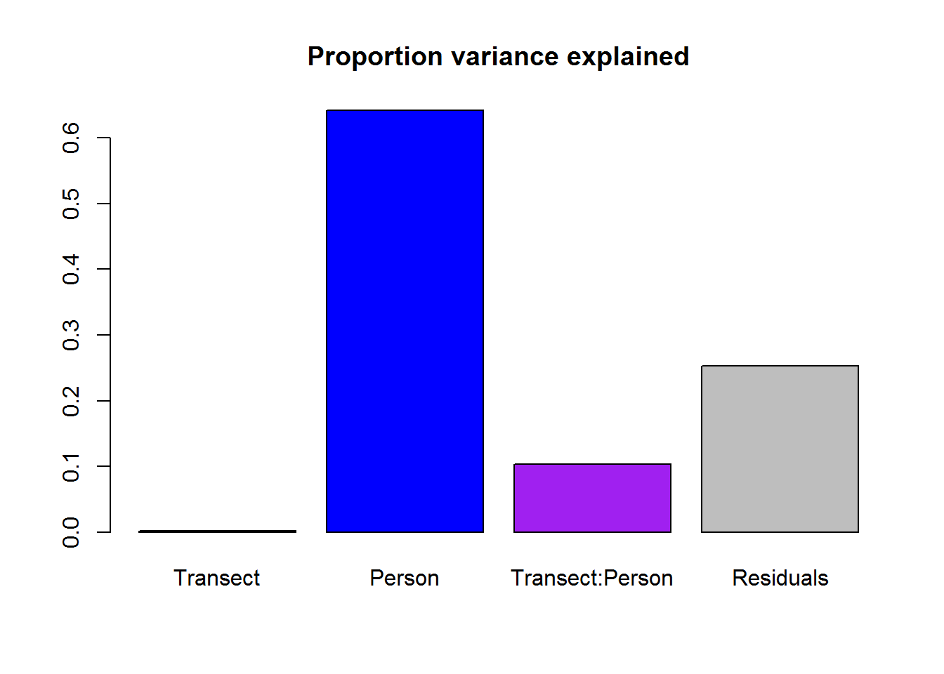
Most of the variation is among individuals, with about 10% explained by differnces individual specific differences among transects.
Person level mixed effects model
The more parsimonious way to model this is with person as a random effect:
require(nlme)
n.Taxa.byID <- ddply(SMBT, c("Transect", "Person"), countTaxa)
n.Taxa.lme <- lme(n.UniqueTaxa ~ Transect - 1, random = ~ 1|Person,
                  data = n.Taxa.byID,
                  method = "ML")
summary(n.Taxa.lme)
## Linear mixed-effects model fit by maximum likelihood
## Data: n.Taxa.byID
## AIC BIC logLik
## 636.2034 647.2269 -313.1017
##
## Random effects:
## Formula: ~1 | Person
## (Intercept) Residual
## StdDev: 28.42325 17.77621
##
## Fixed effects: n.UniqueTaxa ~ Transect - 1
## Value Std.Error DF t-value p-value
## Transectax 145.5279 7.168993 40 20.29963 0
## Transectay 124.4803 7.168993 40 17.36371 0
## Transectfx 111.7200 6.860194 40 16.28525 0
## Correlation:
## Trnsctx Trnscty
## Transectay 0.693
## Transectfx 0.688 0.688
##
## Standardized Within-Group Residuals:
## Min Q1 Med Q3 Max
## -2.355749088 -0.479920393 0.003473955 0.468645884 2.628473642
##
## Number of Observations: 67
## Number of Groups: 25Here’s a fit where the random effect of person depends on the transect, which (according to AIC) is slightly better:
n.Taxa.lme.interaction <- lme(n.UniqueTaxa ~ Transect - 1,
                              random = ~ Transect|Person,
                              data = n.Taxa.byID, method = "ML")
AIC(n.Taxa.lme, n.Taxa.lme.interaction)
There is no difference in the main conclusions: There is a significant difference among transects:
summary(n.Taxa.lme.interaction)$tTable## Value Std.Error DF t-value p-value
## Transectax 145.5270 7.112967 40 20.45940 8.507426e-23
## Transectay 124.4793 6.144126 40 20.25989 1.217302e-22
## Transectfx 111.7200 7.714355 40 14.48209 1.682289e-17With considerable individual level variation:
VarCorr(n.Taxa.lme.interaction)## Person = pdLogChol(Transect)
## Variance StdDev Corr
## (Intercept) 1016.4023 31.881065 (Intr) Trnscty
## Transectay 108.1570 10.399854 -0.555
## Transectfx 775.1043 27.840696 -0.248 0.592
## Residual 69.8904 8.360048i.e., the standard deviation among individuals within each transect is quite high (27 to 37). Note that the final “residual” randomness is down to only 7.7.
Location level mixed effects model
We could similarly model the location specific averages:
n.Taxa.byLocation <- ddply(SMBT, c("Transect", "Person", "Location"), countTaxa) %>%
  mutate(Person = factor(Person))

n.Taxa.LOC.lme <- lme(n.UniqueTaxa ~ Transect - 1, random = ~ 1|Person,
                  data = n.Taxa.byLocation,
                  method = "ML")
Rather interestingly, the differences in the number of unique taxa are much smaller at the location level:
summary(n.Taxa.LOC.lme)$tTable## Value Std.Error DF t-value p-value
## Transectax 55.92480 3.823303 540 14.62735 4.670966e-41
## Transectay 56.57207 3.895265 540 14.52329 1.394237e-40
## Transectfx 54.06371 3.844342 540 14.06319 1.684137e-38Though they are still significant:
anova(n.Taxa.LOC.lme)with, again considerable individual level variation:
VarCorr(n.Taxa.LOC.lme)## Person = pdLogChol(1)
## Variance StdDev
## (Intercept) 336.9177 18.35532
## Residual 206.0833 14.35560This result suggests that the much higher diversity (overall) on arms vs. face is explained by a less similar species composition across transects.
Environmental Covariates
Comparing across transects
The following code builds a compact summary table:
covariates <-  c("Moisture", "Temperature", "pH", "Sebum")
covars.byLocation <- SMBT[,c("Transect", "Person", "Location", covariates)] %>% na.omit %>% unique
And the following generates some boxplots
cols <- c("orange","red","lightblue")
for(f in covariates)
boxplot(covars.byLocation[,f] ~ Transect, ylab = "",
        data = covars.byLocation, main = f, xlab = "", xaxt = ifelse(f %in% c("Moisture", "Temperature"),"n","s"), col = cols)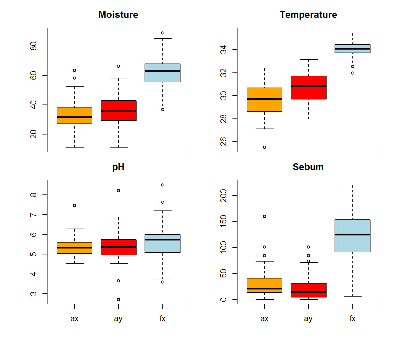
Or - with ggplot:
ggplot(melt(covars.byLocation, c("Transect", "Person", "Location")),
       aes(Transect, value, fill = Transect)) + geom_boxplot() + facet_wrap(.~variable, scales = "free_y")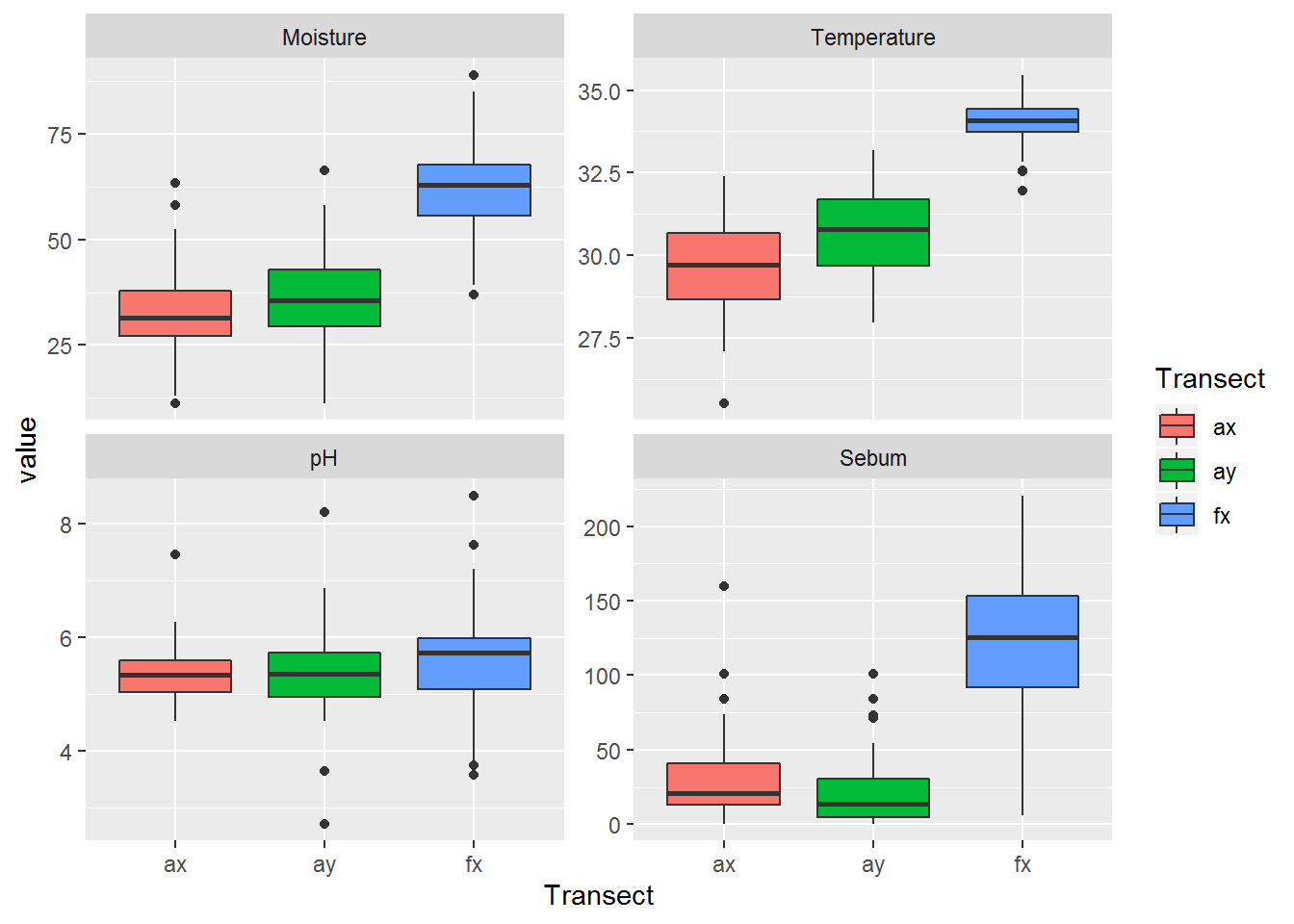
Foreheads are clearly hot, moist and greasy.
Paritioning variance
It is interesting to compare how much variation there is within individuals, and across transects for each of these variables. The following code computes that proportion variance explained by variability across individuals, across transects, in the interaction between the two, and across residuals:
n.Taxa.byLocation <- ddply(SMBT, c("Transect", "Person","Location"), countTaxa)
covars.byLocation <- SMBT[,c("Transect", "Person", "Location", covariates)] %>% na.omit %>% unique
data.byLocation <- merge(n.Taxa.byLocation, covars.byLocation, all.x = TRUE) %>%
  mutate(Person = factor(Person), Location = factor(Location))

data.byLocation$Person <- factor(data.byLocation$Person)

lm.list <- with(subset(data.byLocation, !is.na(Sebum)),
                list(n.Taxa = lm(n.UniqueTaxa ~ Person*Transect),
                     Sebum = lm(Sebum ~ Person*Transect),
                     Temperature = lm(Temperature ~ Person*Transect),
                     pH = lm(pH ~ Person*Transect),
                     Moisture = lm(Moisture ~ Person*Transect)))

anova.list <- lapply(lm.list, anova)
CovarPVE <- laply(lm.list, function(lm){
  PVE <- anova(lm)[,2] %>% prop.table
  names(PVE) <- row.names(anova(lm))
  PVE
  }) %>% t

colnames(CovarPVE) <- c("n.Taxa", covariates)

barplot(CovarPVE, col = c("blue", "red", "purple", "grey"),
        las = 1, bor = NA,
        ylab = "Proportion variance explained",
        legend.text = row.names(CovarPVE), xlim = c(-1,5.6),
        args.legend = list(ncol = 1, cex = 0.8, x = "topleft",
                           bg = rgb(1,1,1,.2), bty = "n"))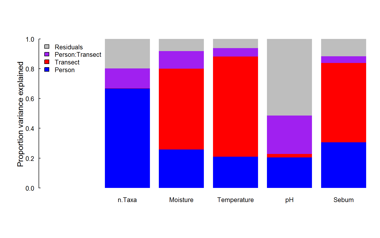
##                 n.Taxa Moisture Temperature pH Sebum
## Person              67       26          21 20    31
## Transect             0       54          67  2    53
## Person:Transect     13       12           6 26     4
## Residuals 20 8 6 51 12Note that in building this table, we (parsimoniously) limited the analysis only to those sites where the environmental variables were measured (much fewer than the complete set of transects).
It is notable that the inter-individual variation, which is so large for the total species diversity, is much lower for the other variables, where cross transect variability is quite high (in Moisture, Temperature and Sebum), or there is simply a high amount of randomness across locations and individual combinations (pH). This result already suggests that - probably - the ability of the covariates to explain variability in total species diversity will be somewhat limited.
Covariates vs. Taxa
We can combine the two data summaries to see if there is any relationship between covariates and diversity:
n.Taxa.byID <- ddply(SMBT, c("Transect", "Person"), countTaxa)

covariates <-  c("Moisture", "Temperature", "pH", "Sebum")
Covar.df <- SMBT[,c("Transect", "Person", "Location", covariates)] %>% na.omit %>% unique

covars.byID <- ddply(Covar.df, c("Transect", "Person"), summarize,
                S = mean(Sebum), S.sd = sd(Sebum),
                T = mean(Temperature), T.sd = sd(Temperature),
                pH = mean(pH), pH.sd = sd(pH),
                M = mean(Moisture), M.sd = sd(Moisture))

summary.byID <- merge(n.Taxa.byID, covars.byID)
The following plot (a “pairs” plot) provides a lot of information on the relationships between the covariates and diversity.
require(GGally); require(ggthemes)
ggpairs(summary.byID, aes(col = Transect), columns = c("n.UniqueTaxa","S", "T","pH","M")) + theme_few()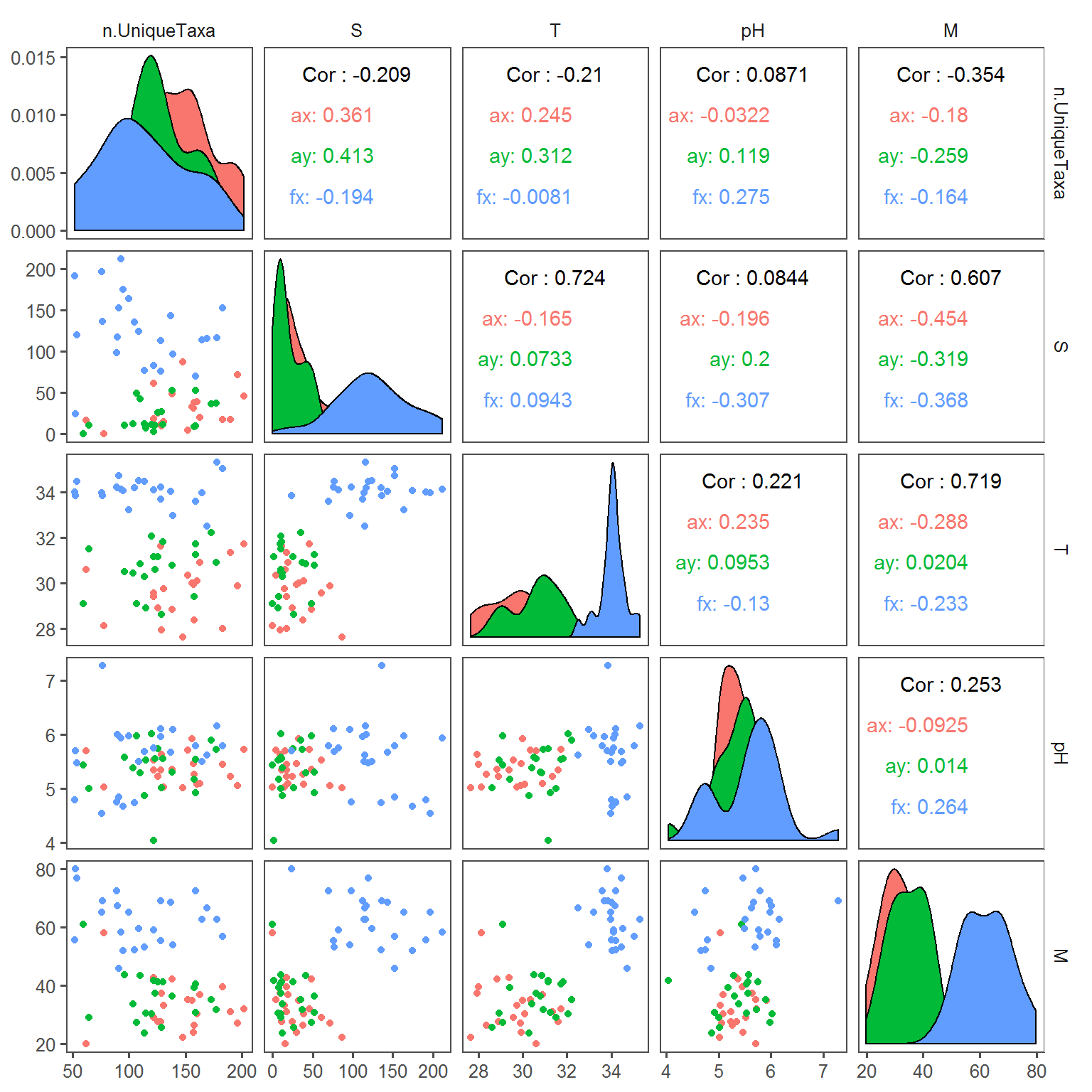
There is a lot of potentially interesting information here, e.g. species richness is positively correlated with higher Sebum on arms but not faces, but mainly negatively correlated with moisture. Environmental covariates are generally uncorrelated, with the exception of a negative relationship between Sebum and Moisture.
Below, we perform a modeling exercise where we use all of the environmental predictors and two-way interactions to predict the number of unique taxa.
We perform this analysis twice: Once on the location level, and once on the individual level:
Location level analysis
We’ll need the following packages:
require(nlme)
require(MuMIn)
Prep data:
n.Taxa.byLocation <- ddply(SMBT, c("Transect", "Person","Location"), countTaxa)
covars.byLocation <- SMBT[,c("Transect", "Person", "Location", covariates)] %>% na.omit %>% unique
data.byLocation <- merge(n.Taxa.byLocation, covars.byLocation, all.x = TRUE) %>%
  mutate(Person = factor(Person), Location = factor(Location))
Specify the following formula:
f <- n.UniqueTaxa ~ (Sebum + Temperature + pH + Moisture)^2Click on tabs to see tables and plots of model selection
AX dredge
ax.lme <- lme(f, random = ~1|Person, data = data.byLocation,
    subset = Transect == "ax" & !is.na(Sebum), method = "ML")
(ax.dredge <- dredge(ax.lme))
plot(ax.dredge)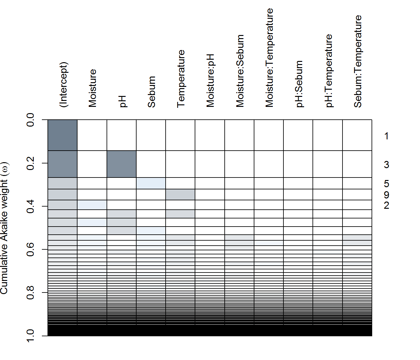
AY dredge
ay.lme <- lme(f, random = ~1|Person, data = data.byLocation,
    subset = Transect == "ay" & !is.na(Sebum), method = "ML")
(ay.dredge <- dredge(ay.lme))
plot(ay.dredge)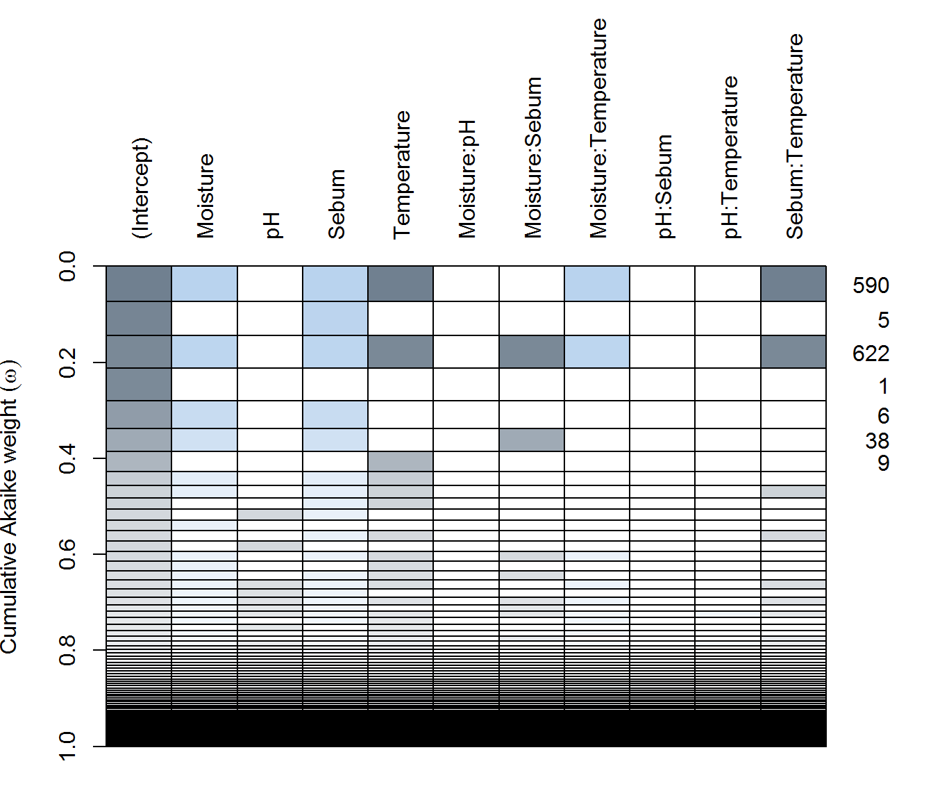
FX dredge
fx.lme <- lme(f, random = ~1|Person, data = data.byLocation,
              subset = Transect == "fx" & !is.na(Sebum), method = "ML")
(fx.dredge <- dredge(fx.lme))
plot(fx.dredge)
There are some major differences! In particular:
in AX - none of the predictors are particularly significant(!), with only the single pH (negative) effect included in a reasonably weighted model. Top models all habe very few degrees of freedom.
in AY - complex and simple models compete for top spots. #1 is includes Moisture (negative), Sebum (negative), and Temperature (negative) are all apparently significant, as are some two way interactions are in the best model. But #2 is a Sebum only (positive!) model is second best, while the null model is #4.
in FX - pH (positive!) and temperature (negative!) both seem to be the most significant predictors.
Parameter estimates
We can visualize these results by selecting a “best” model for each and standardizing the covariates for comparison. However, none of the most important main effects are, in fact, quite significant:
f <- n.UniqueTaxa ~ scale(Sebum) + scale(Temperature) + scale(Moisture) + scale(pH)

fitted.models <- list(
  AX = lme(n.UniqueTaxa ~ scale(pH), random = ~1|Person, data = data.byLocation,
           subset = Transect == "ax" & !is.na(Sebum)),
  AY = lme(n.UniqueTaxa ~ scale(Sebum) + scale(Moisture) + scale(Temperature), random = ~1|Person, data = data.byLocation,
           subset = Transect == "ay" & !is.na(Sebum)),
  FX =  lme(n.UniqueTaxa ~ scale(pH) + scale(Temperature), random = ~1|Person, data = data.byLocation,
            subset = Transect == "fx" & !is.na(Sebum)))
require(broom); require(ggthemes)
results <- ldply(fitted.models, tidy, effects = "fixed")
ggplot(results %>% subset(term != "(Intercept)") %>%
         mutate(p.value = cut(p.value, c(0, 0.05, 0.1, 1))),
       aes(estimate, term, col = p.value)) +
  geom_vline(xintercept = 0, col = "darkgrey") +
  geom_errorbarh(aes(xmin = estimate - 2*std.error, xmax = estimate + 2*std.error), lwd = 1, height = 0.3) + facet_wrap(.~.id)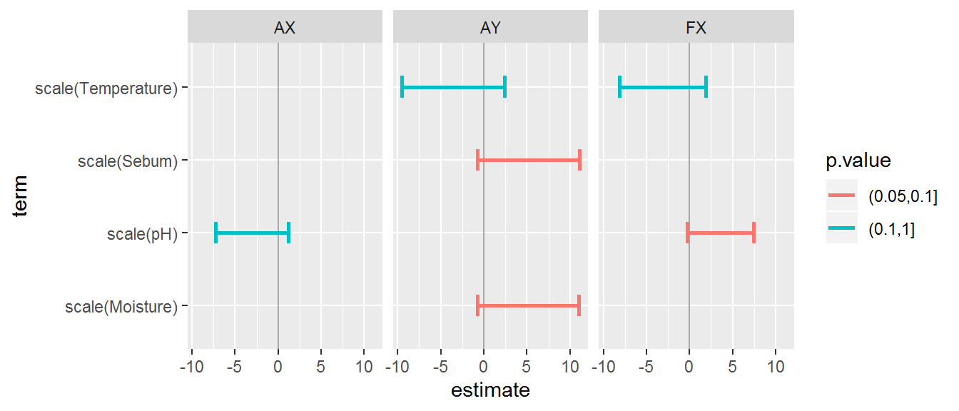
Individual level analysis
Prep data
n.Taxa.byID <- ddply(SMBT, c("Transect", "Person"), countTaxa)
covars.byID <- ddply(Covar.df, c("Transect", "Person"), summarize,
                S = mean(Sebum), S.sd = sd(Sebum),
                T = mean(Temperature), T.sd = sd(Temperature),
                P = mean(pH), pH.sd = sd(pH),
                M = mean(Moisture), M.sd = sd(Moisture))
data.byID <- merge(n.Taxa.byID, covars.byID) %>% mutate(Person = factor(Person))
Specify the following formula (note - shorter column names):
f <- n.UniqueTaxa ~ (S + T + P + M)^2Click on tabs to see tables and plots of model selection
AX dredge
ax.lm <- lm(f, data = data.byID, subset = Transect == "ax", na.action = "na.fail")
(ax.dredge <- dredge(ax.lm))
plot(ax.dredge)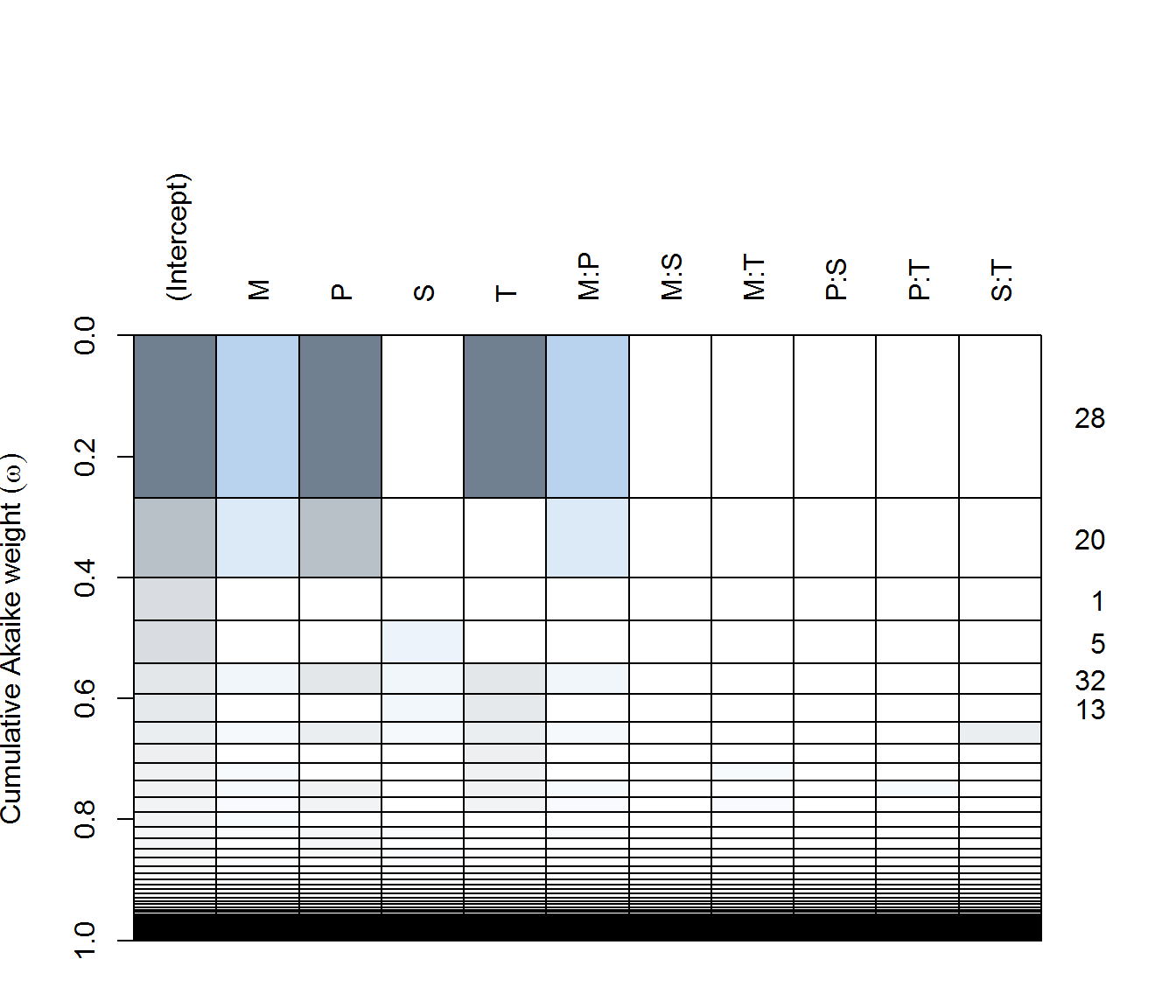
AY dredge
ay.lm <- lm(f, data = data.byID, subset = Transect == "ay", na.action = "na.fail")
(ay.dredge <- dredge(ay.lm))
plot(ay.dredge)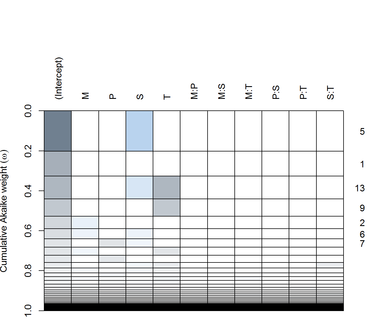
FX dredge
fx.lm <- lm(f, data = data.byID, subset = Transect == "fx", na.action = "na.fail")
(fx.dredge <- dredge(fx.lm))
plot(fx.dredge)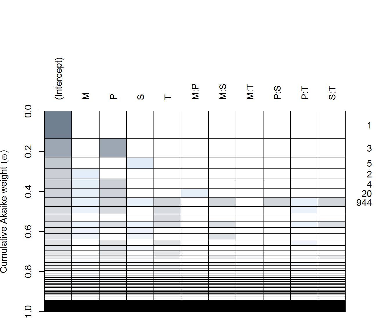
There are some major differences! In particular:
in AX - none of the predictors are particularly significant(!), with only the single pH (negative) effect included in a reasonably weighted model. Top models all have very few degrees of freedom.
in AY - complex and simple models compete for top spots. #1 is includes Moisture (negative), Sebum (negative), and Temperature (negative) are all apparently significant, as are some two way interactions are in the best model. But #2 is a Sebum only (positive!) model is second best, while the null model is #4.
in FX - pH (positive!) and temperature (negative!) both seem to be the most significant predictors.
Parameter estimates
And the best model parameter estimates:
fitted.models <- list(
  AX = lm(n.UniqueTaxa ~ scale(M) + scale(P) + scale(T) + scale(M):scale(P), data = data.byID,
           subset = Transect == "ax"),
  AY = lm(n.UniqueTaxa ~ scale(S), data = data.byID,
           subset = Transect == "ay"),
  FX =lm(n.UniqueTaxa ~ scale(P), data = data.byID,
            subset = Transect == "fx"))
require(broom); require(ggthemes)
results <- ldply(fitted.models, tidy, effects = "fixed")
ggplot(results %>% subset(term != "(Intercept)") %>%
         mutate(p.value = cut(p.value, c(0, 0.05, 0.1, 1))),
       aes(estimate, term, col = p.value)) +
  geom_vline(xintercept = 0, col = "darkgrey") +
  geom_errorbarh(aes(xmin = estimate - 2*std.error, xmax = estimate + 2*std.error), lwd = 1, height = 0.3) + facet_wrap(.~.id)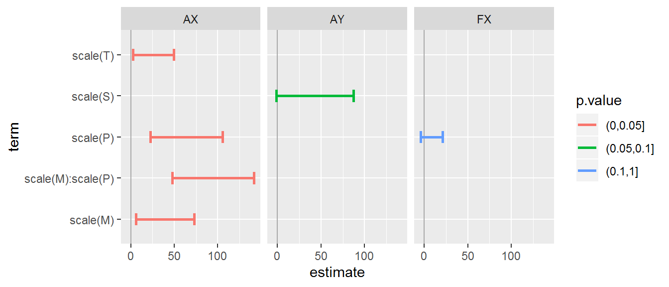
It’s a bit hard to make too much sense of these results! The contrast between Arm-X and Arm-Y is particularly striking, but in any case a relatively small amount of the variation is attributable to these covariates (at least linearly).