Visualizing Movement Data
Elie Gurarie and Silvia Alvarez
Introduction
Visualizing tracks is a first step in identifying possible patterns or errors, as well as potential explanations for them. You should try different kinds of plots depending on your data. The kinds of figures you make should also be tuned to your goals. For your own exploratory purposes, there’s no need to get too picky about formatting and esthetics and there’s a higher premium on simplicity of code. For presentation and publication purposes, it might be worth getting more fussy.
Here are some examples you can later modify and improve to better serve your research question or interests.
Load the processed moose data
We’ll work (mainly) with moose data that has already been processed in the ways described in Processing Data. That said, the raw data of the actual study is on MoveBank, and could be loaded as follows:
moose <- getMovebankData(study="ABoVE: Peters Hebblewhite Alberta-BC Moose", login=login)Here are (some of) the processed data:
load("./_data/moose.df.rda")
head(moose.df)## id nickname day.date time lon lat
## 1 179222573 M1 2009-03-08 2009-03-08 12:02:49 -119.9956 54.61333
## 2 179222573 M1 2009-03-09 2009-03-09 12:02:54 -120.0034 54.61424
## 3 179222573 M1 2009-03-10 2009-03-10 12:02:47 -120.0075 54.61564
## 4 179222573 M1 2009-03-11 2009-03-11 12:02:48 -120.0097 54.61492
## 5 179222573 M1 2009-03-12 2009-03-12 12:02:52 -120.0077 54.61534
## 6 179222573 M1 2009-03-13 2009-03-13 12:02:52 -120.0059 54.61548
## temp x y
## 1 -11.740833 306.5680 6055.888
## 2 -15.585833 306.0646 6056.011
## 3 -13.755833 305.8077 6056.178
## 4 -5.507500 305.6645 6056.104
## 5 3.464167 305.7941 6056.146
## 6 6.460000 305.9096 6056.156Note, the number of individual moose:
table(moose.df$nickname)##
## M1 M2 M3 M4 M5 M6 M7 M8 M9 M10 M11 M12 M13 M14 M15 M16 M17 M18
## 343 346 314 271 348 347 368 314 349 451 433 348 294 443 347 366 75 346Scanning track
We will start by exploring one individual. Lets pick the one with the most points:
which.max(table(moose.df$nickname))## M10
## 10A basic XY-plot of one eagle:
m10 <- subset(moose.df, nickname == "M10")
with(m10, plot(x,y,asp=1, type="o"))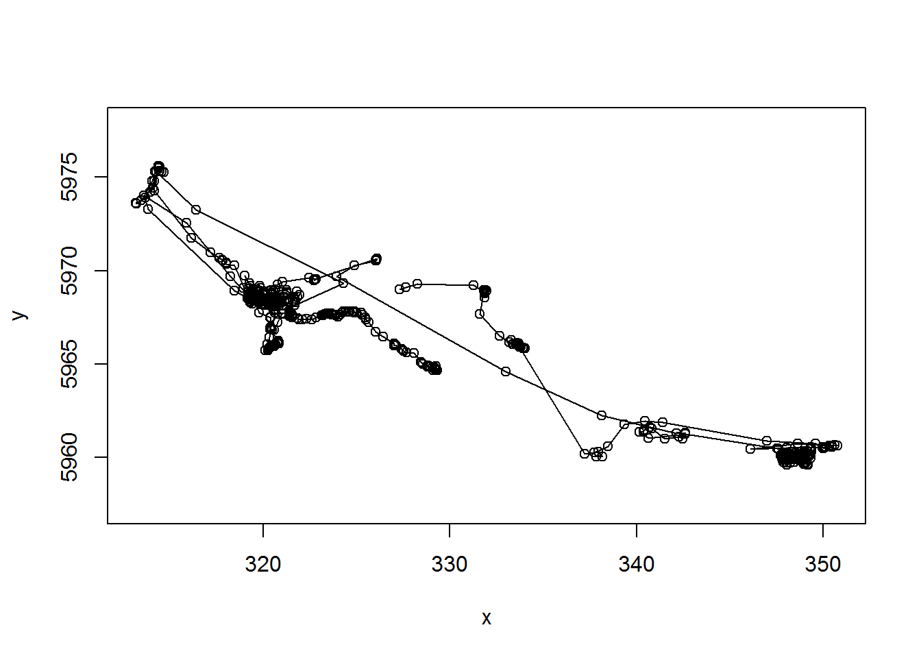
Note the very important asp=1 argument, that makes the aspect ratio between the x and y-axis 1.
What about time dimension? Here’s a way you can plot x and y coordinates as a function of time.
par(mar = c(0,4,0,0), oma = c(4,0,5,0), xpd=NA)
layout(rbind(c(1,2), c(1,3)))
with(m10, {
plot(x, y, asp = 1, type="o")
plot(time, x, type="o", xaxt="n", xlab="")
plot(time, y, type="o")
title(m10$nickname[1], outer=TRUE)
})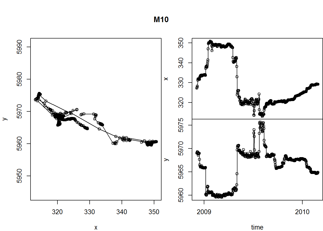
A few tricks here:
- the
layout()command helps “lay out” our three figures in an arrangement that echoes the matrix shape: 1 | 2 1 | 3 - The
par()commands control all graphical parameters, but here, in particular, the margins (mar) and the outer margins (oma). See?parfor more guidance.
This is a useful function, so let’s keep it around.
scan.track <- function(x,y,time, ...){
par(mar = c(0,4,0,0), oma = c(4,0,5,4), xpd=NA)
layout(rbind(c(1,2), c(1,3)))
plot(x, y, asp = 1, type="o", ...)
plot(time, x, type="o", xaxt="n", xlab="", ...)
plot(time, y, type="o", ...)
}R trick: the
...in the function definition allows us to pass any arguments we want to the functions inside thescan.trackfunction. We’re drawing curves - this way we can add colors, control width, etc., all from the “outside”.
Let’s test it:
with(subset(moose.df, nickname == "M2"),
scan.track(x,y,time,pch=19, col=rgb(1,0,0,.5), cex=0.5))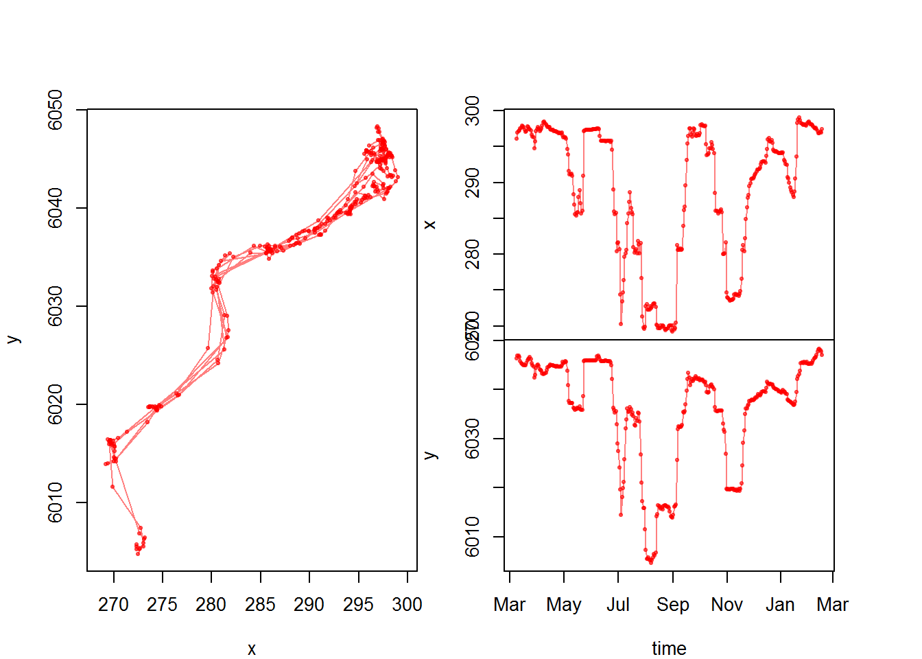
Now that we have a function, we might want to generate this plot for all individuals and save the output as a multi-page pdf. The following loop should do just that:
pdf("moosescans.pdf", width = 6, height = 3)
for(myname in levels(moose.df$nickname)){
me <- subset(moose.df, nickname == myname)
scan.track(me$x, me$y, me$time, pch=19, col=rgb(0,0,0,.5), cex=0.5)
title(myname, outer=TRUE)
}
dev.off() This will generate a pdf with all the moose (labeled).
Pseudo-animating a track
This is, in my opinion, the best way to animate a track, essentially by flipping through a multi-page pdf.
pdf("myanimation.pdf")
for(i in 1:nrow(m10)){
with(m10, {
plot(x,y, asp=1, type="l", col="grey")
lines(x[1:i], y[1:i], col="blue", cex=0.5, lwd=2)
points(x[i], y[i], pch=21, cex=2, col="lightblue")
title(paste(nickname[1], day.date[i]))
})
box()
}
dev.off()Basically, you loop through the data and plot only up to the ith point.
Mapping
Base graphics mapping
Recall base mapping. We can use the world map from the package ‘mapdata’ or from ‘maptools’ for a plot background. I am going to demonstrate this on long range eagle migration data (which is not on movebank). Note the structure of these data - similar, but a bit different from the moose.
load("./_data/eagles.df.rda")
str(eagles.df)## 'data.frame': 16914 obs. of 11 variables:
## $ ID : Factor w/ 4 levels "44787g","80422g",..: 1 1 1 1 1 1 1 1 1 1 ...
## $ Date : POSIXct, format: "2009-07-08" "2009-07-08" ...
## $ Time : num 8 9 10 11 12 13 14 16 6 8 ...
## $ Latitude : num NA 38.4 38.4 38.4 38.4 ...
## $ Longitude: num NA -1.01 -1.01 -1.01 -1.01 ...
## $ Speed : int 0 0 0 0 0 0 0 0 0 0 ...
## $ Course : int 164 122 200 192 73 190 322 329 68 31 ...
## $ Altitude : int 15 698 700 0 700 699 700 700 706 701 ...
## $ DateTime : POSIXct, format: "2009-07-08 00:00:08" "2009-07-08 00:00:09" ...
## $ X : num NA 149 149 149 149 ...
## $ Y : num NA 4253 4253 4253 4253 ...e <- subset(eagles.df, ID == ID[1])
require(mapdata) # also loads maps
require(maptools)
# using the maps function
lonlim = c(-20,10)
latlim = c(10,45)
par(mfrow=c(1,2))
#with mapdata
map("world", xlim = lonlim, ylim = latlim, fill=TRUE, col="lightgrey", bor="grey")
with(e, lines(Longitude, Latitude, pch=19, type="o", col=rgb(0,0,1,.3), cex=0.5))
title("`world` in `maps`")
box()
# using the wrld_simpl data in maptools
data(wrld_simpl)
plot(wrld_simpl, ylim=latlim, xlim=lonlim, col="lightgray", border="gray", axes=F)
with(e, lines(Longitude, Latitude, pch=19, type="o", col=rgb(0,0,1,.3), cex=0.5))
title("`wrld_simpl` in `maptools`")
box()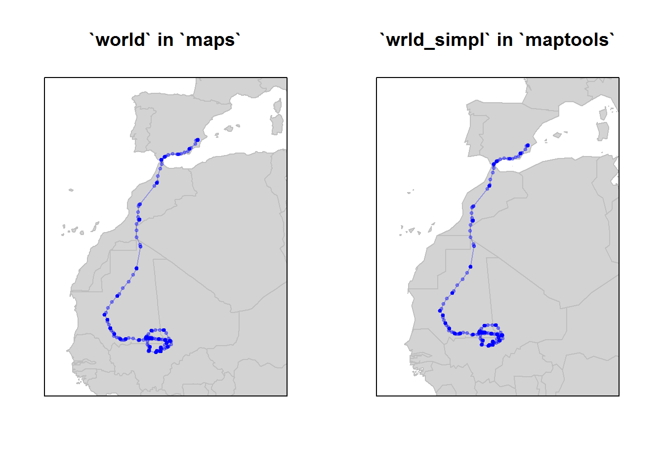
They are quite similar, but world_simpl is an updated dataset on country boundaries.
We can plot the movement track for all eagles on the map using ddply().
require(scales) #this includes some useful plotting functions
ids <- levels(eagles.df$ID)
map("world", xlim = c(-20,10), ylim = c(10,45), fill=TRUE, col="lightgrey", bor="grey")
dlply(eagles.df, "ID", function(e){
with(e, lines(Longitude, Latitude, pch=19, type="o",
col=alpha(match(ID[1], ids), 0.5), cex=0.5))
return(NULL)})
legend("bottomright", legend=ids, col=1:length(ids), pch=19, cex=0.8, bty="n")
box()The biggest trick here is the awkward col = match(ID[1], ids) command , which is saying: match the ID of this eagle (e$ID[1] = XXXX) to the list of IDs (ids = ``X ids). The alpha() just makes the colors a little bit transparent. Note the legend command.
ggplots and ggmaps
A lot of the akwardness of the above code is made simpler using ggplots, which is a whole different way to think about graphics which you’ll have to learn about yourself. For some things, it can be very efficient.
Here’s a ggplot (of the moose) with no maps:
require(ggplot2)
ggplot(moose.df, aes(x=x, y=y, col=nickname)) + geom_path(alpha = 0.5) + geom_point(alpha = 0.5) + coord_fixed()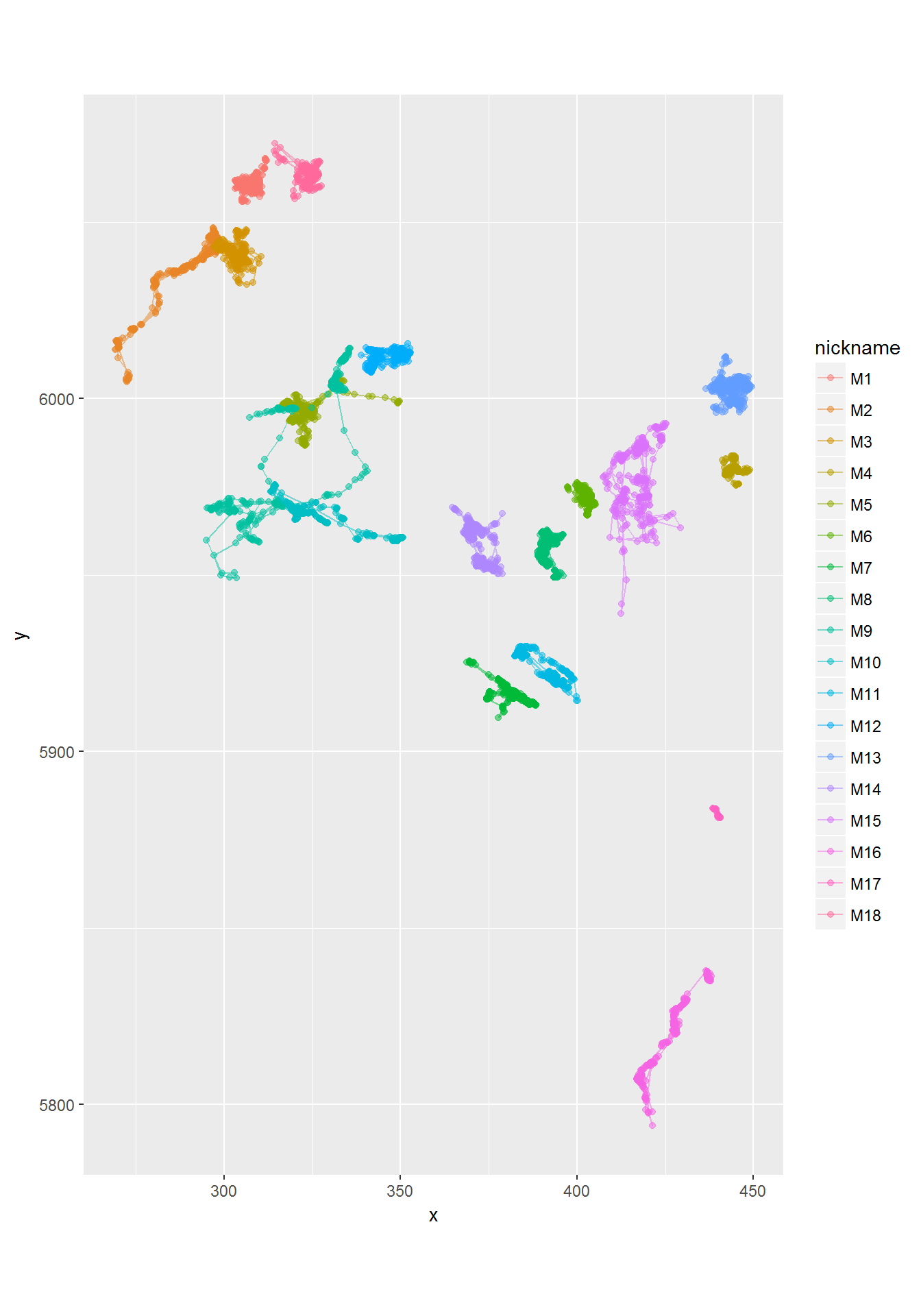
See how the alpha command is buried inside of the point and path geometries. The coord_fixed is equivalent to asp = 1. The best feature of ggplot is the automatic labeling.
There is a great package called ggmap with allows us to use google and other map sources to improve our plots. We will use google maps, available through the package ‘ggmap’. There are several steps here:
- Obtain a “basemap” - which is downloaded from Google, and require a range
require(ggmap)
latrange <- range(moose.df$lat) + c(-.5,.5)
longrange <- range(moose.df$lon) + c(-.5,.5)
moose.map <- get_map(location = c(longrange[1], latrange[1], longrange[2], latrange[2]), maptype = "terrain", source="google")THere are lots of options for the maptype, e.g. “terrain”, “satellite”, “roadmap”, “hybrid”. The coice depends on the information you want to communicate (and how much you want to foreground your tracks).
Note: if you are using the ‘move’ package (data is a Move object), you can use the
bbox()command to automatically obtain the bounding box of the data range code as follows:
require(move)
require(sp)
moose.map <- get_map(bbox(moose), source="google", maptype="satellite")- Now that we’ve downloaded the basemap, we can draw it with:
ggmap(moose.map)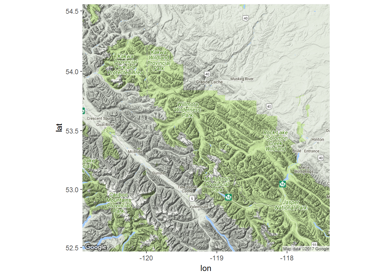
… and add ggplot syntax to add the tracks of the moose.
ggmap(moose.map) +
geom_point(data = moose.df, mapping = aes(x = lon, y = lat, col=nickname), alpha = 0.5, size=0.5) +
geom_path(data = moose.df, mapping = aes(x = lon, y = lat, col=nickname), alpha = 0.5, size=0.5) +
coord_map() + labs(x = "Longitude", y = "Latitude") +
scale_color_discrete(l = 30) +
guides(color=guide_legend(ncol=2))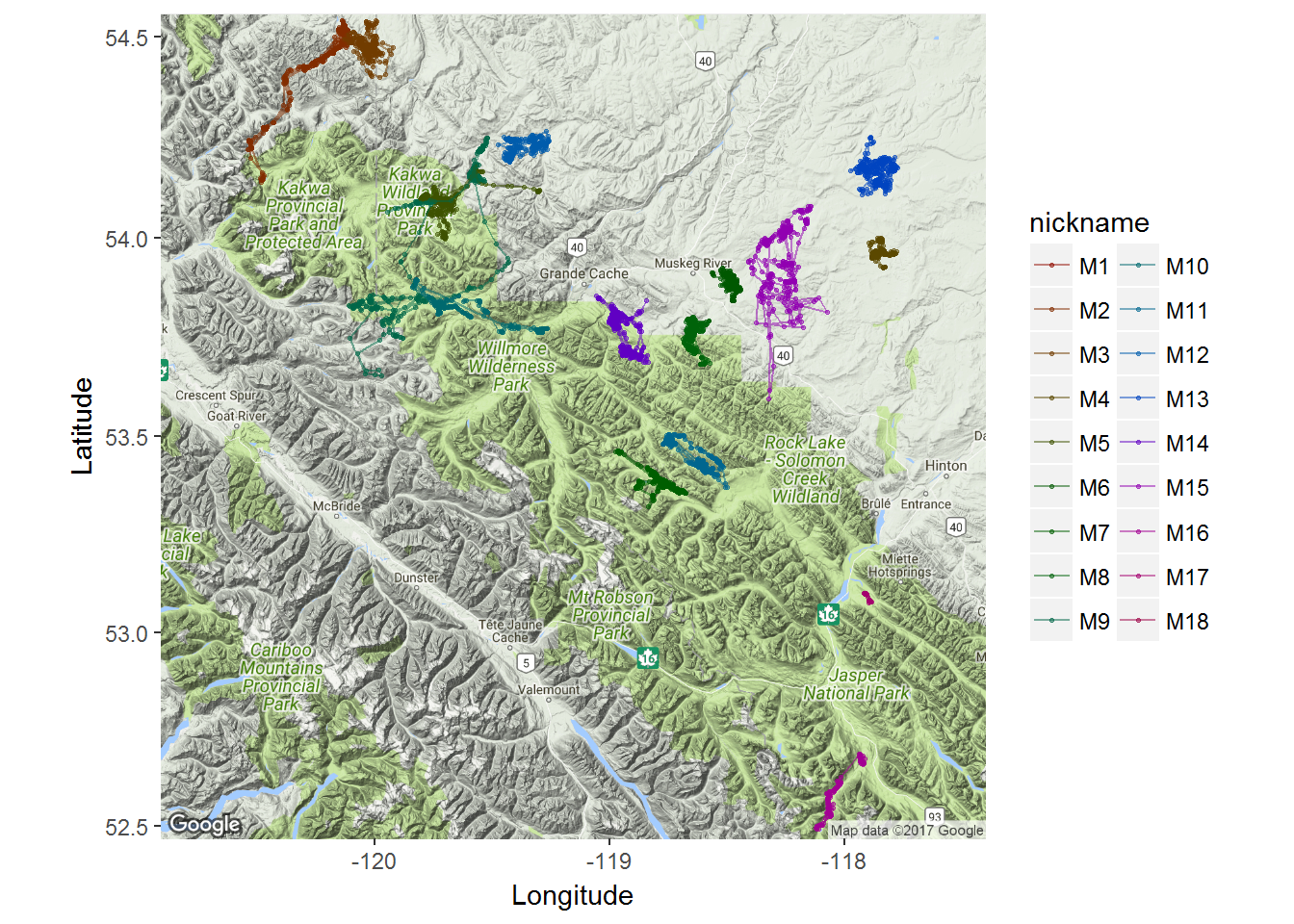
Leaflet and mapview
Mapview is a package which allows you to create interactive, web-friendly “leaflet” maps, which relies on accessing openly availably mapping data.
Even ESRI provides some high-quality world imagery maps. The following code is will open a new, interactive visualization device using ESRI imagery. The window allows zooming and scrolling within the R environemnt. Note, that for this to work we need to convert the moose.df to a SpatialLines object (moose.sp) with the coordinates function:
require(mapview)
moose.sp <- moose.df
coordinates(moose.sp)<- ~lon + lat
proj4string(moose.sp)<-CRS("+proj=longlat +ellps=WGS84 +datum=WGS84 +no_defs")
mapview(moose.sp, zcol="nickname", legend = TRUE, cex=2, lwd=0.1, map.types = "Esri.WorldImagery")