Lab 6: Earthquakes and Sampling Distributions
BIOL 709 / Winter 2018
Preamble on Earthquakes, Volcanoes, and Plates
Recall the “maps” package we loaded once upon a time. We can use this package to very quickly and easily map the location of earthquakes world-wide
Here are the live 1-month earthquake data downloaded from the USGS (https://earthquake.usgs.gov/earthquakes/feed/):
eq <- read.csv("https://earthquake.usgs.gov/earthquakes/feed/v1.0/summary/all_month.csv")It is extremely easy quick and easy to draw a world map and add geographic locations to it:
require(maps)
map("world", fill=TRUE, col="grey", bor="grey")
points(eq$longitude, eq$latitude)
You can make them more informative by scaling according to magnitude:
points(eq$lon, eq$lat, cex=eq$Mag/5, pch=19, col=rgb(.2,.2,.7,.2))
From this website, I also downloaded a summary of global volcanoes: http://www.volcano.si.edu/world/list_allnames.htm
vol <- read.csv("volcanoes.csv")
points(vol$LON, vol$LAT, pch=17, col=rgb(1,0,0,.2))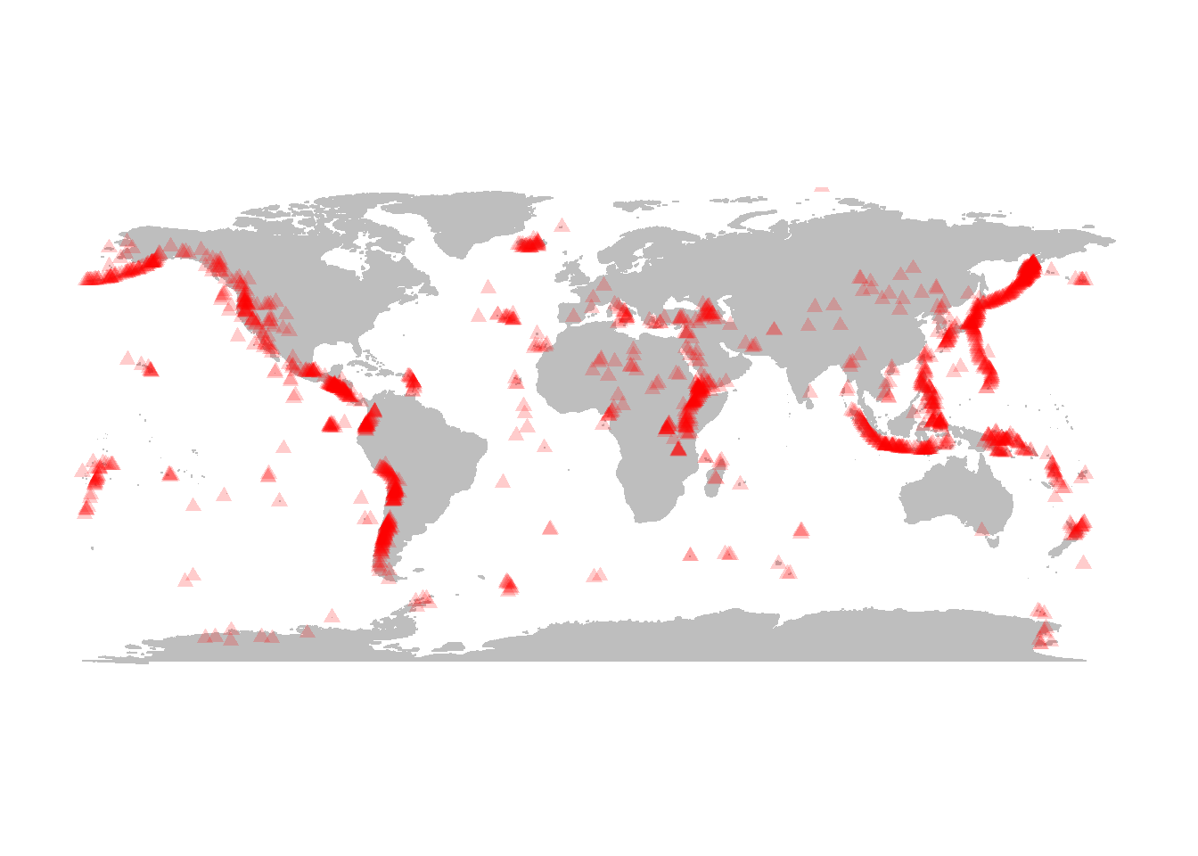
Plate boundary data here are here: http://www.ig.utexas.edu/research/projects/plates/data.htm. It would be nice to load these data directly from this repository, but this requires some mucking with the data.
(Here, by the way, is a nice website covering different tools for loading data from websites in R: http://science.nature.nps.gov/im/datamgmt/statistics/r/fundamentals/index.cfm)
- Load the raw data using
read.table()- making it only one column, separating with tab (\t), even though there are in fact no tabs - the columns are separated by fixed widths. Note also that every once in a while instead of data, we get a row that has no coordinates, just the name of the ridge
ridge.raw <- read.table("ftp://ftp.ig.utexas.edu/pub/PLATES/Data/plate_boundaries/ridge.gmt", sep="\t") or from the course website (if the ftp isn’t working):
load("tectonicdata.robj")This object contains all three of ridge, trench and transform.
- Create a dummy data frame that will contain our “x” and “y” coordinates
ridge <- data.frame(x=rep(NA, nrow(ridge.raw)), y=NA)- Fill these columns with the fixed width substring of the data. Notice that the header entries (“> Name of Ridge”) become NA’s
ridge$x <- as.numeric(substr(ridge.raw[,1],1,10))
ridge$y <- as.numeric(substring(ridge.raw[,1],12))
A few things to note: as.numeric coerces things to be number, and the substring() function is slightly different than substr() does not require a stopping point, only a
Now, do the same with trenches:
## trench.raw <- read.table("http://faculty.washington.edu/eliezg/StatR101/data/trench.gmt", sep="\t")
trench <- data.frame(x=rep(NA, nrow(trench.raw)), y=NA)
trench$x <- as.numeric(substr(trench.raw[,1],1,10))
trench$y <- as.numeric(substring(trench.raw[,1],12))
and transform plates:
## transform.raw <- read.table("http://faculty.washington.edu/eliezg/StatR101/data/transform.gmt", sep="\t")
transform <- data.frame(x=rep(NA, nrow(transform.raw)), y=NA)
transform$x <- as.numeric(substr(transform.raw[,1],1,10))
transform$y <- as.numeric(substring(transform.raw[,1],12))
OK, lets draw these lines:
lines(ridge, col=2)
lines(trench, col=3)
lines(transform, col=4)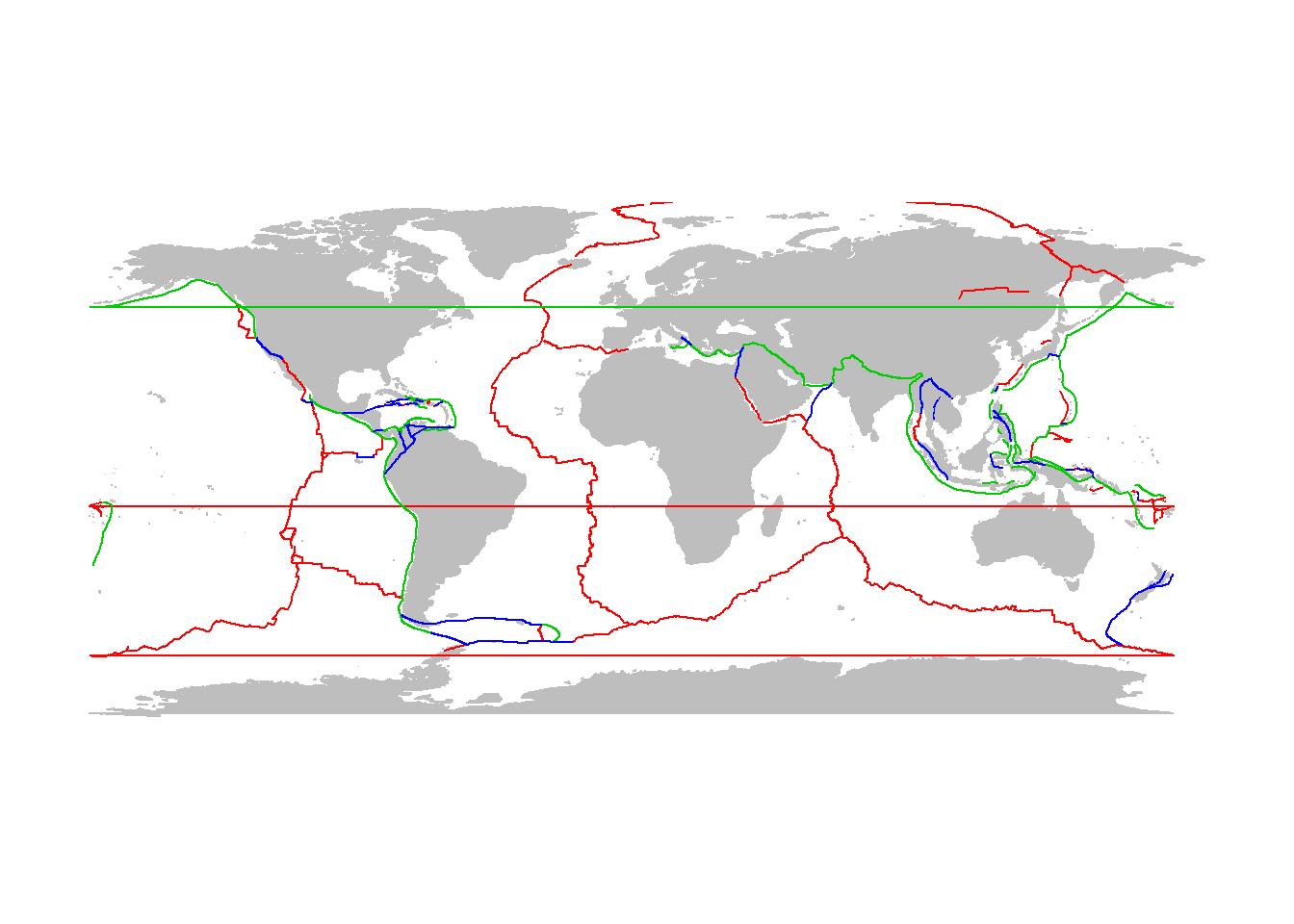
If you don’t like way it crosses the international dateline, we can filter these very large steps out of the “ridge” and “trench” data
trench$x[abs(diff(trench$x))>180] <- NA
ridge$x[abs(diff(ridge$x))>180] <- NA
Try again:
map("world", fill=TRUE, col="grey", bor="grey")
lines(ridge, col="darkblue", lwd=2)
lines(trench, col="darkred", lwd=2)
lines(transform, col="darkgreen", lwd=2)
points(eq$Lon, eq$Lat, cex = eq$Mag/5, pch=19, col=rgb(0,.5,.5,.3))
points(vol$LON, vol$LAT, pch=17, col=rgb(.5,0,.5,.3)) 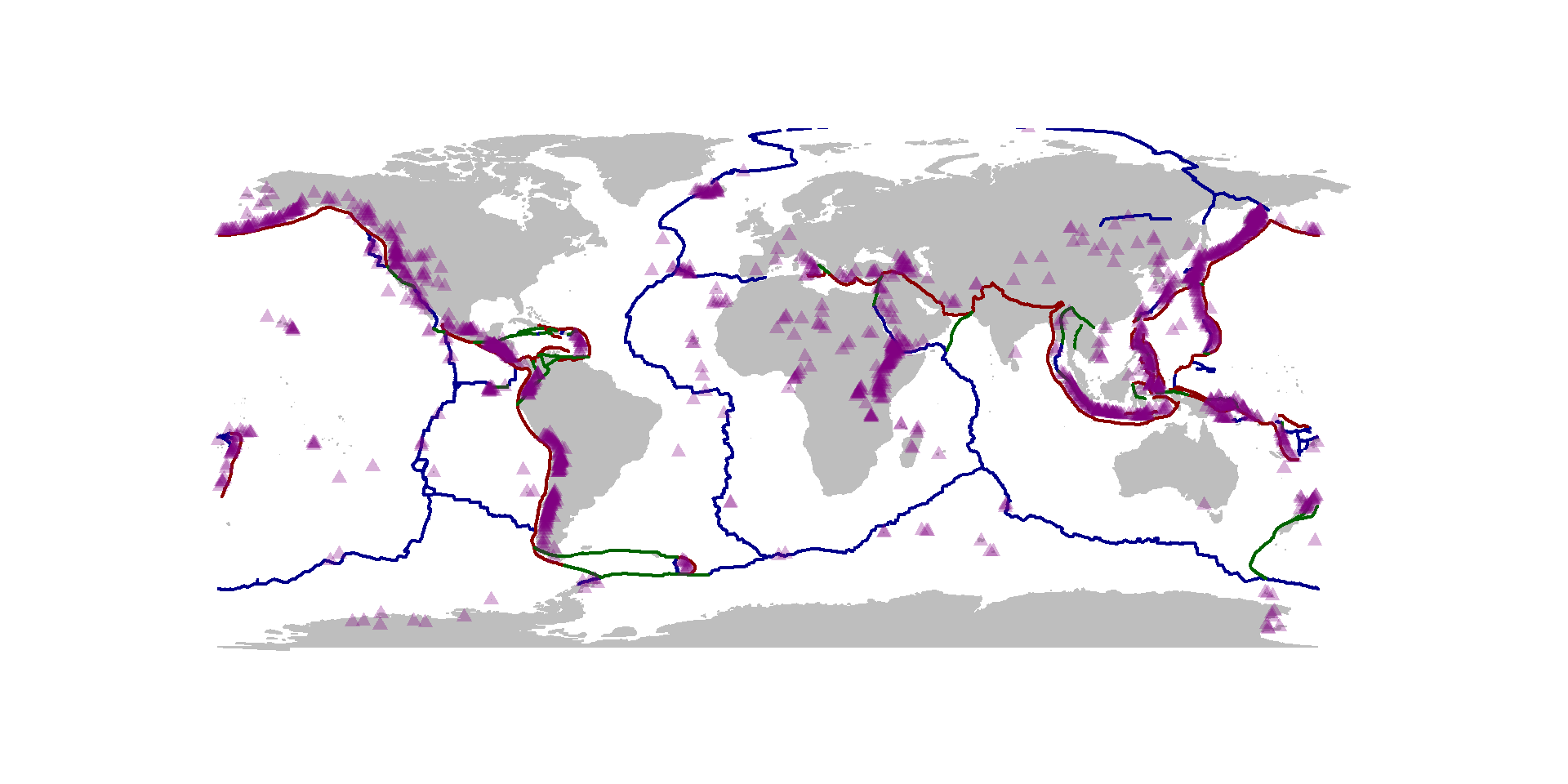
This is, I think, a very informative and detailed visualization of tectonic activity on Earth - pretty compactly coded (one you’ve processed your data). Note that the data repositories are presumably updated regularly, so every time you run this code, you will get an updated visual.
A comment on dates and times
Dates and times cause terrific headaches, as a rule, to process and analyze as data. Unfortunately, they are also extremely important.
By default, date strings are read in as factors:
eq$time[1:10]## [1] 2018-01-31T01:29:08.885Z 2018-01-31T01:23:11.415Z
## [3] 2018-01-31T01:15:25.530Z 2018-01-31T00:55:53.050Z
## [5] 2018-01-31T00:55:34.910Z 2018-01-31T00:51:20.580Z
## [7] 2018-01-31T00:48:14.790Z 2018-01-31T00:39:02.940Z
## [9] 2018-01-31T00:32:46.270Z 2018-01-31T00:29:16.216Z
## 9128 Levels: 2018-01-01T02:16:06.080Z ... 2018-01-31T01:29:08.885ZPOSIX is the standard date-time class in R, and a useful introduction to them is given in this help file: ?DateTimeClasses. You can coerce character vectors into date and time object using the strptime or as.POSIXlt functions, which works well but can be a bit fussy:
strptime(eq$time, format="%Y-%m-%dT%H:%M:%S")[1:10]## [1] "2018-01-31 01:29:08 EST" "2018-01-31 01:23:11 EST"
## [3] "2018-01-31 01:15:25 EST" "2018-01-31 00:55:53 EST"
## [5] "2018-01-31 00:55:34 EST" "2018-01-31 00:51:20 EST"
## [7] "2018-01-31 00:48:14 EST" "2018-01-31 00:39:02 EST"
## [9] "2018-01-31 00:32:46 EST" "2018-01-31 00:29:16 EST"The formatting of the class is specified with %Y - 4 digit year, %m - month (as opposed to %M minute), etc. Formatting examples and instructions are in the strptime and as.POSIXlt help files.
A smoother way is to use the lubridate package (Hadley Wickham’s first major contribution to making things easier in R). The key functions are ymd and hms and ymd_hms which “intelligently” digs out the order of year, month, day, hour, minute, second, etc.:
require(lubridate)
DateTime <- ymd_hms(eq$time)
DateTime[1:10]
## [1] "2018-01-31 01:29:08 UTC" "2018-01-31 01:23:11 UTC"
## [3] "2018-01-31 01:15:25 UTC" "2018-01-31 00:55:53 UTC"
## [5] "2018-01-31 00:55:34 UTC" "2018-01-31 00:51:20 UTC"
## [7] "2018-01-31 00:48:14 UTC" "2018-01-31 00:39:02 UTC"
## [9] "2018-01-31 00:32:46 UTC" "2018-01-31 00:29:16 UTC"What important difference do you see in the way these two functions converted the times!?
Observe how diff() works:
diff(DateTime)[1:10]## Time differences in secs
## [1] -357.470 -465.885 -1172.480 -18.140 -254.330 -185.790 -551.850
## [8] -376.670 -210.054 -267.556Note that the time differences are in seconds. That was a choice made by R. To coerce minutes, we have to “manually” get pairwise differences between the vector of times without the first element and without the second element:
D.mins <- difftime(DateTime[-1], DateTime[-length(DateTime)], units="mins")

hist(-as.numeric(D.mins), breaks=100, col="grey", bor="darkgrey", freq=FALSE)
curve(dexp(x, -1/mean(as.numeric(D.mins))), add=TRUE, n=10000, lwd=2, col=2)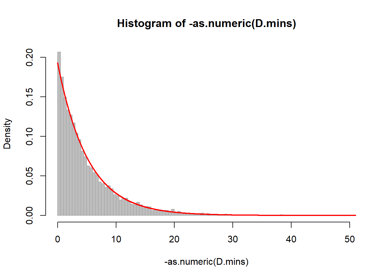
mean(D.mins)## Time difference of -4.728065 minssd(D.mins)## [1] 5.129513We need to use the as.numeric because the time difference class does not play well with many of R’s other function.
Part I: Central Limit Theorem
Sample any random variable a bunch (“k”) of times:
k <- 10000
X <- runif(k)
Sum it several (“n”) of times
n <- 10
Y <- rep(0, k)
for(i in 1:n) Y <- Y + runif(k)
Plot the histogram and qqplot:
par(mfrow=c(1,2))
hist(Y, col="grey")
qqnorm(Y)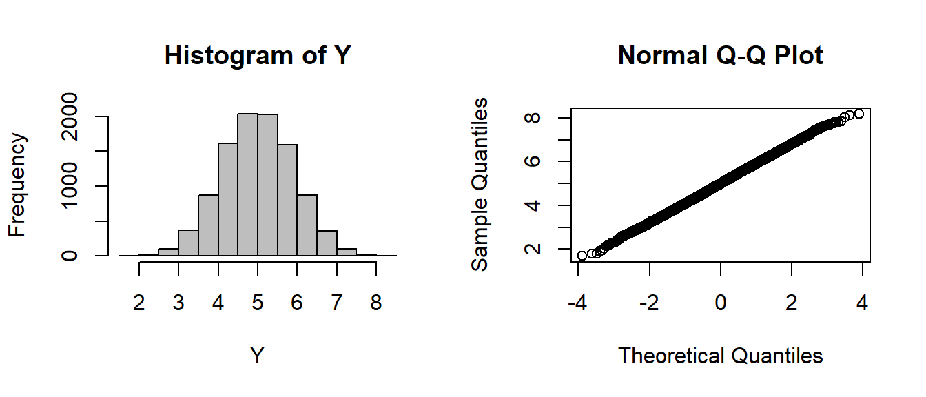
Summary statistics:
c(mean(Y), var(Y))## [1] 5.0048671 0.8240065Compare to theoretical prediction
c(n * 0.5, n * 1/12)## [1] 5.0000000 0.8333333EXERCISE 1: A CLT Function
Write a function that sums random draws from the standard uniform distribution, sums them “n” times, and plots the histogram and qqnorm plot.
Note that we can pass a function as an argument in R:
CLT <- function(FUN, n, k=1000){
    Y <- rep(0,k)
    for(i in 1:n)   Y <- Y + FUN(k)
    hist(Y, col="grey")
    qqnorm(Y); qqline(Y, col=2)
}
par(mfrow=c(2,4))
CLT(runif,1)
CLT(runif,2)
CLT(runif,5)
CLT(runif,10)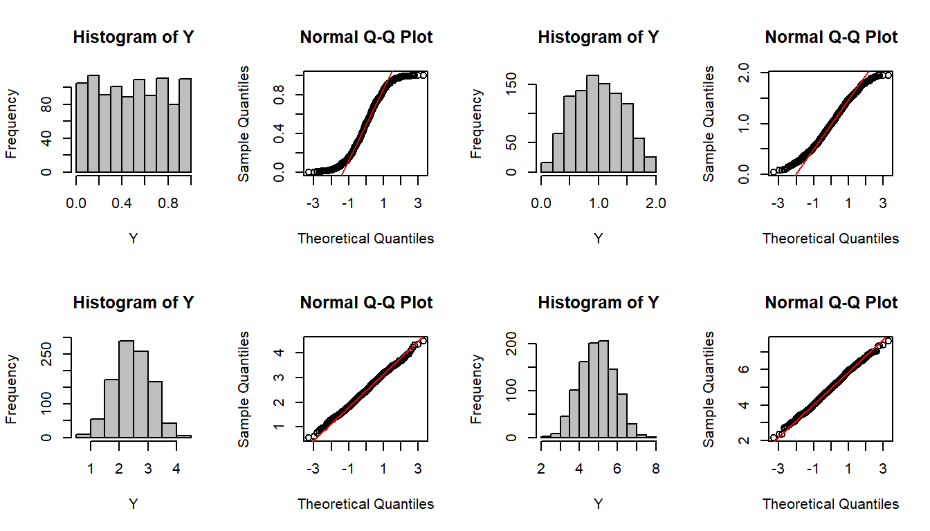
It works for other functions as well:
par(mfrow=c(3,4))
        CLT(rexp,1)
        CLT(rexp,2)
        CLT(rexp,4)
        CLT(rexp,10)
        CLT(rexp,100)
        CLT(rnorm,10)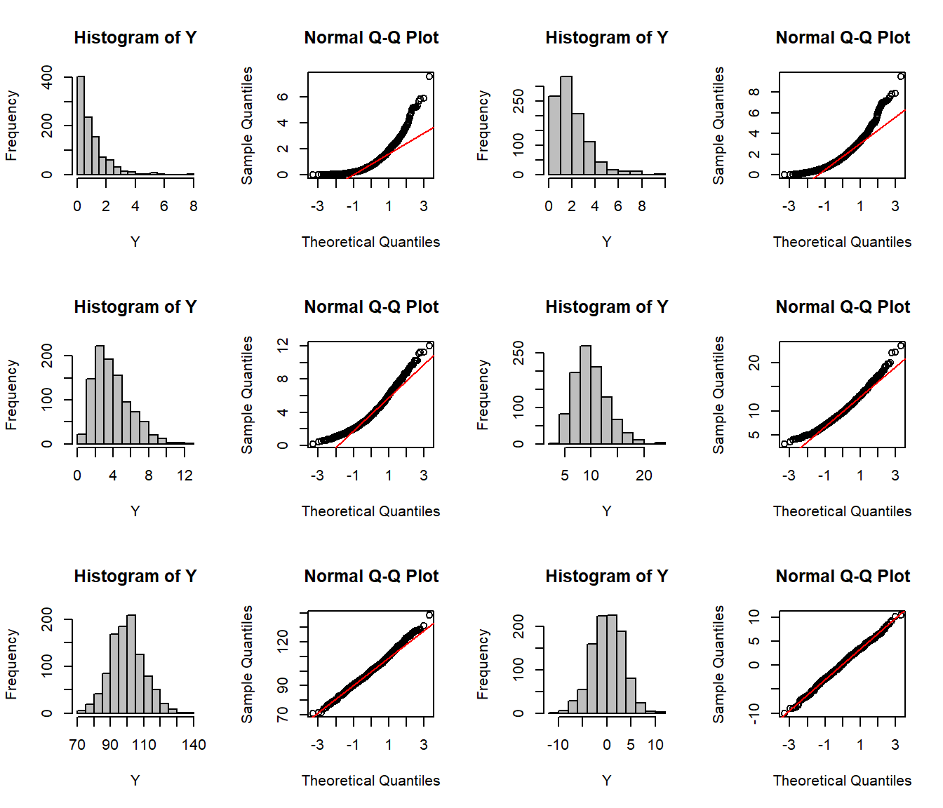
EXERCISE 2: Normal approximation
Modify this function so that it also draws the normal approximation to the distribution of the sums.
Note that this function falls apart quickly when we need more parameters!
CLT(rgeom,10) ## Error in FUN(k): argument "prob" is missing, with no defaultCLT(rgamma,10) ## Error in FUN(k): argument "shape" is missing, with no defaultCLT(rbinom,10) ## Error in FUN(k): argument "size" is missing, with no defaultAll of the preceding distributions require at least 2 parameters, with no available defaults.
The solution for ultimate flexibility is a unique R feature … “…” (the ellipsis)
CLT <- function(FUN, n, k=1000, ...)
{
    Y <- rep(0, k)
    for(i in 1:n)
            Y <- Y + FUN(k, ...)
    hist(Y, col="grey")
    qqnorm(Y); qqline(Y, col=2)
}
This extremely convenient feature allows you to add pass other arguments in your handcrafted function automatically to a selected function internally. It is treated like any other argument.
CLT(rbinom, n=1, size=200, prob=0.1)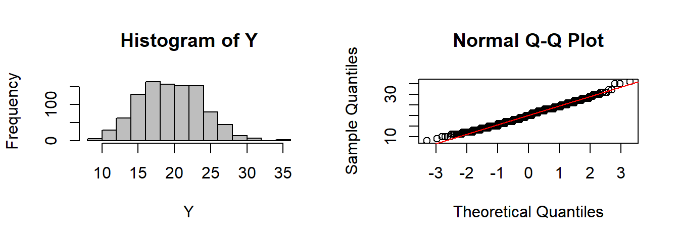
CLT(rgamma, n=10, shape=2)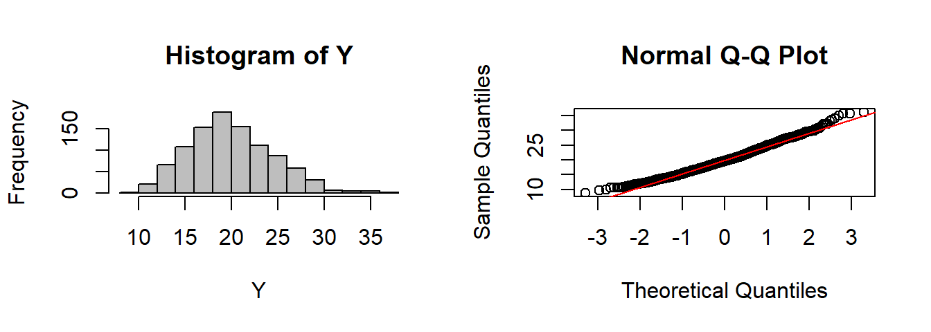
CLT(rbinom, n=1, size=200, prob=0.1)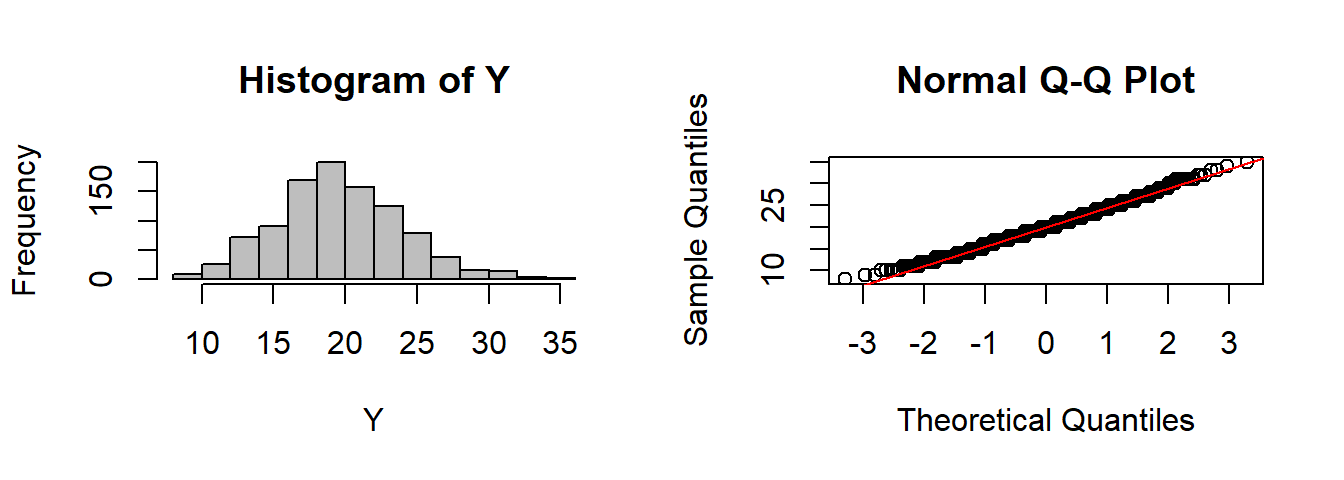
EXERCISE 3: Bernoulli to Binomial
Show (using this function) that the sum of “n” Bernoulli’s is equivalent to a single Binomial(size = n), and that the sum of “n” exponentials is equivalent to a single Gamma(shape = n).
Thus:
CLT(rgamma, n=1, shape=2)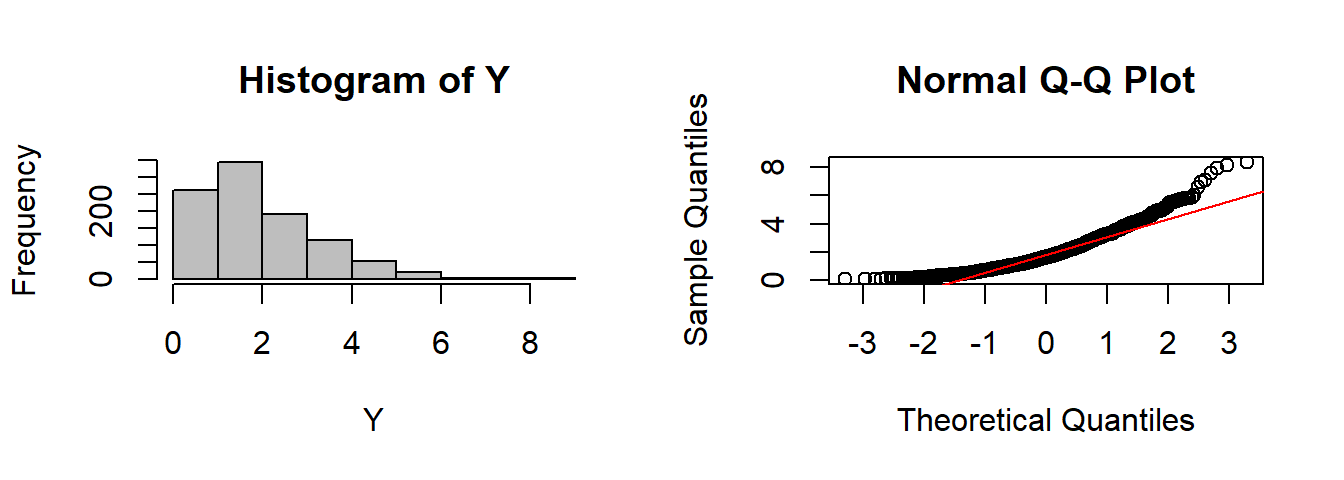
Compare with:
CLT(rexp, n=2)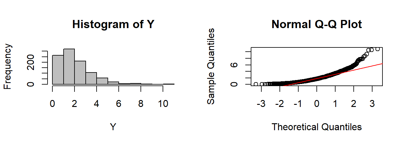
We can smilarly compare a bunch of Bernoulli’s
CLT(rbinom, n=30, size=1, p=0.2)
to a single binomial
CLT(rbinom, n=1, size=30, p=0.2)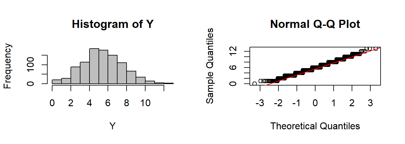
ADVANCED PROGRAMMING TIP:
Say you want to pass a separate list of arguments to the “hist” (or other) function. In that case, the “…” falls apart. For a thorough discussion of this problem, see: http://stackoverflow.com/questions/5080972/using-multiple-ellipses-arguments-in-r but here’s some code that works:
CLT <- function(FUN, n, k=1000, ..., hist.args = NULL){
        Y <- rep(0, k)
        for(i in 1:n)
                Y <- Y + FUN(k, ...)
        par(mfrow=c(1,2))
    do.call(hist, c(x=quote(Y), hist.args))
        qqnorm(Y); qqline(Y, col=2)
    }
CLT(runif, n=2, hist.args=list(breaks=20, col="purple", bor="darkblue", freq=FALSE))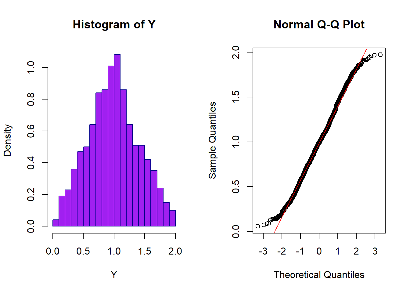
It relies on the “metaprogramming” commands do.call() and quote()
Part II: Sampling Distributions
Lets take the new earthquake data and extract the difference in minutes (note the exists() function which checks to see if eq is in R’s working evironment):
if(!exists("eq"))   eq <- read.csv("https://earthquake.usgs.gov/earthquakes/feed/v1.0/summary/all_month.csv")
time <- ymd_hms(eq$time)
dT.mins <- -as.numeric(difftime(time[-1], time[-length(time)], units="mins"))
hist(dT.mins, breaks=100, col="grey", bor="darkgrey")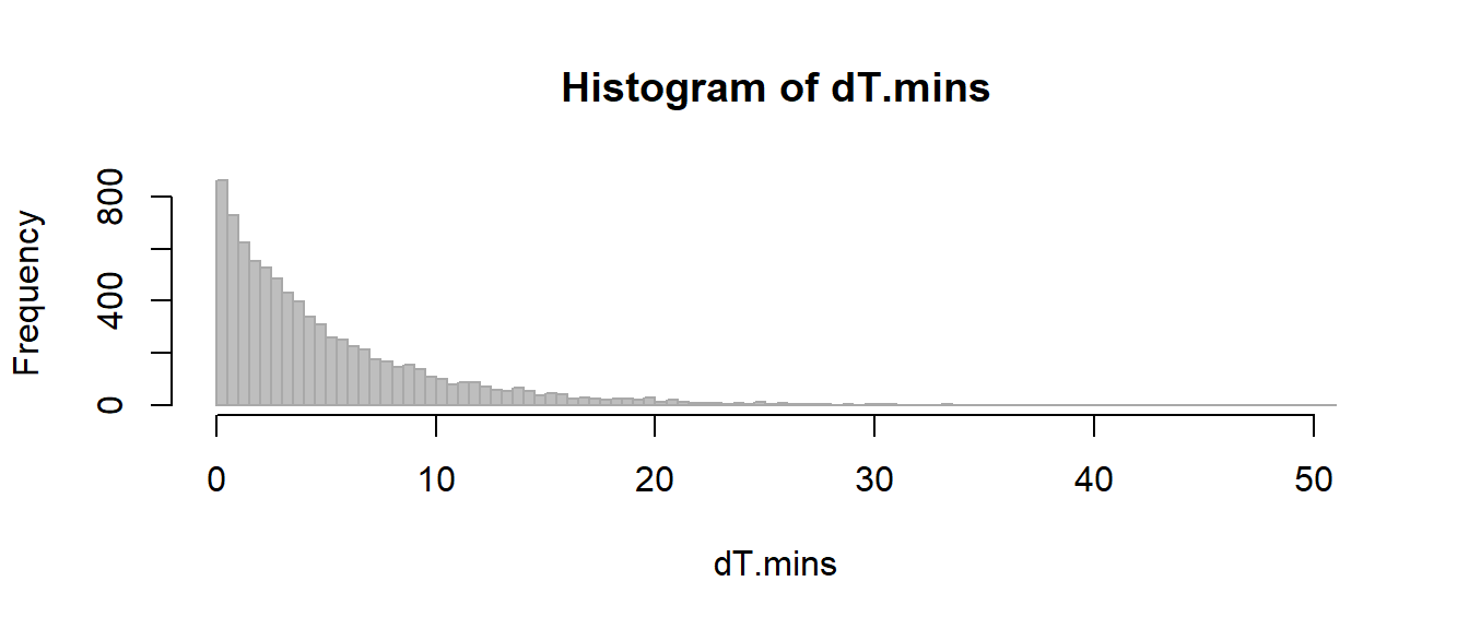
This is a large “population” of earthquakes, with a clearly non-normal (and possibly not even exponential) distribution, with the following mean / standard deviation / and variance.
mean(dT.mins)## [1] 4.728065var(dT.mins)## [1] 26.3119lets take the mean of a small random sample (n=5), many many times:
X.bar5 <- c()
for(i in 1:10000)
    X.bar5 <- c(X.bar5, mean(sample(dT.mins, 5)))
This is clearly also a random variable with a mean that is very close to the true mean
mean(X.bar5) ## [1] 4.677142And a variance that is quite a bit smaller
var(X.bar5)## [1] 5.148135And a distribution, that is unimodal, but not quite normal
hist(X.bar5, col="grey", bor="darkgrey", breaks=40)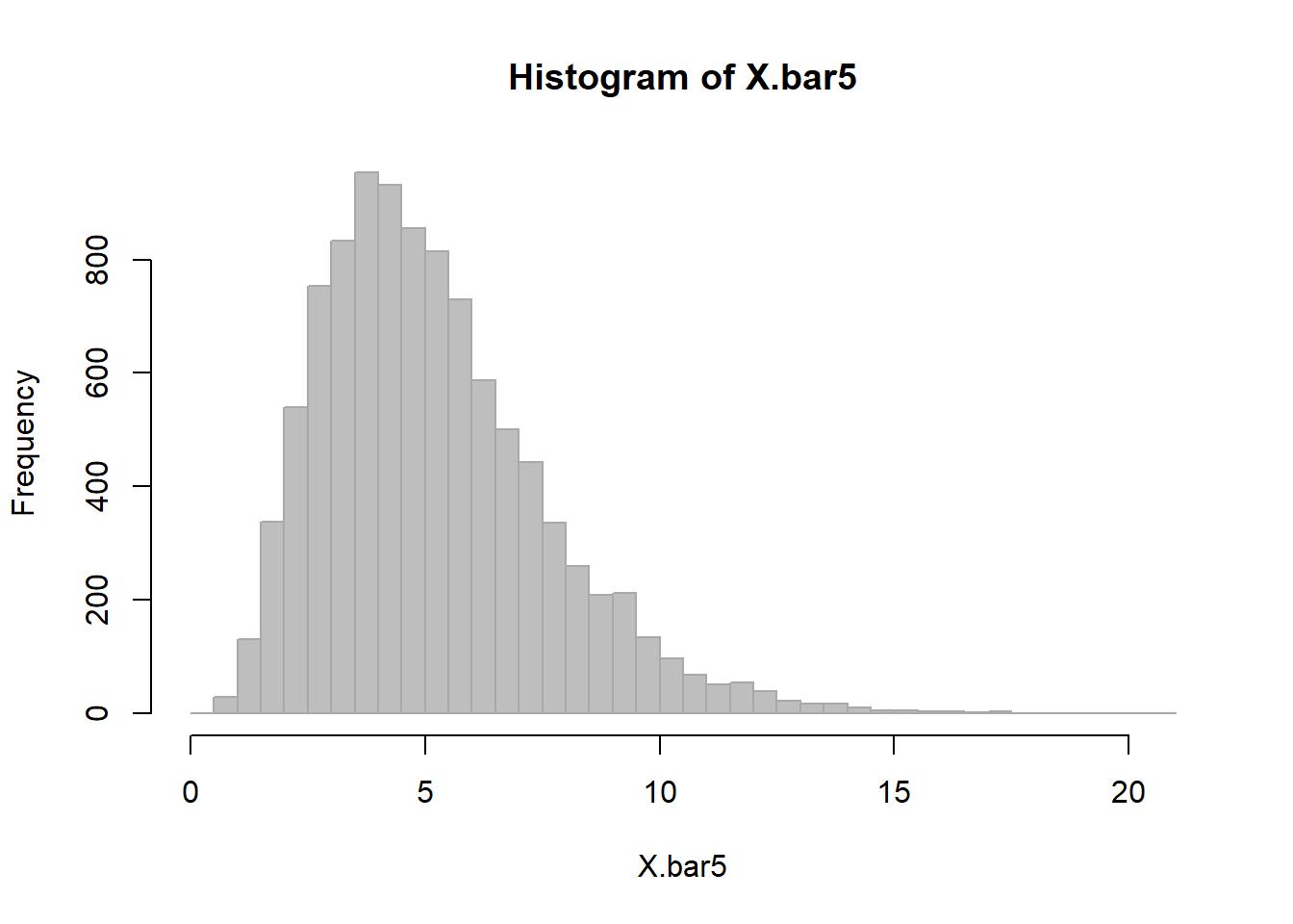
Recall that the all-powerful Central Limit Theorem states that the sample mean of a variable \(X\) with mean and variance \(\mu\) and \(\sigma^2\), respectively, asymptotically approaches:
\[ \overline{X} \sim {\cal N}\left(\mu, {\sigma^2 \over n}\right)\]
EXERCISE 4: Estimating a Sample Mean
Write a function that estimates a sample mean with sample size \(n\) from a dataset \(X\), repeats this procedure \(k\) times (to obtain the sampling distribution of the mean) and then draws its histogram.
Below is a nice, minimal solution to this exercise. You will adapt it for your homework:
SampleMean <- function(X, n=30, k=10000, ...)
{
    X.bar <- c()
    for(i in 1:k)
        X.bar <- c(X.bar, mean(sample(X, n)))
    hist(X.bar, ...)
    X.bar
}
Putting this function to work:
X.bar1 <- SampleMean(dT.mins, n=1, k=10000, col=rgb(0,0,0,.2), bor=rgb(0,0,0,.2), freq=FALSE, xlim=c(0,25), breaks=40, ylim=c(0,.6))
X.bar5   <- SampleMean(dT.mins, n=5, k=1000,  col=rgb(1,0,0,.2), bor=rgb(1,0,0,.2), freq=FALSE, breaks=40, add=TRUE)
X.bar30  <- SampleMean(dT.mins, n=30, k=1000, col=rgb(0,1,0,.2), bor=rgb(0,1,0,.2), freq=FALSE, breaks=40, add=TRUE)
X.bar100 <- SampleMean(dT.mins, n=100, k=1000, col=rgb(0,0,1,.2), bor=rgb(0,0,1,.2), freq=FALSE, breaks=40, add=TRUE)
X.bar1000 <- SampleMean(dT.mins, n=1000, k=1000, col=rgb(0,0,1,.2), bor=rgb(0,1,1,.2), freq=FALSE, breaks=40, add=TRUE)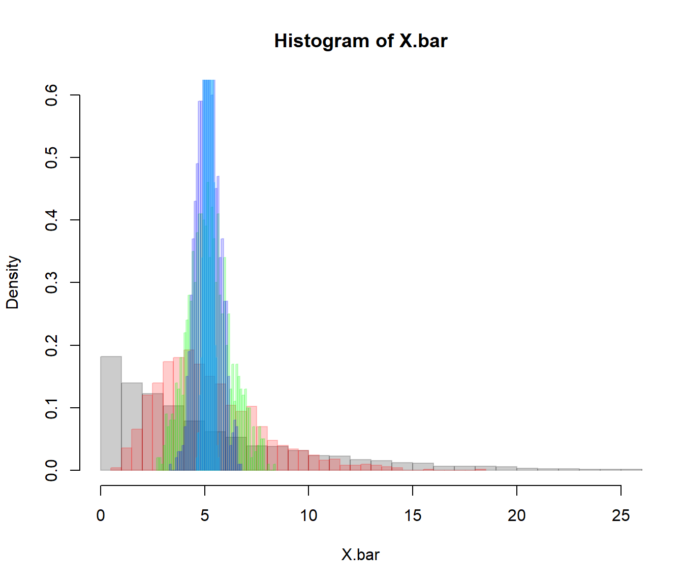
Increasingly higher samples drive the distribution to an estimate that is increasingly narrow, and always unbiased.
c(mean(X.bar1), sd(X.bar1), sqrt(var(dT.mins)/1))## [1] 4.654094 5.071426 5.129513c(mean(X.bar5), sd(X.bar5), sqrt(var(dT.mins)/5))## [1] 4.624479 2.223920 2.293988c(mean(X.bar30), sd(X.bar30), sqrt(var(dT.mins)/30))## [1] 4.7091292 0.9363159 0.9365167c(mean(X.bar100), sd(X.bar100), sqrt(var(dT.mins)/100))## [1] 4.7137917 0.5228348 0.5129513Note how the variance of the sampling distribution does, in fact, agree with the Central Limit Theorem prediction: \(\sigma_{\overline{x}} = \sigma_x/\sqrt{n}\).
Part III: Towards Inference
Let’s say you think that doomsday is coming on January 21, 2017 (right before your final project is due) and you start timing earthquakes with a handy, replicable, easy-to-run R script. You count 10 earthquakes and see that their average interval is 2.5 minutes, i.e. earthquakes have more than DOUBLED in frequency.
Do you go out into the street yelling “The World Is Ending! The World Is Ending!”?
To quantify this risk, we ask the following question: what is the probability of a frequency this high or higher given that the mean interval is 38 minutes with a standard deviation 53?
According to the THEORETICAL sampling distribution \[dT_{n=10} \sim {\cal N}(\mu= 4.85, sd = 5.5/\sqrt(10)).\] We draw the distribution with a vertical line representing our observation:
(mu.x <- -as.numeric(mean(D.mins)))## [1] 4.728065(sigma.x <- sd(D.mins))## [1] 5.129513curve(dnorm(x, mean = mu.x, sd = sigma.x/sqrt(10)), xlim=c(0,10), lwd=2, col=2,
xlab = "Interval between earthquakes (min)")
abline(v=2.5, lwd=2)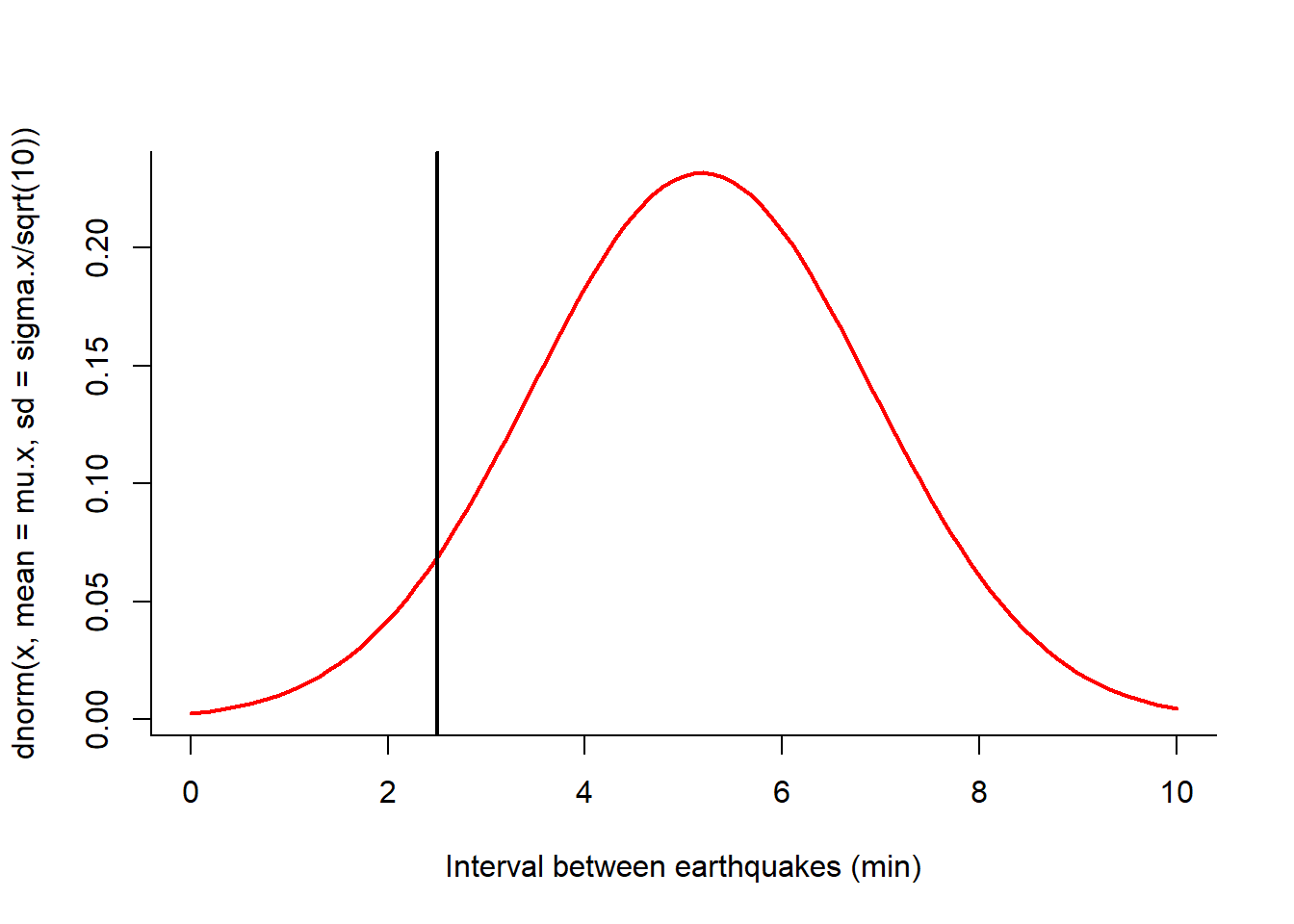
Probability of the high-frequency event:
pnorm(2.5, mu.x, sigma.x/sqrt(10))## [1] 0.084787189% … so not THAT unlikely!
This number is your first “p-value”, or the probability that you would observe a value this extreme or more extreme under the null hypothesis that the world is NOT ending.
EXERCISE 5: Ok, 10 earthquakes in a row was not enough to ring alarm bells. What if, fanatically, you kept downloading the data and saw that after 30 new earthquakes, the average waiting time was still 2.5 minutes? And then, 100 earthquakes. Should you start panicking?
Note, you could have gotten the p-value from the resampling distribution directly.
dTbar.10sim <- SampleMean(dT.mins, n=30, k=10000, col="grey", bor="darkgrey", breaks=20)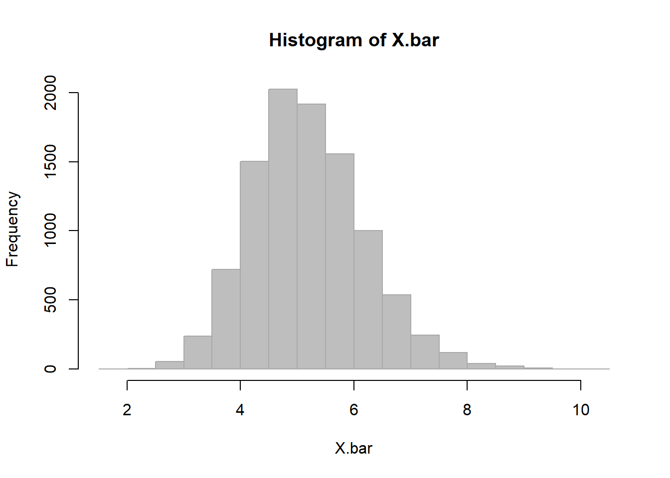
sum(dTbar.10sim < 2.5)/10000## [1] 0.0017This is a more “exact”p-value, but requires more computation. It is different from the one we estimated. Why? Because the CLT hasn’t totally exerted its power yet.
EXERCISE 6: When Do We Panic!?
Determine how many consecutive earthquakes you would need to observe at a rate of 1 every 2.5 minutes to really start panicking, i.e. where the probability that this is just an unlikely sequence within the typical distributions of earthquakes drops to below 1%.