Lab 5: Probability Distributions
BIOL 709 / Winter 2018
Part I: Discrete distributions, expectations and variances
The binomial distribution
n <- 10
p <- 0.2
x <- 0:n
f <- dbinom(x, p=p, size = n)
plot(x,f, type="h"); points(x,f, pch=19)
We can easily create our own distribution function:
binom.pdf <- function(x, n, p)
choose(n, x) * p^x * (1-p)^(n-x)
Note that the “choose” function is conveniently vectorized:
binom.pdf(0:10, 10, .2)## [1] 0.1073741824 0.2684354560 0.3019898880 0.2013265920 0.0880803840
## [6] 0.0264241152 0.0055050240 0.0007864320 0.0000737280 0.0000040960
## [11] 0.0000001024sum(binom.pdf(0:10, 10, .2))## [1] 1Mean and variance are defined as: \[ E(X) = \sum x_i * p_i\] \[Var(X) = E((X - E(X))^2)\sum (x_i - E(X))^2\]
So, in R,
(mean.x <- sum(x*f))## [1] 2(var.x <- sum( (x - mean.x)^2 * f))## [1] 1.6or: \(Var(X) = E(X^2) - E(X)^2\)
(var.x <- sum(x^2 * f) - mean.x^2)## [1] 1.6Note, to show output surround the command with “()”:
(mean.x <- sum(x*f))## [1] 2(var.x <- sum( (x - mean.x)^2 * f))## [1] 1.6Compare with theory:
n * p## [1] 2n * p * (1-p)## [1] 1.6Compare with simulations:
mean(rbinom(10000,n,p))## [1] 1.9927var(rbinom(10000,n,p))## [1] 1.615176As a sum of Bernoulli random variables
Recalling that if \(X \sim Bernoulli(p)\) random variables, then: \[Y = \sum_{i=1}^n X \sim Binomial(n,p)\]
n <- 10
p <- .2
X <- c()
for(i in 1:1000)
        X <- c(X,sum(rbinom(n, 1, p)))
table(X)
## X
## 0 1 2 3 4 5 6 7
## 99 282 302 199 74 34 9 1The table() function conveniently counts these (obtains a frequency), but we would like to get the proportion of each count and plot it. The black bars are the simulation, the red dots are the theoretical prediction:
plot(table(X)/length(X), type="h")
points(x,f, col=2, pch=19, cex=2)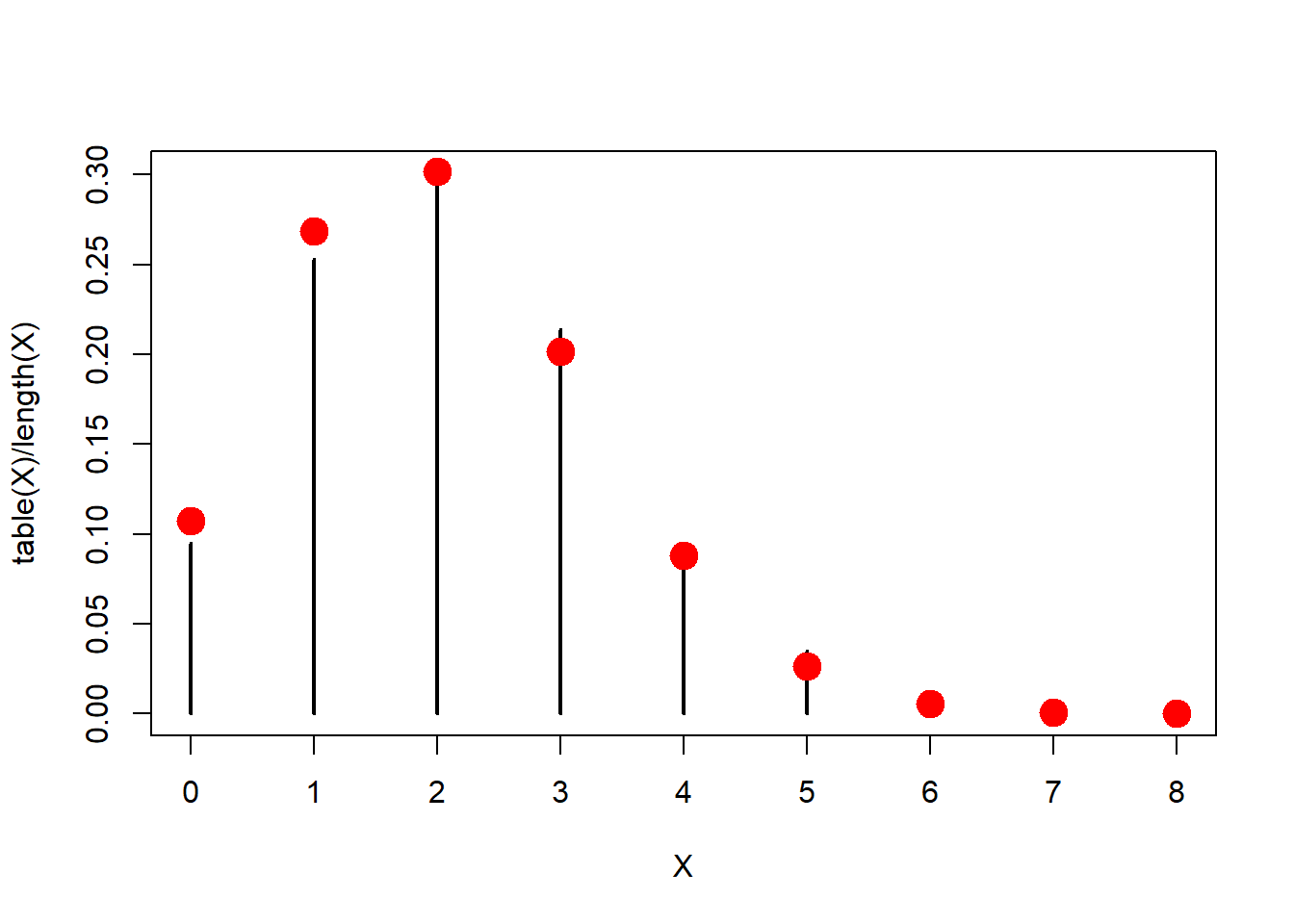
Pretty close!
Exercise 1: Geometric Distribution
Show the mean and variance of the Geometric distribution (geom) are consistent with theory.
Solution:
n <- 1000
p <- 0.05
x <- 0:n
f <- dgeom(x, p)
## plot(x,f, type="h", xlim = c(0,150))
Compute the mean and variance
(X.mean <- sum(x * f))## [1] 19(X.var <- sum( (x - X.mean)^2 * f))## [1] 380Compare with Geometric theory
(1-p)/p == X.mean## [1] TRUE(1-p)/p^2 == X.var## [1] TRUECompare with random draws from geometric process
mean(rgeom(10000,p))## [1] 19.0526var(rgeom(10000,p))## [1] 371.916and plot
plot(x, dgeom(x, p), type="h", xlim=c(0,100))
abline(v = X.mean, col=2, lwd=2)
abline(v = X.mean + c(-1,1)*(sqrt(X.var)), col=3, lwd=2, lty=2)
Other discrete distributions
You can run this code with any other discrete random distribution, such as:
- Poisson
- \(\text{Pois}(\lambda)\)
- In R:
r,n,d,p - pois(lambda)
- Negative binomial
- \(\text{NBinom}(r,n)\) - which we didn’t talk about but models the number of successes before \(r\) failures.
- In R:
r,n,d,p - nbinom(size, prob)
Exercise 2: Geometric distribution II
More interesting - show that the geometric distribution accurately models the number of failures before a success in a string of Bernoulli trials.
The most intuitive way to do this is with a while loop, for example:
X <- c()
p <- 0.2

for(i in 1:100){
  nattempts <- 0
  success <- rbinom(1,1,p)
  while(!success){
    success <- rbinom(1,1,p)
    nattempts <- nattempts+1
  }
  X <- c(X, nattempts)
}
X
## [1] 2 5 2 18 9 1 5 1 1 3 0 3 4 2 0 4 1 2 1 2 13 2 1
## [24] 8 10 10 4 11 0 2 1 2 5 1 9 12 0 9 8 6 2 0 1 1 4 2
## [47] 2 0 1 1 0 2 6 13 3 6 10 6 0 0 1 3 2 2 4 1 8 4 8
## [70] 1 4 2 1 1 1 0 8 7 1 2 1 6 7 14 14 13 0 7 4 4 0 0
## [93] 0 2 2 0 1 6 3 5mean(X)## [1] 3.9sd(X)## [1] 3.98862plot(table(X)/length(X), type = "h")
points(x, dgeom(x, p), col=2, pch=19)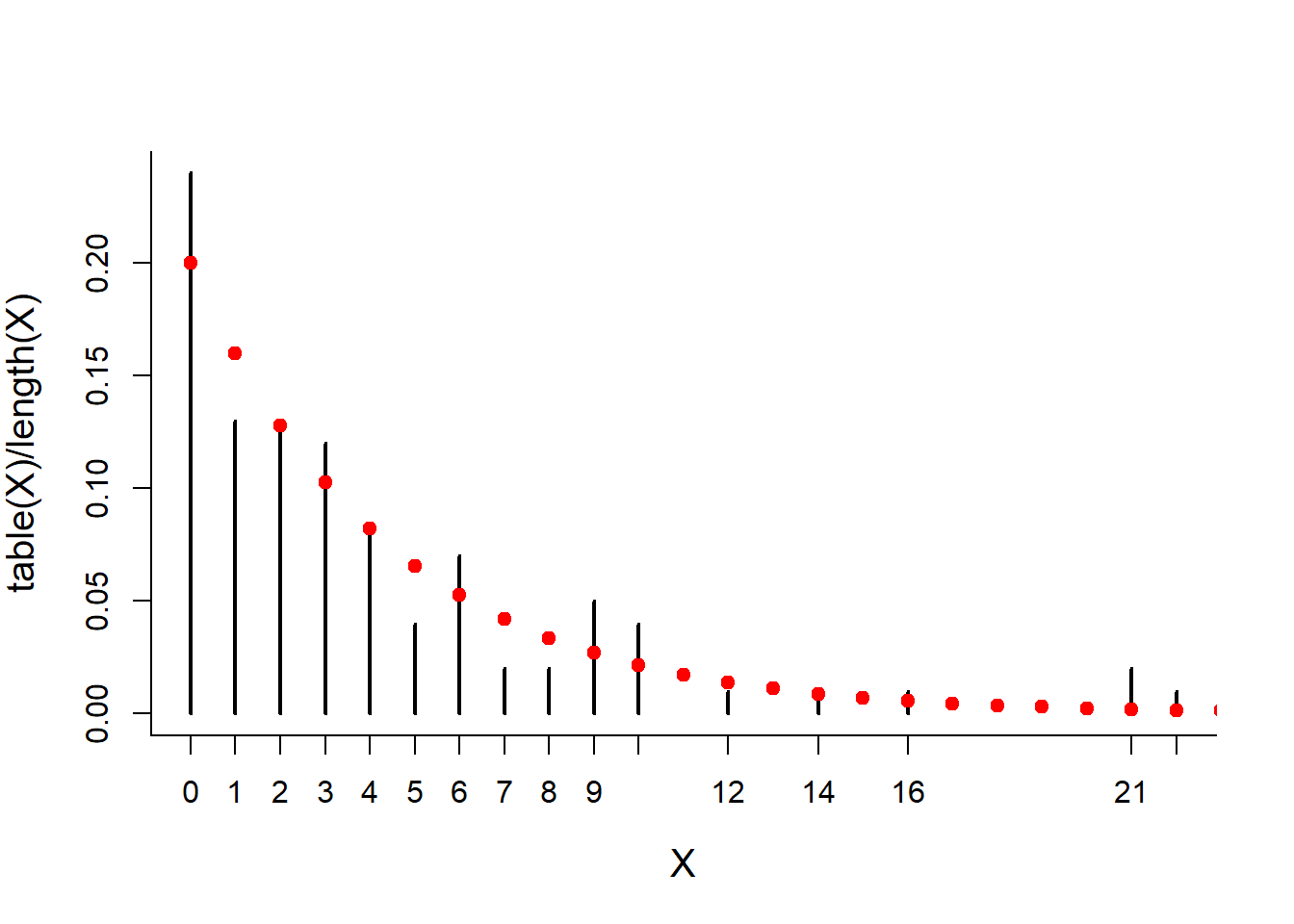
The more efficient way to do this is with the rle() (run lengths) command. Experiment with this command (with a smaller sample size than below) and try to understand what it is returning, and why the following code works (and why I subtract 1 from the X):
Attempts <- rbinom(10000, 1, p)
X <- rle(Attempts)$lengths[rle(Attempts)$values == 0] - 1
mean(X)
## [1] 4.022599sd(X)## [1] 4.369779plot(table(X)/length(X), type = "h")
points(x, dgeom(x, p), col=2, pch=19)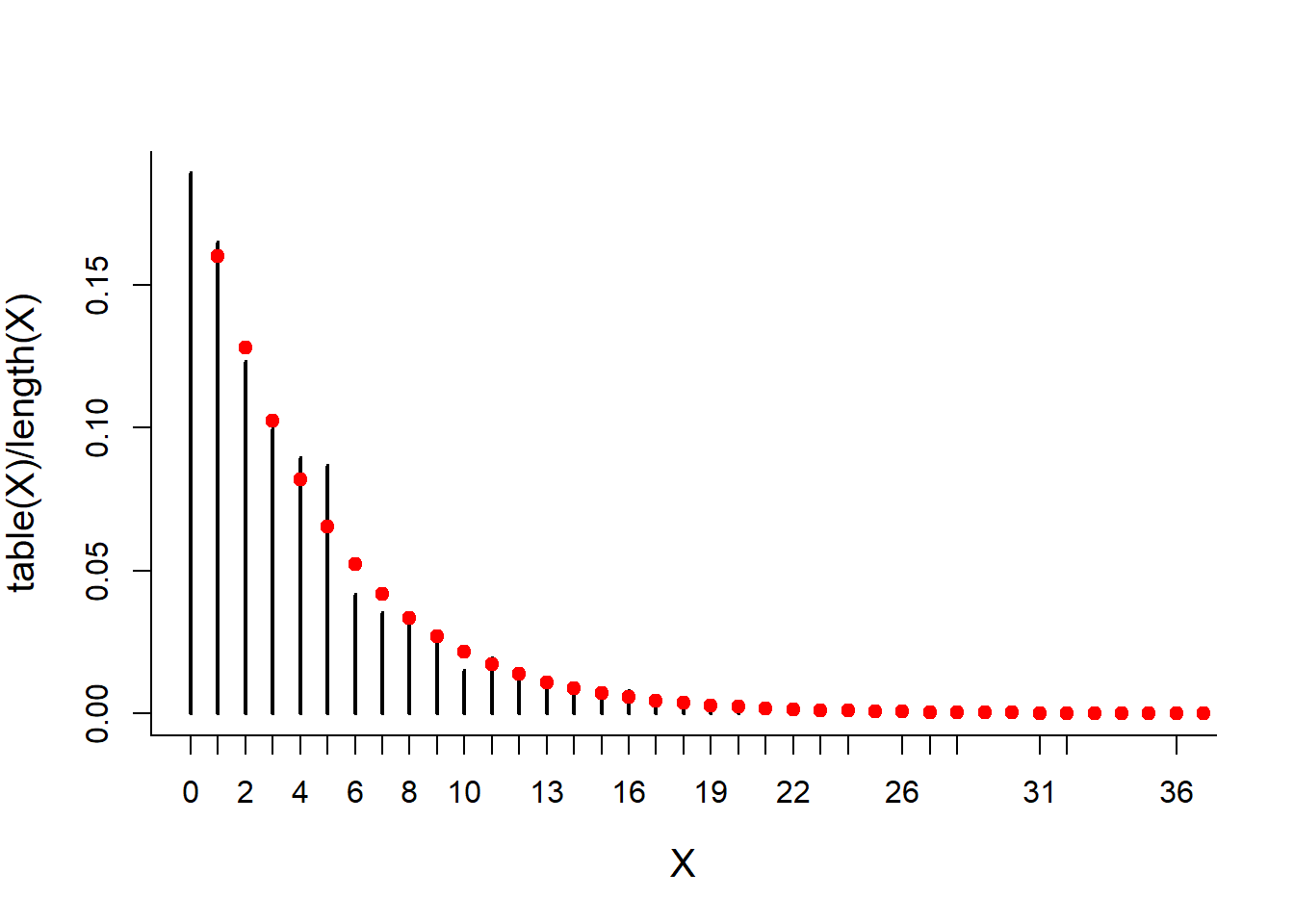
Part II: Continuous Distributions
Relationships between Uniform and Exponential distributions
Consider the Avacha model, where volcanoes are uniformly distributed [RANDOM uniform!] for the past, say, 4000 years with mean 50 year interval:
Tmax <- 4000
Rate <- 1/50
# total number of earthquakes
N <- Tmax*Rate
Avacha <- sort(runif(N, 0, Tmax))
Note that the sorting is important to keep the eruptions chrnological.
Let’s plot the explosion times, and their histogram
plot(Avacha, rep(0, length(Avacha)), pch=19, col=rgb(0,0,0,.2))
hist(Avacha, col="grey", xlab="Eruption Times")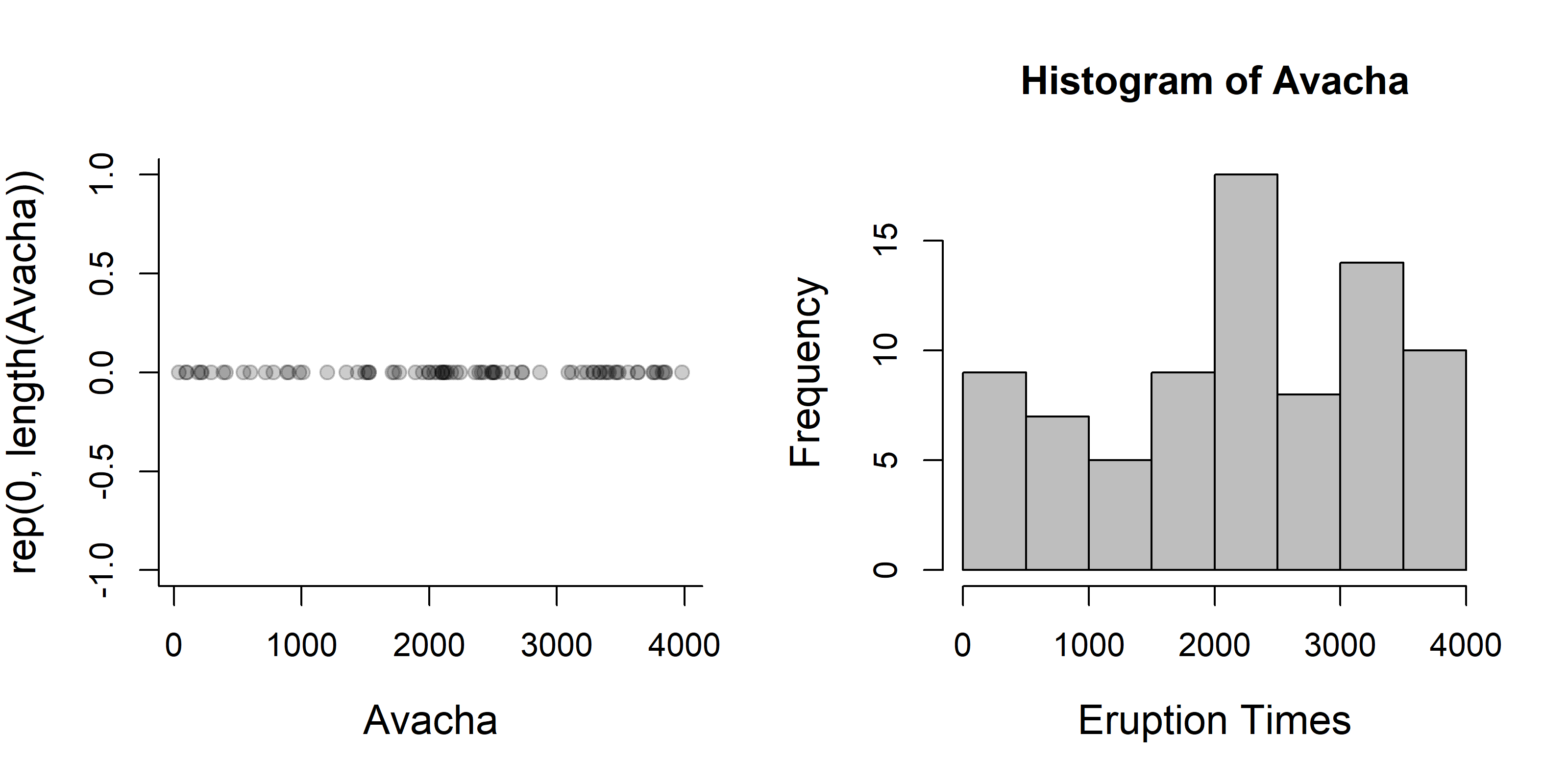
Creata a vector of waiting times (intervals) between eruptions:
W <- diff(Avacha)
# Draw a histogram of the waiting times
    hist(W, col="grey", breaks=20)
# It looks sort of exponential.  Let's redraw it is a density histogram
    hist(W, col="grey", breaks=20, freq=FALSE)
# And superimpose the exponential distribution on the waiting times:
    curve(Rate * exp(-x * Rate), add=TRUE, col=2, lwd=2)
# You can also do this with the "dexp" function
    curve(dexp(x, Rate), add=TRUE, col=3, lwd=2)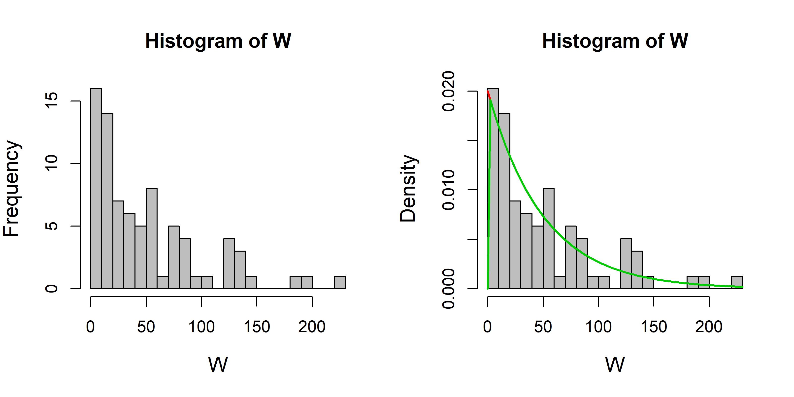
According to the exponential function, the mean and variance are (1/Rate) and (1/Rate)^2 respectively. Let’s see if that’s true for W:
mean(W)## [1] 49.75575sd(W)## [1] 59.82441the numbers should be close to 50.
Expectations and Variances by integration
Note that you can get means and expectations of continuous variables by integrating in R.
Test to see if a distribution is valid:
integrate(function(x) Rate * exp(-Rate * x), 0, Inf)## 1 with absolute error < 6.4e-06Obtain the mean:
integrate(function(x) x * Rate * exp(-Rate * x), 0, Inf) ## 50 with absolute error < 0.0022obtain the variance
integrate(function(x) (x - 1/Rate)^2 * Rate * exp(-Rate * x), 0, Inf)## 2500 with absolute error < 0.0013Incidentally, the layout command gives considerably freedom for arranging plots. You provide a matrix that enumerates which plot goes in which window. The layouts can be arbitratily complex.
Illustrating all the relationships now goes like this:
layout(rbind(c(1,1),c(2,3)))
plot(Avacha, y=rep(0,N), pch=19, col=rgb(0,0,.4,.3), xlim=c(0,Tmax),
    ylab="", yaxt="n", xlab="Year", cex=2, bty="n", main="Simulated Avacha eruptions")
hist(Avacha, breaks=10, freq=FALSE, bor="darkgrey", col="grey")
hist(diff(Avacha), col="grey", freq=FALSE, breaks=12, bor="darkgrey")
curve(dexp(x,rate=Rate), add=TRUE, lwd=2)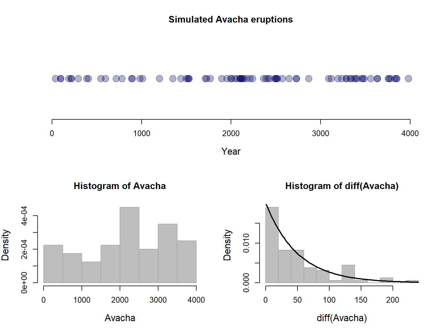
Exercise 3: Vesuvius
Download the Vesuvius data and assess whether the uniform + exponential model appears valid. The data file is available on the course home page or at: https://terpconnect.umd.edu/~egurarie/teaching/Biol709/data/.
Illustrating relationships between Uniform, Exponential and Poisson
The cut() function is very useful for breaking down quantitative data into discrete factors. For example, reducing our simulated Avacha data into centuries:
Avacha <- sort(runif(N, 0, Tmax))
Avacha.100 <- cut(Avacha, seq(0,Tmax,100))
To count how many eruptions there were per century, we tabulate:
tabulate(Avacha.100)## [1] 1 1 1 2 3 3 0 2 1 1 3 4 2 0 2 4 2 1 2 3 1 3 2 1 0 4 2 3 0 1 7 0 2 4 2
## [36] 1 4 4 0 1Note that tabulate() is similar to table, but simply returns a vector (which for our purposes is very convenient).
hist(tabulate(Avacha.100))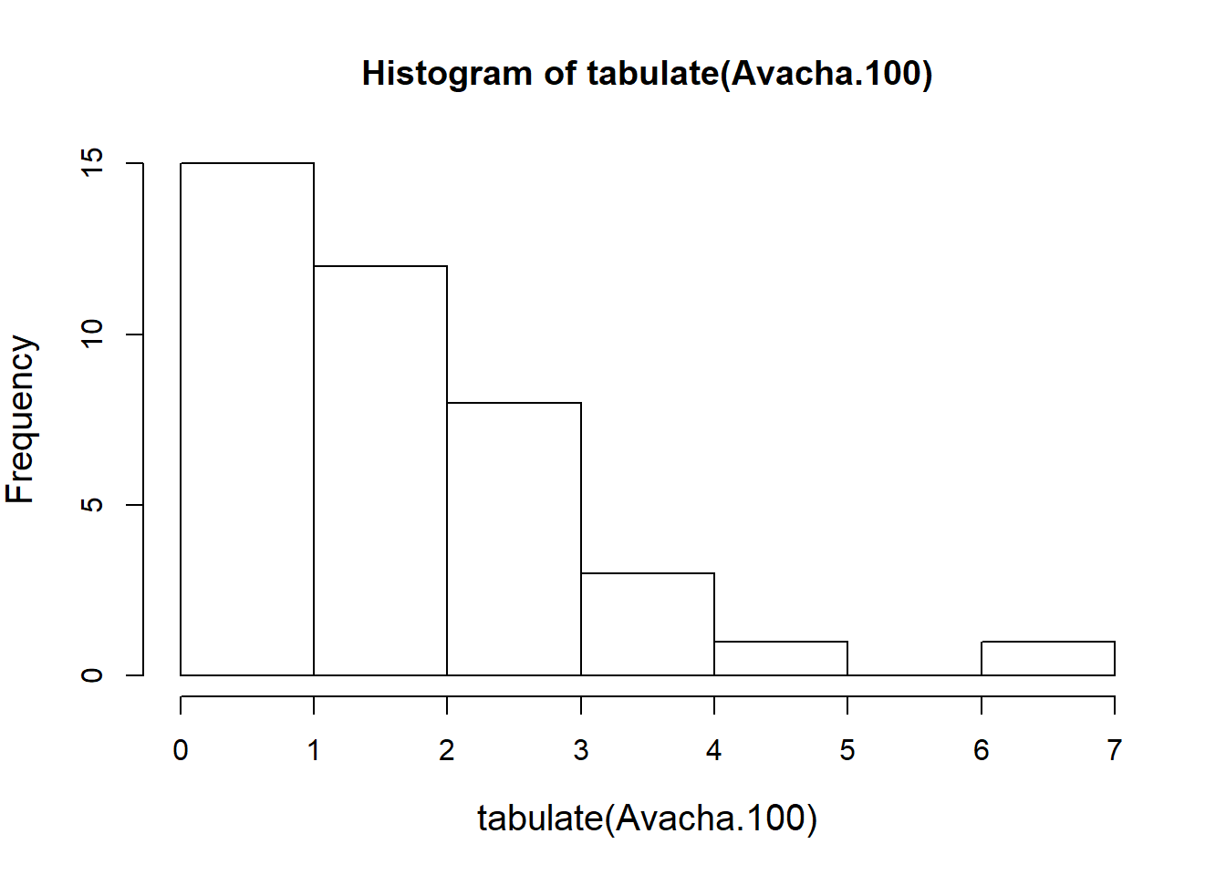
As is typical for the “hist” function applied to discrete data, the breaks are awkward around zero. An alternative is to tabulate the tabulation!
table(tabulate(Avacha.100))##
## 0 1 2 3 4 7
## 6 11 10 6 6 1plot(table(tabulate(Avacha.100)))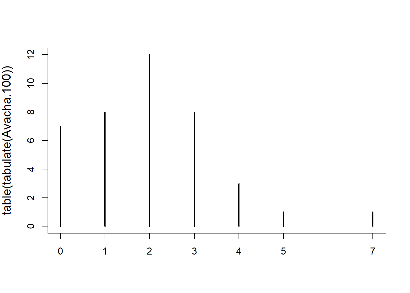
You may or may not get something that looks like the Poisson distribution of numbers, i.e. discrete values (that include 0) and tabulate the number of eruptions per 100 year block
Let’s get a vector of proportions:
P.Avacha.100 <- table(tabulate(Avacha.100))/length(tabulate(Avacha.100))
plot(P.Avacha.100)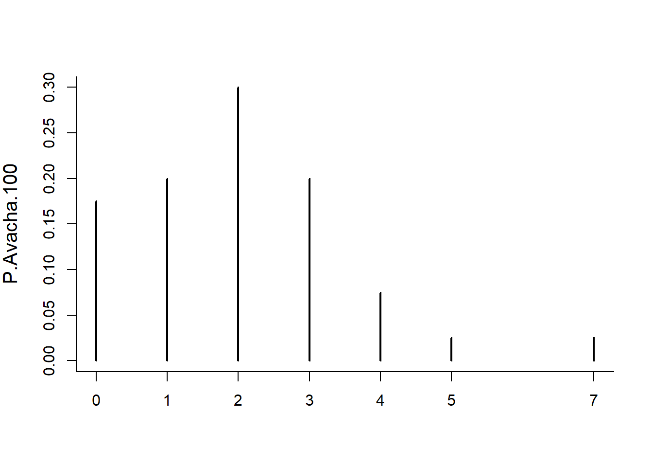
And draw the Poisson distribution over it. Recall that the lambda parameter in a Poisson distribution is the expected count in a block. In this case, the block is 100 years x rate of 1/50 = 2.
plot(P.Avacha.100)
lines(0:8, dpois(0:8, 2), type="h", col=rgb(1,0,0,.2), lwd=10)
So it looks like the Poisson approximation is quite close.
Let’s do this (compactly) for any break:
Interval <- 25
lambda <- Interval * Rate
Avacha.cut<- cut(Avacha, seq(0,Tmax,Interval))
P.Avacha.cut <- table(tabulate(Avacha.cut))/sum(table(tabulate(Avacha.cut)))
plot(P.Avacha.cut)
lines(0:8, dpois(0:8, lambda), type="h", col=rgb(1,0,0,.2), lwd=10)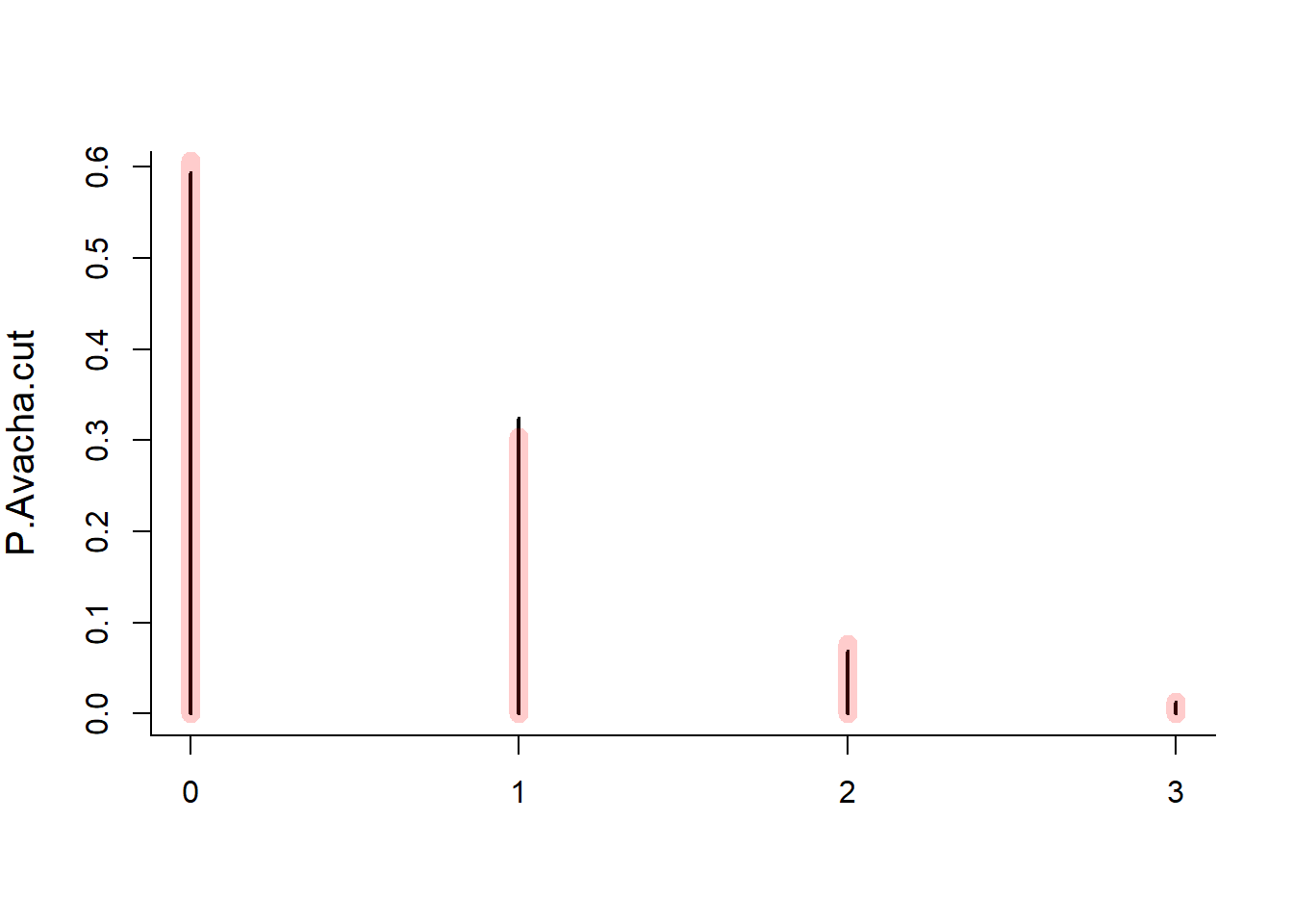
Exercise 4: More volcanoes
Experiment with different break-ups of the Avacha simulation, and see if the Poisson relationship holds for the Vesuvius data.