Lab 1: Loading data and basic visualizations
BIOL709 / Winter 2018
Goals
In this lab we will load several data frames (the most useful way R stores data), and visualiza and efficiently summarize both quantitative and categorical data.
Loading Data
A first step to any good R session is to set your working directory. This is the directory you will be loading your data from and potentially saving your output (figures and summary tables) into.
setwd("c:/users/elie/box sync/teaching/Biol709/Week1/Lab1")(NOTE: this can be done using point and click windows in Rstudio)
Copy the data files from Week 2 into whatever folder you`ve set as your working directory.
We will start by loading the student survey data:
Students <- read.csv("../data/StudentSurvey.csv")Note that this command finds the data by navigating the directory relative to my working directory. The .. means go up a directory, the /data/ means go down one level to the data directory, where the file resides.
I uploaded all of the data that we’ll need for the labs in this class here: https://terpconnect.umd.edu/~egurarie/teaching/Biol709/data/ and we can use the same read.csv() command to load them from there:
Students <- read.csv("https://terpconnect.umd.edu/~egurarie/teaching/Biol709/data/StudentSurvey.csv")Working with data frames
Look at some properties of this data file, with the following functions:
is(Students)## [1] "data.frame" "list" "oldClass" "vector"dim(Students)## [1] 94 15names(Students)## [1] "Sex" "Age" "Height" "Weight" "Shoe" "Handed"
## [7] "Country" "Hair" "Eyes" "Sleep" "Study" "Online"
## [13] "Outside" "Math" "Pingpong"head(Students)## Sex Age Height Weight Shoe Handed Country Hair Eyes Sleep
## 1 Male 28 60 170 10.0 R South Korea Black Brown 7
## 2 Female 19 54 120 7.5 R USA Brown Blue 7
## 3 Female 20 57 115 6.0 R USA Black Brown 7
## 4 Female 20 60 143 6.0 R Bangladesh Black Black 7
## 5 Female 19 60 110 6.0 R Singapore Black Black 6
## 6 Female 20 61 105 7.0 R Vietnam Black Brown 6
## Study Online Outside Math Pingpong
## 1 3.0 0 5 Think it's kind of cool 2
## 2 2.0 6 5 Don't think about it 3
## 3 0.0 0 8~10 Tolerate it 1
## 4 0.5 2 3 Tolerate it 1
## 5 0.0 2 3 I live and breathe it 5
## 6 0.0 2 1 Think it's kind of cool 2str(Students)## 'data.frame': 94 obs. of 15 variables:
## $ Sex : Factor w/ 2 levels "Female","Male": 2 1 1 1 1 1 1 1 1 1 ...
## $ Age : int 28 19 20 20 19 20 20 21 20 19 ...
## $ Height : num 60 54 57 60 60 61 61 62 63 63 ...
## $ Weight : int 170 120 115 143 110 105 110 108 90 90 ...
## $ Shoe : num 10 7.5 6 6 6 7 6 6.5 6.5 5.5 ...
## $ Handed : Factor w/ 2 levels "L","R": 2 2 2 2 2 2 2 2 2 2 ...
## $ Country : Factor w/ 15 levels "Australia","Austria",..: 12 14 14 3 11 15 14 5 5 5 ...
## $ Hair : Factor w/ 10 levels "Black","Black ",..: 2 5 1 2 1 2 4 2 2 2 ...
## $ Eyes : Factor w/ 10 levels "Black","Blue",..: 4 2 4 1 1 4 2 1 1 1 ...
## $ Sleep : num 7 7 7 7 6 6 8.5 8 7 8 ...
## $ Study : num 3 2 0 0.5 0 0 1 0 3 3 ...
## $ Online : Factor w/ 14 levels "0","0.2","0.5",..: 1 12 1 6 6 6 6 8 8 4 ...
## $ Outside : Factor w/ 22 levels "<1","0","0.5",..: 15 15 20 13 13 4 4 2 19 14 ...
## $ Math : Factor w/ 6 levels "Despise it","Don't think about it",..: 5 2 6 6 3 5 6 4 4 NA ...
## $ Pingpong: int 2 3 1 1 5 2 1 1 1 3 ...Note, the str() command (for structure) gives you the most detailed information.
In order to extract a column from a data frame, you can either reference its number (as with a matrix), such as Students[,4] or use the much more useful - and generally better practice - $ and column name operator:
Country <- Students$CountryWorking with categorical data
Summarizing categorical data
Check out what Country is:
is(Country)## [1] "factor" "integer" "oldClass"
## [4] "numeric" "vector" "data.frameRowLabels"
## [7] "numericVector" "atomicVector" "index"
## [10] "replValue" "numLike" "number"
## [13] "Mnumeric" "replValueSp"Now that we have the categorical data, encoded as a factor (the default way in which R interprets a character string when loading data from a text file). The very useful table() function performs a count of the data:
table(Country)## Country
## Australia Austria Bangladesh Belgium China Hong Kong
## 1 1 1 1 28 1
## Japan Macau Malaysia Russia Singapore South Korea
## 3 1 1 1 2 6
## Taiwan USA Vietnam
## 7 37 2A barplot
barplot(table(Country))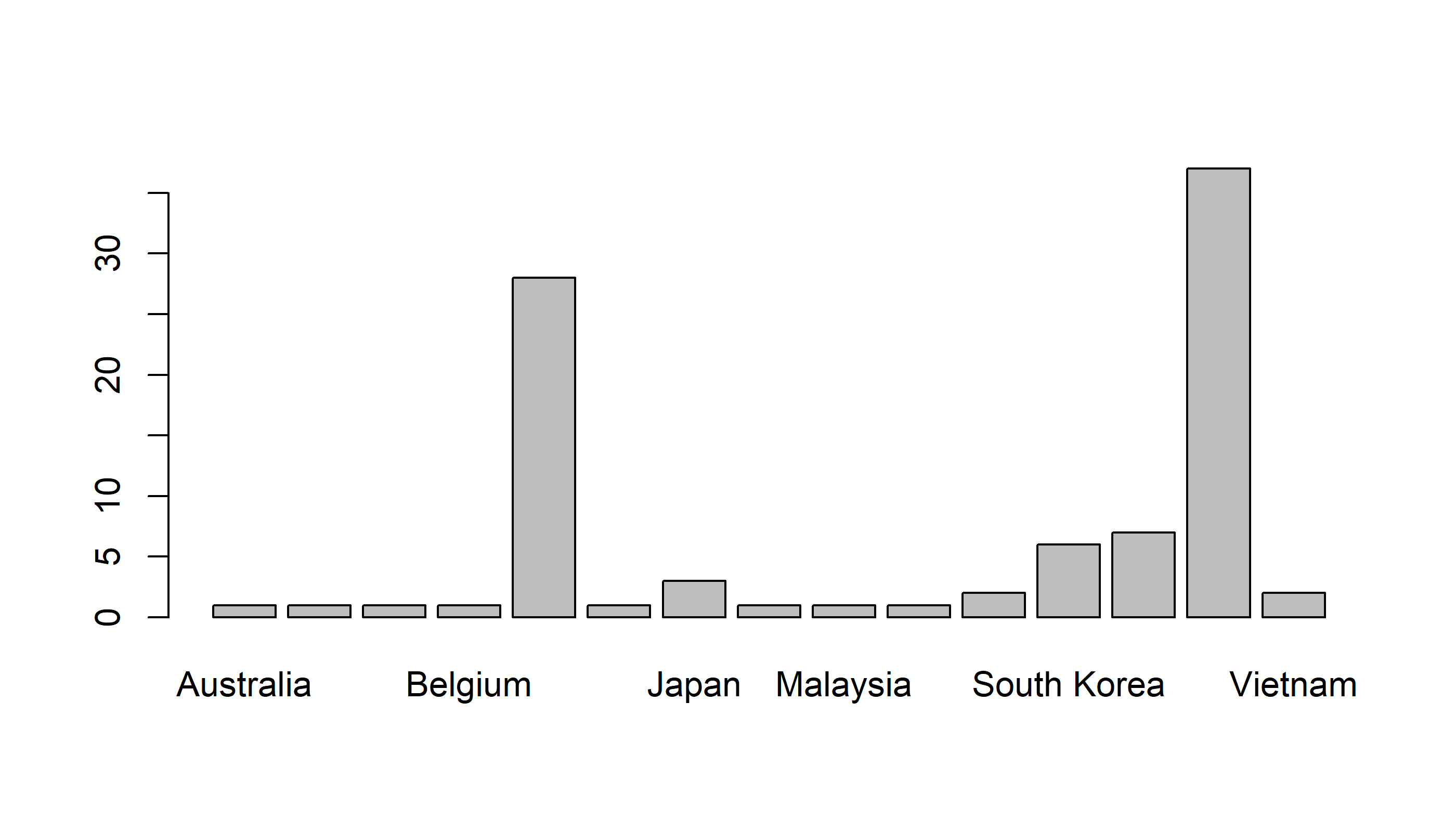
Draw a sorted barplot
barplot(sort(table(Country)))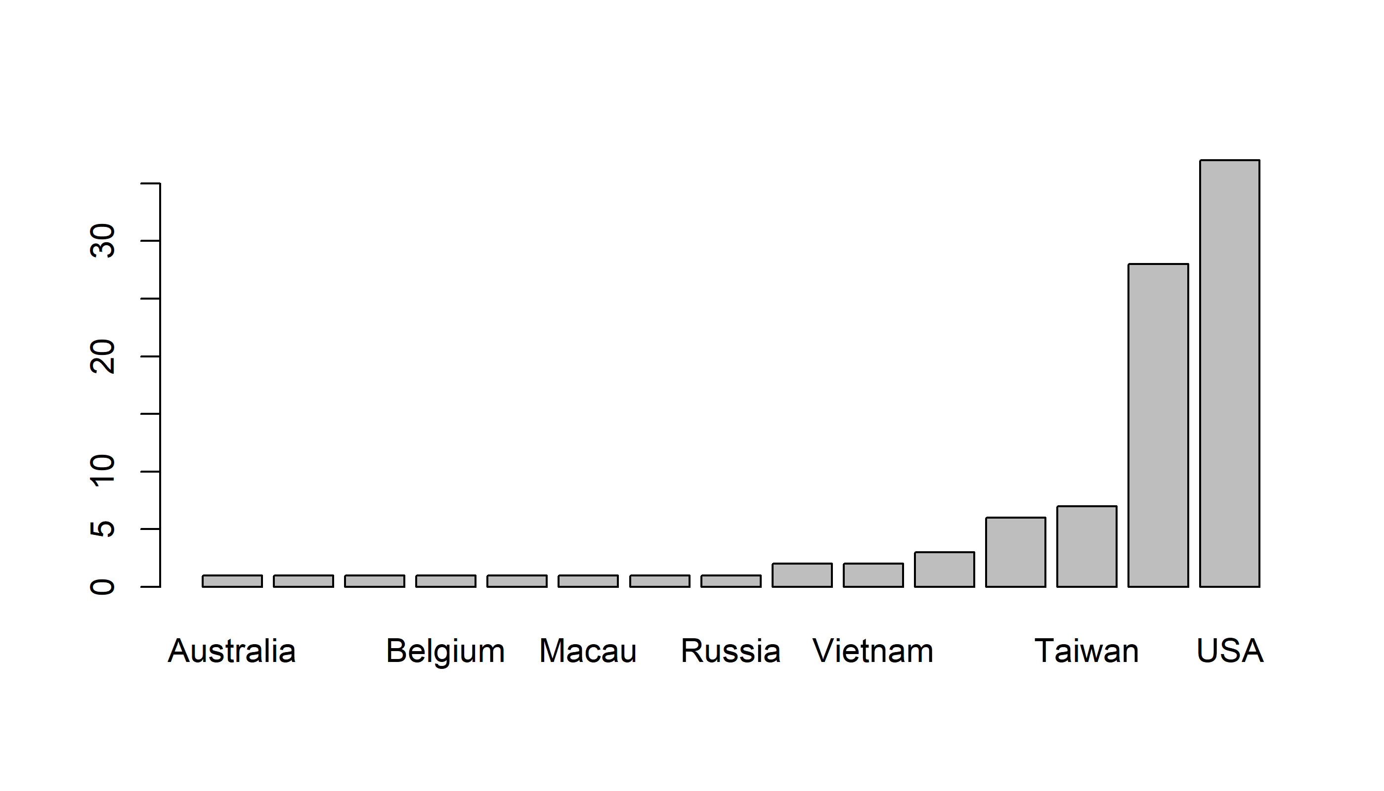
Quickie Exercise: Figure out how to draw a barplot with decreasing frequencies.
Tweaking the bar plot
Note that we cannot really read the x-axis because the country names are so long. We need to tweak this plot in a couple of ways: (1) make the country names vertical and (2) make the lower margins larger.
The motherlode of all plot tweaks is in the “par()” function, which sets all graphical parameters. These settings remain until they are changed or until the graphics device is “renewed”. You will spend much time poking around in the help file of par()!
A few examples: las sets the orientation of labels, mar sets the margin sizes (think about what the four numbers refer to).
par(las = 2, mar=c(7,5,2,2))
barplot(sort(table(Country)))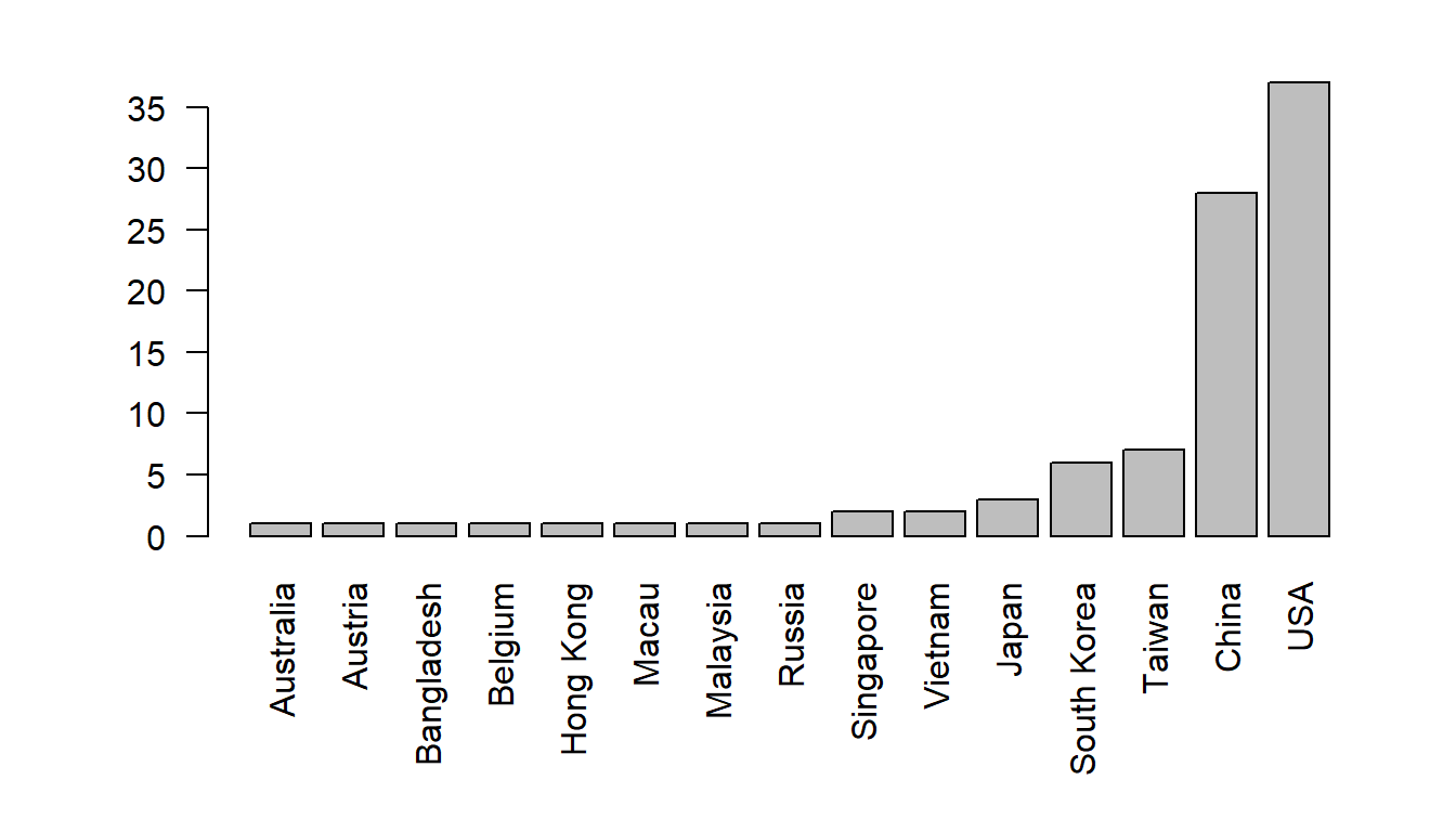
Label the y-axis
barplot(sort(table(Country)), ylab="Number of students")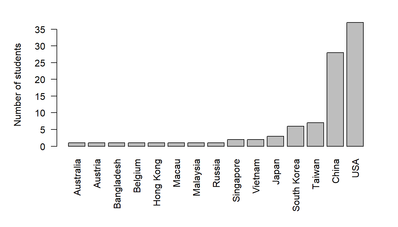
or add colors
par(las = 2, mar=c(7,5,2,2))
barplot(sort(table(Country)), ylab="Number of students",
        col = rainbow(length(table(Country))))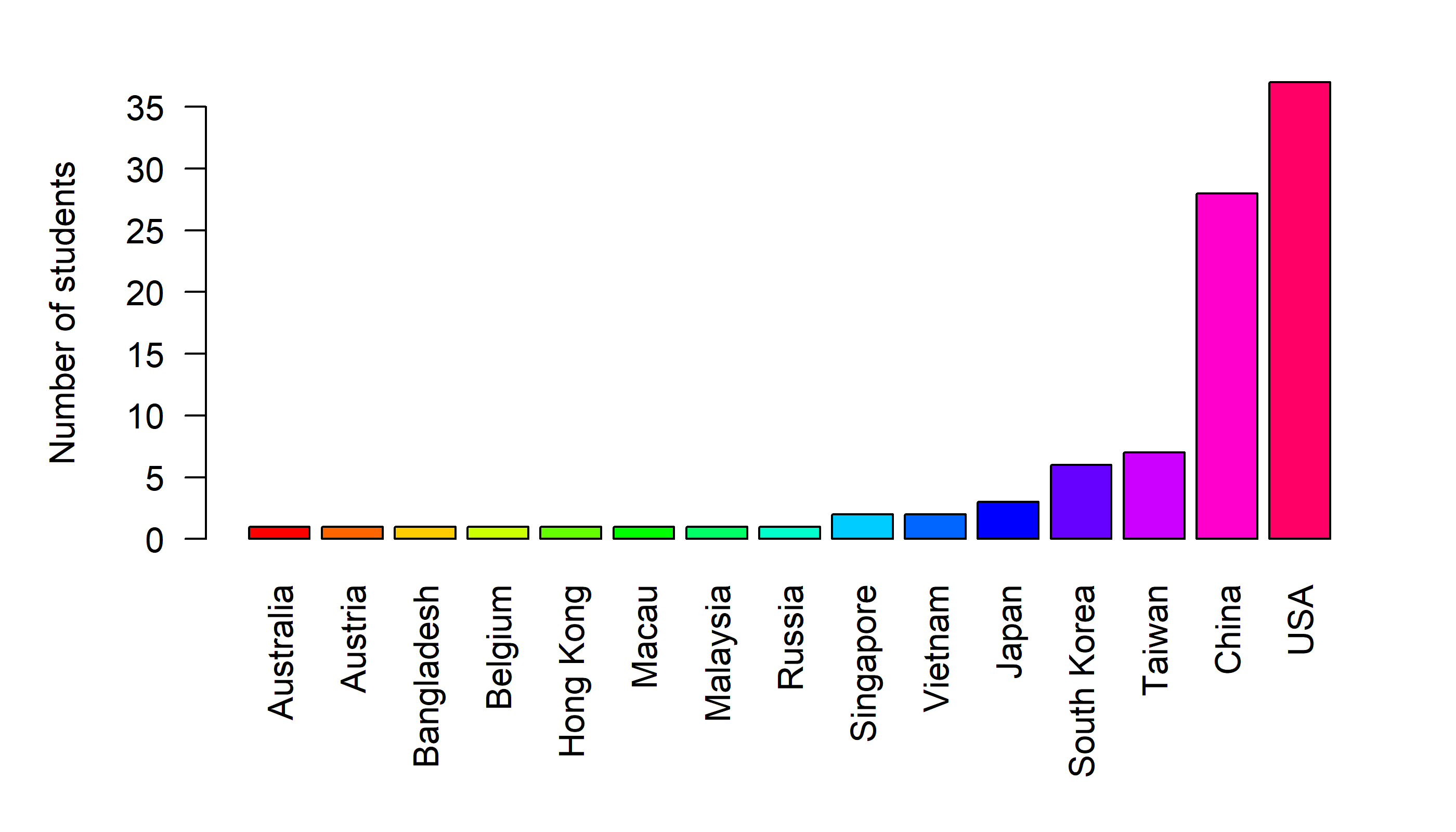
Exporting Graphics
There are several good ways to export graphics, like: pdf() or jpeg() or png() or tiff() or bmp(). Each of these functions has its own ways to set the size, resolution, etc.
I personally like making .pdfs - because they are vector graphics and therefore the resolution is effectively infinite. Also, I compile all my documents directly in pdf format. But they are more difficult to incorporate into, e.g., Word or Powerpoint documents.
The initial command opens a new graphics device (with the specified name)
pdf("StudentBarplot.pdf")
  # you have to redefine your graphical parameter for this new "device"
  par(las = 2, mar=c(7,5,2,2))
  barplot(sort(table(Country)), ylab="Number of students", col=rainbow(15))
dev.off()
# this last command closes the graphics device.
Exporting data frames to a file
Save the summary table as a data frame
Country.df <- data.frame(table(Country))We can save this useful summary table to the computer as follows:
write.csv(Country.df, file="CountrySummaryTable.csv")What if we wanted to count by sex? An inefficient way to do this would look something like this:
  Sex <- Students$Sex
    Country.Males <- Country[Sex == "Male"]
    Country.Females <- Country[Sex == "Female"]
    cbind(Males = table(Country.Males), Females = table(Country.Females))
## Males Females
## Australia 0 1
## Austria 1 0
## Bangladesh 0 1
## Belgium 1 0
## China 9 19
## Hong Kong 1 0
## Japan 3 0
## Macau 1 0
## Malaysia 1 0
## Russia 1 0
## Singapore 1 1
## South Korea 3 3
## Taiwan 4 3
## USA 21 16
## Vietnam 1 1More efficient:
  Sex <- Students$Sex
  table(Country, Sex)
## Sex
## Country Female Male
## Australia 1 0
## Austria 0 1
## Bangladesh 1 0
## Belgium 0 1
## China 19 9
## Hong Kong 0 1
## Japan 0 3
## Macau 0 1
## Malaysia 0 1
## Russia 0 1
## Singapore 1 1
## South Korea 3 3
## Taiwan 3 4
## USA 16 21
## Vietnam 1 1A cross-tabulated table of counts is referred to as a “contingency table”.
Annoying R Nuisance! (these will be coming up throughout the course) A
tableobject is a slightly strange thing. Not a matrix nor a data frame. See what (unexpected) thing happens when you try to turn it into a data frame:
data.frame(table(Country, Sex))To make it a data frame, you have to do run this (poorly documented) function:
Counts <- as.data.frame.matrix(table(Country, Sex))Let’s sort this table by a total count:
Counts <- Counts[order(rowSums(Counts)),]This does a good job - but the syntax is a bit ugly. There are “modern” packages that make processing of data frames much more intuitive. Notably: plyr. Compare this syntax:
require(plyr)
arrange(Counts, rowSums(Counts))
## Female Male
## 1 1 0
## 2 0 1
## 3 1 0
## 4 0 1
## 5 0 1
## 6 0 1
## 7 0 1
## 8 0 1
## 9 1 1
## 10 1 1
## 11 0 3
## 12 3 3
## 13 3 4
## 14 19 9
## 15 16 21Creating all of these independent vectors (Country, Sex, etc.) is a pain. In an ideal (and therefore hard to achieve) R workflow, you would perform all of the analysis that you need without ever “breaking” your original data apart. For this, the with() function can be useful:
with(Students, table(Country, Sex))It accesses objects based on their name in a data frame (or, more generally, a list).
Note that the all-important (if mysteriously named mfrow) argument works by taking a vector with two elements: the number of rows, and the number of columns in the layout
Here’s a version with horizontal bars
    par(mfrow=c(1,2), mar = c(2,0,4,2), oma = c(0,10,0,0))
  barplot(Counts[,1], horiz=TRUE, main="Females", names = row.names(Counts))
  barplot(Counts[,2], horiz=TRUE, main="Males")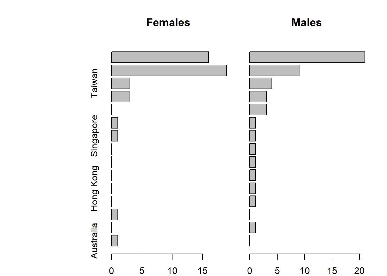
Note: you can read and try to understnad the
mfrow,mar(margin) andoma(outer margin) parameters in the help file of the all-powerfulpar.
Here’s a version with horizontal bars, where we tricked the barplots into lining up.
  par(mfrow = c(1,1), mar=c(5,7,2,2), las = 1)
  barplot(-Counts$Female, horiz=TRUE, yaxt="n", xlim=c(-20,20), col="red")
  barplot(Counts$Male, horiz=TRUE, add=TRUE, col="blue")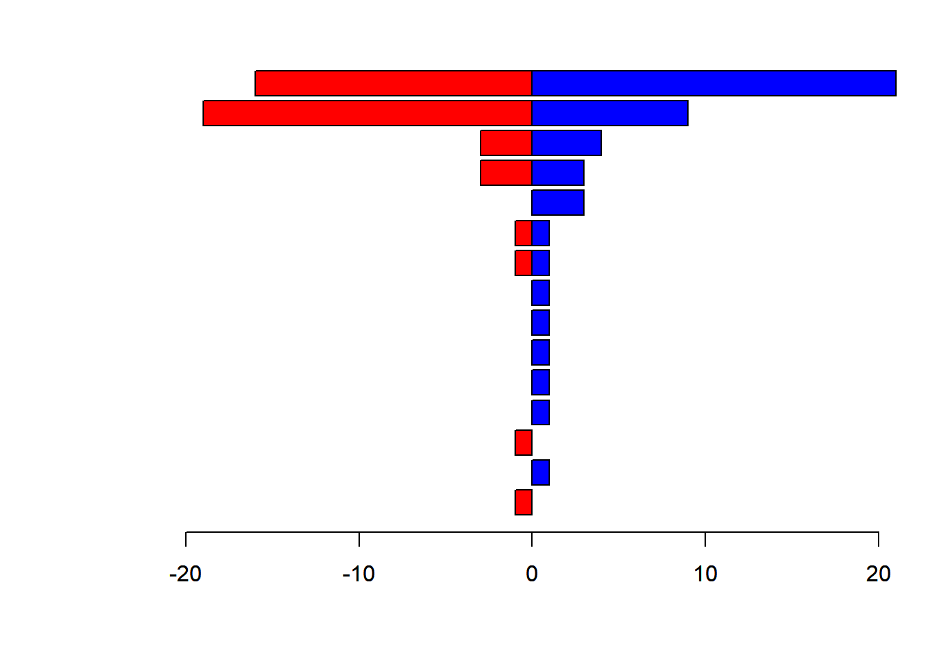
The plot can keep being improved in countless ways, but you get the idea.
Exercise: Read about the text() function, and see if can figure out a way to label the two sides of this figure with “Female” and “Male” tags.
A bit on releveling factors
Note that “Country” is a factor
is(Country)## [1] "factor" "integer" "oldClass"
## [4] "numeric" "vector" "data.frameRowLabels"
## [7] "numericVector" "atomicVector" "index"
## [10] "replValue" "numLike" "number"
## [13] "Mnumeric" "replValueSp" levels(Country)## [1] "Australia" "Austria" "Bangladesh" "Belgium" "China"
## [6] "Hong Kong" "Japan" "Macau" "Malaysia" "Russia"
## [11] "Singapore" "South Korea" "Taiwan" "USA" "Vietnam"Note that the “levels” of Country are alphabetical. We can reorder the levels to reflect the frequencies.
levels.ordered <- names(sort(table(Country)))this is a character vector of the ordered levels, which we use to “recreate” Country.
  Country <- factor(Country, levels=levels.ordered)
  levels(Country)
## [1] "Australia" "Austria" "Bangladesh" "Belgium" "Hong Kong"
## [6] "Macau" "Malaysia" "Russia" "Singapore" "Vietnam"
## [11] "Japan" "South Korea" "Taiwan" "China" "USA"Now, if we recreate our vectors, the figure from above will be comparable
  Country.M <- Country[Students$Sex == "Male"]
  Country.F <- Country[Students$Sex == "Female"]
  par(mfrow = c(1,1), mar=c(5,7,2,2), las=1)
  barplot(-table(Country.F), horiz=TRUE, yaxt="n", xlim=c(-20,20), col="red")
  barplot(table(Country.M), horiz=TRUE, add=TRUE, col="blue")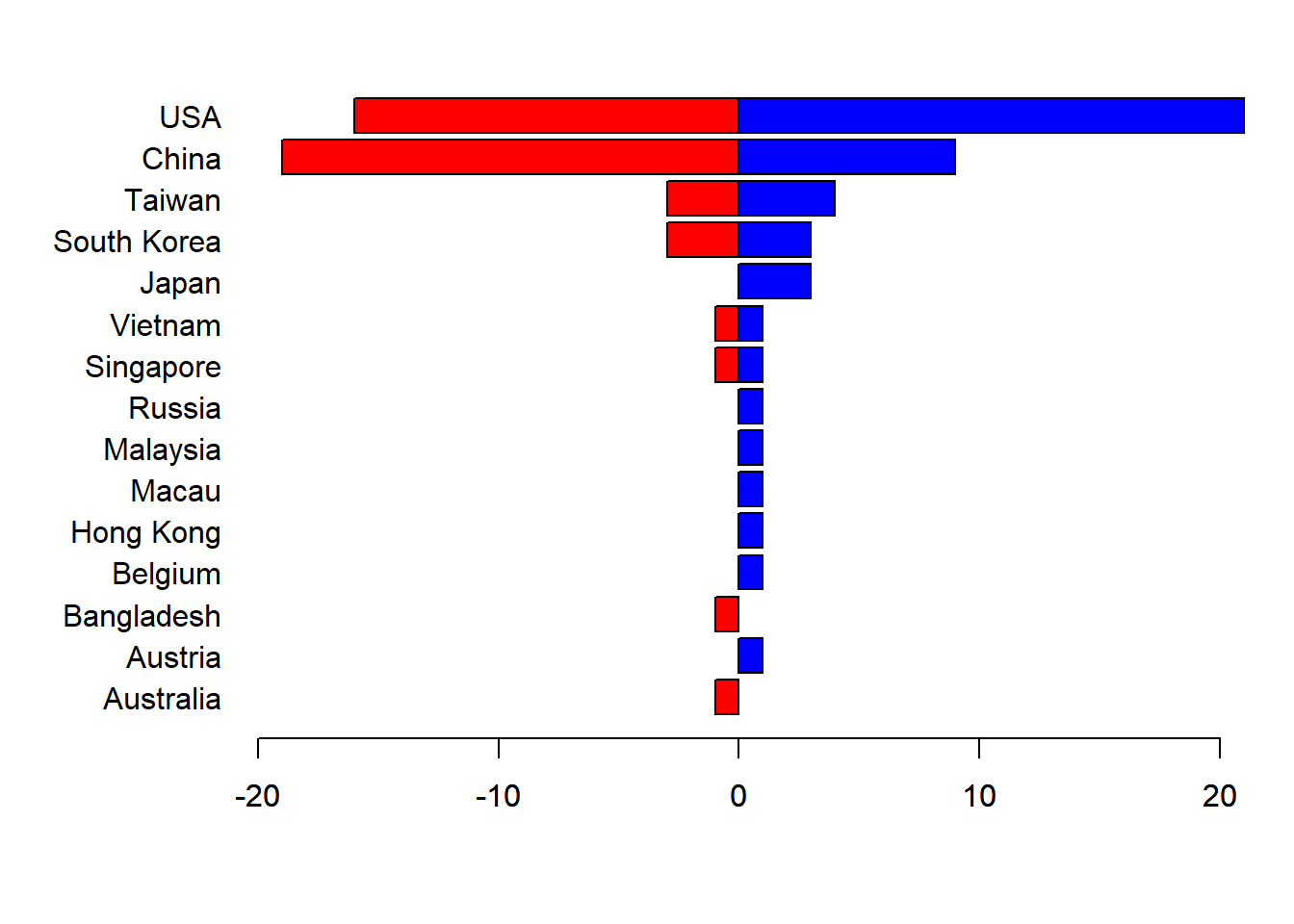
Working with Quantitative Data
Download the sea lion pup data set here: https://terpconnect.umd.edu/~egurarie/teaching/Biol709/data/PupTaggingData.csv
##     Pups <- read.csv("../data/PupTaggingData.csv")
    dim(Pups)
## [1] 498 10 head(Pups)## Island TaggingDate ID Weight Length Girth BCI Sex Age DOB
## 1 Chirpoev 7/10/2005 Br800L 15.5 93 69.0 0.7419355 M NA <NA>
## 2 Chirpoev 7/10/2005 Br801L 29.0 106 71.0 0.6698113 F NA <NA>
## 3 Chirpoev 7/10/2005 Br802L 35.5 112 76.0 0.6785714 M NA <NA>
## 4 Chirpoev 7/10/2005 Br803L 32.0 107 72.0 0.6728972 M NA <NA>
## 5 Chirpoev 7/10/2005 Br804L 32.0 105 73.5 0.7000000 M NA <NA>
## 6 Chirpoev 7/10/2005 Br805L 33.5 111 72.0 0.6486486 M NA <NA>Use the table function to make a quick table of number of pups by Island and Sex
table(Pups$Island, Pups$Sex)##
## F M
## Antsiferov 38 62
## Chirpoev 43 56
## Lovushki 50 50
## Raykoke 49 51
## Srednova 46 53Extract the weight, girth, length, sex, and island vectors
    Length <- Pups$Length
    Weight <- Pups$Weight
    Girth <- Pups$Girth
    Sex <- Pups$Sex
    Island <- Pups$Island
Note that this is tedious. There are two shortcuts we discussed in class to doing this. One is the handy, easy, but not-particularly-recommended “attach()” function. So:
##     rm(list=ls())   # removes all objects in memory
##     Pups <- read.csv("../data/PupTaggingData.csv")
    attach(Pups)
## The following objects are masked _by_ .GlobalEnv:
##
## Girth, Island, Length, Sex, Weight plot(Length, Weight)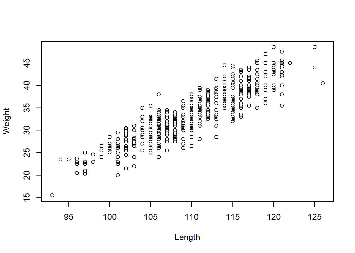
Another is my preferred “unstripping spaghetti” loop:
    n <- names(Pups)
    for(i in 1:length(n))
      assign(n[i], Pups[,i])
There are a few things going on here.
Finally, and most ideally, (as mentioned before) you never break your data frame apart at all.
Histograms
The basic function:
hist(Length)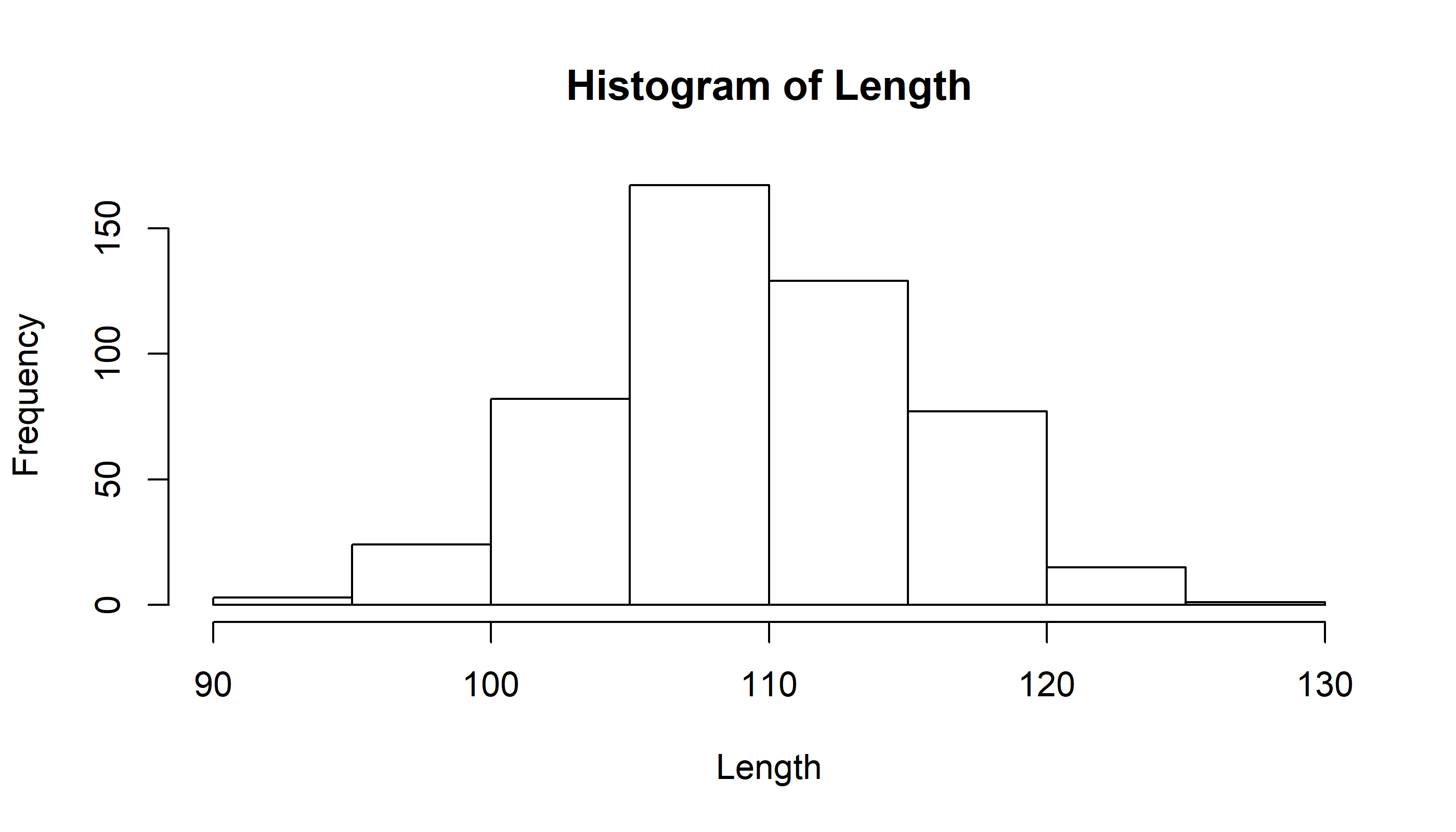
Note, the coarse binning. We can increase the number of bins.
hist(Length, breaks=20)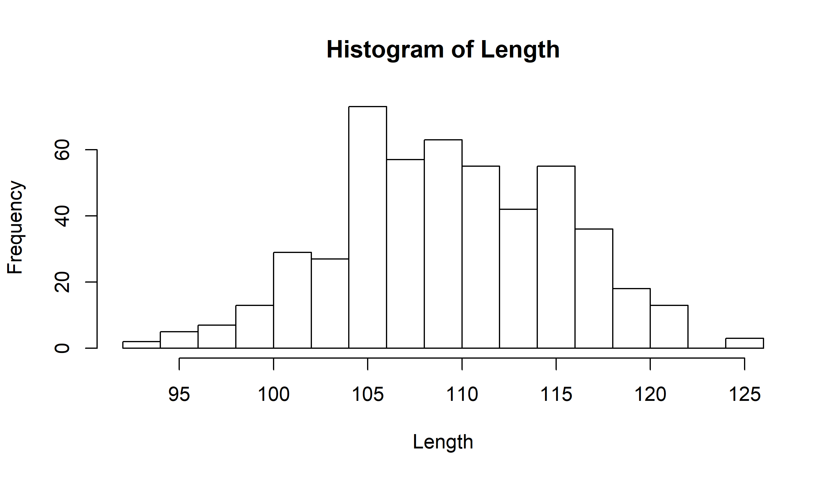
or, with more control, strictly set the number of bins
hist(Length, breaks=seq(90,130,2.5), col="grey")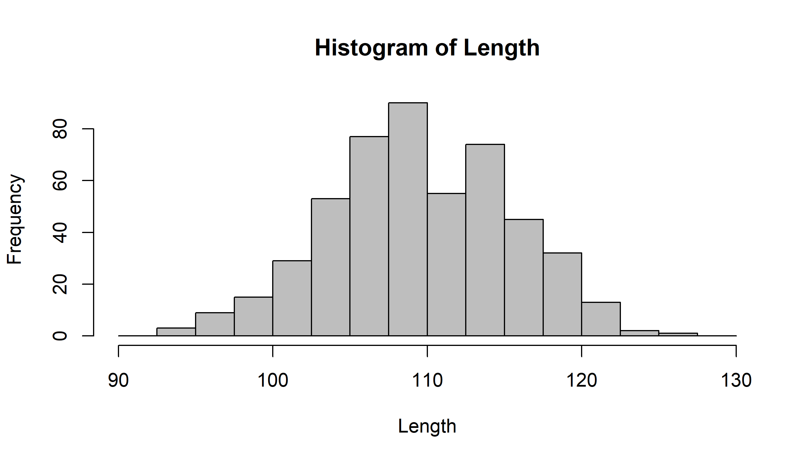
or, with more generality:
    mybreaks <- seq(floor(min(Length)),ceiling(max(Length))+2, 2)
    hist(Length, breaks=mybreaks, col="grey")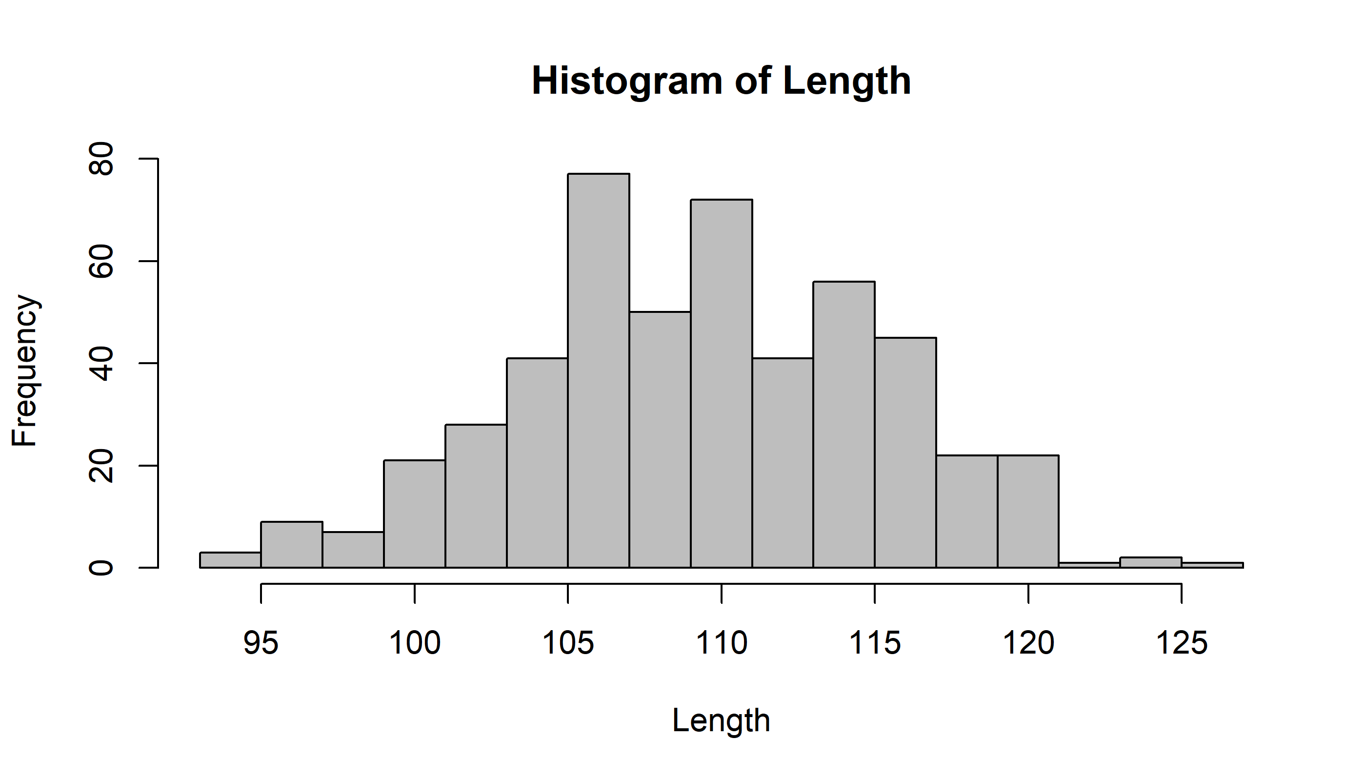
Lets compare males and females:
    hist(Length[Sex=="M"], breaks=mybreaks, col="grey")
    hist(Length[Sex=="F"], breaks=mybreaks, col="red", add=TRUE)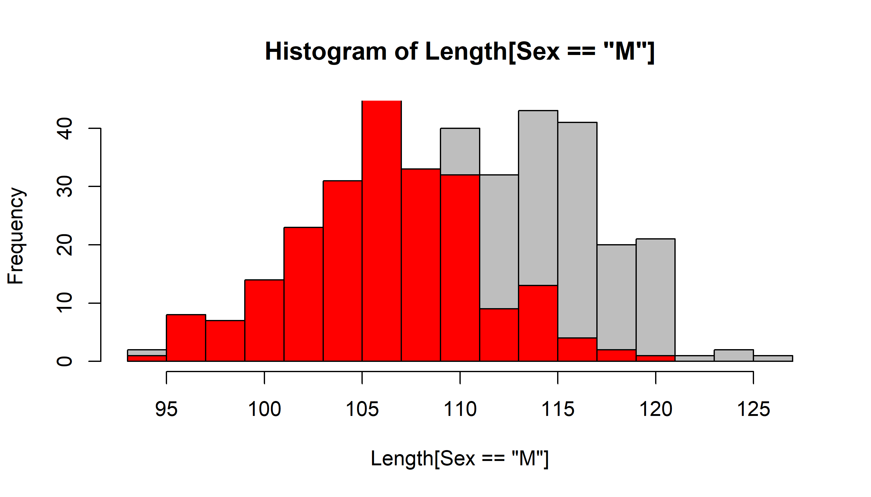
Note the “add = TRUE” parameter, which does not generate a new histogram every time.
It is hard to see what is going on here because of the overlap! We use transparent colors with rgb()
    hist(Length[Sex=="M"], breaks=mybreaks, col=rgb(1,0,0,.2), main="Histogram of lengths")
    hist(Length[Sex=="F"], breaks=mybreaks, col=rgb(0,0,1,.2), add=TRUE)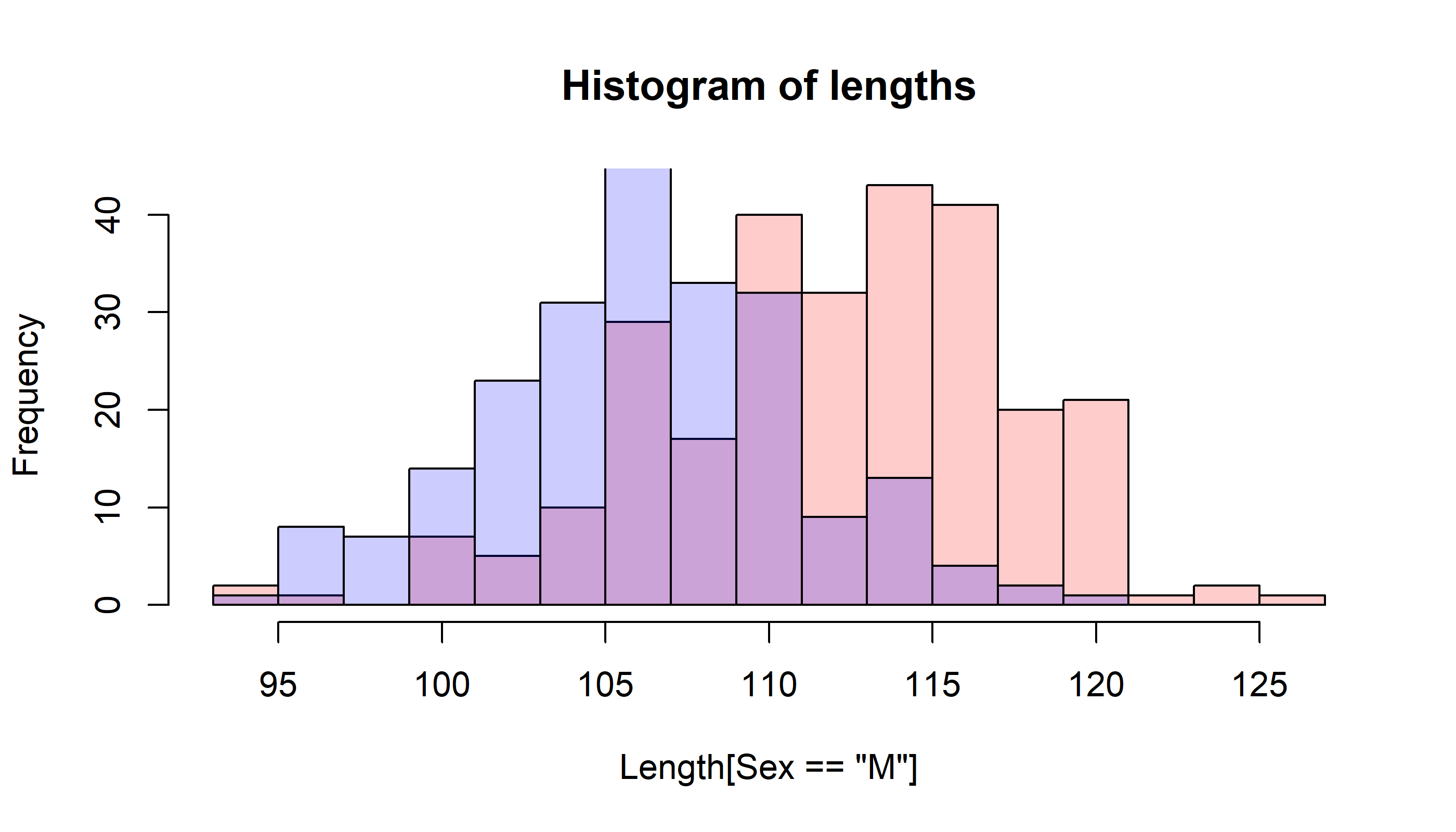
and many additional tweaks are possible.
Density curves
We can add density curve to a histogram as well
Length.density <- density(Length)this is a density plot
plot(Length.density)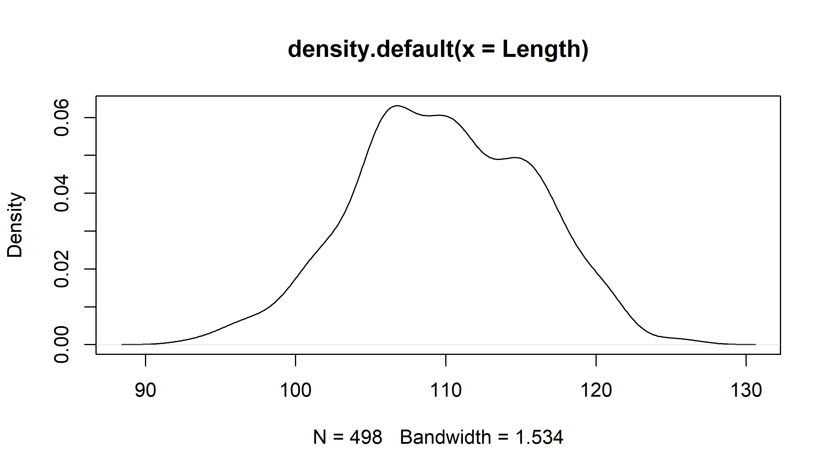
Note that “plot” draws different objects in very specific ways. That is because it is what we call a generic method. You can add the density line to a histogram
    hist(Length, breaks = 20, freq=FALSE, col="grey")
    lines(Length.density, lwd=3)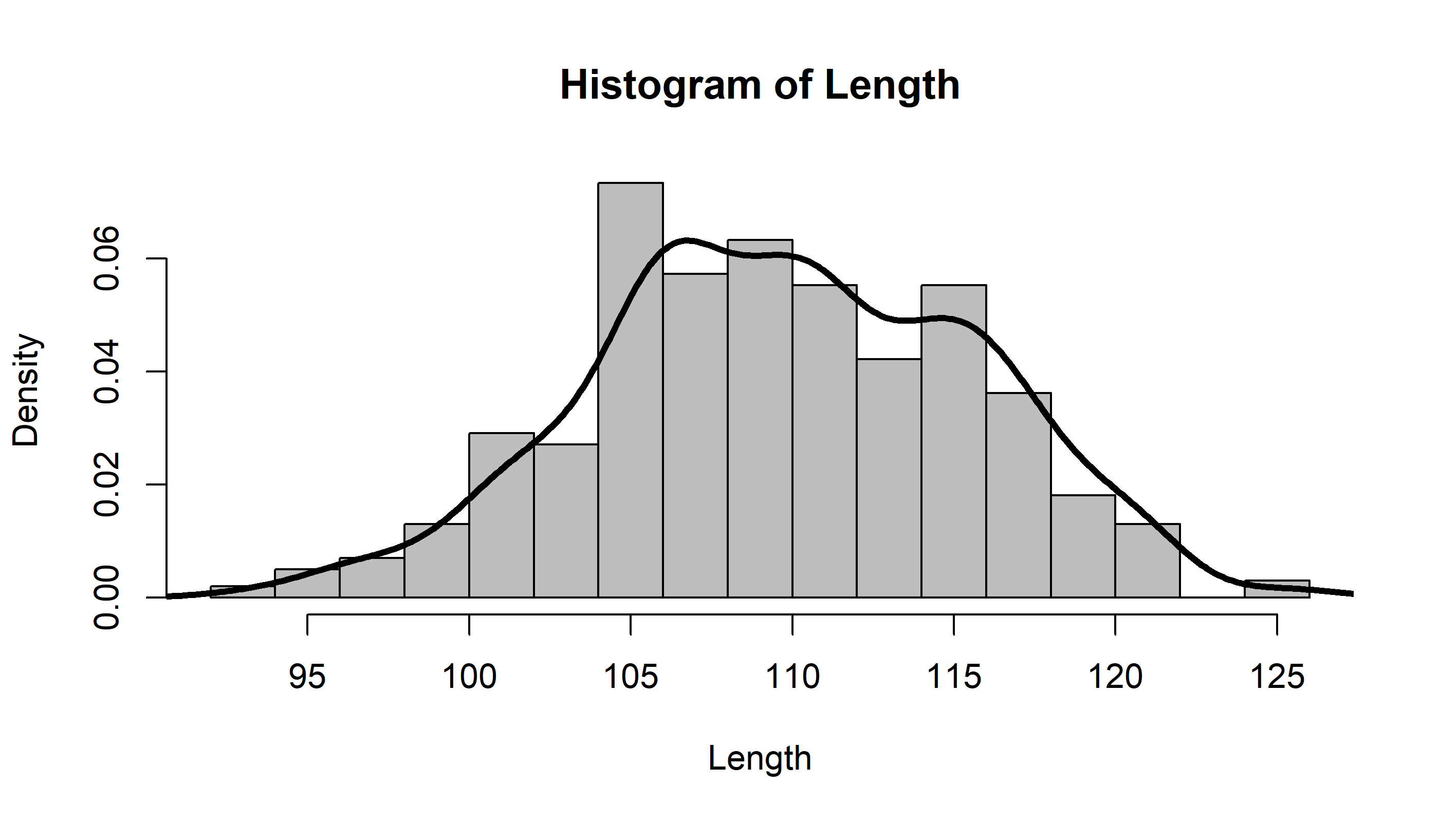
Lets make a customized function for generating a histogram:
    MyHist <- function(X, xlab, binwidth){
      hist(X,
           breaks =
             seq(min(floor(X)), max(ceiling(X)), binwidth),
           col=rgb(.5,0,1,.5), xlab = xlab)
    }
In-Class EXERCISE
Produce a plot with three windows (using par(mfrow=c(1,3))) which draws overlapping histograms of pup weight, length and girth for males and females. Add density lines.
this works:
  par(mfrow=c(1,2))
  MyDoubleHist(Weight, xlab="weight (kg)")
  MyDoubleHist(Length, xlab="length (cm)")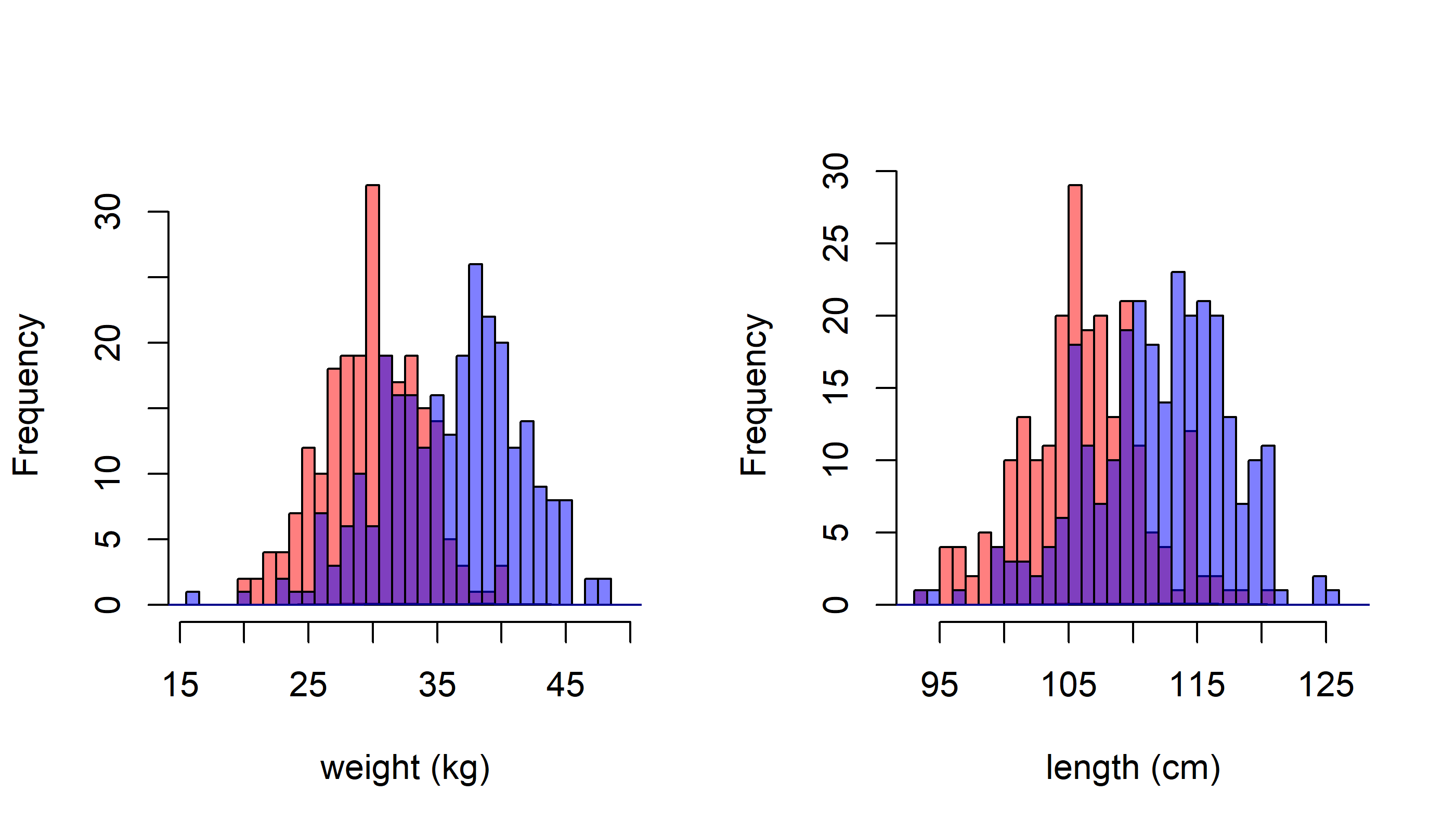
but this doesn’t work!
MyDoubleHist(Girth, xlab="girth (cm)")## Error in seq.default(min(X), max(X) + binwidth, binwidth): 'from' must be a finite numberThis is our first encounter with the dreaded NA!
Note that when we try to calculate the max and min of Girth we get “NA”:
max(Girth); min(Girth)## [1] NA## [1] NAThis is gumming up out generation of the bins. To fix this, we need to add na.rm = TRUE to those calculations. Note also that in this version we present density histograms and add density lines.
  MyDoubleHist2 <- function(X, xlab="", main = "", binwidth = 1)
  {
    X.F <- X[Sex=="F"]
    X.M <- X[Sex=="M"]

    hist(X.F, freq=FALSE,
         breaks = seq(min(X, na.rm=TRUE), max(X, na.rm=TRUE) + binwidth, binwidth),
         col=rgb(1,0,0,.3), xlab = xlab, main=main)
    hist(X.M, freq=FALSE,
         breaks = seq(min(X, na.rm=TRUE), max(X, na.rm=TRUE) + binwidth, binwidth),
         col=rgb(0,0,1,.3), add=TRUE)
    lines(density(X.F, na.rm=TRUE), col="darkred", lwd=2)
    lines(density(X.M, na.rm=TRUE), col="darkblue", lwd=2)
  }

  par(mfrow=c(1,3))
  MyDoubleHist2(Length, "Length (cm)")
  MyDoubleHist2(Girth, "Girth (cm)")
  MyDoubleHist2(Weight, "Weight (kg)")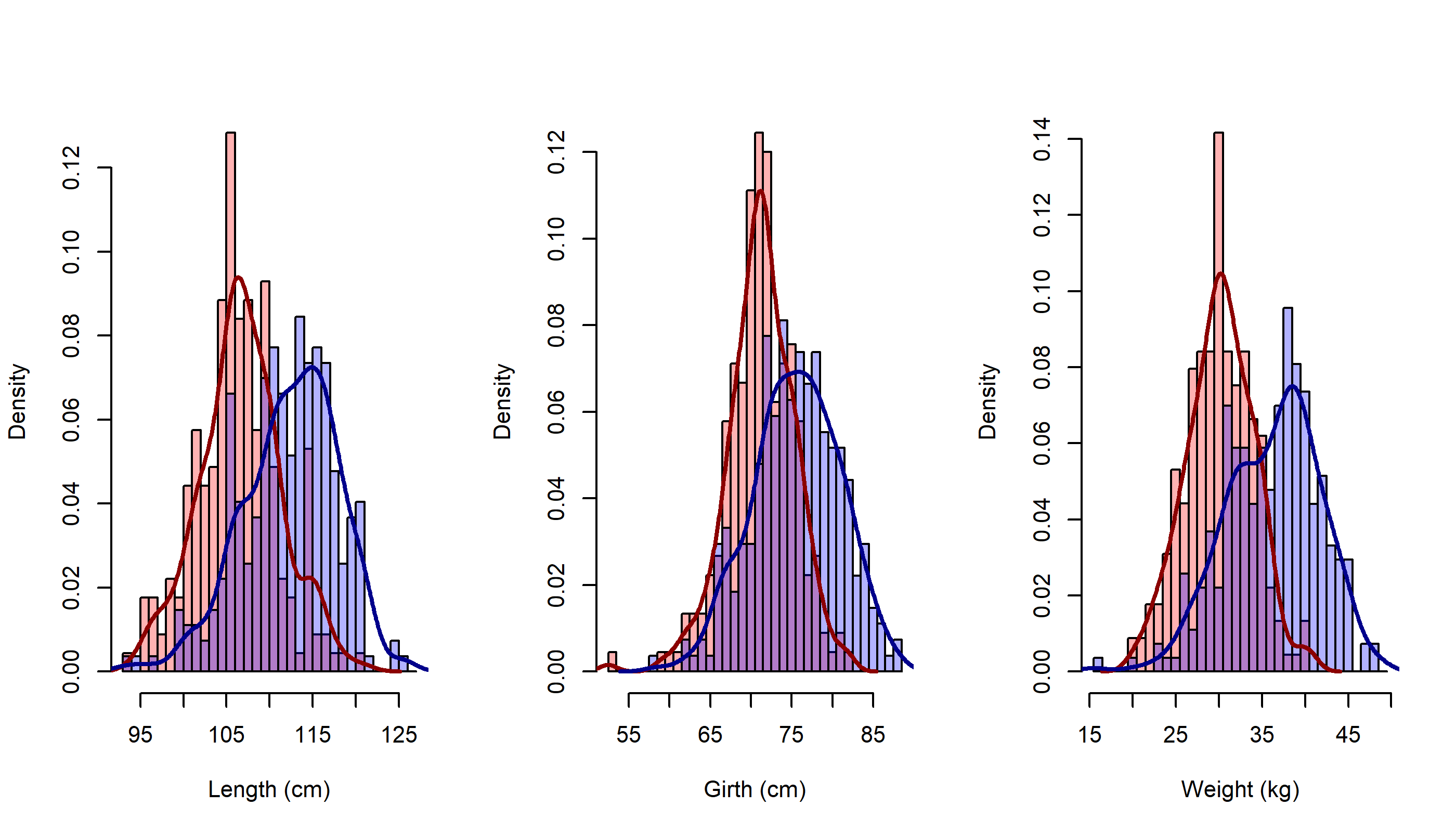
I think this looks pretty darned good!