Lab 2: Visualizing Movement Data
Elie Gurarie
1 Introduction
Visualizing tracks is a first step in identifying possible patterns or errors, as well as potential explanations for them. You should try different kinds of plots depending on your data. The kinds of figures you make should also be tuned to your goals. For your own exploratory purposes, there’s no need to get too picky about formatting and esthetics and there’s a higher premium on simplicity of code. For presentation and publication purposes, it might be worth getting more fussy.
Here are some examples you can later modify and improve to better serve your research question or interests.
1.1 Load the processed caribou data
We’ll work with the caribou data that has already been processed in the ways described in Processing Data. That said, the raw data of the actual study is on MoveBank, and could be loaded as follows:
caribou <- getMovebankData(study= "ABoVE: NWT South Slave Boreal Woodland Caribou", login=login)Here are (some of) the processed data:
load("./_data/caribou.rda")
head(caribou)
## ID Herd Species PTT Gender
## 1 BWCA-WL-17-43 Big Island Boreal Caribou 300434062212720 Female
## 2 BWCA-WL-17-43 Big Island Boreal Caribou 300434062212720 Female
## 3 BWCA-WL-17-43 Big Island Boreal Caribou 300434062212720 Female
## 4 BWCA-WL-17-43 Big Island Boreal Caribou 300434062212720 Female
## 5 BWCA-WL-17-43 Big Island Boreal Caribou 300434062212720 Female
## 6 BWCA-WL-17-43 Big Island Boreal Caribou 300434062212720 Female
## Region Collar.Type Latitude Longitude Location.Class
## 1 South Slave Telonics - GPS/Iridium 61.12582 -116.5238 G
## 2 South Slave Telonics - GPS/Iridium 61.12310 -116.4980 G
## 3 South Slave Telonics - GPS/Iridium 61.11210 -116.5231 G
## 4 South Slave Telonics - GPS/Iridium 61.11034 -116.5253 G
## 5 South Slave Telonics - GPS/Iridium 61.10285 -116.5291 G
## 6 South Slave Telonics - GPS/Iridium 61.10093 -116.5333 G
## Time SerialDate X Y HerdShort nickname
## 1 2017-03-08 17:58:00 42800.75 525655.0 6776895 BI BI.1
## 2 2017-03-09 00:01:00 42801.00 527044.0 6776602 BI BI.1
## 3 2017-03-09 08:01:00 42801.33 525699.8 6775367 BI BI.1
## 4 2017-03-09 16:01:00 42801.67 525582.9 6775170 BI BI.1
## 5 2017-03-10 00:00:00 42802.00 525386.5 6774335 BI BI.1
## 6 2017-03-10 08:01:00 42802.33 525159.4 6774119 BI BI.1Note, the number of individual caribou and herds:
require(plyr)
length(levels(caribou$nickname))
## [1] 107ddply(caribou, "Herd", summarize, n= length(unique(ID)))## Herd n
## 1 Big Island 1
## 2 Buffalo Lake 4
## 3 Buffalo West 11
## 4 Hay River Lowlands 47
## 5 Mackenzie 30
## 6 Pine Point 142 Scanning track
We will start by exploring one individual. Lets pick the one with the most points:
which.max(table(caribou$nickname))## PP.5
## 103So caribou #5 in the Pine Point herd.
A basic XY-plot:
pp5 <- subset(caribou, nickname == "PP.5")
with(pp5, plot(X,Y,asp=1, type="o"))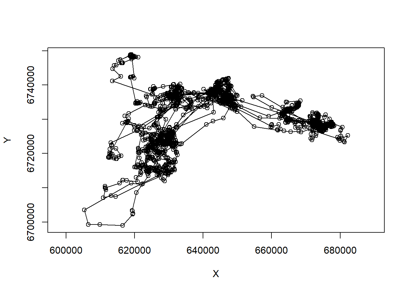
Note the very important asp=1 argument, that makes the aspect ratio between the x and y-axis 1.
What about time dimension? Here’s a way you can plot x and y coordinates as a function of time.
par(mar = c(0,4,0,0), oma = c(4,0,5,0), xpd=NA)
layout(rbind(c(1,2), c(1,3)))
with(pp5, {
     plot(X, Y, asp = 1, type="o")
     plot(Time, X, type="o", xaxt="n", xlab="")
     plot(Time, Y, type="o")
     title(pp5$ID[1], outer=TRUE)
})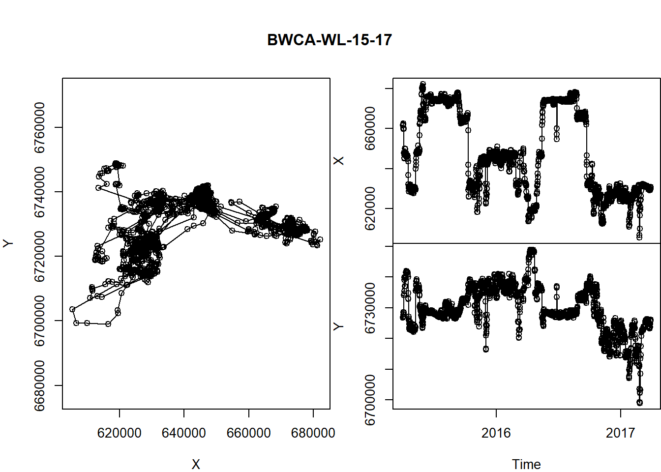
A few tricks here:
- the
layout()command helps “lay out” our three figures in an arrangement that echoes the matrix shape: 1 | 2 1 | 3 - The
par()commands control all graphical parameters, but here, in particular, the margins (mar) and the outer margins (oma). See?parfor more guidance.
This is a useful function, so let’s keep it around.
scan.track <- function(x,y,time, ...){
  par(mar = c(0,4,0,0), oma = c(4,0,5,4), xpd=NA)
  layout(rbind(c(1,2), c(1,3)))
     plot(x, y, asp = 1, type="o", ...)
     plot(time, x, type="o", xaxt="n", xlab="", ...)
     plot(time, y, type="o", ...)
}
R trick: the
...in the function definition allows us to pass any arguments we want to the functions inside thescan.trackfunction. We’re drawing curves - this way we can add colors, control width, etc., all from the “outside”.
Let’s test it:
with(subset(caribou, nickname == "PP.7"),
  scan.track(X,Y,Time,pch=19, col=rgb(1,0,0,.5), cex=0.5))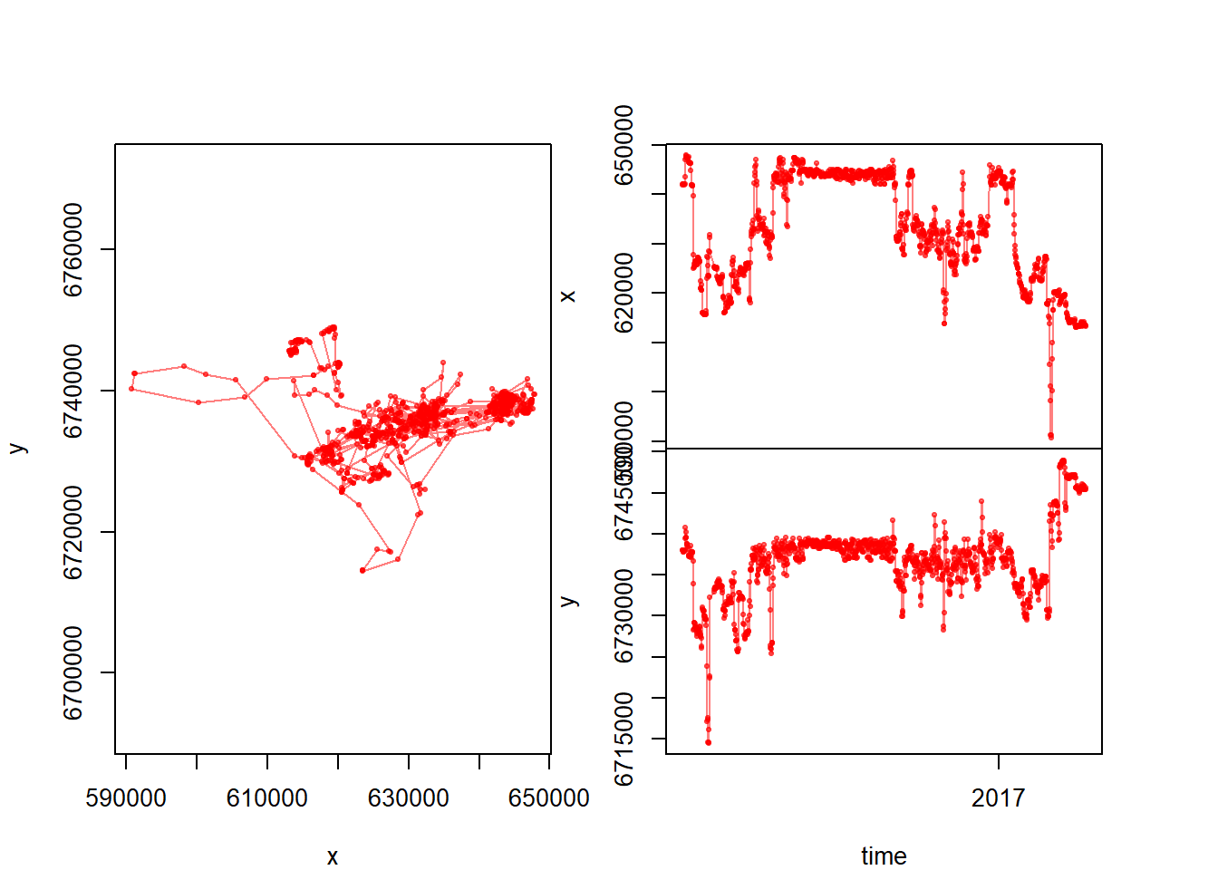
Now that we have a function, we might want to generate this plot for all individuals and save the output as a multi-page pdf. The following loop should do just that (we’ll just limit it the Pine Point animals for now):
pdf("PinePointScans.pdf", width = 6, height = 3)
for(myname in unique(subset(caribou, Herd == "Pine Point")$nickname)){
    me <- subset(caribou, nickname == myname)
  scan.track(me$X, me$Y, me$Time, pch=19, col=rgb(0,0,0,.5), cex=0.5)
  title(myname, outer=TRUE)
}
dev.off()
This will generate a pdf with all the Pine Point caribou (labeled).
3 Pseudo-animating a track
This is, in my opinion, the best way to animate a track, essentially by flipping through a multi-page pdf.
pdf("myanimation.pdf")
for(i in 1:nrow(pp5)){
  with(pp5, {
         plot(X,Y, asp=1, type="l", col="grey")
       lines(X[1:i], Y[1:i], col="blue")
       points(X[i], Y[i], pch=21, cex=2, col="darkblue", bg="lightblue")
       title(nickname[1], sub = Time[i])
  })
  box()
}
dev.off()
Basically, you loop through the data and plot only up to the ith point.
4 Mapping
4.1 ggplots and ggmaps
We did some base mapping (using the map() function) in the first lab, and touched just a litte bit on ggplot. The ggplot philosophy is a whole different way to think about graphics which you’ll have to learn about yourself. For some things, it can be very efficient.
Here’s a ggplot (of the caribou) with no maps:
require(ggplot2)
ggplot(caribou, aes(x=X, y=Y, col=nickname)) +
    geom_path(alpha = 0.5) + geom_point(alpha = 0.5) + coord_fixed()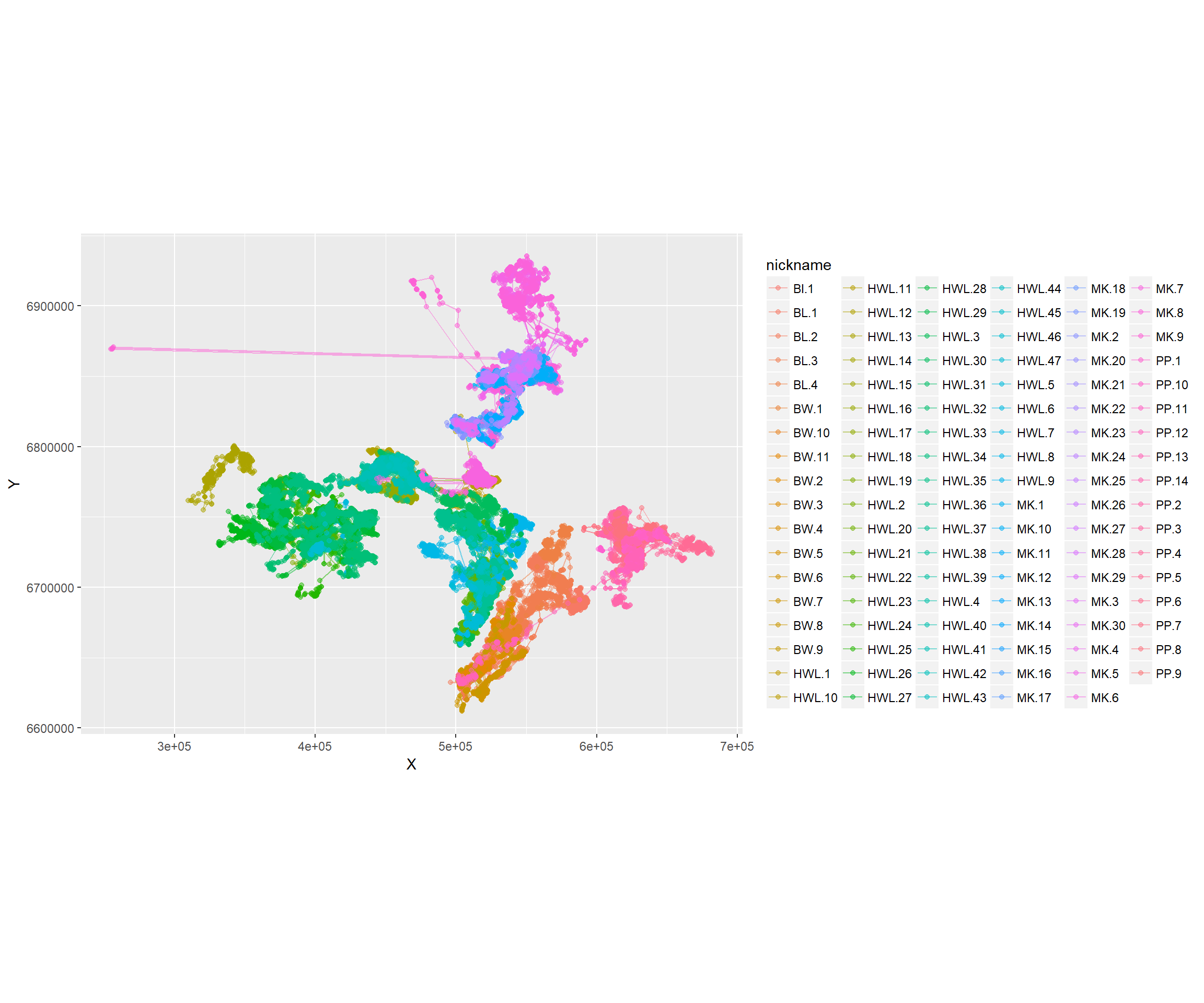
See how the alpha command is buried inside of the point and path geometries. The coord_fixed is equivalent to asp = 1. The best feature of ggplot is the automatic labeling.
There is a great package called ggmap with allows us to use google and other map sources to improve our plots. We will use google maps, available through the package ‘ggmap’. There are several steps here:
- Obtain a “basemap” - which is downloaded from Google, and require a range
require(ggmap)
latrange <- range(caribou$Latitude) + c(-.5,.5)
longrange <- range(caribou$Longitude) + c(-.5,.5)
southslave.map <- get_map(location = c(longrange[1], latrange[1], longrange[2], latrange[2]), maptype = "terrain", source="google")
There are lots of options for the maptype, e.g. “terrain”, “satellite”, “roadmap”, “hybrid”. The choice depends on the information you want to communicate (and how much you want to foreground your tracks).
Note: if you are using the ‘move’ package (data is a Move object), you can use the
bbox()command to automatically obtain the bounding box of the data range code as follows:
require(move)
require(sp)
moose.map <- get_map(bbox(caribou), source="google", maptype="satellite")- Now that we’ve downloaded the basemap, we can draw it with:
ggmap(southslave.map)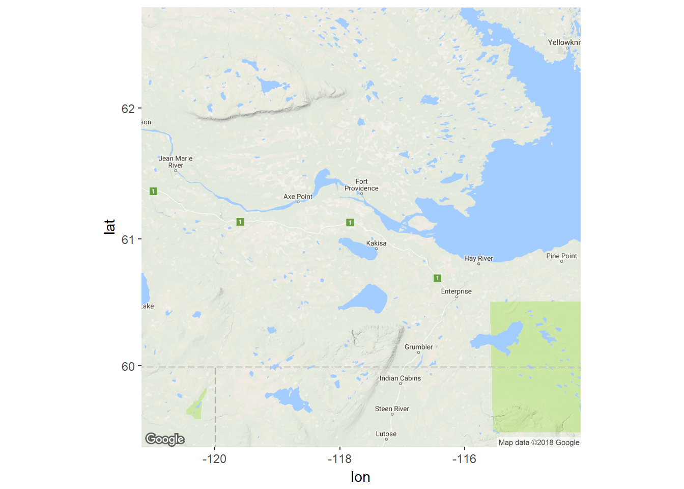
… and add ggplot syntax to add the tracks of the moose.
ggmap(southslave.map) +
    geom_point(data = caribou, mapping = aes(x = Longitude, y = Latitude, col=nickname), alpha = 0.5, size=0.5) +
    geom_path(data = caribou, mapping = aes(x = Longitude, y = Latitude, col=nickname), alpha = 0.5, size=0.5) +
    coord_map() + labs(x = "Longitude", y = "Latitude") +
    scale_color_discrete(l = 30) +
    guides(color=guide_legend(ncol=2))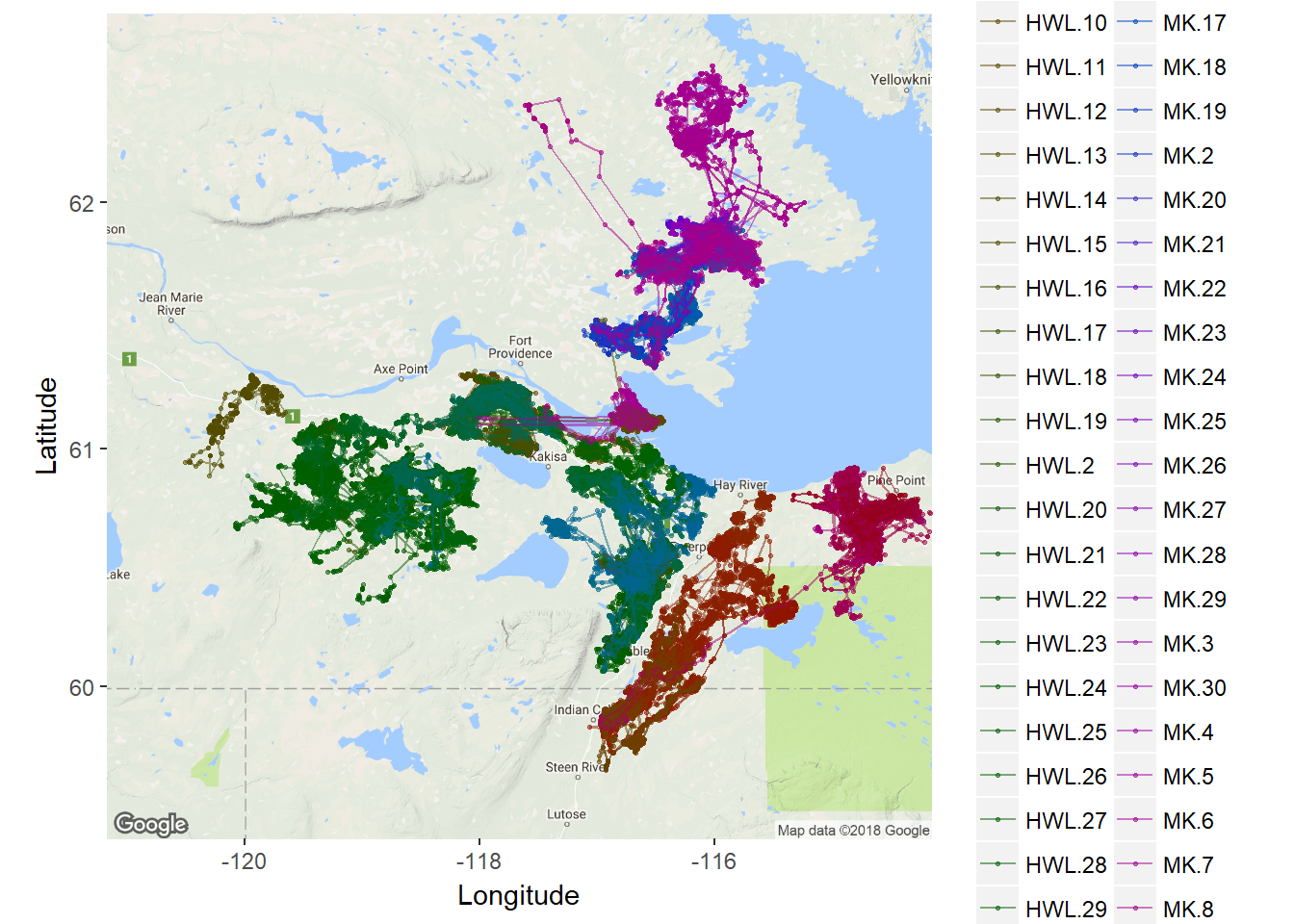
4.2 Google Earth kml files
The kml file syntax is a native syntax for adding locations (points, paths, etc.) to the Google Earth program, which is a wonderful way to visualize what is happening. There is a function in maptools which allows you to output your movement data as a kml. The steps below are a bit complicated, but essentially:
require(maptools)
require(gplots)
n.ind <- length(levels(caribou$ID))
palette(rich.colors(n.ind))
for(myid in unique(caribou$nickname)){
    # get a two-columns matrix of longitude and latitude for each individual
  myc <- subset(caribou, nickname == myid)[c("Longitude", "Latitude")]
  # create spatial lines object
  myc.lines <- Lines(Line(myc), ID = myid)
  #
  kmlLine(myc.lines, kmlfile = paste0("./_plots/kml/",myid,".kml"),
          kmlname = myid, description = myid,
          col=match(myid, unique(caribou$nickname)))
}
Here’s a screen grab: 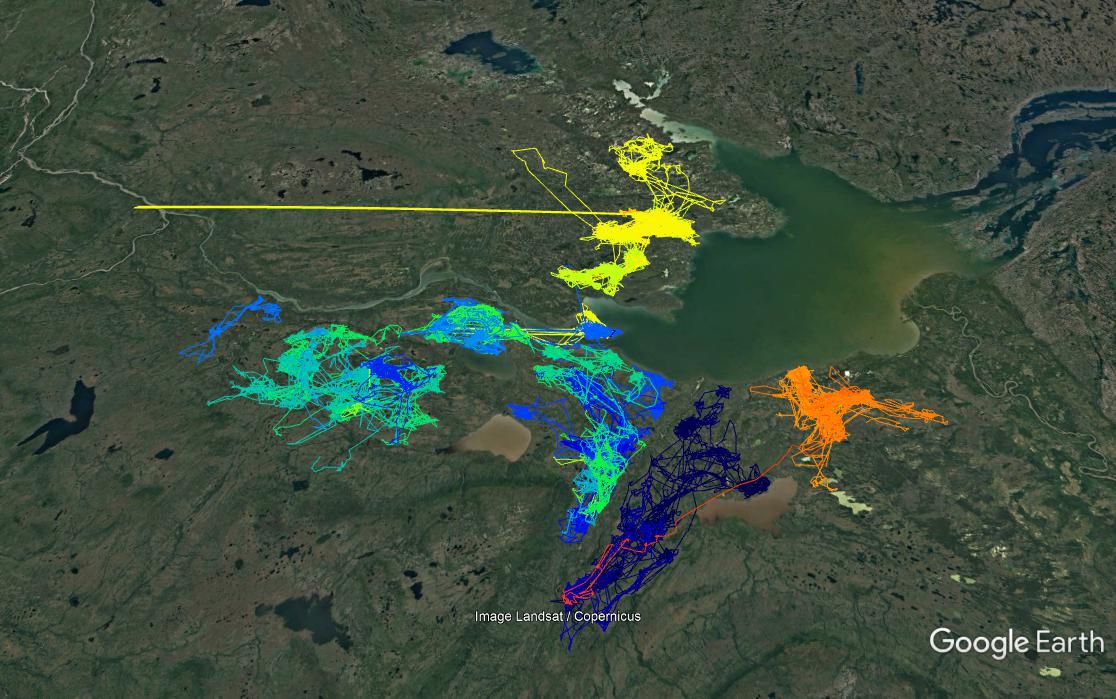
This will generate 107 files, one for each caribou, that can be opened directly in Google Earth.
4.3 Leaflet and mapview
Mapview is a package which allows you to create interactive, web-friendly “leaflet” maps, which relies on accessing openly availably mapping data.
Even ESRI provides some high-quality world imagery maps. The following code is will open a new, interactive visualization device using ESRI imagery. The window allows zooming and scrolling within the R environemnt. Note, that for this to work we need to convert the caribou to a SpatialLines object (caribou.sp) with the coordinates function. This is non trivial!
This can get computationally a bit heavy, so I subsample the caribou data to one herd, and thin it:
require(sp)
require(mapview)
myprojection <- CRS(attr(caribou, "projection"))
caribou.sp <- subset(caribou,Herd == "Buffalo Lake")
caribou.sp <- subset(caribou.sp)[seq(1,nrow(caribou.sp),3),]
coordinates(caribou.sp) <- ~ X + Y
proj4string(caribou.sp) <- myprojection
mapview(caribou.sp, zcol="nickname", legend = TRUE, cex=2, lwd=0.1, map.types = "Esri.WorldImagery")