The wav file "horngoby.wav" (Ctrl-click to open) is a
2-second recording of the sound of a passing automobile
horn, exhibiting the familiar Doppler
effect. The sampling rate is 22000
Hz. Download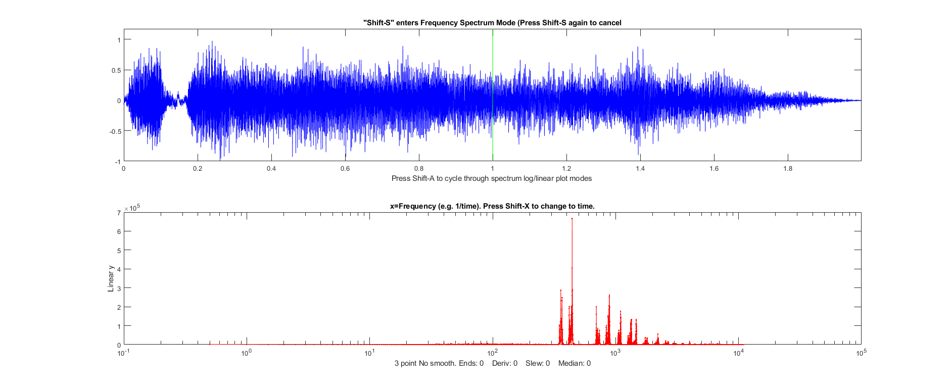 this file and place it in your Matlab path. You
can then load this into the Matlab workspace as the
variable "doppler" and display it using iSignal:
this file and place it in your Matlab path. You
can then load this into the Matlab workspace as the
variable "doppler" and display it using iSignal:
t=0:1/21920:2;
load horngoby.mat
isignal(t,doppler);
Within iSignal, you can switch to the frequency spectrum mode (press Shift-S), and zoom in on different portions of the waveform, so you can observe the downward frequency shift and measure it quantitatively. (Actually, it's much easier to hear the frequency shift - press Shift-P to play the sound - than to see it graphically; the shift is rather small on a percentage basis, but human hearing is very sensitive to small pitch (frequency) changes). It helps to re-plot the data to stretch out the frequency region around the fundamental frequency or one of the harmonics. I used iSignal to zoom in on three slices of this waveform and then I plotted the frequency spectrum (Shift-S) near the beginning (plotted in blue), middle (green), and end (red) of the sound. The frequency region between 150 Hz and 550 Hz are plotted in the figure below:
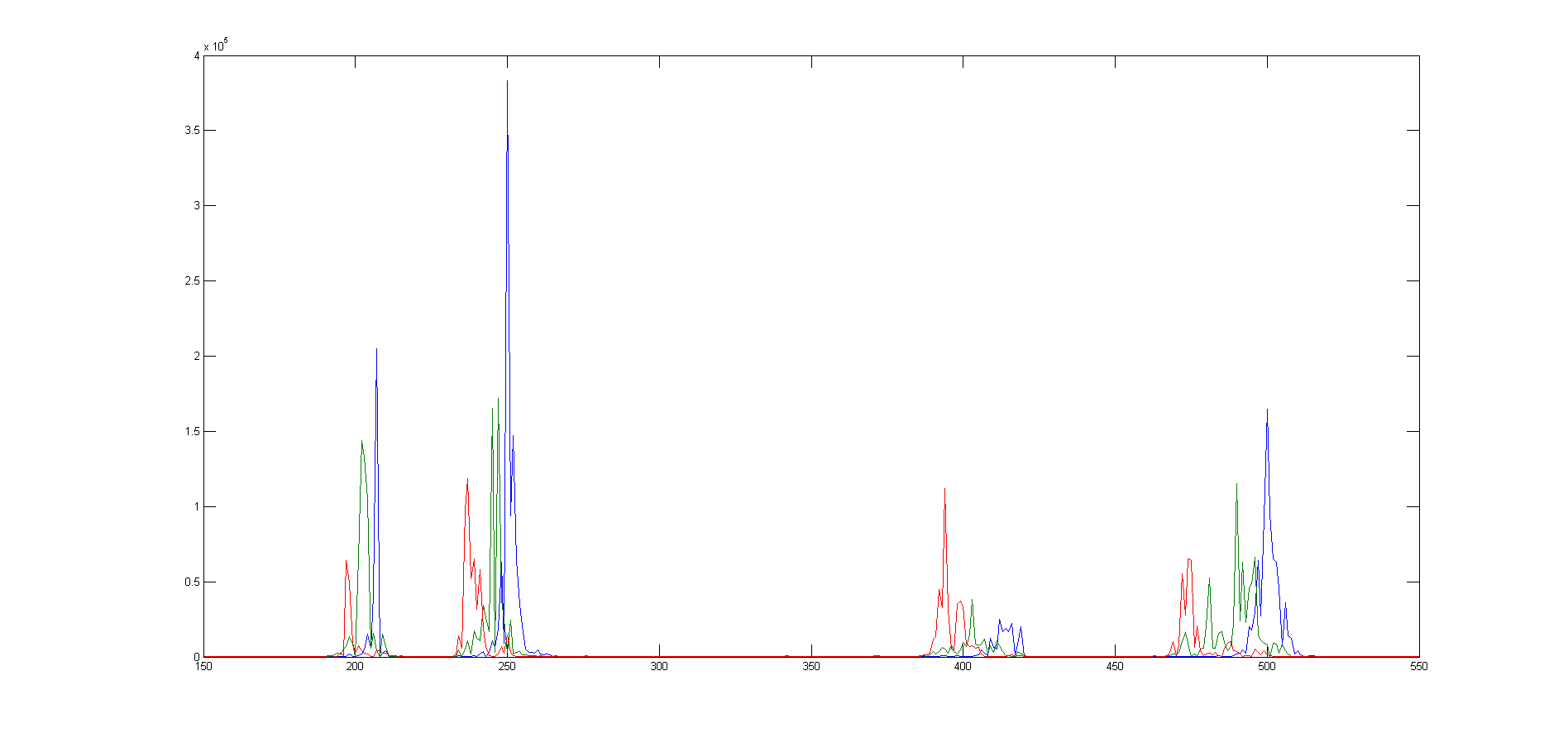
The
group of peaks near 200 are the fundamental
frequency of the lowest note of the horn and the
group of peaks near 400 are its second
harmonic. (Pitched sounds usually have a harmonic
structure of 1, 2, 3... times a fundamental frequency). The group of peaks near 250
are the fundamental frequency of the next higher note of
the horn and the group of peaks near 500 are its second
harmonic. (Car and train horns often have two or three harmonious
notes sounded together). In each of these groups
of harmonics, you can clearly see that the blue peak
(the spectrum measured at the beginning of the sound)
has a higher frequency than
the red peak (the spectrum measured at the end of the sound).
The green peak, taken in the middle, has an intermediate
frequency. The peaks are ragged because
the amplitude and frequency varies over the sampling
interval, but you can still get good quantitative
measures of the frequency of each component by curve fitting to a Gaussian
peak model using peakfit.m or ipf.m:
Peak Position
Height Width Area
Start
206.69 3.02e+005 0.8187 2.46e+005
Middle
202.65 1.55e+005 2.911 4.8e+005
End
197.42
81906
1.378 1.2e+005
The estimated precision of the peak position (i.e. frequency) measurements is about 0.2% relative, based on the bootstrap method, good enough to allow accurate calculation of the frequency shift (about 4.2%) and to demonstrate that the ratio of the second harmonic to the fundamental for these data is 2.0023, which is very close to the theoretical value of 2. You could even calculate the the speed of the vehicle.
It's
also possible to plot the evolving spectrum of such a signal as
a contour graph, using the PlotSegFreqSpect.m function, as
show in the graphic below. You can see the various frequency
components drifting steadily down in frequency as the time
passes. See HarmonicAnalysis.html#Software.
PSM=PlotSegFreqSpect(t,doppler,40,350,0);
% 40 segments, 240 harmonics

This page is part of "A Pragmatic Introduction to Signal
Processing", created and maintained by Tom O'Haver, Professor
Emeritus, Department of Chemistry and Biochemistry, The University
of Maryland at College Park. Comments, suggestions and questions
should be directed to Prof. O'Haver at toh@umd.edu. Updated July, 2022.