Unit III
Things Change
The only thing certain in life is change. From birth we each grow
taller, heavier (and sometimes lighter), older, wiser, richer (and sometimes
poorer). We live in human communities with population that are changing
minute by minute through births and deaths and immigration, and at any instant
of time many of those people are in motion on foot, bicycles, cars, buses,
trains, and airplanes. The physical features of the world around us are
in constant motion--pushed by forces of wind and water and gravity, and
our planet Earth is racing around the sun at nearly 1,700,000 miles per
day. In our economic lives the prices we pay for food, clothes, shelter,
transportation, education, and entertainment go up and down in response
to consumer demand and producer supply.
Many of the most important problems in "post-arithmetic" mathematics
require description and prediction of changes in related quantitative variables--to
build and use models of change. In some cases those problems involve analysis
of changes in variables as time passes; in other cases the problem is to
understand the ways that changes in some variables cause changes in other
variables. The topics of algebra and calculus are at the heart of this study
of change.
The investigations of this unit are based on problems that involve some
of the most common and important patterns of change. They illustrate some
of the most powerful standard techniques for describing and studying those
patterns and problems. The investigations are titled
Patterns of Change
Linear Models
Exponential Growth and Decay
Power Models
Your goal should be to develop skill in recognizing significant patterns
relating variables, in describing those patterns using data displays, graphs,
symbolic rules, and words, and in using information about patterns of change
to answer significant questions.
3.1 Patterns of Change
When we have information about a relationship between two or more variables,
one of the standard ways to display and communicate that information is
with coordinate graphs of (x,y) data pairs. The graphs display many particular
pairs of related numerical data as well as a visual image of the pattern
in those data.
1. The graphs below show eight important and relatively common patterns
relating pairs of variables.
a)

b)

c)

d)

e)

f)

g)

h)

The following statements describe eight different situations in which two
variables are related to each other. Match each situation to the graph that
you believe is most likely to represent the relation between those variables.
Then explain as carefully as you can what the shape of the graph tells about
the ways the variables change in relation to each other:
a) When a tennis player hits a high lob shot, its height changes as time
passes. What pattern seems likely to relate time and height?
b) The senior class officers at Lincoln High School decided to order and
sell souvenir baseball caps with the school insignia, name, and Class of
`95 on them. One supplier said it would charge $100 to make the design and
then an additional $4 for each cap made. How would the total cost of the
order be related to the number of caps in the order?
c) The population of the world has been increasing for as long as data or
estimates have been available. What pattern of population growth has occurred
over that time?
d) In planning a bus trip to Florida for spring break, a travel agent worked
on the assumption that each bus would hold at most 40 students. How would
the number of buses be related to the number of student customers?
e) The depth of water under the U. S. Constellation in Baltimore Harbor
changes due to tides as time passes in a day. What pattern would that (time,
depth) data fit?
f) When the Lincoln High School class officers decided to order and sell
t-shirts with names of everyone in the Class of `95, they checked with a
sample of students to see how many would buy at various proposed prices.
How would sales be related to price charged?
g) How does the height of a bungee jumper vary as time passes in the jump?
h) In a wildlife experiment, all fish were removed from a lake and the lake
was restocked with 1000 new fish. The population of fish then increased
over the years as time passed. What pattern would likely describe change
in fish population over time?
2. For each situation described in (1) and the matching graph, make a table
of numerical (x,y) data that you believe fits the expected pattern of relationship
between x and y and are reasonable values for the variables involved. Be
prepared to explain how the patterns of data in your tables fit the relation
among the variables expected and shown in the graph and how you decided
what reasonable numerical values would be. Include at least 15 data pairs
in each of your tables (you might need more in some cases to really match
the pattern).
Graphs of relations between variables very often portray information obtained
in some sort of experiment. Mathematical modeling of such relations begins
with collection of the data, presentation of the data in clear and accurate
forms, and often the search for an algebraic expression that matches the
pattern of the (x,y) data pairs. You've done such an experiment earlier
in the "bridge testing" activity. The question that follows asks
you to apply your modeling strategies to another familiar problem.
3. Would you jump off a high bridge protected only by an elastic cord, tied
to the bridge and around your waist or feet? That's how some daring New
Zealanders started bungee jumping.
If you decide to take a flier on a bungee jump, you certainly hope that
someone has figured out the risks and made plans for safety. Those plans
should include some experiments in which data is collected and analyzed
to find safe-limits rules.
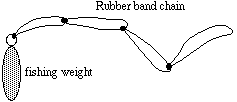
You can make and test a simple scale model of a bungee jump using
some rubber bands and fishing weights. Loop several rubber bands together
to make an elastic rope and then attach some weights.

(a) What pattern would you expect in the relation between the weight of
the bungee jumper and the stretch of the bungee cord?
(b) Work with a group research team and a scale model bungee jump to get
test data for at least five different weights.
(c) Now study the data from your experiments and write a report explaining,
as carefully as possible, your answers to the general question: How does
weight of the bungee jumper relate to the stretch of the bungee cord?
(d) Compare your results to your predictions in (a) and try to explain any
differences.
(e) As a follow-up study, design and conduct a scale model test to find
the likely relation between cord length and stretch length
for some fixed amount of weight. Prepare a report that you believe would
convey the findings clearly to planners of a jump.
Conclusions and Connections -- The examples of this investigation
involved some of the most significant and common patterns that occur in
data from study of related variables. Being able to sketch and interpret
the shape of a graph is a very useful skill.
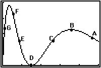
1. Study the following graph and explain how the value of y is changing
as x increases in the neighborhood of each labeled point.

2. There are no scales on the axes of the graph in (1). However, you can
use the shape of the graph to construct a table of (x,y) data pairs that
roughly match the pattern shown in the graph. Construct such a table with
20 data pairs. [Note: There are, of course, many different valid ways to
do this.]
3. When a new model car comes out in the Fall, its sales will vary throughout
the next year. Sketch a graph that you believe might be a likely pattern
of weekly sales over a 52 week period. Then explain what the shape of your
graph tells about the number of cars sold in weeks at various times of the
year.
4. Sketch the graph you would expect to match the relation between speed
of a skydiver in flight and the elapsed time of his/her jump. That is, your
graph should show how the diver's speed changes as time passes in the jump.
Be prepared to explain why the shape of your graph is a reasonable match
of what will actually happen.
5. Based on your graph in (4), sketch a graph showing the relation between
height of the skydiver above ground and elapsed time in the dive.
6. Look at the 8 graphs sketched at the beginning of this investigation
and draw another graph with a different shape that you believe matches the
relation between a pair of related variables.
3.2 Linear Models
The simplest yet most common and important patterns of change in related
variables are those that give linear graphs or data plots. For example,
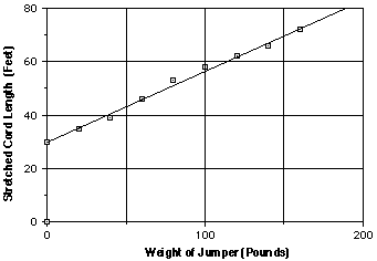
an experimental test of a bungee jump cord gave these data showing the relation
between weight and maximum cord length in a jump:
weight (pounds)     0  20  40  60  80  100  120  140  160

cord length (feet) 30  35  39  46  53   58   62   66   72
Those data give the following plot, with a modeling line drawn to match
the pattern.

In working with linear patterns of data it is often helpful to express the
relationship between variables with a symbolic rule or equation. From your
prior experience with linear relations probably remember that equations
in the form y = mx + b match linear graphs. To use linear models effectively
it is important to know the connections between their graphs, tables of
(x,y) values, symbolic rules, and information given in problem situations.
1. These days it is possible to lease just about any car. For example, for
the modest fee of $1500 down plus $750 per month you can drive a Jaguar.
Unfortunately, those charges add up.
a) What pattern will appear in a table showing total leasing cost as a function
of number of months in the lease?
Lease time    0   1   2   3   4   5   6   7   8


 Total cost
b) What pattern do you expect in a graph relating lease time and total payment?
c) What equation will give an appropriate rule relating length of lease
(x) and total payment (y)?
2. For any linear relation with rule given by an equation like y = mx +
b it is easy to produce tables and graphs of (x,y) data with a graphing
calculator or a computer. However, it is useful to have good sense about
the relation between symbolic rules, tables, and graphs so that you can
check the reasonableness of your machine-generated information.
Do some exploration of a variety of specific examples to discover or confirm
your understanding of the relation between symbolic rules for linear models
and the patterns that can be expected in their tables and graphs. Consider
at least four cases:
Case 1: y = mx + b with m and b both positive numbers
Case 2: y = mx + b with m negative and b positive.
Case 3: y = mx + b with m positive and b negative.
Case 4: y = mx + b with m and b both negative.
In each case, write a brief summary of the patterns you notice.
3. In studying tables of (x,y) data, one of the most useful descriptors
to use is the rate of change in y as a function of x. For example,
in the following table of a model relating weight and stretch in a bungee
jump cord, the stretch increases at a rate of about 5 feet for every 20
pounds of weight or 0.25 feet per pound.
weight   0  20  40  60  80  100  120  140  160


 length  30  35  40  45  50   55   60   65   70
a) How is the rate of change in a table for a linear model related to the
symbolic rule for that model? Check your ideas by re-examining the examples
of (2).
b) How can the rate of change in the bungee example be used to calculate
predicted length of the cord for weights of 21, 22, and 25 pounds?
c) Make a table of (x,y) values using the relation y = x2 .Then
check the rate of change in y as a function of x in this table and compare
the pattern with the linear model examples you explored in (2). What differences
do you notice?
d) How is the rate of change in a table of (x,y) values for a linear model
related to the graph you get for that model? Check your ideas again by re-examining
the examples of (2).
4. In graphs of linear models there are two features that are usually of
considerable practical importance--the slope and the y-intercept
. You recall that the slope of a linear graph is a measure of its inclination
to the axes, obtained from coordinates of any two points with the calculation
y2 - y1
________
x2 - x1
. The y-intercept is the y-coordinate of the point where the graph crosses
the y-axis.
a) Look back at the examples you generated in (2) to find patterns relating
slope and
y-intercept of a linear model to the equation y = mx + b of that model.
b) How are slope and y-intercept of a linear model graph related to patterns
in tables of (x,y) values for that model?
c) Look at a graph of the relation y = x2 and describe the slope
of that graph, comparing and contrasting it to the case with linear models.
5. The diagram below shows six linear model graphs.
a) Find the slope and y-intercept of each line.
b) Produce a table of at least 6 (x,y) values represented by each graph.
c) Find an equation of the form y = mx + b for each graph.

6. Look back at the graph of the bungee test data at the start of this investigation.
Find the approximate slope and y-intercept of that graph and explain what
each tells about the bungee situation.
One of the most common uses of linear models is to describe patterns in
experimental data. You've already seen one example with the bungee test
data at the start of this investigation. In any given situation there are
three issues to consider carefully:
Does the data pattern look like something a linear model might reasonably
fit?
If so, which of many possible linear models is the "best" fit?
How can the linear model then be used to make predictions and solve problems?
The next set of questions give you some practice in working on those problems.
7. The following graph shows data from a market research survey of potential
bungee jump customers. People were asked how much they would pay to take
a jump. Based on those results, the survey company predicted likely numbers
of customers each day at several typical prices.

(a) Describe the trend of the relation between price per jump and customers
per day as shown in the data plot. How will number of customers probably
change as price is raised higher and higher?
(b) Draw a linear model that you believe fits the pattern in the data well.
Explain how you arrived at your model choice.
(c) Use your model to estimate the number of bungee jump customers when
the price is set at $15, $25, and $35.
(d) Find the equation y = mx + b of a good fit linear model for the data
pattern and explain what m and b tell about the situation.
(d) Suppose you found that the bungee jump averaged 32 customers per day
in one month. What guess would you make about the price that had been set?
8. The table below gives 1992 end-of-year data on unemployment and crime
in the eleven largest Michigan cities.
(a). Study these data. What trend, if any, do you see?
(b). Make a scatterplot of the (unemployment, crime) data.
(c). Can this data be modeled well with a line? Explain your position.
(e). Use a calculator curve fitting routine to find a linear model. Then
use that model to estimate the crime rate for a city with a 9% unemployment
rate. How does your prediction compare to the crime rate for Flint?
(f) Explain the meaning of m and b in the modeling equation.
City       Unemployment (%)    Crime rate (per 100)

Muskegon       10.0                     22.42
Lansing        4.8                      16.04
Kalamazoo      4.6                      28.34
Jackson        7.9                      36.22
Detroit        7.3                      15.12
Flint          9.0                      25.16
Grand Rapids   5.5                      22.29
Benton Harbor  7.3                      43.63
Battle Creek   6.7                      21.18
Ann Arbor      3.9                      14.15
Saginaw        6.5                      23.10
Source: Michigan Employment Security Commission and Department of State
Police
9. In 1975 a new Ford Mustang car had a base price of $4,906. In 1981 a
comparable car had a base price of $7,900; in 1987 a base price of $9,750;
and in 1993 a base price of $13,245.
(a). On graph paper, make a plot of the sample (year, price)
data and draw a line that fits the pattern of the data well. (Hint: Use
time beginning with 1975 as 0.) Find an equation in the form y = mx + b
for that model line and explain what m and b tell about the situation.
(b). Use your linear model from (a) to estimate base price for Ford Mustangs
in 1978, 1984, 1990, and 1994.
(c). Produce a scatterplot of the data with your calculator. Then, experiment
with different expressions in the  menu to find an equation using
X for year and Y for price, whose graph is a line and models this data well.
Use the Trace or table-building feature of your calculator to compare the
prices predicted by that rule with those from the original data.
(d) Use the STAT menu of your calculator to find the equation of best fit
that it recommends and compare the result with what you produced in (a)
and (b).
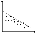
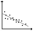
10. The following graph shows a scatter plot of data and two different possible
modeling lines.

(a) Which of the two modeling lines do you believe is the best fit to the
data pattern?
(b) How could you support your choice with a quantitative measure of accuracy
of a model fit? To help you in devising and applying a method of estimating
"goodness of fit" for the two lines, you might use these facts:
* The equations of the modeling lines are y = 1.5x + 2 and y = x + 4
* The data points all have whole number coordinates, beginning with (0,3),
(1,5), (2,5), etc.
How many different television stations do you watch in a typical day or
week? With the spread of local cable systems, American television watchers
now have access to dozens of different special-focus stations--from music
videos and sports to news, cartoons, and home shopping. As a result, the
audience for shows on the major networks has declined rather steadily. The
following graph shows the trend from 1982.

Think About This Situation
The graph shows trends in American television viewing habits for a period
of 8 years from 1982 to 1990.
1. What significant patterns do you see in the data?
2. What factors are causing the changes in network and cable audience shares?
3. To make a report on future prospects of cable and major network television
audiences, what kinds of questions would you use the linear models to answer?
4. Would you expect the trends in the data from 1982 to 1990 to continue
until
the year 2000?
There are several kinds of questions that naturally occur in thinking about
the television audience trends. For example, people planning to invest in
a television business might wonder:
(1) When might the cable audience share reach 30 percent?
(2) When might the cable and network audiences shares be equal?
(3) How long will the network audience share remain above 50 percent?
Trends in network and cable television audience shares can be modeled well
by linear relations:
Major Networks: Y= 75 - 2.5X
Cable: Y= 5 + 2.5X
(where X stands for years since 1982 and Y stands for percent audience share).
Using those symbolic models, the prediction questions can be written as
algebraic equations and inequalities like this:
(1) 30 = 5 + 2.5X
(2) 5 + 2.5X = 75 - 2.5X
(3) 75 - 2.5X >= 40
The problem is finding values of X (times) when various audience share conditions
hold.
One way to solve these equations is to make tables and graphs of (time,
share) data for the two models and look for key points in each.
13. Estimate solutions for each of the following linear equations and inequalities.
In each case, explain what the solutions tell about prospects for network
and cable television audience shares, and explain how solutions can be found
using a table and graph.
(a) 30 = 5 + 2.5X
(b) 50 = 75 - 2.5X
(c) 5 + 2.5X = 75 - 2.5X
(d) 75 - 2.5X >= 40
(e) 5 + 2.5X <= 75 - 2.5X
14. Write and solve equations and inequalities matching each of the following
questions about network and cable television audience shares. In each case
explain how you can use tables and graphs of the linear models to find solutions.
(a) When will the major network audience share decline to 30 percent?
(b) When will the cable audience share reach 40 percent?
(c) When will the major network audience share be below 50 percent?
(d) When will the major network audience share be less than the cable audience?
Conclusions and Connections -- The problems of this investigation
required three kinds of understanding and skill:
Recognizing relations between variables that can be modeled well by linear
graphs.
Finding symbolic equations that match linear graphs and the patterns in
related data tables.
Using linear graph, table, and symbolic models to answer questions about
related variables.
The following questions ask you to summarize the properties of linear models
you've learned and to apply your reasoning skills to some additional problems.
1. If two variables are related by a rule given with an equation in the
form y = mx + b, what will the particular values of m and b tell you about:
(a) The graph of that relation?
(b) The pattern in a table of (x,y) values for that relation?
2. If you are studying a situation in which some (x,y) data have been collected
and your task is to find a model to fit the pattern in that data:
(a) How do you decide whether a linear model is a sensible fit?
(b) How do you decide what the best linear model might be?
3. If you are working with a linear model with rule of the form y = mx +
b, how can you use tables and graphs of that relation to solve equations
and inequalities like this:
(a) mx + b = c (b) mx + b < c
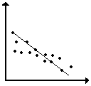
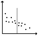
4. The sketches that follow show five ways of drawing a linear model on
the same scatterplot. See if you can figure out the reasoning used to make
each drawing. Then decide which linear model seems best and explain why
the others are not based on sensible strategies.
(a) (b) (c)


(d) (e)


5. Consider the relation between rankings and audience share for television
shows on the major networks. Those variables are important because they
set advertising rates and the survival of the shows themselves.
The table below shows a sample from the complete list of ratings for regular
television programs during the 1992-93 season.
 Rank            Show           Audience*
  10       Full House, ABC         14.7
  20     Unsolved Mysteries,       13.2
                 NBC
  30        Simpsons, Fox          12.1
  40        L. A. Law, NBC         10.8
  50         Day One, ABC          10.0
  60     Beverly Hills 90210,       9.4
                 Fox
  70         Nurses, NBC            9.0
  80      Space Rangers, CBS        8.3
  90    Reasonable Doubts, NBC      8.0
 100         Code 3, Fox            7.4
*In millions of households
Make a scatter plot of the data on graph paper and then answer these questions.
(a) What do the table and graph show about the relation between ranking
and average weekly television audience for television programs?
(b) How can you predict the average weekly audience from the rankings of
a show using the graph? Using the table?
(c) How can you predict the ranking of a show from the average weekly audience
using the graph? Using the table?
(d) Which display do you find easier to use in making ranking or audience
estimates?
(e) Which display would be more effective in a report to another group?
The table and graph of television program rankings and audiences do not
include data for every one of the 141 shows during the 1992-93 season. But
they give enough information to make some predictions. Those predictions
would be more easily and accurately done if the data were modeled by a smooth
graph; a straight line is a reasonable model in this case.
6. Draw a linear graph model that you believe fits the trend in the (ranking,
audience) data.
(a) Explain why you drew your modeling line where you did.
(b) Find the equation of that model in the form y = mx + b and explain what
m and b tell about the situation being modeled.
(c) Use the STAT menu and one of its curve-fitting options to find a linear
model for the data. Then compare the equation of that model with what you
produced by the eyeball method.
(d) Use your preferred linear model to answer these questions:
(1) Seinfeld was the 25th ranked show for the year. What audience
does your model estimate for that show?
(2) In Living Color had an average weekly audience of 9.7 million
households. What ranking does your model predict for that show?
(e) The actual average weekly audience for Seinfeld was 12.7 million
households, and In Living Color was ranked 54th. Compare these values
to your estimates in (d) and explain any differences between predicted and
actual numbers.
7. Consumer Reports rates many manufactured goods. Their 1993 ratings
for the overall quality of color print films (ISO 100) and price for the
24-print roll are given in the table.
        Brand              Cost        Quality
                                        Score
    Polaroid High         $2.49           96
     Definition
  Fujicolor Super G        2.91           95
   Kodak Gold Plus         3.49           94
   Konica Super SR         2.91           94
     Kodak Ektar           4.27           93
    Scotch Color           2.69           93
   Fujicolor Reala         4.69           90
    Agfacolor XRG          3.49           83
   Signature Color         1.75           76
Source: Consumer Reports, Nov., 1993
(a). Study these data. What trends, if any, do you see?
(b). Make a scatterplot of (quality, cost) data. What does
the graph suggest?
(c). Can this data be modeled well with a line? Explain.
(d). Are there apparent outliers? If so, which point(s)?
(e). Are the data well modeled by a line when the outlier(s) are eliminated?
8. Most Americans can afford nutritious and varied diets, even if
we do not always eat what is best for us. But, in many countries of the
world life is a constant struggle to find enough food. That struggle
causes health problems like reduced life expectancy and infant mortality.
The following data show how daily food supply (in calories) is related to
life expectancy (in years) and infant mortality rates (in deaths per 1000
births) in a sample of countries in the western hemisphere.
      Country        Daily Calories   Life Expectancy  Infant
                                                       Mortality
Argentina                 3113        71               29
Bolivia                   1916        54               93
Canada                    3482        77               7
Dominican Republic        2359        67               57
Haiti                     2013        56               86
Mexico                    3052        70               36
United States             3671        76               8
Venezuela                 2582        70               33
Source: Universal Almanac
(a) Make scatterplots of the (calories, life expectancy) and
(calories, infant mortality) data. Study the patterns in the
table and the scatterplots and then answer these questions.
(b). What seems to be the general relation between average daily calorie
supply and length of life in the sample countries?
(c). What seems to be the general relation between average daily calorie
supply and infant mortality in the sample countries?
(d). What factors other than daily calorie supply might affect the
two variables of life expectancy and infant mortality?
Increasing the food supply in a country usually takes money. So economists
try to figure out the likely increase of life expectancy or decrease of
infant mortality for various increases in food supply.
(e) Find linear models fitting the (calories, life expectancy)
and (calories, infant mortality) data patterns. Then find
equations for those linear models.
(f) What do the slopes of your linear models say about the probable effects
of change in daily calorie supply in the sample countries on life expectancy?
On infant mortality?
(g) Average daily calorie supply in Chile is 2581. What life expectancy
and infant mortality would you predict from the calorie data?
(h) What daily calorie supply would you predict from these facts:
(1). The life expectancy in Brazil is 66 years.
(2). The infant mortality rate in El Salvador is 53 per 1000 births.
(3). The actual data for Brazil is 2751 calories and for El Salvador is
2317. What does the difference between predictions and actual values tell
about the usefulness of the model you have found?
(i) What life expectancy does your model predict for a daily calorie supply
of 5000? How much confidence do you have in that prediction?
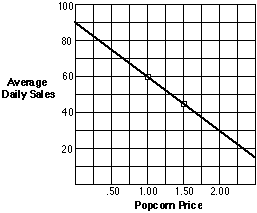
9. Many people who go to movies like to have popcorn to munch on during
the show. But movie theater popcorn is often very expensive. The manager
of the Cineplex Odious Theater wondered how much more she might sell if
the price was lower, and whether such a reduced price would actually bring
in more popcorn profit.
One week she set the price for popcorn at $1.00 and sold an average of 60
tubs per night. The next week she set the price at $1.50 and sold an average
of 45 tubs per night. She made a linear graph model to predict sales at
other possible prices.

(a) Find the equation of the graph model.
(b) Explain what the slope and intercept of the model tell about popcorn
sales prospects at various prices.
(c) Write and solve equations and inequalities matching the following questions
about theater popcorn business prospects.
(1) What price will give average daily sales of about 75 tubs?
(2) What price will give average daily sales of less than 30 tubs?
(3) What sales is predicted for a price of $1.80?
(d) Use the graph or rule relating price to average daily sales to make
another table relating price to revenue from popcorn. Explain what the pattern
in that table tells about the relation between price, sales, and revenue.
(e) Solve these equations and inequalities, similar to those about popcorn
price and sales. Use at least three different methods--table, graph, and
just plain thinking--and show how each answer can be checked.
(1) 9 + 6x = 24
(2) 1.5x + 8 = 3 + 2x
(3) 1.5x + 8 <= 3 + 2x
10. On June 13, 1993 the Chicago Bulls and Phoenix Suns played a triple-overtime
game in the finals of the National Basketball Association playoffs. The
63-minute game set many records. The game box score below shows who played,
how much they played, and their performance.
       Chicago Bulls                      Phoenix Suns
Player      Min.  Pts.  Reb.        Player      Min.   Pts.  Reb.
Jordan      57    44    9           Barkley     53     24    19
Pippen      56    26    10          K. Johnson  62     25    7
Cartwright  20    3     8           Miller      11     2     2
Grant       45    13    17          Majerle     59     28    7
Armstrong   58    21    0           Ainge       40     10    5
Paxson      5     2     0           West        36     11    5
Williams    46    4     14          Dumas       24     17    5
King        12    0     5           F. Johnson  2      0     0
Tucker      14    3     1           Chambers    27     12    2
Walker      2     0     0           Mustaf      1      0     0
Team        315   121   59          Team        315    129   52
(a). Combine the data for the two teams to study the relation between minutes
played and points scored. Use your graphing calculator to produce a scatterplot
of the (minutes, points) combined data.
* Describe the overall relation between those variables and any interesting
deviations from that pattern.
* Would a linear graph be a good model of the pattern in this data? Explain
your reasoning.
(b). Repeat the analysis to study the relation between minutes played and
rebounds.
(c). Repeat the analysis to study the relation between points scored and
rebounds.


