
Assignment 1: Critique a Website
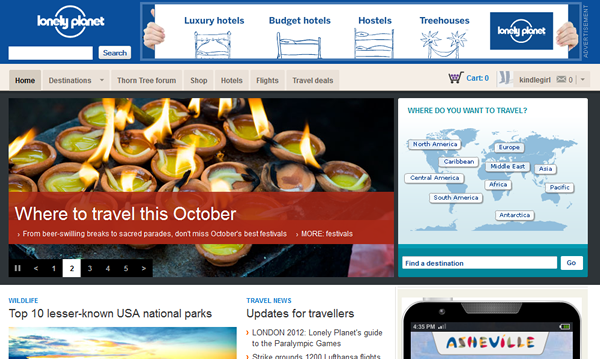 The Lonely Planet travel guide site offers a hodgepodge of information, products for sale, links to other travel websites (such as Kayak), and community forums. The index page of the site reflects that hodgepodge, with a band of advertisement at the very top, then a graphic slider of site highlights, and a little interactive world map. Below these areas are links to news stories and travel tips, as well as more links to products for sale and media galleries. Some of these links open in a new window, but some take the user away from the site without warning. I could not identify any rules for which links would open in a new window. I must mention that I tried to pause the slider, because I find those things distracting, and it paused for about 10 seconds – and then it started up again! Sheesh!
The site includes simple dialog, such as a warning about cookies that includes a direction to the “cookie settings” link at the bottom of the page. Other text on the site, such as information about creating a membership, is informal without being too cute, as well as long enough without providing too much detail. Feedback and error messages are clear and concise. When I created a user ID, I got a clear message explaining what my next step was. When I used a form to create the ID and left some required fields blank, error messages appeared at the top of the form as well as next to the fields I had left blank, which I think is inspired, since the field where one made the error may not be visible after the form has been submitted. On the other hand, the punctuation and capitalization of the error messages was random at best.
Navigation on the site is simple, as the main menu is usually visible, and it usually indicates what part of the site the user is in. The header and menu remain the same in every section except the photo gallery display, and even there, menu items are available: they just appear in a different color. This is beneficial consistency, but there are some pages that don’t appear to be listed anywhere in the menu, such as user support pages like the contact form. While the menu is still visible from those pages, it doesn’t reflect the user’s location in the site, which seems disorienting. Further, it is possible to get to some pages – such as an FAQ for the shop -- that have a different menu and header, which is also disorienting. Help and documentation are available, but not from the main menu of the site. I reached it from the “see all help and support topics” from the shop section of the site, and I got the different header and menu.
In summary, this site does its job of helping the user find information about travel destinations, meanwhile gently selling its books, plane tickets and hotel rooms. However, it’s not a very polished web presence.
