Event name: National Museum of Natural History, Smithsonian Field Trip
Event time and place: October 20, 2024. Washington D.C.

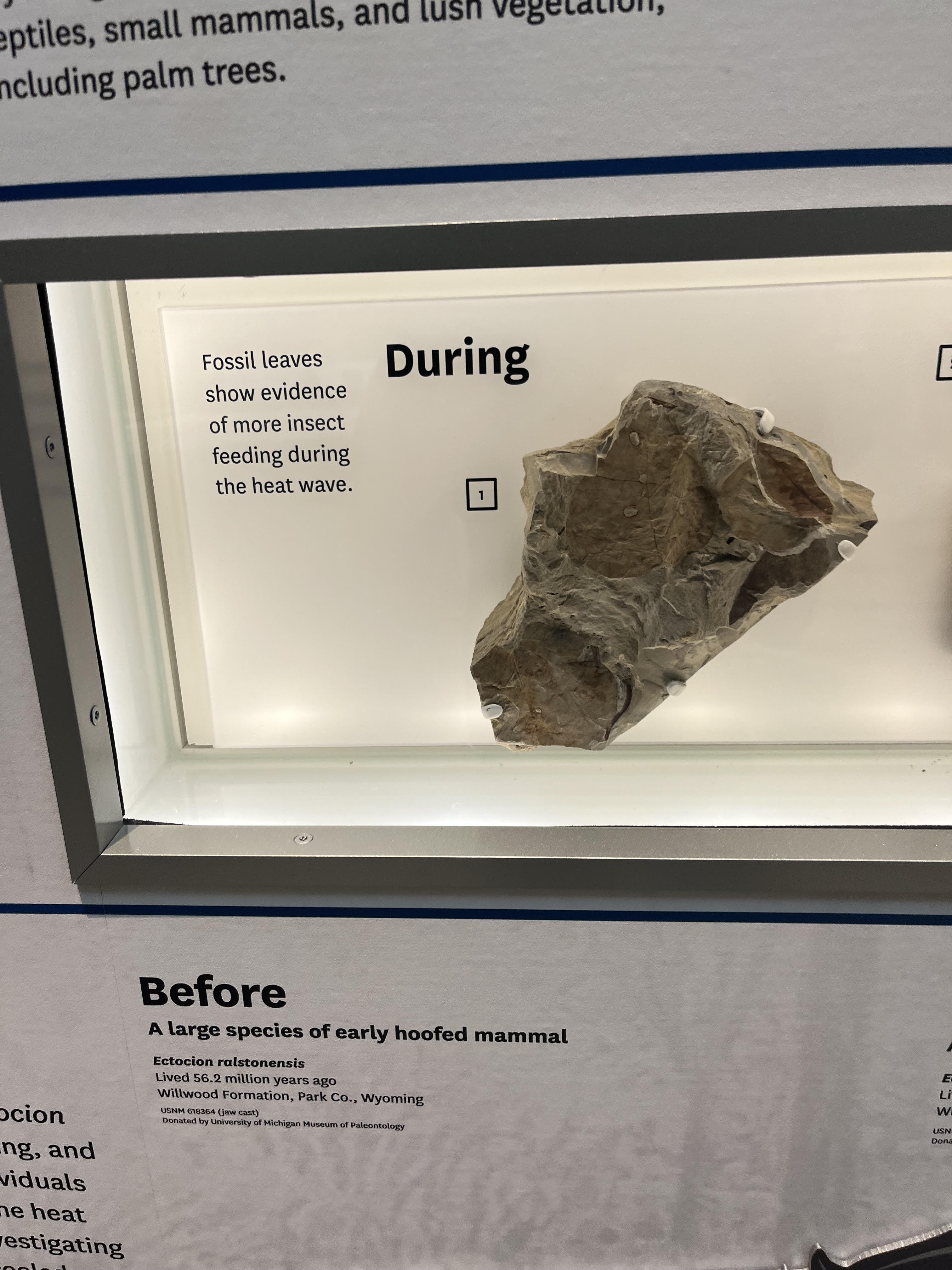
Fossil Leaves that help identify climate change.
Part 1: Cellphones. The new cellphones exhibit had multiple ways of communicating information. One way they did this was by straight up displaying the minerals required for your cellphone. This is the traditional way of disseminating information, and I think it works well for the older visitors of the exhibit. The exhibition also sought to gain the attention of younger visitors, and it did this by having interactive games and an interesting comic on the wall. I think both of these mediums of communication are more digestible for kids, but for an older visitor like me, the games were not at all that interesting. The comic was cool, and it mainly depicted the impact, not the production, of cell phones. I honestly thought the positives and negatives it portrayed were cool.
The exhibition attempts to convey information about the environmental impacts of the cellphone production process. It doesn't really use the interactive methods to describe these impacts, and instead settles for boards where you can read about the information. The exhibit mentions the impact of internet traffic growth on the environment. They note that internet traffic grew 1200 percent over the 2010s, and that data centers are having to become more sustainable as a result. They mention that a video like Baby Shark alone produces 11,500 tons of CO2 emissions. Lastly, they discuss the waste produced by the mining of minerals such as copper. Mining copper produces 735 pounds of waste rock.
One technological impact demonstrated was the impact of cellphones on internet traffic. As I mentioned above, it grew 1200% over a decade. Two social impacts depicted in the comic included the rise of anxiety caused by social media, and the awareness and proliferation of social justice movements globally. The tech impact was conveyed via a panel, and the social impacts were conveyed in the comic.
Part 2: Hall of Human Origins. The Hall of Human Origins describes the process of crop introduction to various continents, the change in CO2 levels worldwide, and the rise of the human population. The exhibit uses a timeline on the wall that shows when crops were introduced and the simultaneous rise in human population. The exhibit has graphs of CO2 levels over long term history, and interestingly, the exhibit has one of those live counters that depicts the human population change in real time.
I do think the exhibit could have done a better job at conveying the human impacts of CO2 emissions. The exhibit just showed graphs, but showing some coal plants and diesel trucks could have made this exhibit more impactful. The pictures on the timeline wall are not impactful. More effort could have been put in this exhibit in my view.
Part 3: Ocean Hall The first video I watched was our Blue Planet. This video just gives the basic statistics, such as 70% of our Earth being Oceans, less than 50% of them being protected, and the fact that they have absorbed 25% of the CO2 since 1800. The next video I watched was Deep Ocean Creatures, a video produced by NOAA that discovered new creatures off the coast of Hawaii. These videos were very digestible.
The Global Ocean Video that I watched on the Sphere depicted currents. It discussed surface currents, the Gulf Stream(which warms water from the tropics to the North Pole), trade winds, and circumpolar currents. The sphere used different colors to highlight the different types of currents, and it made for a cool depiction about this concept.
Part 4: Hall of Fossils. I took a look at two different dioramas. The first model depicted Kentucky 22-20000 years ago, when the world was much colder and ice sheets were at its maximum. Different animals that we would associate with the arctic were displayed, such as Arctic hares and Woolly Mammoths .The CO2 levels were about half of today, and the temperature was around 6 degrees celsius, with the ocean levels being 120 meters lower. The next diorama I looked was a jurassic diorama from 157-145 million years ago. The CO2 was 4 times higher than today, the temperatures were about 9 degrees C higher, and the sea level was about 100 m higher than today. These exhibits are really cool, and I like seeing how much they can fit in while still making the display look nice.
I found an exhibit depicting a time 56 million years ago. This exhibit calculates the climate using fossil records of leaves, which showed evidence of more insect feeding during the heat waves during this time. Additionally, animals needed to eat more to meet their needs, and since many could not, they shrunk as evidenced by the smaller skeletons. This particular exhibit gives a good demonstration using fossil records and geological information to calculate the temperature. Another exhibit displays the present day situation, and highlights how we can use tree rings to calculate past and present temperatures. This panel provides a more ominous warning about our future, and whether it will be too hot to handle. Overall, I found these exhibits to be tucked away but valuable, highlighting how we can use fossils and geology to find past temperatures.


